How to make a watercolor mixing chart step by step
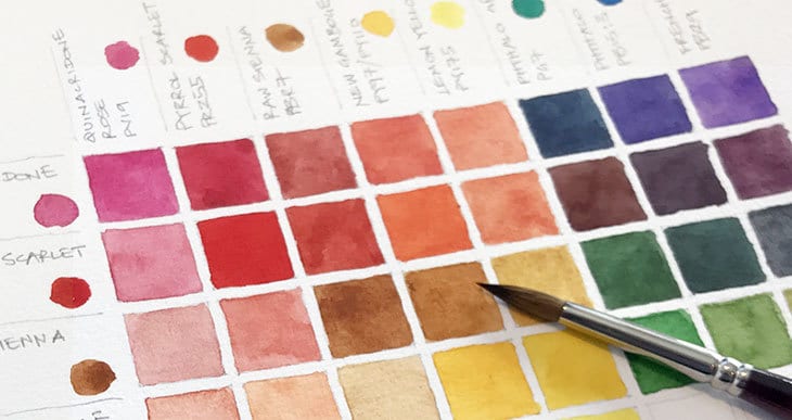
You’ve seen them… Right ?
Those beautiful looking watercolor charts with a rainbow of fantastic colors.
It’s only natural that you want to make one yourself. That’s exactly how I felt when I began my adventure into watercolors.
So I looked for a simple tutorial about how to make my own watercolor mixing chart. But the more I searched, the more confused I got !
There are loads of different types of color charts.
And some of them are not very clearly explained.
On top of that, different artists seem to have different ways of making them… I ended up looking at a lot of charts !
But it doesn’t have to be that complicated. Making watercolor charts is a lot of fun and it’s a very instructive exercise.
I’m going to explain the different types of watercolor charts you will commonly find and how to make a perfect watercolor chart that will serve as a reference for all your future projects.
In this article I’ll be showing you one of the most common types of watercolor chart – what is referred to as the “ watercolor mixing chart ”. But I’ll be covering each different type of chart in separate articles. I recommend you check out the list of each type below to get a full understanding of watercolor charts – then you can shamelessly flaunt your beautiful color charts to everyone you know !
The different types of watercolor mixing chart
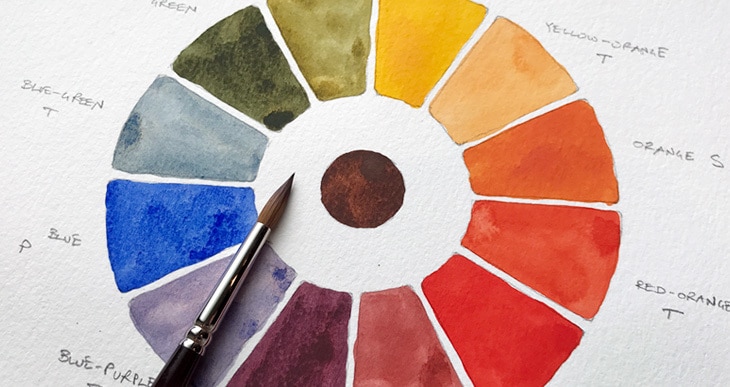
- The color wheel – This is a fundamental chart for understanding primary color mixing.
- The mixing chart – Read this article to find out more !
- The glazing chart – This chart shows you how your paints work together when glazing.
- The dual color mixing chart – These charts mix only two colors but in different paint ratios.
- The value chart – These help you to learn the proportion of water needed to mix colors of different values, from light to dark tones.
- The palette chart – A useful chart to keep in your palette as a visual guide to the real color appearance of your paints.
- Watercolor swatches – these “charts” are for testing single paints and provide a reference which describe the characteristics of your individual paints.
What’s the purpose of a watercolor chart ?
Have you ever been puzzled about what colors to mix in a particular situation ?
Watercolor charts are all about mastering mixing. These simple charts help you learn how to mix your collection of paints and remember which ones you need to reproduce a particular hue.
I’m always surprised by the huge variety of colors that can be created from just a few tubes of paint. If you do this exercise it will help you understand how your own paints work together. You’re going to do a lot of mixing ! But that’s the whole idea…
You may be astonished by the colors your paints can produce !
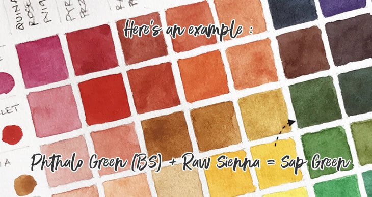
How does a watercolor color chart work ?
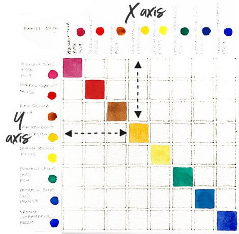
A watercolor chart is a grid of colored squares using all or some of the paints in your palette. The grid is labeled on the top and side axis with the names of all your paints. Each square in the chart is at the intersection of a row and a column of the chart.
You fill in each of the colored squares on your grid by mixing the color on the side axis with the color on the top axis.
For example in the diagram Row 4 + Column F = 4F
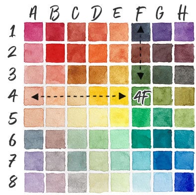
The completed grid gives you an overview of the mixing range of your palette colors.
6 good reasons to make a watercolor mixing chart
- I always recommend using single pigment and transparent watercolor paints. Why ? Because if you mix too many pigments it often ends up as a muddy dull color. I’m sure, like me, you prefer bright vivid colors in your paintings. Mixing single pigments is less inclined to produce flat colors. A color chart will help you identify which single pigments produce a desired color mix, and you may find some 2 or 3 pigment paints which mix badly !
- Knowing how to mix blacks or grays with just two colors is extremely useful, (if you have a tube of black paint you’ll probably find don’t need it). A mixing chart will help you find which two colors mix beautifully to produce interesting grays and blacks.
- Sometimes you also need to reduce the intensity of a color (paint that comes directly from the tube is at its brightest most intense hue). A lot of artists will be tempted to do this by adding black, but black will deaden your colors ! It’s much better to add a complementary hue, and your color chart will help you identify the right combination.
- Mixing greens can also be quite tricky. When we go to mix paints we find it difficult to pick the right combination to get the right shade of green. A color chart goes a long way to helping with this.
- Pinks and skin tones can be particularly frustrating to mix. A lot of beginners will mix red with white paint. The results are similar to when you try to mix a color by adding black. Your colors will look flat and uninspiring. There are several combinations that will produce great flesh tones and your mixing chart will help you discover them.
- Do you really need all those tubes of brown, indigo and violet ? Convenience mixtures like these are useful if you need a very specific color all the time, but you can probably mix these colors with your existing palette of paints. Making your own color chart could save you money because you’ll know how to mix a color using two other paints. You may find that you end up using less colors.This is especially useful to know if you intend to paint while traveling, so you can make your own small travel palette.
Even if you have a limited palette you’ll probably find some pleasantly surprising mixing results along the way.
And in the end a good chart will make your life easier.
I’ve used 8 colors for this example mixing chart but you can use more or less. You can use any combination of colors you want to test. Quite often if you get a new palette set from a particular manufacturer, it’s a good way to test the mixing capabilities of your new paints.
So sit back, grab a coffee and have some fun !
My watercolor mixing chart – download the pdf
I like to do things the easy way.
But at the same time I kind of like things to look neat !
Most artists will ask you to grab a ruler and measure a grid of squares. If you don’t want to go to all the trouble of measuring, I have a quick and easy solution for you. Download my printable watercolor chart template
Try sticking a sheet of watercolor paper in your printer and print out the template, (thin 190 gsm paper may work best). Or you can trace the template onto watercolor paper using a lightbox or against a window, (this is what I do).
Psst… Sometimes you don’t even need to draw a neat grid ! Just sketch a few lines in your sketchbook.
My own color chart was designed for 8 colors, which are taken from my recommended limited color palette.
How to make a watercolor mixing chart
1. Prepare your materials
Obviously you’re going to need paper, and a brush. I used a round brush size 8, and a sheet of hot pressed 300 gsm watercolor paper for my color chart. You will also need:
- All your paints
- A pencil
- 2 jars of water
- Paper towels or a rag.
2. Setting up the color chart.
First of all count your paints.
The number of paints = the number of squares along each side of the chart.
For example, this chart includes 8 colors giving a total of 64 squares. I like to leave a gap between the squares, otherwise you have to wait for the paint to dry before painting adjacent boxes.
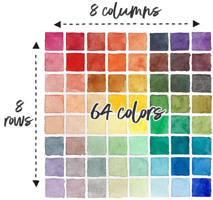
You can either sketch or draw your chart with a pencil and ruler or download my ready to go template.
3. Plan the order of your colors
I like to arrange my colors according to the hues of the color spectrum. I find it produces the most harmonious results. The order goes something like this:
Reds / oranges / yellows / greens / blues / violets / dark colors
Dark colors include paints such as Burnt Umber or Paynes Gray. Any earth colors like Raw Sienna or Yellow Ochre and pinks like Quinacridone Rose are located between the reds and yellows.
I used the following Daniel Smith paints for this chart:
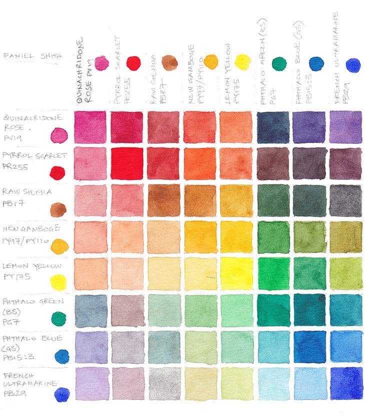
Quinacridone Rose / Pyrrol Scarlet / Raw Sienna / New Gamboge / Lemon Yellow Phthalo Green (BS) / Phthalo Blue (GS) / French Ultramarine
For more details on choosing paint take a look at my recommended colors
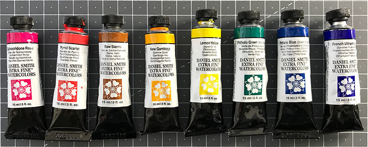
4. Label your chart
Write the names of all your paints along the axis at the top and sides of the grid. Label them in the same order for each axis:
Left to right for the top axis – top to bottom for the side axis.
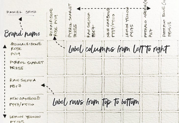
Note that the “name” of a paint is only a marketing name used by the paint brand. For this reason I like to include the specific pigments used in each paint for a better understanding of my palette.
If you’re testing one specific brand of paint you can make a note in the top left corner like I did. I’m using a waterproof pen to avoid bleeding or smudging the text.
5. Color the labels
Start by filling the labeled top and side rows with a dot of unmixed paint. This gives you a visual reference of the color appearance of your unmixed paints. It also helps associate the name of each paint with it’s color appearance.
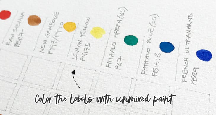
6. The diagonal
The next step is to paint the base colors along the diagonal (this means the unmixed colors from your palette)
Follow the color from the X axis down to where it intersects with the same color across from the Y axis. For example, this is the square where Quinacridone Rose meets Quinacridone Rose or New Gamboge meets New Gamboge, etc.
Now if you look closely at your labels, you’ll realize that each “two color mix” is represented twice on the chart.
Quinacridone Rose + New Gamboge
is the same thing as
New Gamboge + Quinacridone Rose
This is why artists traditionally paint the two halves of the diagonal with a different strength of paint. I’ve put a full strength mix in the top right diagonal, and a watered down neutral mix in the bottom left diagonal.
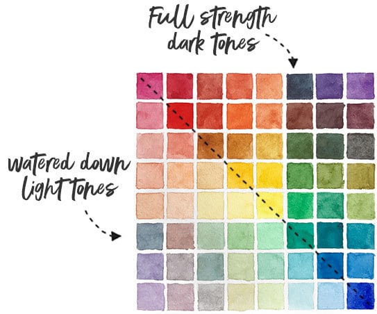
This gives you a visual reference of how the paints appear at different values.
7. Which color mix in each square ?
Now it’s time to start filling in the squares. Each square represents the mixture of two colors. Each mixture should be an equal ratio of two paints (a 50/50 % ratio).
Locate the paint your using on the X axis at the top. Then run your finger down until it intersects with the paint your using on the Y axis. These are the two paints to mix for that square.
Mix your first two paints starting in the top left corner of the chart. The most logical way I have found to proceed, is to paint the fully saturated mixture first, then add some water and paint the lighter value on the opposite side of the diagonal.
Proceed row by row and column by column. For example I chose to work on the Quinacridone Rose row first. I mixed all of the two color combinations until I reached the end of the row. At the same time, I watered down each mixture and painted the corresponding column, until I reached the bottom of the that column. Then I moved on to the next row labelled Pyrrol Scarlet. I’m right-handed, so I find this method best to avoid smudging the painted boxes.
Now keep going !
Relax and have fun. Enjoy the beautiful colors you’re creating. This is a great exercise to build your color mixing confidence.
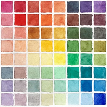
Here’s the final watercolor mixing chart that I produced for this exercise:
Would you like to learn all about color mixing? Give my new course a try:
“Successful Color Mixing in Seconds Using Color Maps!”





I am making the color chart, but am unsure how to water down the colors. Do we take the 1st color on the x axis and put it in each square along its y axis, then mix it with the corresponding color on the y axis on top of that color?
Hi Ana
Because every mix appears twice on the chart, I paint the mix stronger on one side of the diagonal, then water it down and paint the same mix on the mirrored side.
Hope that helps 🙂
Thank you so much for this colour mixing chart! I finally makes sense to me. It took a while to soak in that you use more water to make a paler rather than adding white. I have the handle on that now. downloaded the mixing sheet. Thanks again!
Have fun making it Samantha!
This detailed explanation about making a color chart finally made sense to me. Thanks
Happy to help Susie
Hi Anthony, so excited to find your website, as others have stated, it’s such a treasure chest of knowledge for beginners like me! My question is this: what if I only own all of the pre-poured Daniel Smith paints in the tins, I don’t want to go back now and spend the money on the tubes of the same colors! How would you recommend managing the 50/50 paint and water formula?
Hi Michelle
You can certainly continue to use your DS pans 🙂 It would be shame not to use them.
When the paint runs out or you need another color you can always opt for tubes if you wish…
I find the best way to verify the strength of my paint mixtures is to use a scrap of paper to test brush marks before starting to paint.
Hope that helps
Where would browns and blacks fall on your chart…the rest I notice is the order of a rainbow. Or would you not include those in your color mixes?
Hi Marcey
Browns are desaturated reds, so if you wanted to include those on a chart you could put them near the red group 🙂
This is a very helpful explanation of the process to make a mixing chart. Thank you for taking the time to explain it so well.
Great tks so much
I would love to do your wonderful lessons
Anthony, I absolutely love your concise and detailed lessons! You are an amazing teacher 🙂 Thank you!
Thanks Julie 🙂
I had thought it was like when doing the colour wheel with acrylics that you used white to lighten the shade but it sounds like you are literally watering it down (by adding water instead of white paint). Is that correct?
Hi Alison
Yes – you don’t use white in watercolor painting. Because watercolors are transparent, the white comes from the underlying paper 🙂
Anthony, I’ve learned more from your website and emails than from books!! Thank you for all you give us from your talents.
I’ve been looking and I don’t see your recommended paper to use when making a color wheel , chart or mix for a painting. I would guess for a painting and mixing colors use the same paper as the painting will be on. But for just mixing to understand colors should a 140 cold press be used ? Theses pages would be for future reference of mixing. like the download you give us.
thank you again so much for your help!!!!
shandel
Hi Shandel
I mostly use student grade paper for charts and testing, rather than wasting expensive artist grade paper. But yes, I do use watercolor paper.
I would only use something like Arches if i need to test specific handling qualities of paints, such as wet in wet effects, since student grade paper won’t handle the same way.
Hope that helps 🙂
Thank you for a simple and understandable explanation. It is a wounderful way to get to know my colors and so many possible combinations.
Hi Rossana
Absolutely right ! Making color charts is a great way to understand the mixing possibilities of your paints 🙂
Hi greetings from Mexico, i will try to follow your recommendations, thanks for this info… It’s gold for me
Merci pour ces conseils. Je débute en aquarelle et vais me lancer dans le nuancier. Mais j’ai une palette de 36 couleurs. Je craids que mon nuancier soit très grand ! est-ce qu’il faut faire une sélection et comment ?
Bonjour bernadette
36 couleurs! C’est beaucoup pour commencer 🙂
Vous pouvez essayer simplement avec les couleurs primaires. Choisissez uniquement les jaunes, bleus et rouges. Alternativement, vous pouvez essayer de faire correspondre les mêmes couleurs que celles utilisées dans cet exercice. J’ai utilisé une version chaude et froide de chaque couleur primaire et deux autres couleurs (vert et marron).
Bonne chance avec votre nuancier !
Hi Anthony, I’ve just started this exercise and managed the first row and column. Amazing colours! A great exercise to develop understanding and mixing skills. Thank you.
Found you, and I got a brand new starter pack from Daniel Smith. I’m going to TRY a color chart. Happy new year!
Good for you Kim !
Thank you Anthony! I found this useful. I was working in a book and stopped and did this instead. Very fun. But I had 26 colors in my palette, and couldn’t use them all, and picked the wrong ones. Or, the 2 greens are almost the same, reds, same thing. Anyway, thanks again
You’re welcome Cindy. You can always try with a more limited palette. You’ll be surprised how many hues you can produce with just a few paints!