Why Use a Limited Watercolor Palette? (And which Colors to Choose)
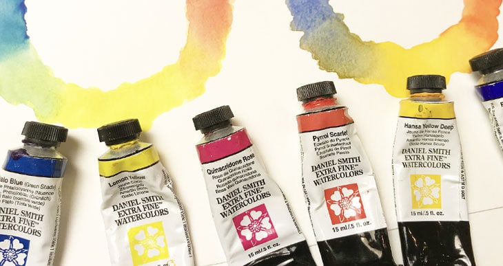
A limited palette of watercolors does not have to be limiting!
Yes… I’m kind of pleased with myself for that sentence! But it’s true.
You’ll be happy to know you don’t need that luxury box set of 80 colors to get fabulous mixing results with watercolors.
However, it does take a little bit of care and consideration when choosing a limited palette for watercolor painting.
Ideally when you select paints, you should choose a minimal number of colors that produce the entire range of mixing possibilities, including dark values, and as close as possible to black.
These paints would be the foundation of a good watercolor palette…
Why use a Limited Palette for Watercolor Painting
Imagine being able to mix a huge range of colors with just a handful of paints. Wouldn’t that make life easier? Using a limited number of paints has several advantages:
- It’s probably the best way to learn about color mixing. If you have too many color choices in your palette, trying to remember mixing possibilities is more of a struggle.
- A limited palette is more affordable. Starting off with a small number of paints is much cheaper !
- It can be quite liberating using a small range of colors because there are less choices to make. As a result this helps speed up your painting process.
- Another advantage of a limited palette is that it creates improved color harmony in your paintings.
All you need to do now is choose the fewest paints for the best possible results. So what are your options?
3 Color Watercolor Palette (The RYB Color Model)
Three paints are the strict minimum needed for mixing all the hues around the color wheel. This is known as a primary triad.
Traditionally we think of primary colors as red, yellow, and blue(This is called the RYB color model).
In theory, all colors can be mixed using just three primary colors. But in reality we’re restricted by the color appearance created by the pigments used in paint ingredients.
Generally speaking, some pigments have a warm bias, and others have a cool bias. For example you can find cool red paints or warm red paints, cool blues and warm blues, etc.
(Note: Colors can be “perceived” as warm or cool. This idea stems from certain psychological triggers. For example we associate warm colors with sunlight, but cool hues are more associated with shade)
Unfortunately, mixing with paints which match the yellow, blue and red criteria would not give us a full range of color mixing potential.
In terms of paint colors, an example of this would be:
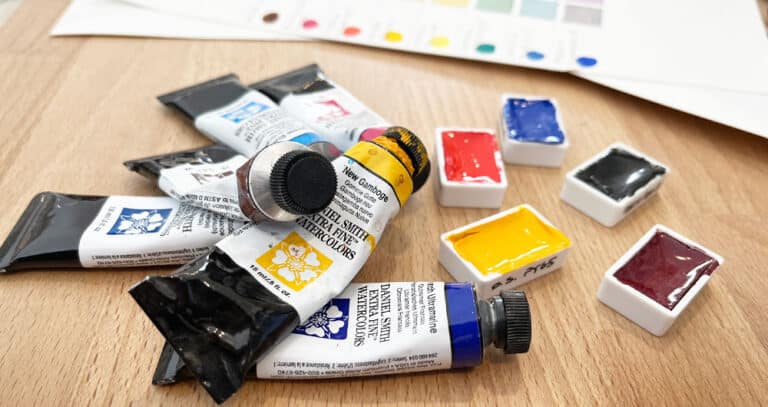
- Hansa Yellow Deep – Pigment number: PY65
- French ultramarine – Pigment number: PB29
- Pyrrol scarlet – Pigment number: PR255
(Note: these paint names refer to Daniel Smith paints).
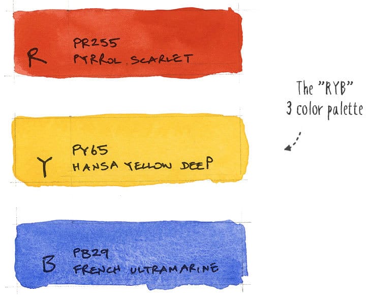
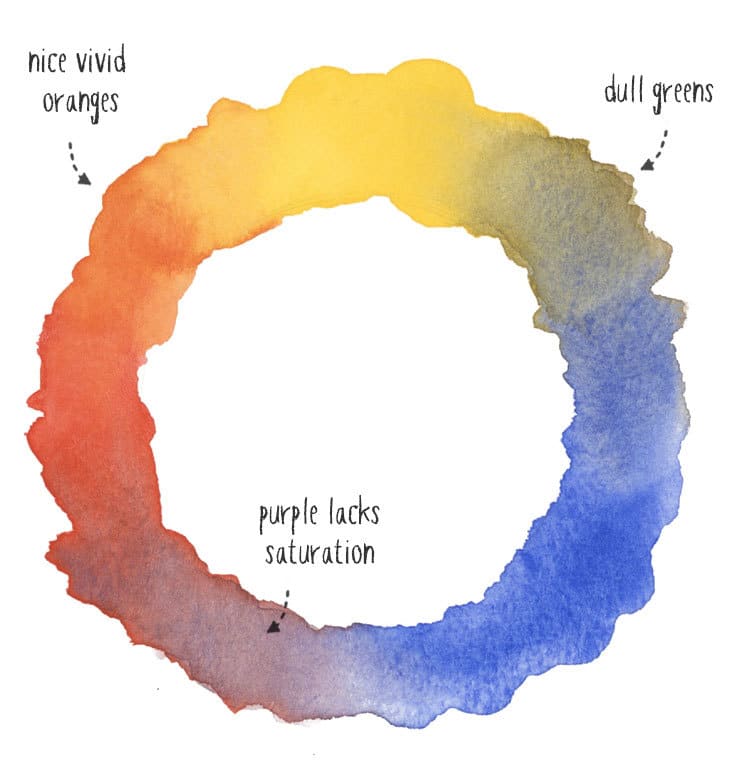
As you can see, the oranges created by this range of paints are nice and saturated, but the greens and purples are dull and lack saturation.
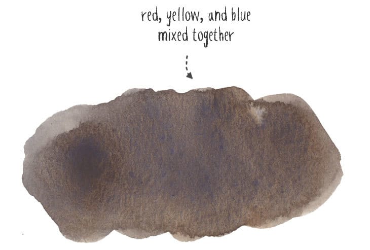
Mixing all three paints in various proportions should theoretically produce black. In reality this is quite tricky to achieve and at best you can produce a neutral dark gray.
3 Color Watercolor Palette (The CYM Color Model)
Because the RYB model has some failings in terms of color saturation, for mixing purposes a lot of artists argue that a “true” primary triad should be made up of cyan, yellow, and magenta. (This is the CMY color model which is the same as used in modern printing).
A close equivalent to cyan, yellow and magenta in terms of paint colors would include:
- Phthalo blue GS – Pigment number: PB15:3
- Lemon yellow – Pigment number: PY175
- Quinacridone rose – Pigment number: PV19
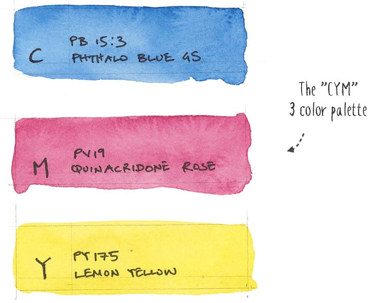
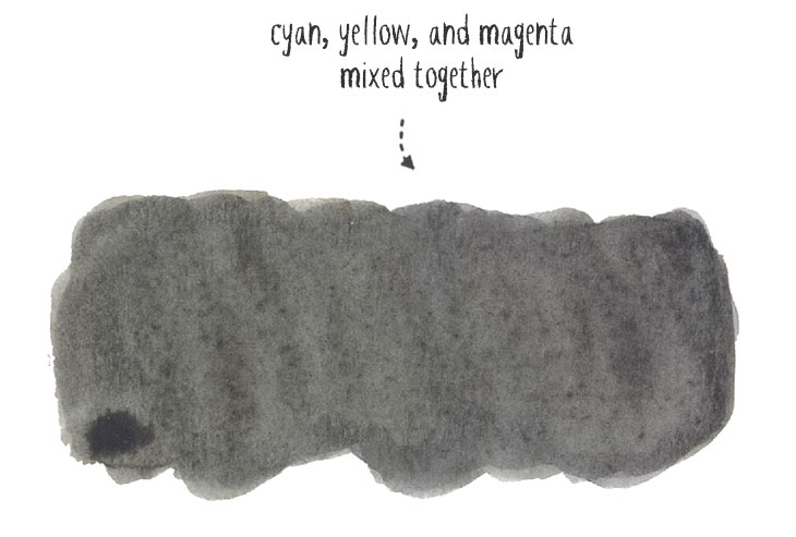
This time all the colors are quite brightly saturated. The greens are intense and the purples are quite vivid. And by mixing all three colors together you can get slightly closer to black, although I admit this is still tricky to pull off, and takes time to adjust the balance of pigments.
So the “CYM” three color palette is probably more versatile, letting you mix a wider range of colors while maintaining color saturation in comparison to the “RYB” palette.
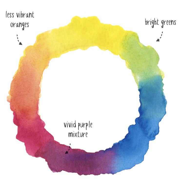
This color system is widely accepted and used in art schools to teach color mixing basics. So if you’re looking for an absolute minimum number of paints for achieving a large range of hues, I would go with this.
However, mixing with primary triads like these takes skill to use. Everything needs to be carefully mixed and from a usability point of view it lacks comfort and convenience.
And despite what some purists argue, even the CYM selection of paints is imperfect. Some of the color mixes still lack good color saturation. The oranges and blues for example are less vibrant and noticeably duller than other paint mixing options.
Trying to choose the “best” three paints for the primary triad can get very intellectual – remember a palette is meant to be used and enjoyed for the colors it produces !
And keep in mind that these combinations of three paints is just an example of many possible combinations. There’s nothing to stop you from experimenting with many other options
6 Color Watercolor Palette (The Split Primary)
To help solve the limitations of color triads, artists frequently opt for a six color palette of watercolors to use as a mixing foundation.
And when choosing these six paints, one thing most watercolor artists will agree with is to pick one cool and one warm version of each primary color.
This is the basis of the split primary palette.
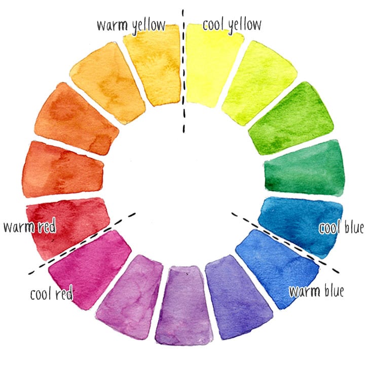
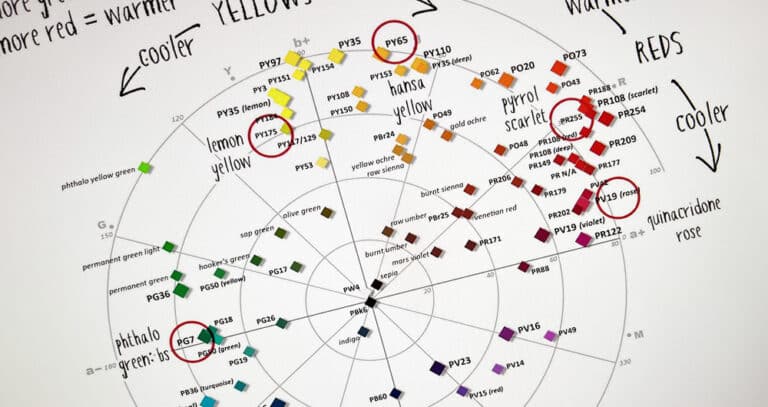
This color wheel represents the split primary concept. As you can see, this is called a “split primary” wheel because it “splits” each primary color in two by using a warm and cool version of each primary.
This six color, split primary palette offers the best of both the RYB and CYM color models above by combining them both together.
- Hansa Yellow Deep – Pigment number: PY65
- Lemon yellow – Pigment number: PY175
- Phthalo blue GS – Pigment number: PB15:3
- French ultramarine – Pigment number: PB29
- Quinacridone rose – Pigment number: PV19
- Pyrrol scarlet – Pigment number: PR255
(Please note: these link to Jackson’s art supplies Store. By using these links you can get a 10% discount on your first order with them).
The advantage of this combination of colors is that it offers a wider range of mixing possibilities, it’s easier to use, and it helps distribute the saturation problems of primary triads more evenly.
In other words, you can more easily mix bright saturated colors around the whole of the color wheel.
An Alternative Six Color Palette (the Secondary Palette)
The idea behind six color palettes like the one above is to add more paints to improve the color intensity of mixed colors, in particular the secondary colors: green, purple, and orange. So why not simply add paints to represent those secondary colors?
This is exactly what some artists do. It’s often called a “secondary palette”.
The idea behind this kind of palette is to use the CYM primary triad (cyan, yellow, and magenta) and then add colors for green, purple and blue.
In terms of paint selections you end up with something like this:
- Yellow: Lemon yellow – Pigment number: PY175
- Green: Phthalo Green BS – Pigment number: PG7
- Cyan: Phthalo blue GS – Pigment number: PB15:3
- Purple: French ultramarine – Pigment number: PB29
- Magenta: Quinacridone rose – Pigment number: PV19
- Orange: Pyrrol Orange – Pigment number: PO73
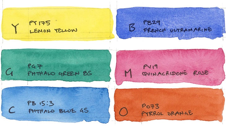
Phtahlo green has a vivid, somewhat unreal color appearance, but it’s great for mixing other greens. We already know the warm blue French ultramarine which is a pigment which tends towards violet, hence its use for representing purple. And Pyrrol orange has a warm red-orange appearance.
Adding highly saturated secondary paints like these enhances the color intensity of your mixtures and is a great option worth trying out.
8 Color Watercolor Palette
Once you have built a good foundation of six colors for your mixing palette you can start to expand your mixing possibilities with a few more paints. So to take things slightly further, here is my suggestion for an 8 color watercolor palette.
My own approach is to build upon the six colors in the split primary palette which offers a huge range of well saturated mixing possibilities. To build an eight color palette, the two paints which I would add are:
Phthalo green BS – Pigment number: PG7
Burnt umber – Pigment number: PBr7
Notice that Phthalo green is part of the secondary palette. And the split primary palette already includes French ultramarine. So I could just add Pyrrol orange to incorporate everything from the secondary palette with the split primary collection. But I find I don’t need to, because mixing Pyrrol scarlet and Hansa yellow (from the split palette) produces beautiful intense oranges !
So for this reason I choose to add a warm earth colored pigment to the palette.
Burnt umber is the darkest earth color and is extremely useful for landscapes.
Here is my recommended 8 color palette:
- Hansa Yellow Deep – Pigment number: PY65
- Lemon yellow – Pigment number: PY175
- Phthalo Green BS – Pigment number: PG7
- Phthalo blue GS – Pigment number: PB15:3
- French ultramarine – Pigment number: PB29
- Quinacridone rose – Pigment number: PV19
- Pyrrol scarlet – Pigment number: PR255
- Burnt umber – Pigment number: PBr7
This list of 8 paints is what I recommend to anyone starting out with watercolor. You can mix just about any color you need with just these 8 colors.
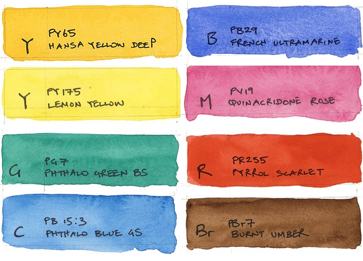
Burnt Umber has a beautiful warm red-orange appearance, and I think it’s probably one of the best mixing colors you can add to your collection.
Apart from its usefulness for earth tones, Burnt umber mixed with French ultramarine is one of the easiest ways to mix very intense blacks and some interesting dark grays!
Adding a green paint to the palette can help to brighten up the otherwise dull mixed greens. On it’s own Phthalo green BS is a fairly unreal vivid green but when mixed it produces an extremely useful range of green hues. It mixes well with yellows and blues, and it’s actually the pigment you’ll find in a lot of pre-mixed green paints, like sap green, permanent green, olive green etc.
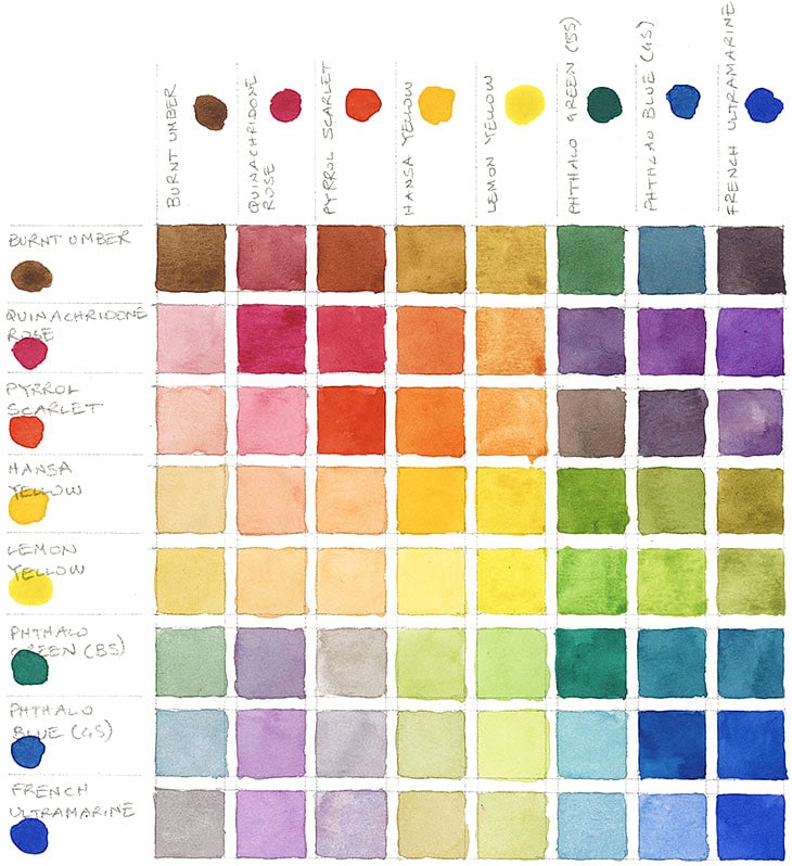
Here’s an example mixing chart using these 8 paints:
Experimenting with Limited Watercolors
You’d be surprised just how many wonderful hues you can mix with a small number of paints, so why burden yourself with too many choices.
Using only a handful of paints is also cheaper and easier to handle.
If you choose your paints wisely you should be able to mix an amazing range of colors with just a few paints.
Try experimenting your mixing capabilities with just a small number of paints from your collection. Use the guidelines above to try and pick the pigments which give you the highest amount of saturation when you mix them !
If you want more guidance on choosing paints, read this: “Watercolor paints – a complete guide”




Your eight paint mixing chart is what I’ve been looking for but I use Winsor & Newton watercolours. Do you know if there’s a conversion chart somewhere. It’s been great following your colour theory Anthony, you’ve opened my eyes to colour mixing. Many thanks.
Hi Janet
Happy to help 🙂
You might find THIS article useful. It shows you how to compare and match colors across brands…
Also, in THIS article near the bottom of the page you’ll find a link to a list of W&N professional watercolors categorized by color temperature.
This should help you find close equivalents if you don’t have the exact paint pigments.
Hope that helps 🙂
I just keep reading the information you provide here on colors, and it’s my favorite! I’ve posted in the comments a couple of times already, and you are always so nice about responding.
I love the way you’ve simplified things, and being a fan of D. Smith, I have a lot of the right colors already. You provided a template on one of your pages that has a formula for mixing primaries, that is extremely easy to follow. I did one for my warm and cool primaries. I discovered exactly the things you describe here in which colors made the most vibrant secondaries.
Then I did a quick painting where I only used my primaries, and mixed them for my other colors. I had a wonderful time. Thank you so much.
Thanks Anne!
There’s nothing like experimenting with your own sets of paints to get a feeling for the way they mix 🙂
It has been said that the mark of a great teacher is to be able to present complex subjects in a simple manner that everyone can understand. By this standard, you are a great teacher Anthony. I’ve seen so many articles on the same subject of basic colors and mixing, but they made it unnecessarily complicated. Thank you so much for making it clear and memorable. Bravo!
Thank you April for your kind comments 🙂
April, I’ll second you on that. I’ve been driving myself nuts on colors, and trying to figure out which ones to use. Anthony has made this so much easier than anyone else. And, believe me, I’ve been looking at a lot of books, YouTube videos, and websites!
Anthony I love your tutorial. Very clearly presented and easy to understand. Thank you so much.
You’re welcome Elizabeth!
Thank you so much for sharing this information, very clear, with examples!
Thank you for being so generous with your expertise and talents. I’m really enjoying it and learning from what you share.
thanks Rosa!
Finally a mixing chart that explains things in an easy to understand manner. Thank you for this information!
Happy to help Barbara
This is fantastic information for those of us learning more about color mixing and I love the idea of just eight fabulous paints. Thank you so much!
Glad you found it useful Marsha !
Thank you Anthony for your valuable knowledge on mixing colors.
Mary Ireland 🇮🇪
Happy to help Mary!
Wonderful lesson, I’ll buy them from Daniel Smith.
Do you sell your eight paint palette as a set?
Hi
No… They don’t exist as a set unfortunately – you need to buy them separately.
cheers !
In an earlier article, you suggested New Gamboge rather than Hansa Yellow Deep. Why the change?
Thanks for all your articles; they have been very helpful.
Hi Lynn
Hansa yellow deep is a single pigment paint, whereas New gamboge uses two pigments to produce a warm yellow hue. I prefer to start with single pigment paints in my palette as far as possible…
Hope that helps !
This such good info presented in a lucid, understandable way. Thank you..
Great information. The variability of pigments often makes choosing the right color very daunting.
Glad it was useful Lita !
Thanks very much. Your article is the best I’ve ever read on choosing a palette.
Thanks Michelle ! Have fun with your watercolors !
Thanks for all the great info. Since lockdown I’ve had to stop painting in oils (studio is closed and I live in a small appartment)
So I switched to watercolour, I find it a challenge but adore the fact I only need water ? and NO smells.
Yes ! watercolors are extremely accessible and easy to use just about anywhere…
So much interesting and helpful information. The 8 color palette produces such beautiful and vivid colors. Wish I had known this information before I invested in the more than 200 tubes of paint I have. Every teacher has their favorites, so I felt I had to have what they recommended. Anthony, wish I’d found you and your website earlier. Understanding the colors the way you present them has made it easier to learn which to choose and why. Now, I’m ready to move on to the ‘how’ to use them. Thank you for all the detailed information and the easy-to-understand manner in which you present it all.
You’re very welcome Clarisse – so glad you found this useful !
Than you thank you thank you
You’re welcome (x3)
🙂