How to Make Watercolor Swatches like a Boss
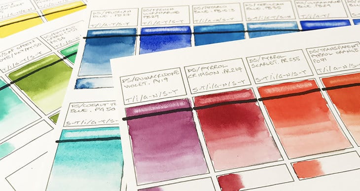
Painting swatches is an excellent way to compare and get to know the characteristics of your paint. I wanted to learn how to make watercolor swatches in a way that would be a useful reference guide when I’m painting. I’ve seen lots of examples of these, but they all seem to be slightly different. I decided to find out what kind of information I should include on my swatches, and what paint attributes to take note of so that my swatches would become a truly helpful guide.
So how do you make watercolor swatches?
It’s good practice to paint your swatches on the same watercolor paper you use for your watercolor paintings. For each swatch make a note of the brand, the paint name, and the pigments used in the paint formula. Paint a graded wash so you can see the full range of the paint’s color appearance, from fully saturated to diluted. You can also use your swatches to reveal characteristics such as transparency, staining properties and granulation.
To get the best out of your watercolor swatches feel free to try the step by step tutorial which I’ve described below. To help you out, you can also download the template I created for my own swatches.
There are hundreds of paints to choose from and they all have their own unique characteristics. Swatches are an excellent way to become more familiar with your own watercolors and understand their true qualities and color appearance. I’d encourage you to try making your own versions which you can add to as your collection of paints increases.
It’s good fun, and you never know, you might find some surprising results…
Watercolor Swatch Template
First of all let’s break down the different components of the template I made for swatching my watercolors. If you like the way this is done and you want to try this for yourself, you can download a copy of my template below and print it onto watercolor paper. Hopefully it’ll make the process slightly quicker ! (Simply download and save the PDF template, then load your printer with a sheet of watercolor paper. This works fine on my own printer with fairly thick 300 gsm paper).
Download the watercolor swatch template here
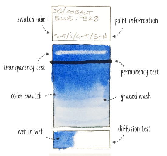
Here you can see how I decided to organize each swatch for creating a test sample of each of my paints. The aim was to make the layout of the swatch cards as efficient and easy to make as possible. The swatch box is broken down into the following parts.
The Label:
I’ve made the label area big enough to contain all the written information you need to note down. I don’t see the point in having separate small boxes for each paint attribute, and you can get all your note taking done in one area. The important data I decided to put here include the paint name, the manufacturer, and the pigment numbers contained in the paint ingredients.
As you probably know, paint names can vary from one brand to another, so to avoid confusion you need to note the paint name and brand together. Paints which have the same color name might actually use different pigments in their paint formula, and have very different color appearances.
What Information to Include:
Sometimes you might not find all the information you need on the label of your paint tubes, or maybe you’re using pans and no longer have the label available. You can usually find all this data on the color charts provided by the paint manufacturers website(For example, I use Daniel Smith watercolors – you can find their color chart here). These color charts will give you lots of information you can copy onto your swatch cards if you feel it’s important. A reminder of the things you might want to note include:
- Brand
- Color name
- Pigment information
- Opacity
- Lightfastness or permanency rating
- Granulation
- Staining properties
Understanding Pigment Numbers:
Understanding which pigments have been added to your paint will also increase your familiarity with your watercolors. As artists we are essentially interested in color. The pigments in watercolor paints are noted in the form of color index numbers. These numbers have a prefix which indicate the color family that the pigment belongs to:
- PY Pigment Yellow
- PO Pigment Orange
- PR Pigment Red
- PV Pigment Violet
- PB Pigment Blue
- PG Pigment Green
- PBr Pigment Brown
- PBk Pigment Black
- PW Pigment White
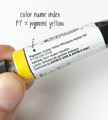
Knowing how many pigments are included is also an interesting attribute to know, because watercolorists often prefer single pigment paints. Paints that contain multiple pigments have the reputation of producing less vivid color mixes, especially when mixed with other paints.
Abbreviations for Swatch Notes:
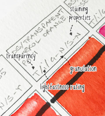
To simplify your notes you can use a code or abbreviation of some kind for the opacity, lightfastness, granulation and staining info. I’ve included the following legend on the template for this purpose:
- Transparency: T / S-T / O (transparent / semi-transparent / opaque)
- Lightfastness: i / ii / iii (excellent / very good / fair)
- Granulating: Y / N (Yes / No)
- Staining: Y / N (Yes / No)
It could be tempting just to print out a copy of the manufacturer’s color chart for reference, but keep in mind that this won’t give you a good feeling for the real life attributes and handling properties of your watercolor palette. Sorry – you still have to do the work of making all those swatches !
A box for painting a Graded Swatch of Color
This is the space for painting a color swatch using a graded wash of your chosen paint. The reason you want to paint a graded wash is so that you can see the full range of color from full color saturation of the pigments (often referred to as the masstone) and the lightest pastel color(usually called the tint).
Try to make the size of the swatch large enough to get a good visual appreciation of the paints color and attributes. Mine are 1and 1/2 inchs (38 mm) wide by 2 inches (50 mm) tall.
An Indelible Line for Testing Transparency
This is a typical way of evaluating the opacity or transparency of watercolor paints. Transparency is generally indicated by manufacturers as either transparent, semi-transparent, or opaque. Painting over this line gives us a visual measure of the paints real transparency.
This attribute is useful to know because traditionally watercolor artists aim for the most transparent paints possible. Watercolor paintings are frequently built up in layers, with each new layer of paint adding more intensity and deepening the tones of the painting. This layering (known as glazing) is best achieved with transparent paints. Truly transparent paints allow the underlying colors and the white paper to shine through.
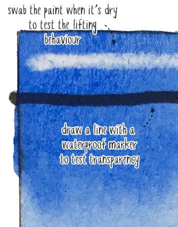
An area for testing lifting properties
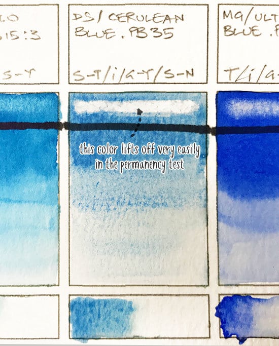
This is the part of the swatch used as a lifting test area to get an idea of the staining properties of the paint. A non staining paint will lift easily whereas a highly staining paint will be difficult to lift. You may have already noted the staining information in the notes at the top, but this gives you a true visual assessment of the paint’s lifting behaviour.
This is a useful characteristic to note. For example, non-staining paints that lift off too easily may not be very good for glazing, since each new glaze of paint would lift the underlying layers of color.
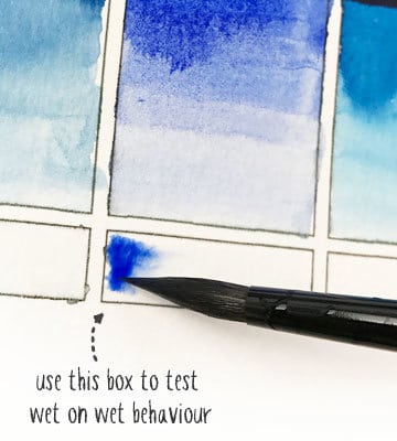
Wet in wet diffusion test
This is a way to assess the paints behaviour for wet on wet painting situations. The activity of pigments in a wet wash can vary depending on pigment particle size, granulation and the quantity of pigments in the paint. We are looking for things like, how far does the paint spread in a wet in wet wash, or does the pigment separate into two colors (this can occur with a mix of different pigments).
It can sometimes be tricky to find watercolor paints with the best characteristics. It takes some time to verify all the paint attributes, but it’s worth the extra effort. I always try to buy only transparent, single pigment paints, with a good level of lightfastness. If you need help choosing your watercolors then feel free to take a look at my list of recommended paints.
Swatch Format
I scratched my head about this for a while!
First of all, ask yourself how you want to organize your swatches? I see a lot of artists organizing swatches by brand. However, I think this system can get complicated when you add more paints to your collection. I chose to organize the swatches by color, regardless of the brand being testing.
Some people paint individual swatch cards and put them on a ring binder, or keep them in a large binder file with transparent sleeves to contain the cards. This is quite a neat method, but I find it makes the process longer because you have to cut up all the individual cards. (If you do opt to make a lot of individual cards then I recommend you use a paper cutter to speed up the process).
For me, the objective of swatches is to clearly show the differences between your different paints, and as a comparison between colors as if you were in a real life painting situation.
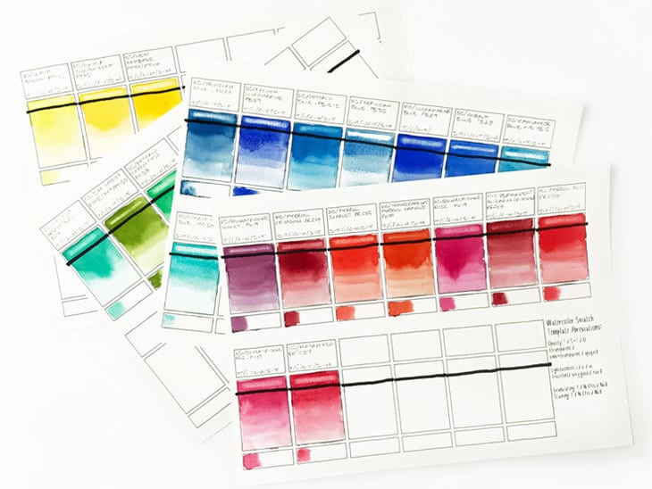
A better system seems to be to paint your swatches on individual sheets, such as the ones I created here. The advantage is that you can create sheets for each color family and compare similar hues more easily. You also don’t have to cut up a load of individual cards. Just print out a new sheet when you need one. You may not fill in all of the swatches on each page, but that’s fine. It leaves room to come back and add a new color when your paint collection grows.
Keep in mind that paint will have a different appearance depending on the watercolor paper, so it’s important to use the same paper you use for your actual paintings. I use Arches cold pressed paper for most of my artwork. The paper’s color, sizing, texture, etc., will all have an effect on the final color appearance.
How to Make Watercolor Swatches
When painting your swatches, try to make all samples as similar as possible so you have consistent results for comparison. Use a constant amount of water and mix a reasonably thick puddle of paint, making sure the water and pigment mix well. You can always try making three swatches for the same color as a test. If the results are quite similar then you know that your method is fairly consistent.
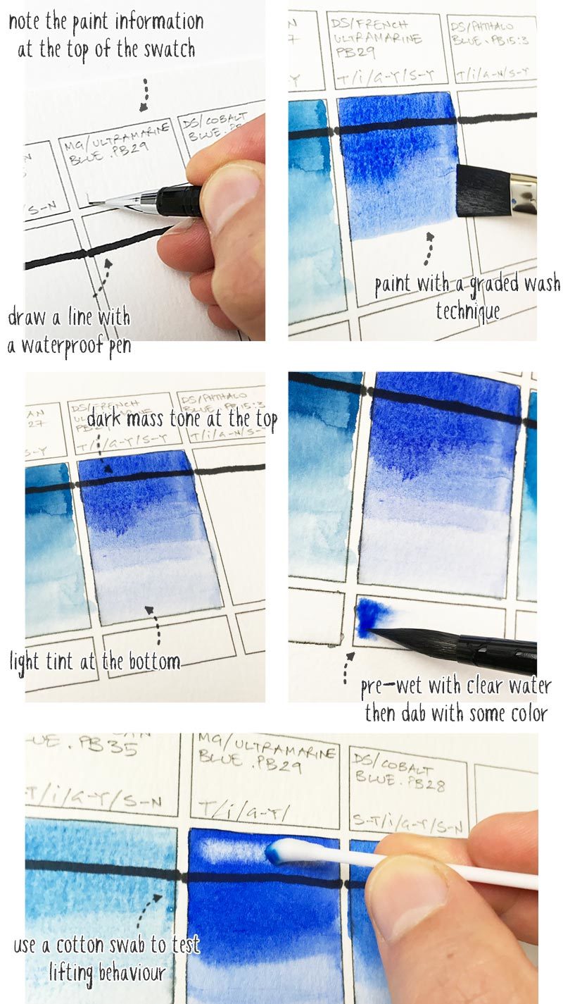
Start by drawing a horizontal line near the top of the color swatch using a Sharpie or other type of waterproof pen. Leave a space above this line for the lifting test.
Write the brand name, paint color name, pigment numbers and any other information you want to note at the top of each swatch.
Paint your swatch using a graded wash technique. I find it easier to use a small number 12 flat brush for this. Start at the top of the box with a thick mix of paint to show the mass tone. Progressively graduate the wash as you move down the paper. Do this by dipping your brush in water, and blotting the brush to remove excess moisture, then apply a new brush stroke underneath the previously laid color. Don’t worry about trying to paint a perfectly smooth wash. I think an imperfect wash helps reveal the handling qualities of the paint.
The top of you wash should show the mass tone and the bottom the tint (dark to light). Increase the mass tone if needed with another pass of paint so you get a well saturated color.
When you paint over the impermeable ink line this helps reveal the transparency of the paint. Observe the paint as you apply the color, the differences in transparency should be quite obvious with semi-transparent and opaque paints covering the line more.
The small box underneath the swatch color is for testing the wet in wet behavior of the paint. Pre-wet this box with clear water, then dab some color into one side of the box only. Watch the pigment activity to see how fast or slow the pigments spread in the clear water. this will continue for a while until the paper dries and gives an indication of how lively the paint is in wet in wet painting conditions.
Leave your paint swatches to dry for a while, ideally overnight. The final stage is to test the staining properties of each paint (otherwise known as permanency). For this I used a cotton swab dipped in clear water. Blot the cotton swab so there’s not a huge amount of water, then rub it in the area over the top of your indelible ink line. Do this 4 or five times, always rubbing with the same horizontal stroke (use the same amount of rubbing strokes on each swatch or the results will be skewed). Try to avoid scrubbing back and forth. If you rub too hard the paper may start to disintegrate.
That’s it !
You now have a bunch of swatches which fairly reliably show the paint attributes of your colors.
Looking at the Results of your Swatches
If you’ve been using your watercolors for a while you probably already have an idea how they perform. The results of your swatches may help confirm some of your suspicions about iffy colors and those which are a pleasure to work with !
For example, take a look at the swatch for Cerulean Blue. This paint is semi-transparent, very granular, and non-staining. For me personally, these properties all together make it a color which is difficult to handle. The pigments just seem to swim around on the surface of the paper without fixing, which I find unpleasant. This is due to the low permanency of the paint. It’s also quite opaque making it a poor color for glazing.
Use your swatches as an opportunity to judge your watercolors objectively against each other. It will probably help confirm your favorite paints, and maybe prompt you to replace some badly behaving colors !
“Successful Color Mixing in Seconds Using Color Maps!”




Thank you so much for this detailed information, so useful! I’ve literally just come across your site on a Google search, really glad I found it!
Happy to help Natalie 🙂
Thanks for this great post. This is exactly what I was looking for.
I love the idea of sorting the watches by colors.
I copied the template onto a flash drive to take to a local printer that can handle 140 pound paper and uses toner as it is less likely to bleed.
What size watercolor paper did you use for the template?
Hi Nancy
the sheet is about the size of an A4 sheet, which in the US would be equivalent to a “letter” size I believe.
Have fun doing your swatches 🙂
Finally, I get it now. Thank you so much for this thorough explanation of Swatches.
You’re welcome Teri 🙂
Searching all over the internet and it always comes back to your site. Thanks!
Happy to help Anna 🙂
I too am returning to watercolours after about 25 years. I am so glad I found your site. Your generosity of sharing what you know is amazing and so helpful to beginners. I am a fan!
Hi Lainie – You won’t regret coming back to watercolors ! Have fun !
Hi! I’m grateful that I’ve found your website about how to do watercolor swatches! <3 I am new to watercolors so I am literally learning from scratch. I was searching on what is the importance of swatches and how to do it, and this post taught me so well! Thank you!
Really happy to hear you’re starting out with watercolors Mary… Enjoy !
Hello Anthony,
I have been to many, many how-to watercolor sites and yours is the best. Hands down. So bravo, keep doing what you’ve been doing, and try to find a book agent or publisher to help get your teaching out there in the world. Or perhaps a (paid) video series available for download. You are THAT good at teaching. (Just a thought).
One small suggestion–alas, your link to the Daniel Smith color chart no longer works; it leads to one of those pesky “404” pages on Dropbox. However, if you go to this page: http://danielsmith.com/brochures-and-color-charts/, there is what I imagine to be a permanent link to their color chart. So perhaps if you used that website link instead of the Dropbox one, all would be well.
Thanks again for all your hard work!
Thanks for your kind comments ! – i’ll look into that link problem 🙂
Thanks so much for ALL this info…very helpful!
I just found your site and am glad you started at the beginning.
Denise Soden has been reviewing paints on her “In Liquid Colour” You Tube videos and she has probably covered every brand and every colour out there. I am sure she would agree that while her results are good for review and commentary, you still need to do it yourself to appreciate how to handle the paint. What I appreciate about this site is that it is starting right at the beginning: colour properties and tonal value. If you don’t understand those things your watercolours will look like paint by numbers. There is nothing wrong with that, but I don’t think that most people are attracted to watercolours to get a “paint-by-numbers” effect. I’m so glad I came across this site as I had not seen it before!
Thanks Molly – I couldn’t agree more… Using your own watercolors is the best way to become familiar with their characteristics.
Wow…such great Information! I’m so glad I found your site.
Thank you for sharing.
Glad you’re enjoying the site Pam!
The most comprehensive and understandable tutorials and wc info I’ve seen. Great stuff!
I try some 90lb wc paper which I know will print the template realizing that it might not look the same as my 140lb.
Thanks Will! Use whatever paper you regularly use so you get a good idea of how paints work… Have fun!
Hi!
As always, thank you for your great blog.
I am wondering if you printed this yourself or had it printed on a laser printer since it has to be waterproof.
Thanks!
Hi Basia – it was printed on an inkjet printer. I just try to be careful when painting over the ink lines…
I have just returned to watercolor painting after almost a decade and wanted to go from tubes (which I used to use along with a cheap cake set) to making my own pans/palette. I’m loving your site! I love the case you suggest and Daniel Smith does seem like the one I should go with. I was looking on Amazon at the 6 tube set and the following 10 tube set came up as something I might like: DANIEL SMITH 285610016 Alvaro Castagnet Master Artist Watercolor Set (10 Pack), 5ml What do you think about this? Some of the paints are the same from the intro set but not all. This just seemed like a good value but maybe not. Just would like your thoughts!
Hi Paulette – great that you’re getting back into watercolors! The colors are all good in the Alvaro Castagnet collection, but I think that set is missing a cool yellow and a cool red (I’d suggest Lemon Yellow and Quinacridone Rose). I’m also not familiar with his choice of orange. My own personal favorite is Transparent Pyroll Orange, which is a gorgeous color on its own! Hope that helps…
So helpful. Thank you.
Thank you for this great post, and your website in general! I’m new to watercolor and am in love with the saturation and transparency of the colours, but lack much in terms of skills… Your site is full of infos that are really useful.
Thanks also to Chris for the stamp idea – I just tried to print the template and jammed my printer : (
Hi Marie – the more you paint with watercolors, the more you’ll love them!
Maybe also check out the Wafflefower swatching stamp set. Skip the printer and stamp straight on the paper, great if you need to use heavier paper. Follows the same basic template as Anthony’s, and can be customised a bit. Great post, by the way!
Thanks for the tip Chris!
Could you please load the photos that go with the watercolor swatches tutorial? Also, you don’t explain how to print the template onto watercolor paper. Although certainly a ruler and pencil would do well, if a little slower 🙂
Thanks much for a fabulous resource for beginners who, like me, are learning alone at home!
Holly
Hi Holly
sorry about the bug with the images ! Seems to be fixed now 🙂
I’ve added a note to the text about printing the template onto watercolor paper.
Glad you’re enjoying your watercolors !