Black Watercolor (Artists Don’t use Black)
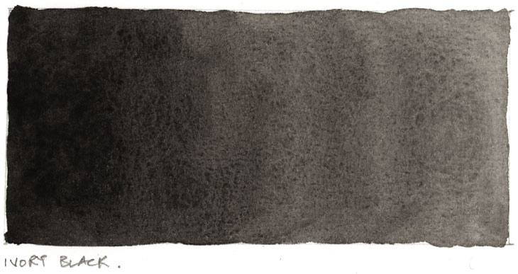
Using black watercolor paint is a bit of a controversial subject among artists…
Some artists passionately argue against using black paint in watercolor altogether. They say things like “Real artists don’t use black”… Others happily accept the use of black paint as a convenient, ready to go color.
So what should you do? And who should you believe ?
In this article I’ll explain everything you need to know about using and mixing black and neutral colors in watercolor painting. We’ll look at the arguments for and against using black directly from the tube versus mixing your own blacks.
Black Watercolor (Basics)
The most common pigments used in black watercolor paint and other neutral colors are probably PBk6 and PBk9.
These numbers simply refer to the color index names of the pigments. You can usually find these written on the paint tubes. All paints have a pigment number like this. The “P” stands for “pigment” and “Bk” stands for “black”.
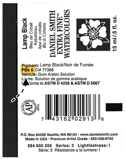
You can learn more about how to read paint labels and the various properties of paints in this article (click here)
Black pigments are carbon-based. In other words they come from things like charred bones, soot, and charcoal.
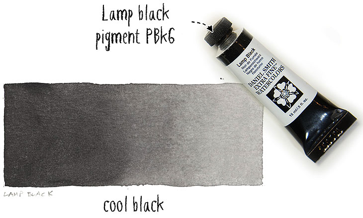
PBk6 is often referred to as Lamp Black. It’s the most opaque of these black pigments. Lamp black has a cool bluish undertone.
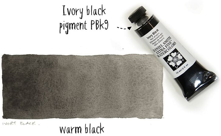
PBk9 is known as Ivory black. This pigment is less opaque than lamp black and it has more of a warm black appearance.
Black pigments in general have a high tinting strength. This means they can easily become overpowering when mixed with other paints. Also black paints are very opaque. As a result they tend to hide underlying colors when layered over the top using a glazing technique.
Keep in mind that these two characteristics can be a disadvantage. The high tinting strength and lack of transparency can cause black paint to appear dominant and overwhelming compared to other colors in your painting.
Do you use Black in Watercolor?
Whenever you want to add shading and shadows, or to darken a color in your palette, it’s a natural instinct to want to use black. After all… If a color isn’t dark enough, just add black… Right?
But actually a lot of traditional watercolor artists do not use pure black paints, preferring to mix dark colors by combining the other hues in their palette.
A common complaint with pure black paints is that they tend to modify the original hue in a rather unnatural and harsh way, and that they don’t harmonize well with the other colors in a painting.
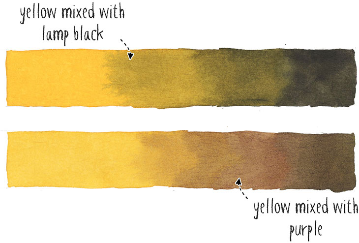
But what does this mean exactly ? Take the example below using the color yellow.
I started out by painting with pure yellow. Then little by little I mixed in some lamp black to produce a gradient of color from light to dark.
In the next example I again started with pure yellow, then I darken the yellow paint by mixing in some purple.
For those of you who are not familiar with color mixing theory, purple is the complement of yellow. Complementary colors are any colors on opposite sides of the color wheel, and when mixed together they create a neutral gray or brown appearance. They are said to “neutralize” each other.
This time the resulting gradient produces a more harmonious looking transition in tonal value from light to dark.
Here’s another example. Say that I wanted to paint this bowl of lemons. What do you think would be the best mixture of colors to produce a natural and harmonious range of hues and tonal values?
Mixing yellow with black ? Or mixing yellow with complementary hues?
When you sample the actual colors from the photo, you can see that the shading and shadows are made up of a range of warm oranges and browns. Even the darkest part of the shadows is a dark chocolate color and not black.
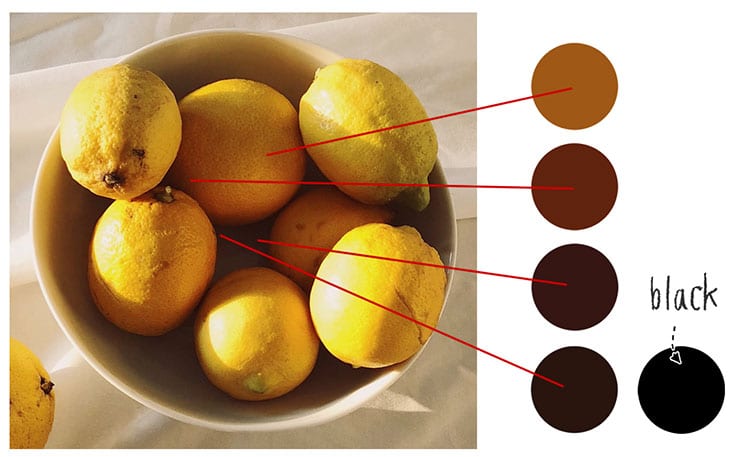
So, it appears that mixing yellow with complementaries would give rise to a more compatible range of colors. This is one of the reasons why a lot of artists prefer shading with complements rather than pure black paints…
This is not to say that black pigments should be avoided at all costs. I know a number of artists who use convenience mixtures which contain black pigments like PBk6 and PBk9.
Neutral tint, Payne’s gray, Indigo and Sepia are all good examples of neutral convenience colors which contain black pigment mixed with other colors.
The advantage I find with these convenience mixtures is that they’re a lot less harsh than using pure black.
Should you use black in watercolor?
There is no right or wrong choice.
If you want to use black, just be careful to mix in a small amount at a time. Because of it’s high tinting strength you don’t need much. You can also try mixing black with other colors to get shades that have more interest, or even reproduce the mixes used for convenience paints.
For example Payne’s gray is a mixture of Ivory black and French ultramarine (PBk9 + PB29).
Advantages of mixing your own blacks
There are however some important advantages to mixing your own colors for dark toned areas of a painting (as you can see from previous example with the lemons):
- You get blacks which have more color variety and interest.
- You can harmonize your neutral colors to better match the other colors in your painting.
- Mixing your own blacks and neutrals also improves you color mixing skills
How to make black in watercolor
So how do you mix black watercolor ?
The truth is you can mix perfectly good neutral colors or a good interpretation of black by mixing other paints.
So before you reach for a tube of black paint I would encourage you to experiment with mixing your own blacks, grays and neutral colors.
I’m going to show you a few simple recipes for mixing your own grays and dark shades. But before we look at that, it’s useful to understand the mixing method typically used to neutralize a color, or to make black. And to help us understand the relationships between paint colors and the mixing results that can be achieved we can use an artist’s color wheel.
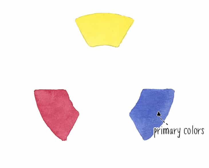
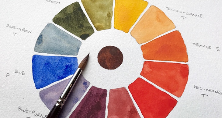
This color wheel was painted using three primary paint colors, a yellow, a blue and a red.
Mixing together adjacent colors results in the secondary colors, green, purple, and orange.
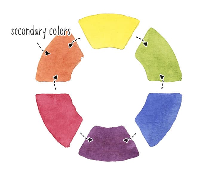
When mixed together, the three primary colors make black, or usually some variation of dark gray.
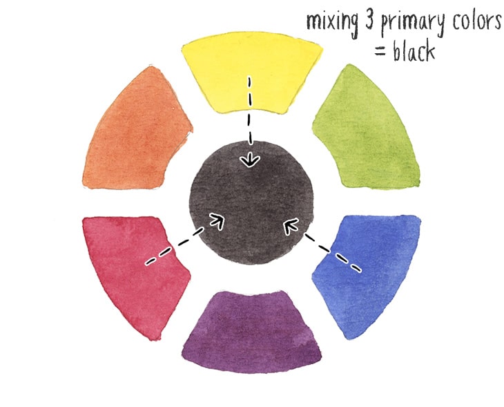
So the standard formula for mixing black is to mix together three primary colors.
But obviously mixing three paints every time you want black or gray is somewhat complicated and time consuming. Getting a balanced mix of the three primaries takes time to get the desired result.
An easier option is to mix together just two paints.
In general, this can be done by mixing any given color with a “complementary color” on the opposite side of the color wheel. As mentioned earlier, this is known as neutralizing a color.
So for example, to neutralize red you can mix it with a green color. And to neutralize blue you mix it with orange.
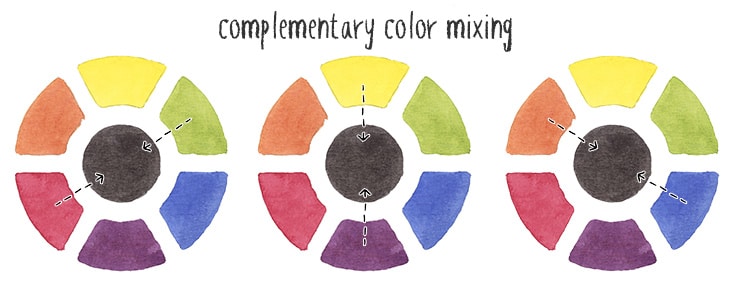
But why do dual color combinations like this work for mixing black?
Well, if you think about it, orange is the result of mixing the two primaries yellow and red. So when you mix orange with blue, it’s like mixing together three primaries. The same goes for green, which is mixed with the primaries yellow and blue. You just need to add red to complete the mixture of three primary colors.
This is why mixing together two paint colors such as ultramarine blue and burnt sienna (which is like a warm orange color) works so well.
Below you can download a copy of these mixing recipes for future reference:
Try these mixes for yourself ! Click the button below to download the worksheet for this tutorial.
Black Watercolor Mixing Recipes
So here are a few examples of the useful mixing recipes for making black or gray.
This first set of two-color mixtures uses some form of blue and orange based pigments. You can produce neutral colors from just about any mixture of blue and orange.
French Ultramarine + Burnt umber
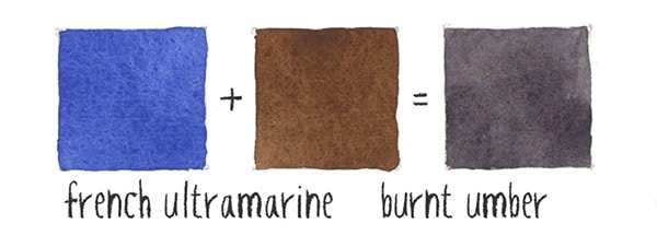
Two colors that I recommend people have in their palette are French Ultramarine and Burnt umber. When mixed they create a color very close to black, which can be fine-tuned to achieve a warm or a cool black as needed. (Just add a little more blue to get a cool neutral, or a bit more brown for a warm dark color appearance).
French Ultramarine + Burnt sienna
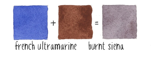
This mixture produces a nice cool range of grays and leans towards a purple gray. This color combination is also known as Jane’s gray, named after the well-known Australian watercolorist Jane Blundell. You can even buy this as a ready-to-go convenience mixture.
“In mixing it acts as a neutral tint, darkening other colours without changing them.”
Cobalt Blue + Burnt umber (or burnt sienna)
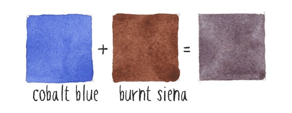
Cobalt blue is somewhere between a warm and cool blue pigment color. This is another nice combination for making warm or cool grays depending on the mixing ratio.
Phthalo Blue G.S. + Burnt umber
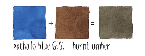
Not quite as neutral as mixing burnt umber with french ultramarine. The green shaded blue results in grays that have a tinge of green.
Phthalo Blue R.S + Transparent Pyrrol orange
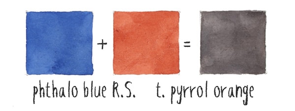
Both of these paints have quite an intense color appearance. Phthalo blue is a very good complement to transparent orange. Phthalo blue Green Shade works pretty well, but Red shade is even better !
As we saw earlier we can also mix grays using some kind of combination of green and red. Here are a couple common of examples to try out:
Phthalo Green B.S. + Pyrrol scarlet
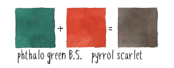
The combination of Phthalo green B.S. and Pyrrol scarlet produces a nice warm gray appearance.
Phthalo Green B.S. + Quinacridone rose
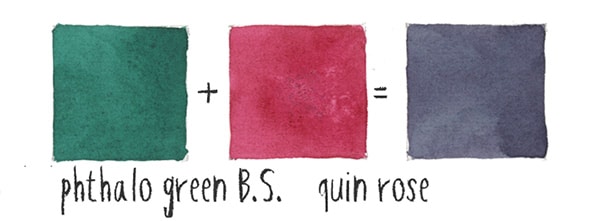
In contrast to the previous mixture, this combination creates an interesting cool gray color.
Next time you paint, I hope you’ll give black color mixing a try for yourself.
Mixing together two complementary pigments gives rise to some wonderful vibrant blacks and grays that contain a hint of other colors, and help you achieve a much more lively appearance in your paintings.
Best black watercolor paint:
What are the best black paints and convenience mixtures for shading ?
In my opinion you can’t go wrong with some of the following. If you do need a very intense black appearance, then go for something like lamp black. Just keep in mind everything outlined in the article above (the links below are affiliate links):
Ivory black watercolor PBk9 (warm bias)
Lamp black watercolor PBk6 (cool bias)
Neutral tint PBk6 / PV19 / PB15
And if you’d like to learn everything you need to know about color mixing – check out my new course:
“Successful Color Mixing in Seconds Using Color Maps!”




Brilliant, to the point, not overly wordy or cumbersome to follow and I’ve been “watercoloring” for years! I have read numerous big books on watercolors by the big names, watched lots of videos (paid and unpaid) and No One has ever explained watercolor theory with such simple understanding before. That’s the sign of a good teacher, thank you!!!
Thanks Jennifer 🙂
Brilliant stuff thank you!
Thanks Doug 🙂
Okay, sometimes I do want to a little black to another color. I rarely use black on its own, and I understand why mixing my own black is the best option.
However, I’m still confused about which black. I see a lot of tutorials will add a little lamp black. Why that one? I like to add it to browns every so often.
Lamp black is cooler than ivory black. I’d say it’s more of a personal preference.
You can always push black paint in a warm or cool direction depending on which color you mix it with 🙂
Thank you Anthony- so helpful to me as a beginner!
I definitely agree that black is not good for mixing the colors for most European-style paintings, but I still use a lot of black because I love ink wash paintings (Chinese, Japanese-style watercolor paintings that look really beautiful and ethereal). Black is also essential for painting silhouettes with the backdrop of the sky which is another ethereal-looking style of watercolor painting. It really depends on your style.
Hi Ana
Yes… when you’re working monochrome or you need a really deep contrasting black, then black paints are extremely useful. As you say, it depends on the context 🙂
This has been so helpful,
thankyou so much!
Interesting! I appreciate the examples of colour blending.
Super informative. Thank you!