The Essential Guide to Watercolor Mixing

It’s exasperating don’t you think ?
Not knowing how to mix the color you need…
When I first started painting I really didn’t understand how to mix watercolors and get exactly the right hue that I needed. I would simply rely on intuition, throw a few pigments together and hope for the best !
Eventually, I started to get interested in color theory and watercolor mixing recipes. I did experiments, and I painted color charts to test the mixing range of my palette. And little by little this helped me develop a better understanding of how to use my paint.
Are you sick and tired of trying to mix the same color you made yesterday, but you just can’t remember which pigments you used?
Well, keep reading and hopefully all will become clear.
Do you want to master watercolor mixing ?
Knowing how to mix your watercolors is essential, and being able to mix colors quickly and easily is a real bonus. Color mixing is as easy as riding a bike. It really isn’t that difficult, it just takes a bit of practice.
I’ve put together the following tips and exercises to help you build a foundation in watercolor mixing. Learning basic color mixing can be inspiring and having confidence in your color mixing abilities is one of the keys to successful and enjoyable painting.
I’ve done my best to make this article as clear as possible without getting too technical ! Here are the different elements explained in this guide. Feel free to skip the parts you already know:
Color theory: Primary, Secondary and Tertiary colors
Color theory… Argh ! Sounds boring right ?
Don’t’ be put off – it’s not as bad as it sounds ! The better you know some basic color theory, the more easily and quickly you’ll be able to mix colors from your palette.
The basics of color theory can be clearly understood by means of a color wheel:
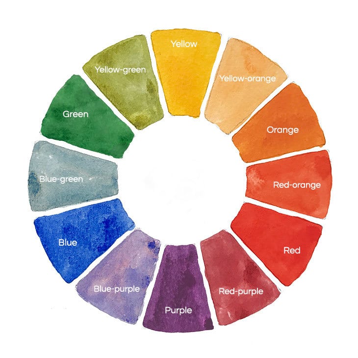
The color wheel is an incredibly useful tool for watercolor artists. It shows us what color can be produced by mixing adjacent colors with each other. Traditional color wheels are made up of three categories of colors: primary, secondary and tertiary.
It all begins with primary colors.
The primary colors are the starting point for any color wheel.
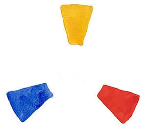
Primary colors are the foundation of color mixing because these three color pigments cannot be mixed by the combination of any other colors.
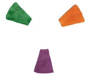
Next we have secondary colors. Most of us are already familiar with these simple mixing formulas:
The final category is tertiary colors. These are achieved by mixing the primary and secondary colors which are adjacent to each other on the color wheel:
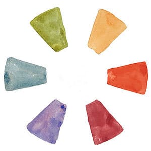
(note: traditionally the naming convention for tertiary colors always begins with the primary color, then the secondary: red-orange, yellow-green, etc.)
All this talk about color theory is useful to understand but it’s somewhat abstract because it applies to pure colors and ignores the reality of actual paints mixed together to make new colors.
The color appearance of paint relies on the pigments they contain. There are lots of different yellows, reds, blues, greens or purples made from different single pigments. You may already have a large collection to choose from.
But the pigments used in paints don’t always produce a pure color appearance. Most of the colors that you have in your collection have a color bias. Most artists refer to paint hues as warm or cool depending on their color bias.
What are warm and cool colors ?
It’s pretty simple:
Warm colors are those that are situated on one side of the color wheel and include yellow, orange, and red.
Cool colors are on the opposite side of the color wheel and include purple, blue, and green.
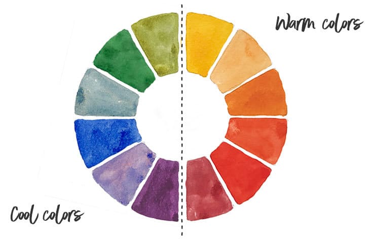
Any color can have a warm or cool bias.
Yes… That’s right ! Any color. So for example you can have warm reds and cool reds, warm blues and cool blues, etc.
This is where a lot of people get confused. How do you identify whether a color is warm or cool ?
Color wheels can help us with this. The color wheel below is based on two sets of primary colors. There’s a warm and a cool version of each primary color. So we have a warm and a cool yellow, a warm and a cool red, etc. I’ve also painted the secondary color mixes in between each set of primary colors.
The position of a color on the color wheel represents whether it is warm or cool:
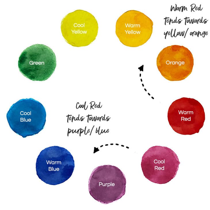
For example, look at the warm red. You have to ask yourself, “does this color tend more towards orange/yellow or does it tend towards purple/blue” Depending on which side of the color wheel it inclines, this tells us whether it is warm or cool.
The warm red has more of a yellow/orange bias. Yellow and orange are on the warm side of the color wheel, so this particular hue is “warm”.
We can do the same exercise with the cool red. If you look closely, you can see that this color leans more towards the purple/blue side of the color wheel. This particular red therefore has a cool bias.
The same type of classification can be done with any of your paint colors. Using a color warmth as a guide, you can judge whether the color appearance of a paint is biased towards the warm or cool side of the color wheel.
Mixing pure saturated secondary colors
Even though color theory tells us that red+blue = purple, not every red mixed with every blue makes a pure purple.
As mentioned above, your paints can have a warm or cool bias. Let’s say you want to mix a pure green color. The simple mixing recipe yellow + blue can sometimes produce surprising results, depending on the color bias of the paints you choose:
So, do you know how to mix a saturated secondary color such as a pure saturated green or saturated purple ?
Take another look at the color wheel we used earlier:
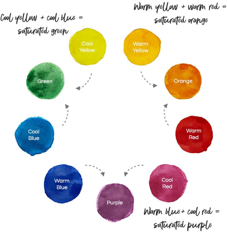
This is what could be labeled as a “pure saturated” color wheel. The aim of this chart is to show you how to mix pure saturated secondary colors.
To make it you need both a warm and cool version of each primary color, so six primaries in total.
Making your own color wheels is the perfect way to become familiar with the exciting world of color mixing. This is the kind of mixing exercise I think you should try first. Try making a wheel like the one above. (If you’re interested, you’ll find the exact paints I used in my list of recommended palette colors.)
As you can see above, the secondary colors, orange, purple, and green are bright and saturated.
To mix them you need to use a specific combination of two primary colors:
You may be wondering what happens if you break this formula and mix different primary colors together. For example if you mix a cool blue and a warm yellow you get the following mixture:
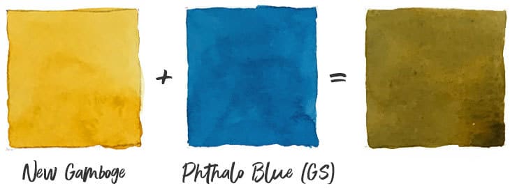
As you can see, this produces a attractive olive green appearance, but it’s nothing like the saturated green mixture.
This is the reason why the foundation of most artists watercolor palettes is built on a selection of warm and cool primary colors. In theory you can mix any color you need using just these primary colors. This is often what watercolorists refer to as a limited palette.
Mixing neutralized hues using compound colors
A vast range of mixing can be achieved with a small number of paints.
You now know how to mix pure saturated secondary colors by combining the two primary pigments closest to the desired secondary color on the color wheel.
But often we need to reproduce a desaturated or muted version of a color like a muted green or desaturated orange.
This is referred to as neutralizing a color. Neutralizing means reducing the intensity or chroma of a color. A desaturated gray for example is a neutral color.
You can obtain neutral colors by mixing combinations of warm and cool primary colors which are located further away from the desired color on the color wheel. Mixing in this way produces compound colors. These are colors which include a trace of all three primary colors
Let’s take the example of purple.
You can create a muted compound purple by using the primaries furthest from purple on the color wheel:
For instance, mixing warm red + cool blue produces a desaturated neutralized purple:
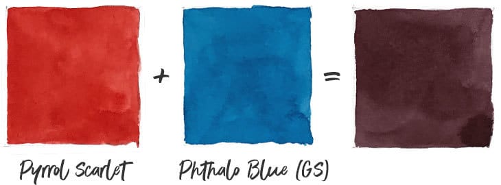
The same is true for the other secondary colors. A muted compound orange can be achieved by mixing yellows and reds further away from orange on the color wheel:
Neutralized compound purples comes from mixing reds and blues further away from purple on the color wheel:
Mixing neutralized hues using complementary colors
Using the same six primary colors you can push your color mixing further by implementing complementary color mixing. This method allows you to neutralize and desaturate your colors to produce a vast range of grays and earth tones.
A complementary color is any color on the opposite side of the color wheel.
The complement of yellow is purple.
The complement of red is green.
When you mix any color with its complementary color you get a neutralized gray or earth hue.
Here are a couple of examples:
As a quick rule of thumb, try to remember the following complementary combinations:
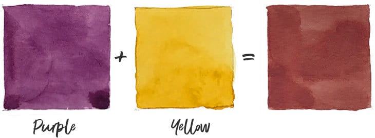
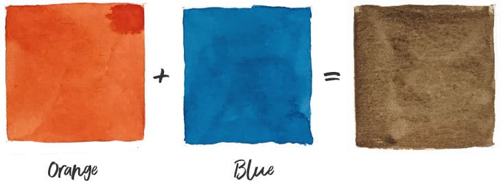
As a quick rule of thumb, try to remember the following complementary combinations:
Using a limited color palette
As you probably now realize, the primary colors yellow, red, and blue, are the backbone of any watercolor palette. Primary paint colors are an indispensable part of your palette because you cannot mix primaries from any other paint colors. Almost every possible color mixture can be obtained using just a few primary color paints.
And the best way to set up your watercolor palette is to begin with a variety of warm and cool primary colors.
If you’re starting out with watercolors, you want to become a better artist, and you have a small budget, you could begin with a limited palette of just six colors.
Painting with a limited palette also has the advantage of creating color harmony in your work. What’s more, a limited palette is also good practise for you color mixing confidence. You have to work a little bit harder to mix a specific color but you will learn a great deal about color along the way.
You’ll be amazed just how many colors can be produced using just six primary hues such as these:
The chart below illustrates this mixing range:
Feel free to download this cheatsheet and use it for reference. It provides a good guide to the mixing range of secondary colors you can expect from six warm and cool primary pigments.
(Note: this chart is just the tip of the iceberg. They show mixtures in a ratio of 50%/50%. You can achieve a multitude of other color appearances by varying the paint ratios).
Using the color wheel as a guide to mixing
Rather than relying on improvisation to mix your colors, you can use a color wheel as a guide to point you in the right direction.
Here’s a step by step example of how to do this.
Let’s say you want to reproduce a color similar to Raw Sienna.
First locate the approximate hue you want to mix on the circumference of the color wheel. Raw Sienna is a warm color somewhere between red and yellow. This hue is probably more yellow than red, so your starting point on the color wheel would be yellow-orange.
Having made these judgements I can now locate my target color on the color wheel.
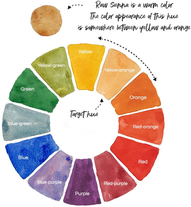
Now you need to estimate the approximate saturation of your target color. Raw Sienna isn’t brightly saturated. It’s more like a dull, neutralized yellow-orange.
To neutralize a color we mix it with its complementary color on the opposite side of the color wheel. Take another look at the color wheel to locate the complementary color (in this case blue).
So my target color has a hue which is located somewhere between yellow and orange and is slightly desaturated by adding blue.
Here is a swatch of Raw Sienna taken directly from a tube of paint:
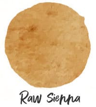
To mix this color I start with a warm yellow (New Gamboge) and I mix in a small amount of warm red (Pyrrol Scarlet). Remember, I want more yellow than red. This gives me my yellow-orange base.
Next I need to neutralize the color slightly. To do this I added a very small amount of warm blue (French Ultramarine). I mix a small amount at a time so as not to desaturate the color too severely:
80% New Gamboge + 15% Pyrrol Scarlet +5% French Ultramarine
Here is the resulting mixture next to the swatch of pure Raw Sienna from a tube:
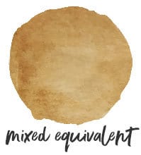

Not bad eh ?
With a bit of practice, and by using your color wheel as a reference guide, you can easily mix just about any color you need from a good set of primary paints !
Tonal Adjustments
Tone is the relative lightness or darkness of a color.
With watercolors, the brightest most saturated colors are the pure pigments that come straight from the tubes. You cannot make these colors any brighter.
This kind of saturated color is said to have a strong tonal value.
If you want to “tone down” your colors to make them lighter, it’s simply a matter of adding more water to dilute the mixture and thereby lighten the tones.
Because watercolor paint is a transparent medium the lightness of a color comes from the underlying white paper.
It’s possible that you have a tube of white or black paint in your watercolor collection. You may be tempted to use one of these to darken or lighten your colors. But black or white paint will deaden your colors.
In watercolor painting you control the level of tone by changing the ratio of paint to water.
Correct tone is one of the essential components to successful painting. If the relative tones in your scene are true, you can produce a believable sense of space, light and form.

Making a tonal steps chart like the one above is an excellent way to practice paint to water ratios to accurately reproduce a desired tonal value. I recommend you give this a try. it’s actually not as easy as it looks, but it’s an excellent way to help you understand and control tone.
Mixing Tips
Phew ! If you’ve got this far then well done !
Hopefully you now have a basic understanding of watercolor mixing.
To round up this article, here are some bonus tips about how to successfully mix your watercolors:
(Click here to download a cheatsheet of all the color mixing possibilities using six warm and cool primary colors)
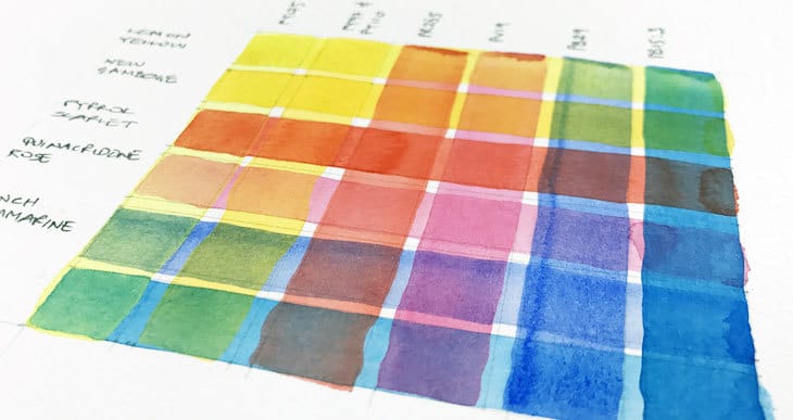
“Successful Color Mixing in Seconds Using Color Maps!”




Thanks a lot for this detail and useful guide to watercolor mixing.
Thank you so much for this, I found it when I was searching for water ratio. I didn’t find the answer yet. For example when I need a 50/50 ratio. Maybe a stupid question but how do I do this? 1 load of color on my brush and 1 load of water? Or just a tip of color on my brush?
In the meantime I will practice your tips for mixing colors. You explained it the best way (and I’ve read a lot already)
Hi Heidi
Achieving the right paint consistency is more a question of practice than measurement… And remember the water to paint ratio is intimately tied into the value (lightness or darkness) of the color you want to mix.
This can vary slightly from one paint to another. I tend to work in two ways depending on the strength of paint I need to mix. For example if I need a weak diluted mixture, i use a pipette to put a large puddle of water on the mixing palette, then add pigment a bit at a time – testing the tonal value on a sheet of scrap paper from time to time. If i want a strong valued mix, I start by putting a dab of paint directly from the tube onto the palette, then I’ll add water a little at a time until I have the right consistency.
It can also be very useful to practice painting value scales with a few of your colors.
I would also suggest you try my free watercolor lessons here… They could help 🙂
Hi Antony, Thanks for the really useful information on your colour mixing lessons. I’m really struggling to get a mix of “grey” for sky scapes or anything else really, tree trunks etc. Any pointers or tips would be welcome. I’m trying not to use black and white.
Thanks and best wishes.
Nick
Hi Nick
You might find THIS article useful 🙂
Very useful information, thank you so much… looking forward for more.
I hope this site is being updated, because I’m learning so much. I used acrylic for about 3 years and just last month decided I want to learn watercolor. From your free information so far, I’ve learned I have a LOT more to learn about color mixing. I’ll be very interested in your course.
Hi Elaine
Glad you’re finding the info useful! Yes, color mixing is almost a subject in its own right!
cheers
this article was excellent. the pictures, the explanations. best guide i have found so far. thank you very much!
I’m interested! A colour mixing course sounds great! 🙂
I already am painting watercolors but mixing colors, what to add when I want a certain color, or what to add ,or how to add colors together to get a certain shade etc. I wish you would write a book or make a video.
Hi Marla
I know color mixing is a tricky skill for a lot of artists. I may do a quick course on this if people are interested…
I would love a course on this! I find mixing colors the most difficult. So far, I never get the exact color I want or know what to add to get a certain shade. Or, figuring out how much of each paint color to mix together (even if someone gives me a percentage…like 30% — blue and 70% — yellow). Thank you.
Hi Glenda
Hopefully get something like that done in the future 🙂
I’m loving your site!!! This was the most useful, detailed and yet simple to understand article I have across on colour mixing. I’m finding all your other articles also very engaging. Thanks a lot for sharing your knowledge to ease the path of beginners.
Glad it was useful Nandini !
Very clear helpful article … great advice and generous with information . Thank you .
You’re welcome 🙂
Fantastic comprehensive article on watercolour mixing! Thank you for taking the time to provide tutorial with visual colour samples to educate new painters!
I love the way that this is written. It is useful and allows me to try things out, see examples, etc. Thank you for providing this “starting point” for the new paint mixing water colorist!!
Here’s to you! May your paint mixing endeavors be amazing and fun!! I am bookmarking your site.
I loved the article! One practical question I can’t find the answer: what do you do when you mix more paint than necessary? You throw it away? (no, please!) If you keep it, where? On an empty pan? On the mixing palette? Thank you in advance!
Hi Cristiane – most watercolorists just leave their paint on the mixing palette and reuse it the next time they paint. The paint will dry, but it can easily be reconstituted by adding water. But beware of dust! (I hate dust…) The best option is to cover your palette, or find a palette with a lid that closes. Hope that helps…
Thanks a lot for sharing your knowledge!
I have just started using watercolours and came across your site. Thank you so so much for the wealth of information you have here! There is so much to learn and you have included so much information for us beginners so thank you! I am slowly going through all of your articles and have bought some of the items you have recommended.
Great to know you’ve started painting with watercolors Mary!
Thank you SO incredibly much for your site!! Ive only just started using watercolours, absolutely love it, BUT I’ve rapidly become quite overwhelmed (?)… I’m the type of person who wants to learn everything at once. There is so much info and i feel that its not explained very well on many sites unfortunately . You have broken it down and explained it fantastically and in a concise manner!! THANK YOU!!
Thanks Paige
Really happy to hear you’ve discovered watercolor painting! I just love it!
Keep practicing and painting as often as you can. I just hope this site will be as useful as possible…
This was very helpful. I am trying to learn color mixing for water colors. Thanks for your guidance it was easy to understand.
No problem Sandi – i find mixing watercolors fascinating!