Watercolor Color Theory & Design that will Change Your Artwork
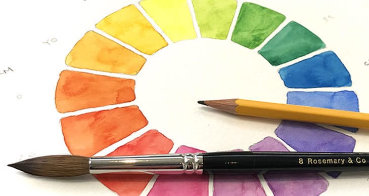
Don’t you think it’s curious? The way certain watercolors provoke emotion, but others fall short of your expectations. Color plays a huge role in successful painting, which is why color theory in watercolor art is a valuable thing to grasp. Understanding colors and how they interact with each other can go a long way to making you a better artist!
I’ve lost count of how many times I’ve abandoned a painting because the colors weren’t working. And in my early days as an artist, I’m sure this had a lot to do with poorly chosen color schemes. It took me a while to realize that you can “design” the colors of your paintings to produce better results. The colors you choose don’t need to be a lifelike copy of the subject you’re painting, and simple tricks such as limiting your color palette or combining specific colors together can go a long way to creating more attractive, harmonious artwork.
I think you’ll find a little theory goes a long way…
Watercolor Color Theory
Colors are at the heart of any painting. Ideally, you should be controlling your choice of color rather than randomly picking what “looks nice” from your palette. Color theory and color design will help you do exactly that.
Bright vivid colors can be used to attract the eye and create focal points in a painting. For example, you can use bright colors to draw attention to the main subject of your artwork. On the other hand, muted colors can produce a calm, dreamlike quality. Too many dull colors may become boring so a few intense colors can help to balance a composition. Alternatively, contrasting colors can produce lively, uplifting artwork. As you can see, there are numerous ways to put color theory ideas to work for you.
But first, to help you get a better understanding of color theory we need a bit of artist’s vocabulary…
Understanding color theory
Any color can be described by using three distinct characteristics. These are the hue, the value and the intensity.
Hue is just another word for what we commonly call “color”. Hue names correspond to the colors of the spectrum: red, yellow, green, blue, and purple. These are pure hues with the most intense color.

Value is a way of referring to the lightness of a color. Good use of values in a painting helps to produce a realistic perception of three-dimensional form and light. Painters often use a gray scale ranging from light to dark (white to black) to help them judge values.

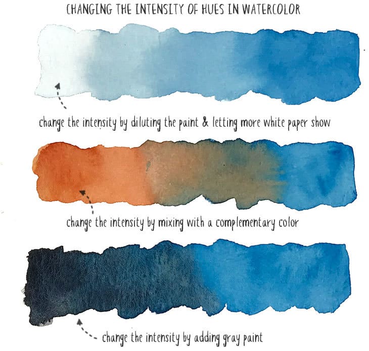
Intensity is what artists often refer to as saturation. A bright color is highly saturated whereas a dull color has lower color saturation. Unsaturated color looks closer to black, gray or white. In watercolors you change the saturation in a few different ways. You can add more water to increase the amount of white paper showing through. Or you can add gray paint to the mixture or add a colors complementary color, which creates a more dull, muted color appearance. (A complementary color is any color on the opposite side of the color wheel – see below).
Using the color wheel as an artist’s tool
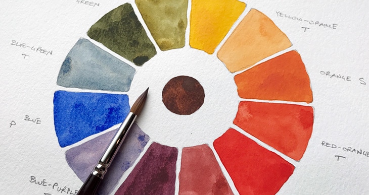
Now that you’re familiar with the terms used to discuss color, let’s take a look at the artists favorite color tool. A color wheel is probably one of the most useful things you can paint and stick on your wall !
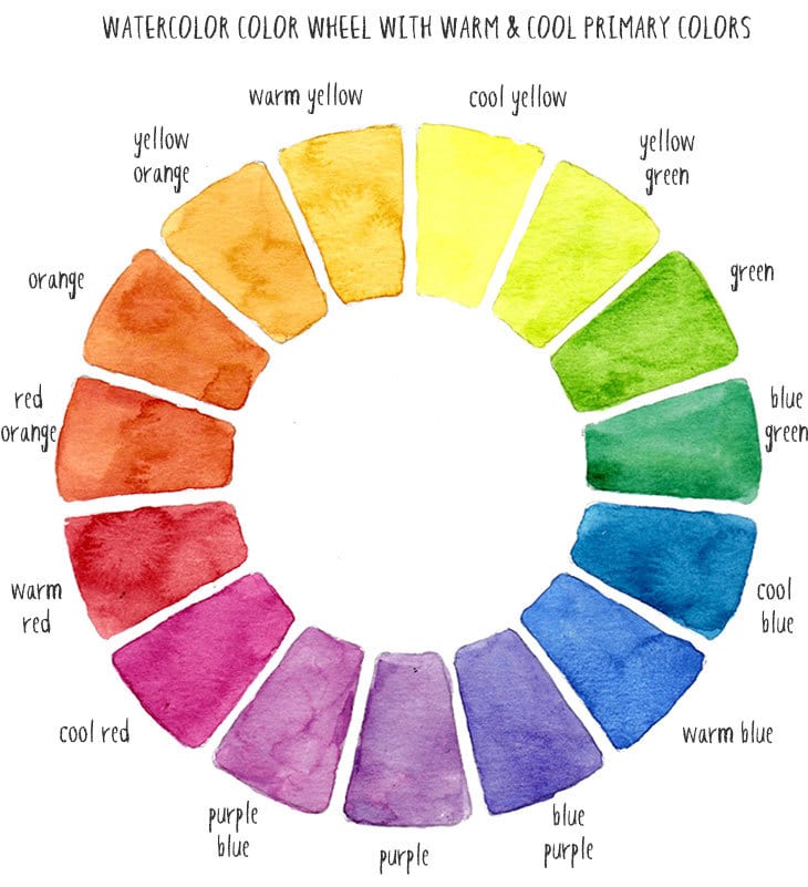
This is a tool that most artists use to help them with color. It’s a way of classifying colors in an easy to read format. The hues are organized according to the colors of the light spectrum (just like you see in a rainbow). A color wheel will help you design color schemes and also get a better understanding of paint mixing. If you’re not yet ready to paint your own color wheel you can find an excellent and easy to use ready-made color wheel here(check the reviews on Amazon).
The hues on a color wheel are structured into groups. First come primary colors, then secondary, and sometimes you also here people talk about tertiary colors.
Primary colors are at the top of the structure because in theory you can mix any other color you like using primaries. The primary colors are yellow, blue, and red. If you combine two primary colors together you get a secondary color. This makes sense, right? If you mix red and yellow you get orange, and so on. The secondary colors are green, purple, and orange. Next come tertiary colors. If you mix a primary color with a secondary color this produces a tertiary color. You can see the range of tertiaries in the color wheel.
Color Temperature in Watercolors
Very often you’ll here artists talk about color temperature, especially when they refer to their paints. Remember those “pure” hues we talked about. Well, it’s very tricky to find paints which have a pure color (the color appearance of the paint is restricted to the pigments used in the ingredients). As a result, most paints have what we refer to as a warm or a cool bias. For example, you can get warm yellows or cool yellows, each of which give different results when mixed with other paints.
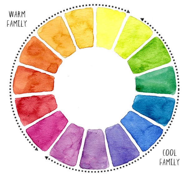
The color wheel helps us categorize colors into warm or cool families. In general, warm colors contain more red, and cool colors contain more blue.
Warm colors can be grouped into yellow, orange and red. Cool colors are purple, blue, and green.
Watercolor Color Schemes
Now comes the fun part!
Different combinations of colors lead to different types of color harmony. A harmonious color scheme will help to produce a sense of unity in your watercolors. You can plan ahead by choosing an appropriate color design depending on your subject and what you want to express, using your color wheel to help you find color associations and paint mixes.
Here are some of the better known color schemes to help you find color relationships that work for you!
Monochrome
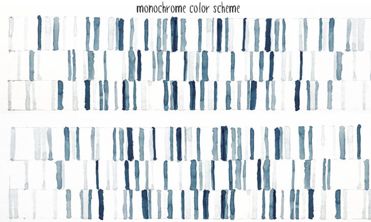
The simplest color scheme in the world is monochromatic! By using a single color you’re guaranteed not to get any color conflict. This kind of painting can also be quite dramatic if you create highly contrasting values. Monochrome watercolor paintings are also a great way to study light and form.
Analogous
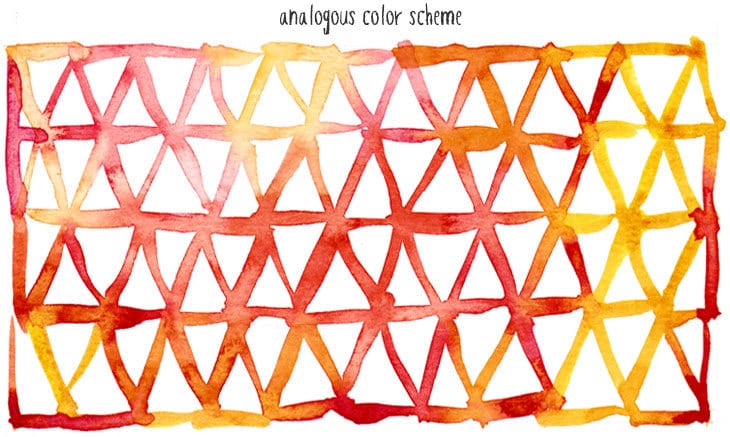
When you choose three or four neighboring colors on the color wheel, you get analogous colors. Associating colors like this tends to produce calming, harmonious results. You will also get bright vivid colors because of the close relationship between your paint hues. It’s only when you start mixing a complementary color (colors on the opposite side of the color wheel) that color mixes become muted and de-saturated. Analogous color schemes are one of the simplest ways to achieve pleasing color effects.
Complementary
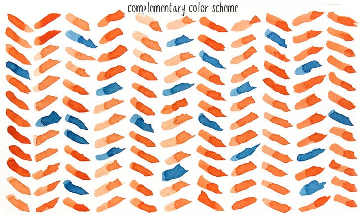
Complementary colors have been mentioned earlier. Colors opposite each other on the color wheel produce the greatest hue contrast. Pairs of complementary colors usually work well together and produce strong compositions. The two colors “compliment” each other. You’ll often find complementary hues in nature (an orange sunset in a blue sky. Leafy green foliage with red flowers, etc.). In my opinion, some complementary color combinations work better than others, so make your own judgements before mechanically using two complementaries.
Split Complementary
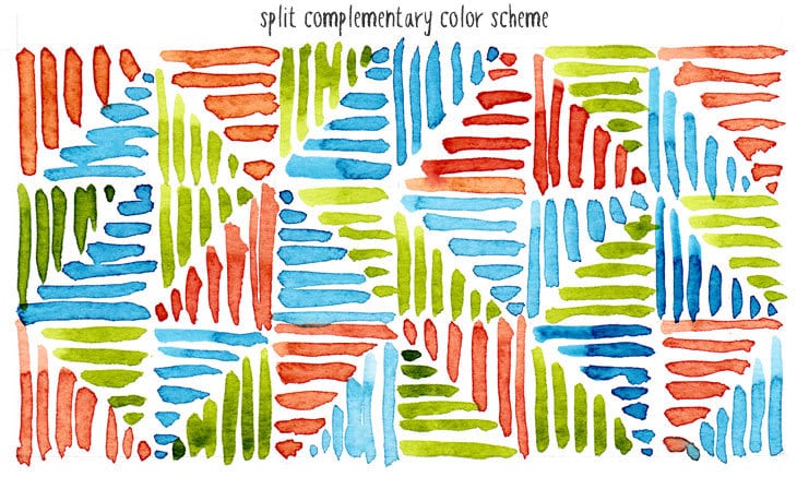
A split complementary color scheme is a bit of a variation on the complementary. It makes use of the same visually contrasting hues, but softens the result slightly by using colors adjacent to the opposite complement. It adds more variation. When the colors are mixed together you get some good harmonies because each of the new colors contain some of the parent colors.
Complementary Analogous
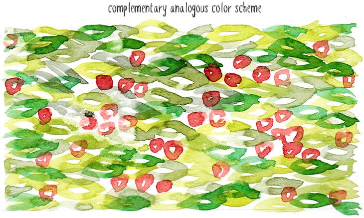
I see this color scheme more as a variation on the analogous color relationship. As the name suggests, you take an analogous group of colors and then you add a complementary color. You get the benefits of both designs! Smooth harmonious analogous colors and a vivid contrasting complementary color. I think this works best when the complement is used only for a few touches of color here and there.
Primary Triads
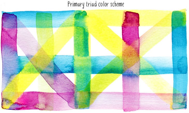
A primary triad is a combination of three primary colors. The colors have a triangular relationship relative to each other and are spaced at equal distances around the color wheel. You can get some extraordinary vibrant results with this color scheme but you need to be careful. Mixing all the primaries together will result in dull muted colors. This kind of design works best if you let one of the colors dominate, and try to blend colors closest to each other to produce secondary mixes rather than muddy de-saturated colors.
Secondary Triads
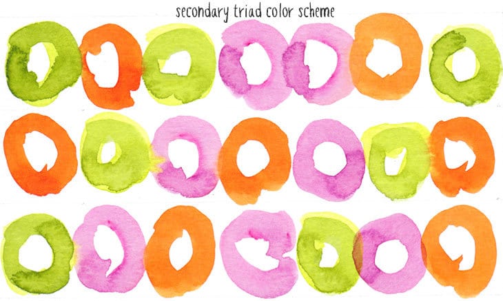
As you have probably guessed, a secondary triad color scheme is similar to a primary triad, only this time you’re combining three secondary colors. The results can be quite surprising in the absence of any primary color. Again you may have better success if you choose a main color and use the other two for accent colors.
How to improve color harmony in your paintings
You don’t have to leave your colors to chance when painting in watercolors. With some careful thought you can enhance your work and produce some fantastic color relationships.
Here are a few tips on how to improve the color harmony of your artwork:
- Think about developing a color scheme before you start your painting.
- Use your imagination. You don’t just have to represent real-life colors.
- Take the time to experiment on a spare sheet of paper.
- Emphasize differences or similarities with analogous or complementary color schemes.
- Try limiting the number of colors you choose from your watercolor palette to increase harmony. You’ll still get a wide range of color mixes.
- Once you’ve chosen your colors, stick to them. Most color designs start to fail because the artist begins adding additional colors to the palette.
- You can unify the color scheme of a painting by using a glazing technique (layering washes of color on top of each other). You can either lay down a wash of one color as an underpainting, or glaze over the top of a painting when it’s completely dry. This has a unifying effect on the whole.
- Sometimes it’s a good idea to choose one color as the dominant hue. Use it in most of the other colors you mix and repeat the color frequently throughout the painting.
There are so many beautiful color paints in watercolor painting. Using them wisely is just one of the things you can do to dramatically improve your masterpieces…
Now go and splash some paint (in a harmonious way of course) !



Hi Anthony,
Do you have a color wheel template?
Thank you!
Mary Lou
Hi Mary Lou
Sure – There’s a color wheel lesson with template HERE
Thank you for keeping the blog. You’ve written so many incredibly useful posts that I haven’t even been able to read through them all yet! I’m still a beginner in watercolor painting and my progress lies on the hands of skilled people like you, providing us free material to study from 🙂
Thanks Lita!
Have fun with your watercolors !
Loved this comprehensive post. The most concise explanation I have found.
Thanks, I learned all this 40 years ago and have let it get lost in all the baggage in my brain, I really needed this.
Glad to know you’re getting back into painting 🙂
This is the best explanation I’ve seen about color theory. Thank you! Do you remember what the name is of the warm red you used in your color wheel? It’s so gorgeous.
Hi Jennifer
Thanks ! The warm red i use is Daniel Smith’s Pyrrol Scarlet 🙂
Very simple but life-saving! Many thanks!
All the very best! 🙂
Great information! I have thought for a long time that I’m just not good at design, therefore it isn’t fun to do and therefore I felt restricted to copying what someone did or coloring in their designs. It was a lightbulb moment today when I realized that it wasn’t fun and why. I had an impulse to check on choosing colors. I may not be “natural” at it but I can improve knowledge and skills of course. And voila! here you are. Thank you for the great tips and I LOVE the colors in your color wheels! So bright and alive. Thanks!
Happy to help Connie !
Have fun designing your color schemes…
Thanks for a really clear explanation of colour theory, vital with watercolour.
you’re welcome Jane – enjoy your painting !
I love your website and the simple yet thorough way you explain things. The examples are so clear and helpful. Thanks!
Thank you so much for this article, I’ve been painting for many years and only now just starting to understand colour theory, this was a great explanation to help me chose colours better 🙂
Your blog is amazing. I stumbled onto your site while searching for information on how to set up a watercolour palette. I’ve stayed a couple of hours and I will be back! Thanks for everything you have shared. You are a gifted writer and teacher.
Glad you’re enjoying the site so much Shelley !
Oh my God. Such a lovely article. I am just new to watercolors. And always scared of color theory. Your article has put everything on just right place. Thank you for sharing your knowledge. Glad i found this.
thanks Rini !
Just found your articles. The best I’ve seen. i’m a beginner and your explanations are very clear and understandable. Thank you.
Glad to help Jay…
Oh my goodness! I am so happy I found this website!! I am a beginner. I found your site by searching for a color sheet example. Not only did I find a beautiful color sheet, I also found information about color theory and examples of how to use the color wheel in painting. You have my gratitude for putting this information online for free. THANK YOU!
You’re welcome Kali – glad it was useful 🙂