
Simplifying Watercolor for Beginners (8 Simple Tips)
Does watercolor ever feel so overwhelming, you just don’t know where to start?
Maybe you sit down to paint, and before you’ve even begun, your brain’s already juggling too many colors, too many details, and too many decisions. And halfway through, it’s the same problem – everything feels important, and you don’t know what to focus on.
But what if I told you it doesn’t have to be that complicated?
The truth is, watercolor gets a lot easier when you stop trying to do everything, and start simplifying. In this lesson, I’ll share 8 simple tips that help you start a painting without the overwhelm and keep it manageable all the way through. And believe me, you’re not alone if you struggle with this – more than 1 in 7 of my masterclass students say simplification is their biggest challenge!
8 Beginner-Friendly Ways to Simplify Your Watercolors
Often when you sit down to paint, everything feels important, and it’s easy to get overwhelmed by all the details and the different steps… The secret to getting past this confusion is, you guessed it, simplification!
And this is something I learned the hard way. So for example, back when I first started, I thought using every color on my palette would make a painting look better – but all it did was turn into mud! Or I kept fighting the paper, layering more and more, until everything looked dull and overworked. It took me YEARS of trial and error to discover that keeping things simple was the real answer.
And I don’t mean randomly leaving things out. It’s about making smart choices that let your painting say more with less.
The good news is, learning to simplify is a skill you can build over time.
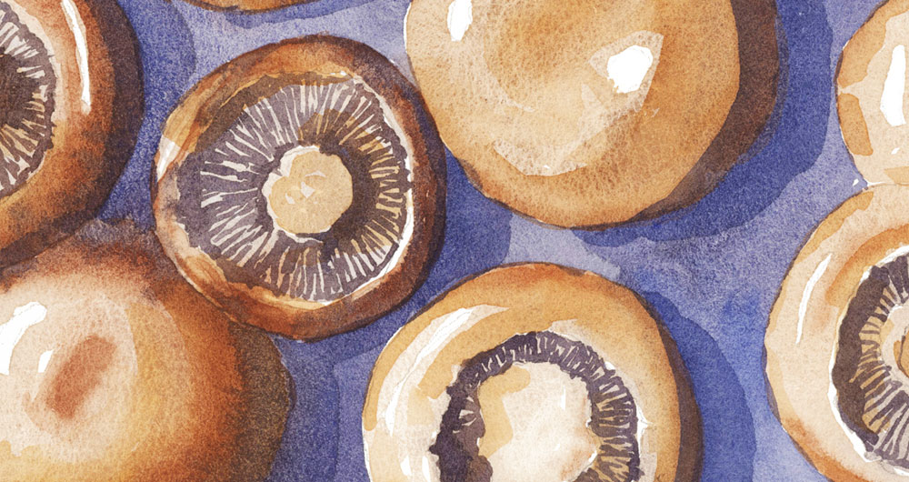
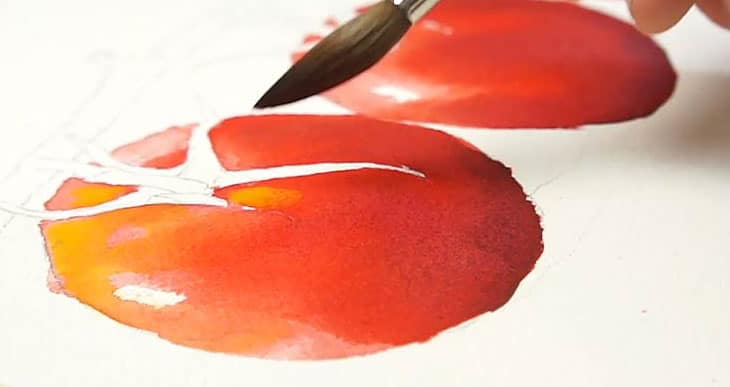
So to demonstrate what I’m talking about, I’m going to be painting this photo I took of a baking dish full of mushrooms.

BEFORE PAINTING
To get started, here are few things you can do to simplify even before you put brush to paper:
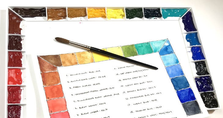
Tip Number 1: Use a limited palette
One of the easiest ways to simplify a painting is to limit your color choices.

Beginners often think more colors means a better painting, but honestly, it usually just means more confusion, and the possibility of ending up with muddy looking results.
Simplifying your colors has two big advantages:
- Color mixing becomes much easier
- And the finished painting will look a lot more harmonious.
If you pick just two, three, or maybe four colors, suddenly your decisions are way easier. You don’t have to juggle fifteen different paint colors, and your painting will look more harmonious because all the colors naturally relate.
The result is, fewer choices, fewer mistakes, and a calmer brain while you’re painting 🙂
Tip Number 2: The One-brush rule
Try choosing a single, versatile brush and make it do all the work. Using a larger brush forces you to think in broad strokes instead of getting lost in tiny details. And if you’re anything like I was—a perfectionist obsessed with every tiny detail—this trick is a lifesaver for keeping things simple!
You’ll find that using a bigger brush keeps things loose and forces you to simplify the details. And it’s a brilliant way to stop yourself from fussing.
The brush I used for the whole of this painting is this one-inch long sable brush by Rosemary & Co.

Using just one large brush might feel frustrating at first – but oddly enough, it makes everything simpler. You’ll be surprised how much you can achieve with just one good, large round brush.
Tip Number 3: Squint to See Big Shapes and Values
This one is a classic artist trick:
Squint!
Yep, literally half-close your eyes until everything blurs out. Squinting softens the scene and helps you focus on broad shapes and values instead of details. This simplified view is what you want to try to capture, not the complicated jumble of details crammed into your reference photo.
So try this: Squint like you’ve just lost your glasses! Suddenly, the world breaks down into big shapes and clear contrasts.

If you prefer a less squinty method, you can even turn your reference into a black and white version with a phone app like I did here…

These quick and easy value studies give you a kind of roadmap to follow when painting. They help you plan your tonal values, and highlights – and over time, they also train your eye.
Tip Number 4: Pick References with Clear Contrast
This is another step that happens before you even start painting:
Choose a reference photo that’s simple to read!
If the lighting is flat and everything’s the same mid-tone, you’ll spend the whole time guessing what shapes to paint! Instead, use a photo with clear light and dark areas.
For example, with my mushroom subject, the overhead light created these strong highlights and deep shadows. That made it so much easier to decide where the values go, without getting bogged down in every last detail.

Simplified references work because they make it more obvious where to place shapes and colors.
DURING PAINTING
Tip 5. Paint Shapes, Not Objects
When you start painting, don’t think, ‘I’m painting a mushroom.’ Think, ‘I’m painting a light shape, or a dark shape, and maybe a few lines for suggestion.’
Don’t paint what you think is there — paint the shapes of different tonal value and color that really are there.
For example, I began the mushrooms with some big, loose variegated washes of color – just enough to lay down the foundation.
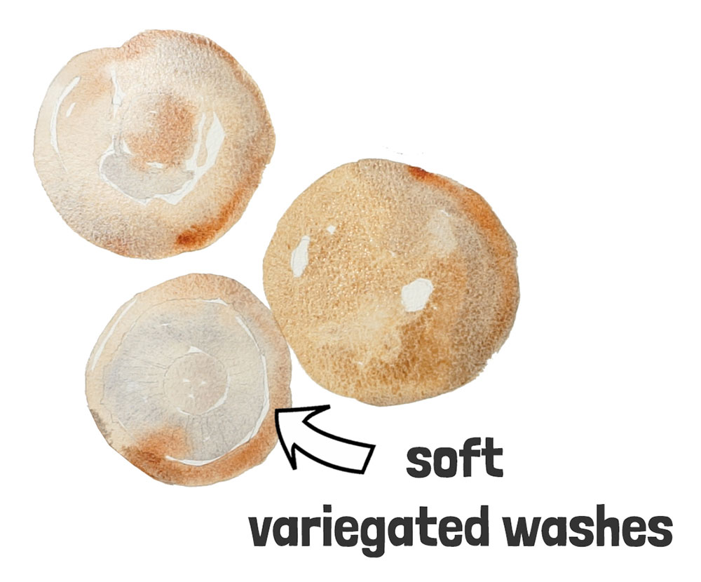
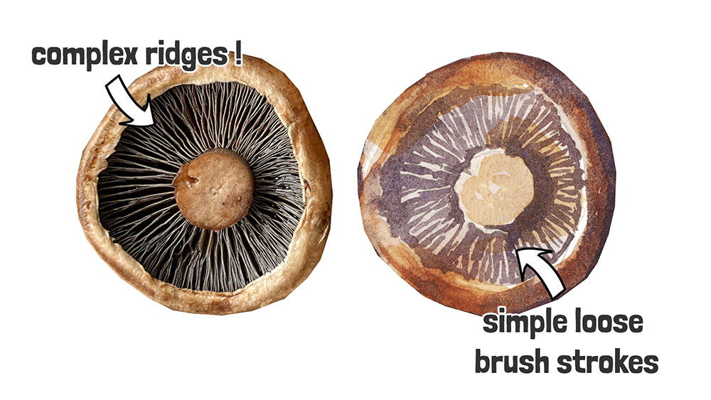
And all those little ridges on the underside of the mushrooms could drive you mad if you tried painting them realistically. Instead, I just used very loose brushstrokes to paint a few dark lines and shapes. And that was enough. Our brains are brilliant at filling in the gaps.
That’s really the heart of simplification: you’re not trying to spell everything out in detail, you’re suggesting just enough for the viewer to complete the picture in their own mind.
Tip Number 6. Work Light to Dark, & Broad to Detailed
Watercolor works best if you go from light to dark, and from broad shapes to sharper details.
I say this often, but watercolor lends itself to this approach because of its transparency. Ideally you should build your painting gradually: start with your lightest and largest shapes, then add mid-tones, and finish with dark shading and details. Oh, and preserving the white of the paper for highlights.
Think of it like stacking transparent sheets of colored glass – each one adds depth without covering what came before. That’s why this approach simplifies things: instead of trying to solve the whole painting in one go, you build gradually, step by step.
Tip Number 7. Use Your Techniques Intentionally
For most paintings, you really don’t need a hundred different fancy techniques. Just focus on two core techniques
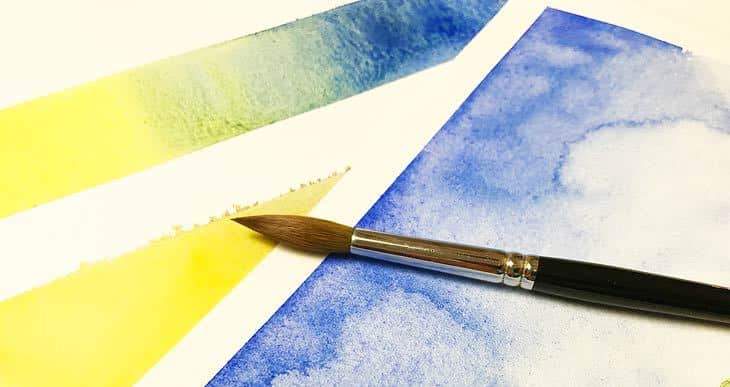
- wet-on-wet
- and wet-on-dry.

For example, at the start, I used wet-on-wet to lay down big, loose shapes. This creates those beautiful blended transitions that watercolor does so well. Once that layer was dry, I switched to wet-on-dry for sharper edged shapes and details — and I can follow my “value roadmap” to add the next darkest shapes to lay on top of the underlying colors.
Sometimes I even mix a bit of both techniques in one layer. For example, I might drop in some wet-on-wet color to create variation, then define a shape with wet-on-dry leaving the edges unblended.
By using just these two techniques thoughtfully and swapping between them as needed, you cover about 90% of what you’ll ever need in a painting — and it keeps techniques simple..
Tip Number 8. Avoid Overworking
Sometimes the hardest part of painting is simply knowing when to stop. Overworking is one of the most common struggles I hear from beginners.
So if you find yourself fussing with your brush for no real reason, that’s usually the moment to step back. One simple way to avoid this problem is to plan your layers ahead of time — and then stick to your limit. Most watercolor paintings only need three or four layers at most.
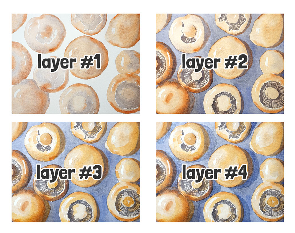
Sticking to just a few layers not only prevents overworking, it also simplifies the whole process by keeping your choices clear and your painting fresher.
It’s tempting to keep going, but remember: in watercolor, less really is more. Your painting will thank you for it 🙂
Final Thought:
Simplifying isn’t about doing less — it’s about focusing on what really matters, and letting go of unnecessary details. So give yourself permission to stop overthinking or chasing perfection — trust me, your painting (and your sanity) will thank you for it. 😉
Oh, and if you want more help getting started without overthinking every brushstroke, check out the free lessons in the link below.


You have described me to a “T”! 🤭 I’m a perfectionist and LOVE doing detail painting. I have been to so many workshops in the past, YouTube videos, etc. but nobody really teaches how to learn to paint loose and still have a great looking picture when your done. Looking forward to the lessons ahead. Thank you.
Thank you, Anthony. Looking forward to trying your pinecone.
Have fun Loretta 🙂
Thank you. I started a class at a local community college.i felt so overwhelmed…..I’ve stepped back for a bit and I discovered you as a resource. Im painting again. Learning about myself.
Hope this helps Annette!