If I Was Starting Watercolor from Scratch – I’d Do This…
If I had to start learning watercolors all over again this is exactly what I would do to get better, quicker!
A lot of beginners get caught up in things that just don’t matter. For example, they obsess over the ‘perfect’ supplies or dive into complicated paintings before learning how to break subjects down into simple shapes.
Knowing what I know today, there are a few things I’d approach differently, things that would make a real difference in getting faster results.
So in today’s lesson, I’m going to walk you through exactly what I would do if I were starting watercolor from scratch, with everything I’ve learned along the way.
By focusing on just a few basics, you’ll see real improvement sooner than you’d think.
So…
Tip 1. Supplies – Keep it Simple

In the beginning, I’d keep my supplies as simple as possible!
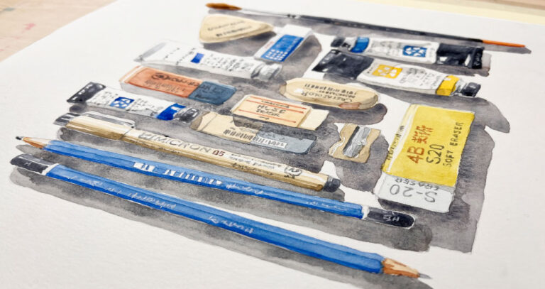
You only need a couple of “versatile” brushes, a small but well-chosen palette of colors, and some decent paper.
I believe the key is quality over quantity!
Quality matters more than quantity at this stage, since quality supplies make watercolors easier to handle and therefore simplify the learning process. But also, keeping things minimal prevents overspending!
Here’s what I think you need to begin with and why:
Brushes.
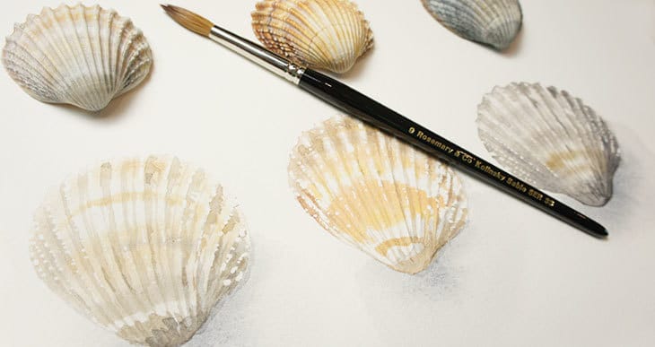
The best brushes to get started would be a large and a small round brush.
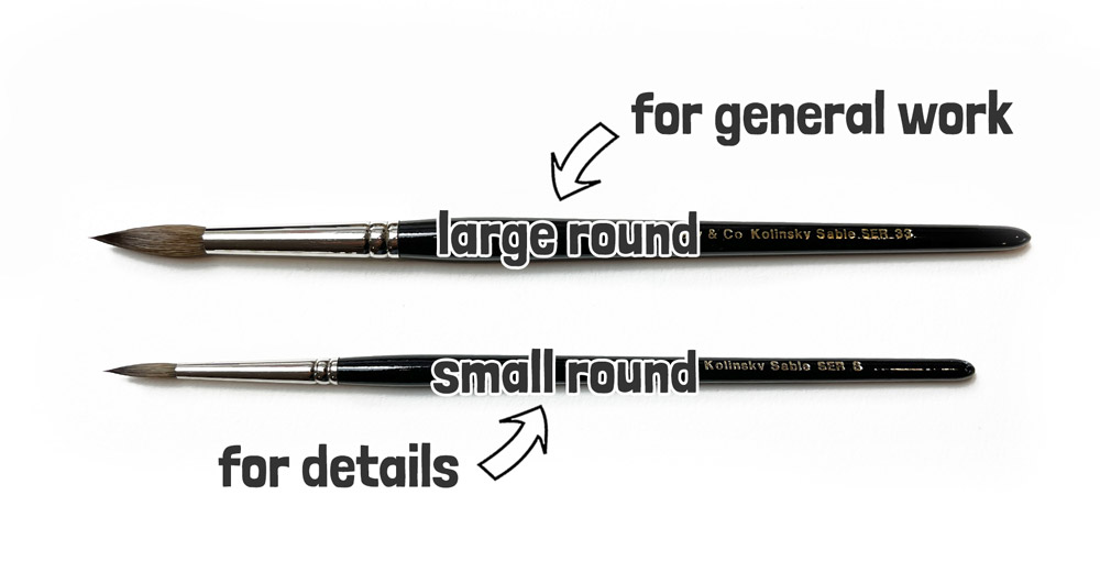
Earlier I said you want “versatile” brushes, and a large round brush is probably the best all-round type of brush you can get. You can apply a large range of brush strokes with a round brush, from detailed marks to broad washes.
A large round, which for me means about 1 inch long, is what I use most of the time.
The second most used brush would be a small round. This is extremely useful for more intricate details.
And it doesn’t really matter in the beginning if you choose a synthetic or natural haired brush!
Natural hair, like sable for example, has better water-holding properties. But brush manufacturers have made a lot of progress with synthetic watercolor brushes.
If your budget can extend to natural hair then that’s great! Otherwise, stick to synthetic to start.
A few recommendations:
- Rosemary & Co Red Dot Pointed round size 10
- Princeton Aqua Elite Round size 10
- Rosemary & Co Red Dot Pointed round size 4
- Princeton Aqua Elite Round size 4
Paper
Paper is the foundation and the source of light for your watercolor paintings. Which is why quality also matters.
But watercolor paper can be quite expensive!
The best type of watercolor paper is made from 100% cotton. This is generally known as “professional” grade paper, whereas “student” grade is often made using less durable wood pulp.
Cheap, student-grade paper can be useful for watercolor sketches, but it doesn’t absorb or disperse water evenly, which can lead to streaky washes, or unwanted blooms!
Luckily there are a few less expensive cotton papers that have good handling properties.
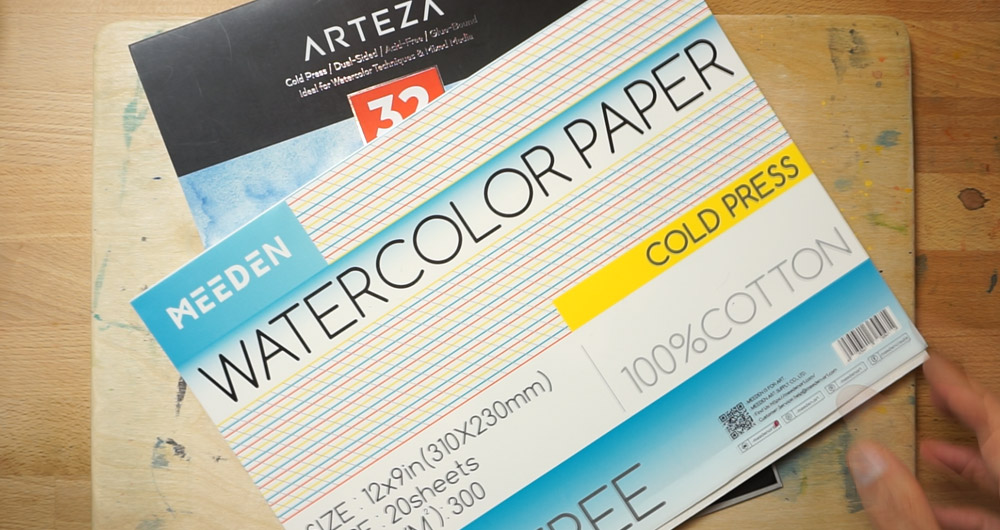
For example the brands Arteza and Meeden make cotton papers that are more affordable, and still provide good watercolor handling.
Once you find a brand and type of paper you like, try sticking with it for a while. Getting used to how one type of paper handles makes a big difference, so you’re not constantly adjusting to new textures or absorption rates – otherwise, it just takes longer to get the hang of things 🙂
Paints
Just like other supplies, paints come in both professional and student grades.
Student grade paints are cheaper because they use less pigment – in other words they have a lower pigment load. Or sometimes they use inexpensive alternatives to more costly pigments.
As a result, the colors may appear less vibrant and intense, which can lead to disappointing results in your paintings.
For this reason I usually recommend starting with a small collection of “artist” grade paints…
Tip 2. Choosing a Limited Palette (5-6 Colors)
The goal of a limited palette is to choose a set of colors that give you a broad range of mixing possibilities. You want to spend less, but still be able to mix a full range of colors.
The basis for any useful color palette includes the primary colors, red, yellow and blue.
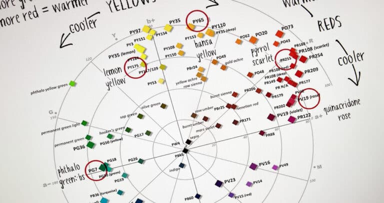
But three primary colors alone often fails in creating a full range of hues and vibrant color mixtures. This is because each primary color has a color bias – in other words it “leans,” towards either a warmer or cooler hue.
So instead you can opt for a mixture of primary and secondary colors – or use a split-primary palette which includes warm and cool versions of each primary.
Here’s what these might look like:
Primary & Secondary Mix:
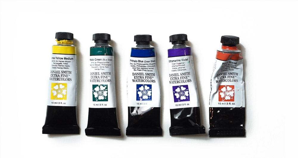
- Hansa Yellow Medium – PY97
- Phthalo green (yellow shade) – PG36
- Phthalo blue (green shade) – PG15:3
- Ultramarine Violet – Pigment number: PV15
- Pyrrol scarlet – PR255
Split Primary:
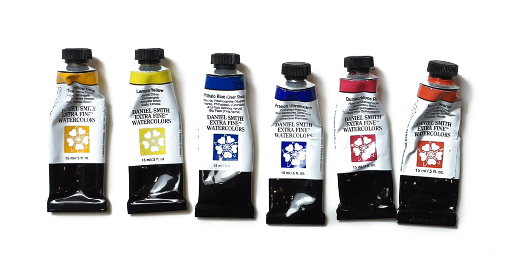
- Quinacridone rose – Pigment number: PV19
- Pyrrol scarlet – Pigment number: PR255
- Hansa Yellow Deep – Pigment number: PY65
- Lemon yellow – Pigment number: PY175
- French ultramarine – Pigment number: PB29
- Phthalo Blue Green Shade – Pigment number: PB15:3
If you struggle with color mixing and want to be able to mix colors with ease – try my “Color Mixing in Seconds” course !
A few well-chosen colors can yield a surprising range of mixes, and the smaller choice of paints helps you understand color interactions quicker.
Tip 3. Experiment and Explore
Your very first steps should involve plenty of experimenting!
For example, spend time mixing colors – or let pigments flow together on the paper and see how they interact with different amounts of water.
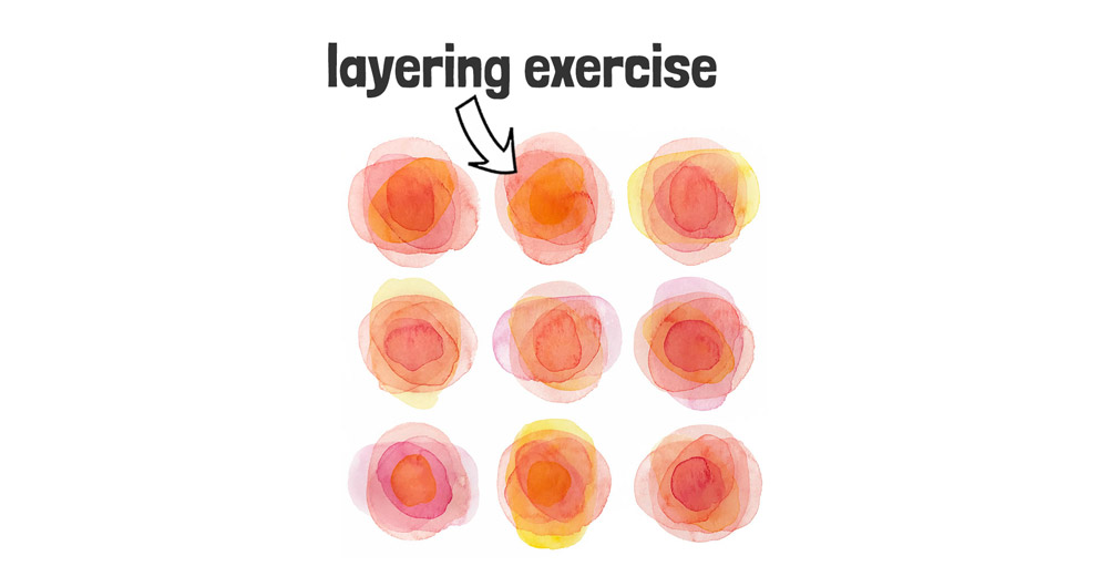
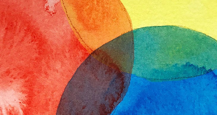
You could try simple exercises like layering shapes (using a glazing technique) to explore how the transparency of watercolors works, and how layering affects the final appearance.
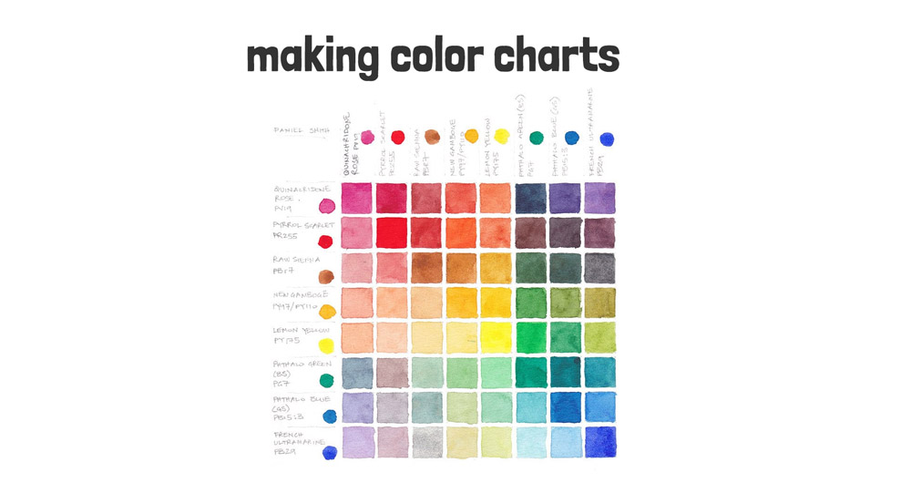
One of the best exercises for testing out your new paints is a color wheel or a color chart. These charts help you see how your paints blend and reveal the full range of colors you can achieve. They’re a great way to understand the characteristics of each color and how they interact. And they’re fun!
If you’d like to learn how to make these, here’s a link to a tutorial.
Tip 4. Understanding Values Early On
Values (or the lightness and darkness of colors ) are even more important than colors themselves in a painting. Understanding “values” early on helps bring depth and realism to your work.
A lot of the students I’ve helped in the past told me things like:
“My paintings always look so flat”.
Or “My paintings lack life and I have difficulty getting a three-dimensional look”.
If I could go back to the beginning, learning to create depth with tonal values would be one of the first things I’d do! Values help us convey light, shade, and shadow, which gives subjects a three-dimensional feel.
But visualizing values in a complex scene can be very tricky!
To make this easier, try using a simple value finder or a phone app to convert photos into value studies.
Here are some links to a few tools and additional articles if you want to explore this further…

Tip 5. Start with Small, Manageable Projects
At first, you should avoid the temptation of jumping straight into complex subjects.
Instead, focus on small, achievable paintings that build confidence and skills little by little.
This approach is something known as “purposeful practice”, and studies have shown this is one of the fastest ways to improve any skill.
This is the method I use in my Watercolor Masterclass, and it allows my students to focus on one element at a time and see progress quicker.
For example, if you want to work on layering and glazing, start with simple shapes and practice applying thin, transparent layers on top of each other. Observe how colors shift and darken with each added layer. Then, apply this technique to a single painting, such as a still life or floral painting, concentrating on layering to build that skill even further.
Tip 6. Embrace Mistakes and Learn from Them
Watercolor has a mind of its own, and unexpected effects and blends of color are part of its beauty!
So embrace these ‘happy accidents’ as learning experiences, and try not to see them as failures. It’s normal for your first attempts to fall short of your expectations.
The trick is to observe the conditions under which certain effects occur:
- Was the paper almost dry when you added the color?
- Did you use a lot of water, or just a small amount?
- Was the brush loaded with strong pigment, or was it a mix of light, watery paint?
Noticing these details helps you understand how to recreate (or avoid) specific effects, and you’ll gain more control over your watercolors with time…
Tip 7. Commit to Regular Practice for Consistency
I know you’ve heard it before, but consistency really is the key to faster progress.
Paint as often as you can, without leaving too many big gaps between painting sessions!
To make this easier, put your painting practice in your daily schedule. Aiming for 15-20 minutes a day is often better than a single long session every couple of weeks. Or if you don’t know what to paint, consider using a structured program that guides you step-by-step.
Small, regular practice sessions build muscle memory and familiarity with techniques, materials, and colors, speeding up your overall progress.
Tip 8. Master Water Control Early On
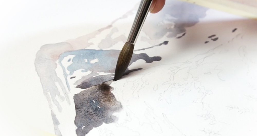
Water control is one of the first big challenges a beginner faces.
A lot of people think it’s just about how damp or dry the paper is…
But it also comes down to how much water is on your brush, and how much water is in your paint mixtures too!
For example, a wet brush loaded with watery paint applied to an almost dry paper can cause a flood of pigment, sometimes causing watermarks like blooms. Whereas a thicker mixture of paint applied to a moist wash will disperse evenly onto the surface.
These differences can be quite subtle, so again the key is observation!
Watching how the wet paper interacts with different water-to-paint ratios helps you understand how to control the flow of watercolors.
So in the beginning, try playing around with different moisture levels, on your paper, brush, and in your paint mixtures… then observe the results, and make notes of the resulting effects.
Tip 9. Be Patient and Enjoy the Process 🙂
When you start learning watercolors it’s normal to feel a bit lost at first. Painting should bring you joy, not stress. So celebrate small victories, stay patient, and enjoy each brushstroke as part of your artistic journey.
Positivity is a big help towards better results 🙂
I know that sometimes perfectionism is a common hurdle for beginners. So if perfectionism is something you’re battling with, go and watch this video next, where I’ll share 7 practical tips to help you overcome it and let go of the fear of making mistakes.



Hi Anthony. At the end, you suggest perfectionists watch “this video” to help them overcome that, but there’s no video link…
Hi
I just added the link 🙂
You have taught me so much in the courses I’ve followed so far, particularly about the different qualities and handling of paints. I have taken your advice on Daniel Smith and my little set of six warm/cool colours arrived yesterday. They are so pure, bright and clean to work with and a little goes a very long way! Wishing you all the best!
Thanks so much Alison
Have fun with your new paints 🙂
Hi Anthony I started painting a year ago and I’m amazed of what I have learnt from you during this time. Thank you so much for explaining everything so very well and making it possible to achieve great results in a short time. I am now hooked on painting with water colours 🎨Thank you, Patricia
I’m delighted to hear you’ve made progress with your painting Patricia 🙂
Have fun!
Love your easy way of explaining. I like to see what you have come up with today! Your color chart was a real map into so many choices I did not know I already had at my fingertips! Thank you
Happy to help Kathy 🙂