
Mastering the Value Scale (Guide to Drawing, Making, & Using It in Art)
In real life, light reveals the form of an object.
Without light, we cannot see forms. Light enables us to perceive the world around us as shapes that differ in brightness.
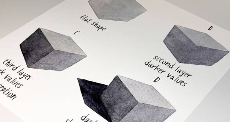
Artists express lightness or darkness as “values” (or tones). Stronger values are dark. Lighter values are bright…
By drawing shapes with the correct values, artists can create an illusion of three-dimensional space… On a flat sheet of paper!
But to draw or paint realistically, you need to be able to interpret light, shade, and shadow into a series of values.
This is where value scales become extremely useful…
What is a Value Scale in Art?
A value scale allows artists to understand and organize different shades from light to dark. It includes a graduated scale from the lightest value (white) to the darkest value (black) and various gray tones in between.
To simplify the concept of tonal values in art, scales are depicted in a grayscale format. Removing color from a scene makes it easier to see and evaluate values according to brightness.
Note: The terms “value” and “tone” are used interchangeably by artists. Also, value is independent of color, so it’s often easier to judge values in monochrome.
The Value Gradient
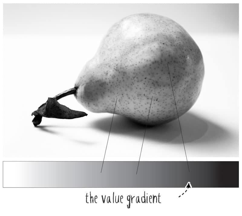
A value gradient shows a gradual transition of tones from light to dark. If you examine a black-and-white photo, you can place the value of anything in the scene somewhere along the gradient.
But the range of values in a black-and-white image can be overwhelming! The scope of possibilities is almost endless.
To “see” shapes of different tones, artists must simplify a subject even further…
The Value Scale
A value scale provides a “reduced” and easier-to-comprehend version of the value gradient.
Even when artists use a monochrome reference image, it can be tricky to differentiate between all the shades of gray.
By breaking down tones into a graduated scale with multiple steps, subjects can be categorized into a simple range of light and dark shapes. Furthermore, the contrast between each step on the scale is visible to the eye, providing a visual reference with differences in tone that are easier to observe.
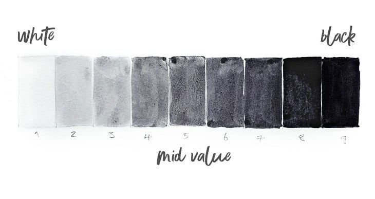
Denman Ross Nine-Step Scale:
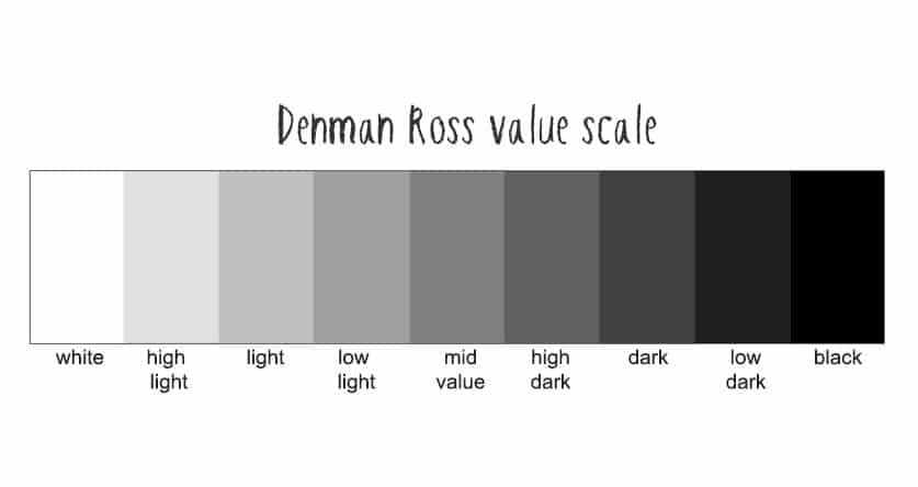
One of the most common value scales is the Denman Ross version. The nine-step graduated scale was introduced by this American painter at the beginning of the 20th century and is still used today by many artists.
This scale provides a wide range of shades which Ross labeled with the following terms:
- White
- High light
- Light
- Low light
- Mid value
- High dark
- Dark
- Low dark
- Black
Each step increases incrementally in tonal value but is still easily discernible to the eye.
The scale can be used to categorize shapes in a scene into simple-to-understand levels of brightness.
Munsell value scale:
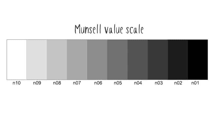
Another popular value scale you may come across stems from the Munsell color system.
Munsell developed a system based on three properties of color:
- Hue (color)
- Chroma (intensity or saturation)
- Value (lightness or darkness)
The Munsell version of the value scale typically includes 10 steps from white to black which are simply numbers 1 to 10 (zero refers to black, and ten refers to white).
Three-step value scale:
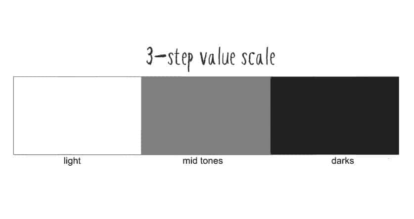
The simplest version of this tool is a three-step value scale:
In other words, black, white, and gray (light, dark, and mid-tones).
I think this is one of the best ways to start drawing and interpreting a subject!
To help you see tonnes more clearly, you can begin by separating what you see into three simple groups:
- light,
- mid-tones
- and darks.
From here, you can refine the tonal structure of your painting or drawing. Adding or removing shading to improve the realism of your artwork.
I begin many of my artworks like this. When sketching, for example, this is a great way to quickly create a feeling of three dimensions without going into detail. Some of my paintings are even made up of just three tonal values – highlights, mid-tones, and darker shapes of shade and shadow!
How do artists use value scales?
Scales like this are used as a way to simplify lightness and darkness. It’s a tool to help artists see and evaluate different values from light to dark without getting confused by an overabundance of shades.
Over time, using a value scale can help develop your ability to see accurate values.
Typically, artists use a value scale they have made themselves by drawing or painting onto a sheet of paper. Or sometimes, they opt for a commercially bought value finder like this (Amazon).
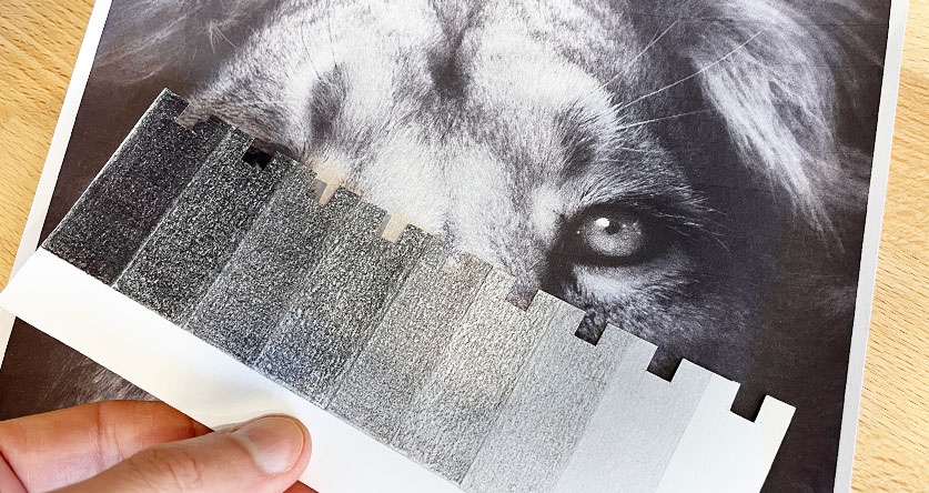
The Grayscale and value finder
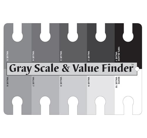
A gray scale value finder is a printed sheet with monochrome squares ranging in tonal value from black to white. (Amazon) They usually include ten shades of gray (as in the Munsell system).
Each gray shape includes a hole or a cut-out notch used to isolate a small part of a reference image.
How to use a value finder
- Select a part of the reference image.
- Place the holes over that part of the image.
- Move the value finder until you find the closest shade of gray.
Isolating small areas like this makes it easier to evaluate a shape’s brightness or darkness level.
Value Finder Apps
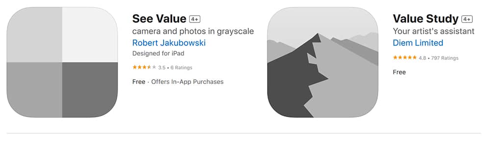
Want an easier way to see values?
Use your smartphone 🙂
Nowadays, you can find some very handy artist applications that quickly create the equivalent of a “value study.”
These apps automatically convert a photo or a camera view into a grayscale version, then break it down into a small range of values so you can see the brightness levels.
This is extremely useful! Especially for beginners when dealing with colored scenes that are more difficult to interpret.
I use these all the time 🙂
A couple of my favorite apps are the “See Value” and the “Value Study” apps.
How do you make a grayscale value finder for art?
There’s a significant advantage to making your own value finder. Commercial grayscale finders are acceptable, but they are printed using inks that don’t match your art medium.
If you draw in charcoal or use graphite pencils, you’ll get a much better visual match of values if you use your own supplies to make the value scale.
Here’s an example using graphite pencils… but you may find it helpful to make a different version for each art medium you use.
This can be quite a challenge to get right! But it’s excellent practice 🙂
Note: different mediums will have their own individual value range. For example, an HB pencil will have a lighter maximum tone than a soft 6B pencil, which produces darker marks.
How to make a Value Finder Step by Step:
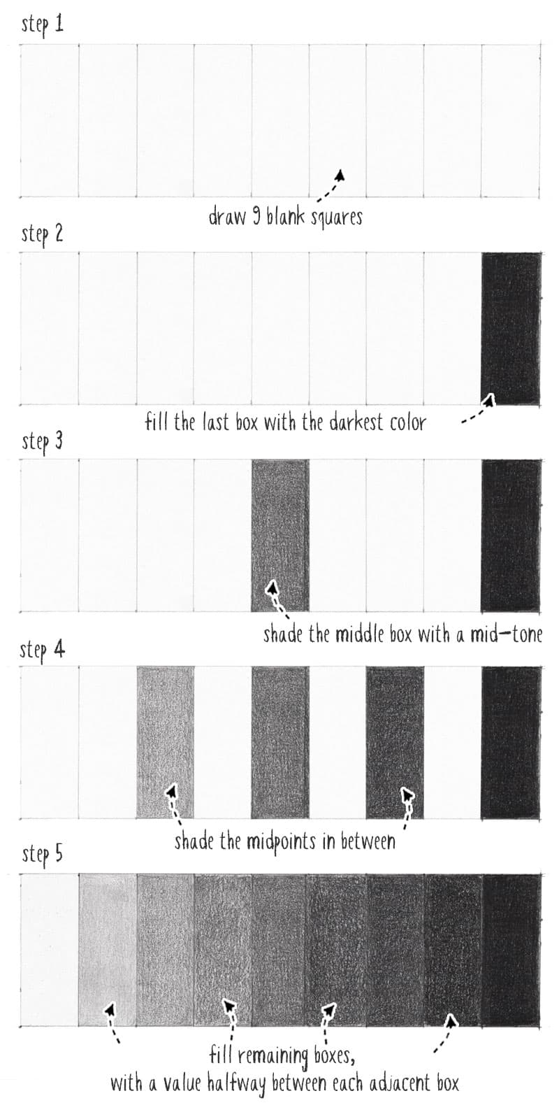
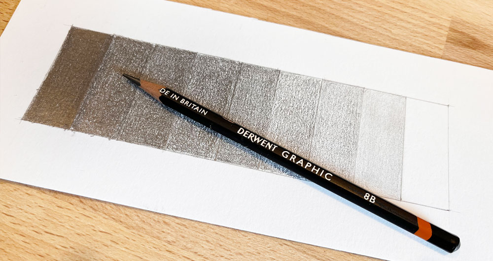
I used a sheet of smooth white vellum paper and an 8B graphite pencil for this handmade value finder.
- Draw an empty scale with 9 blank squares or rectangles (Denman Ross version). Use light pencil marks.
- Start with the extremities. Leave the white paper blank for the lightest tone. Then fill the last box with the darkest color your pencil can make.
- Now shade the center box with a mid-tone. Get as close as possible to a half-tone (It’s better to be too light than too dark! This can be adjusted later).
- Next, shade the midpoints between black & mid-tone and between mid-tone and white. Use very light pencil marks and build up the values slowly.
- Finally, fill in the remaining boxes, using a shading value halfway between each adjacent box. Do your best to make the shading as uniform as possible.
Working in stages like this makes the process more manageable – using side-by-side comparison helps hit the proper value strength.
Cut out your value finder, then cut some notches into each shaded box, in a similar way to a commercial grayscale finder.
Value scale worksheet
Below you can download a PDF worksheet for making your own value scale.
It includes a template that you can print out and draw directly onto if you’re using graphite or charcoal. Otherwise, use it as a traceable to transfer onto watercolor paper or other grounds. In addition, it includes step-by-step instructions for making a pencil value scale.
Get the grayscale and value finder pdf here…


I agree with Robyn. You are a master teacher and I sincerely appreciate your gifts and willingness to share them. Getting the right tones into my watercolors is a skill I continue to work on and your explanations have made it easier for me to see where I need to improve. Thank-so much.
Happy to help Kate 🙂
As always a clear and simple explanation and useful tips for beginners and more advanced students. Love this blog. Thanks Anthony.
Thanks Robyn!
Happy to help 🙂
Thank you!!
You’re welcome 🙂