Examples of Value in Art (A Visual Guide!)
The concept of value in art is better understood with a few visual examples.
After all, the definition in words can be tricky to understand.
Value (also known as tonal value or tones) is:
“the relative lightness or darkness of a color”.
Ok… Great!
A description like that doesn’t exactly help you visualize what value really means, and how to apply it to your artwork.
So… in this article I’ll go over a few concrete and graphic examples so you can better understand this tricky but VERY important principle.
What is an Example of Value in Art?
The most obvious example for the use of values in art is portraying a sense of volume and three-dimensional form: lighter tones are used to represent areas that are more illuminated, and darker values depict the shade and shadows. Values are also applied in landscape painting to create a sense of depth and distance: backgrounds use lighter values but darker tones are used for the foreground, thus creating an illusion of spatial distance. Values are also commonly used as a compositional tool in art to create mood and atmosphere. For instance, darker overall values generate a feeling of tension or gloom, whereas lighter tones are calm and uplifting.
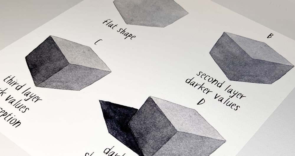
Example 1
Artists use values to create depth and a sense of three-dimensional form in their artwork. A better understanding and use of values can improve your artwork and help convey realism to your paintings and drawings.
Here’s a simple trick to show you how artists use value in art:
If you look at image A, all you see is a flat gray shape.
But in images B, and C I’ve added a component of value. Immediately your mind perceives this as a three dimensional cube.
Your brain is extremely good at interpreting light and shade into three-dimensional form. So despite the overall shape being the same, and you’re viewing this on a flat surface, the use of values tricks you into seeing this as a cube…
Image D: adding a darker shape to represent the cast shadow immediately grounds the volume and improves the painting’s 3-dimensionality.
So as you can see, one of the main reasons artists use values in art is to create an “illusion” of volume and realism.
Example 2
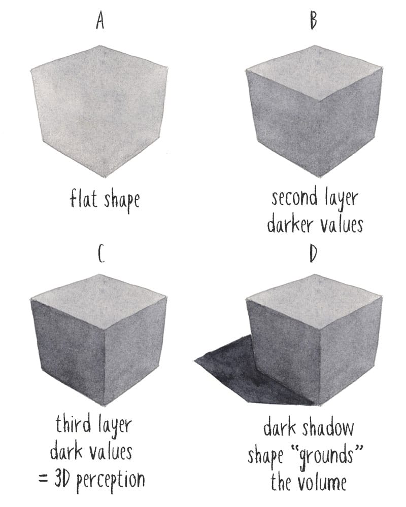
Perhaps one of the most familiar illustrations of value in art is in landscape painting.
Artists represent distance by using different values for the background, middle ground and foreground. Typically, background objects are depicted with the lightest values and the foreground uses the darkest tones.
This effect makes the furthest objects seem to recede into the distance and brings closer objects forward.
Applying values like this mirrors what we see in nature. Distant objects appear lighter because we see them through a thicker layer of atmosphere. The greater atmospheric haze between the viewer and the distant objects makes them appear to fade. As the landscape gets closer the effect of the atmosphere reduces, and objects look darker in value.
This is an art term referred to as “atmospheric perspective”.
In this simple landscape composition I built up the painting following this principle. The background is tainted as one large, light-toned shape. The middle ground mountain uses a slightly darker mix of paint. The mountain shape in the foreground and the nearest trees are both applied with the darkest values.
Even though the spades are relatively simple, the scene still reads as having depth of space.
Example 3
A more sophisticated example of values in art is when artists create feeling and atmosphere in their artwork. Different values have an effect on perceived mood in art.
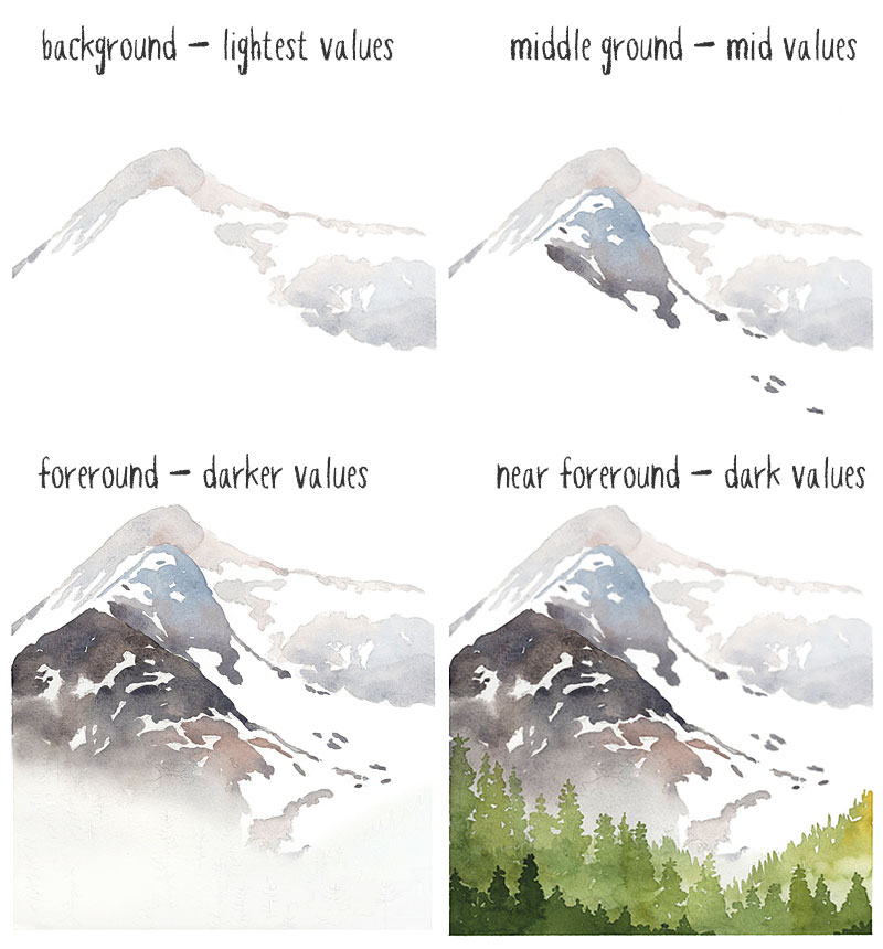
To do this there are three types of value structure that are commonly used:
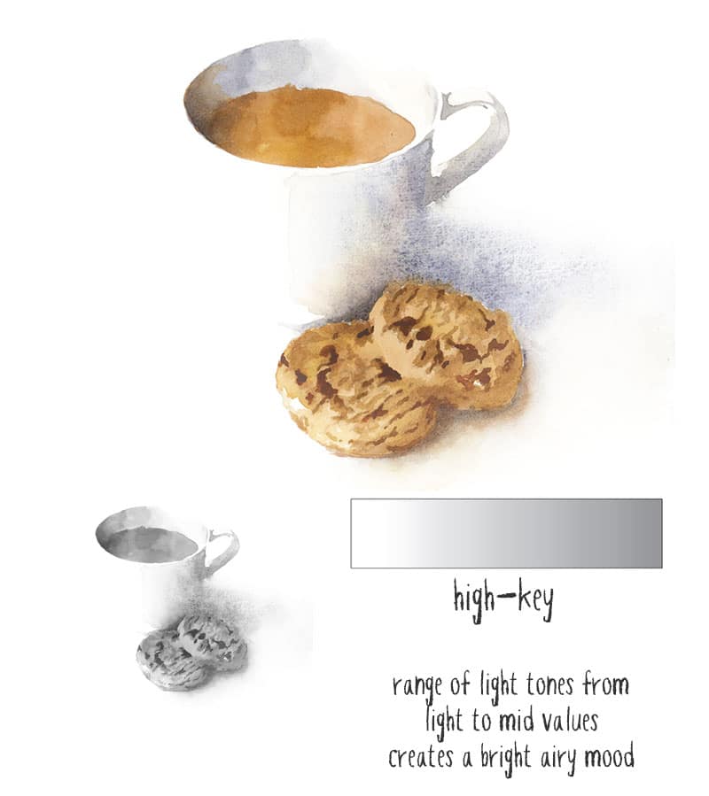
- high key
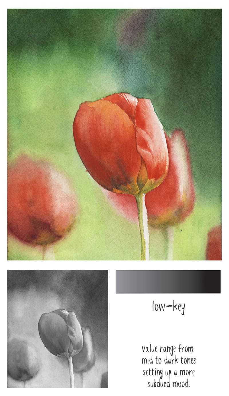
- low key
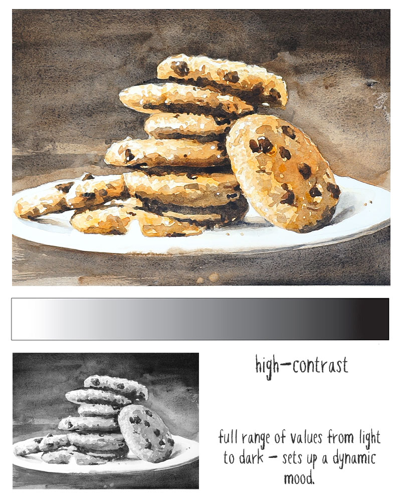
- high contrast
The terms “high” and “low” key refer to the predominant values in a scene. For example high key art uses mostly mid-to-light tones. On the other hand, low key artworks employ a range of values from mid-to-dark.
The term “high contrast” refers to artwork that uses a full range of values, from bright highlights to dark tones.
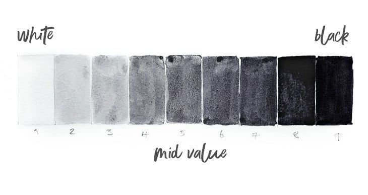
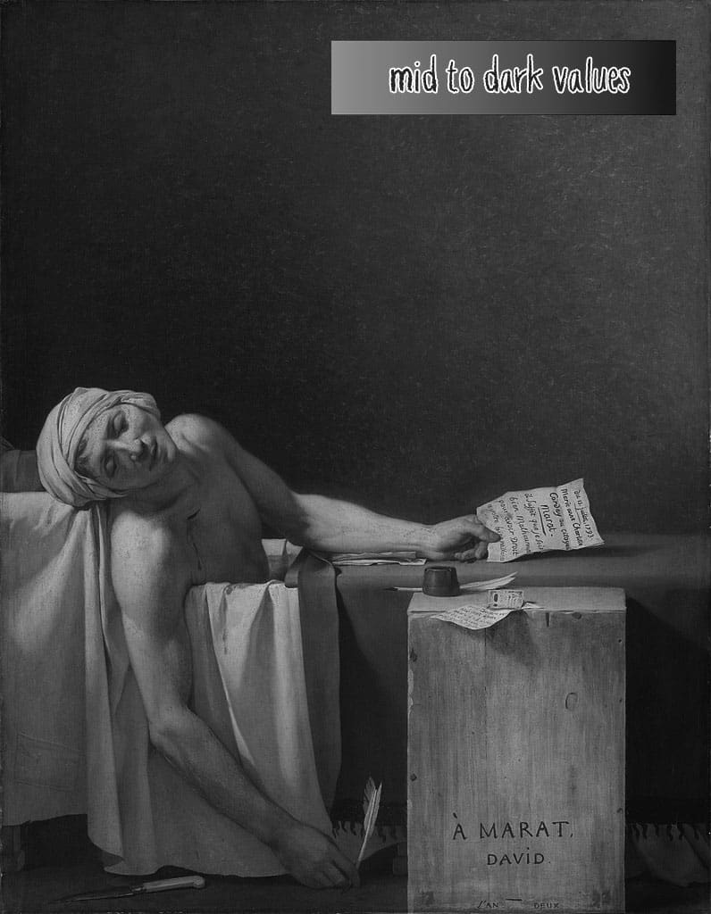
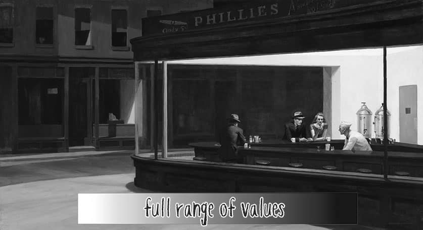
Note: artists typically use a value scale ranging from white to black to illustrate the concept of values. This diagram above shows the value structure that would be used in high-key, low-key, and high contrast paintings to create mood.
As a result, high-key art tends to have a soft, calm, lifting mood. They can also be bright and refreshing.
Low-key artworks provoke a more subdued feeling. They can be mysterious or even dramatic.
High contrast art can be quite dynamic, making use of the full range of values to create bold shifts from light to dark. They can have quite a striking effect.
Famous Historical Examples of Value in Art
Of course, there’s a vast range of work by many renowned artists that provide useful examples of values in art.
Here are a few select instances where the choice of value structure by the artist has a direct impact on the ambience of the artwork.
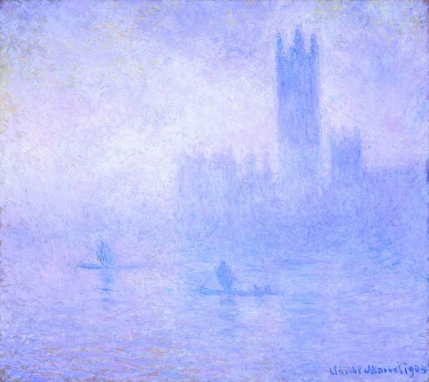
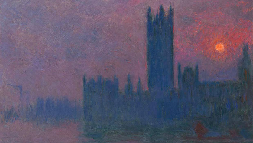
The founder of impressionist painting, Claude Monet, provides us with some excellent illustrations of high-key and low key value compositions. For example, between 1900- 1905 Monet painted a series of scenes of the houses of parliament in London. All of them were painted from the same viewpoint! But each one strives to develop a different mood through the varying use of color and value.
In this version, the use of high key values produces a soft dreamy appearance. You get the impression of a misty morning across the river Thames.
Whereas here, the low key tonal values create a more subdued and mysterious feeling to this sunset version.
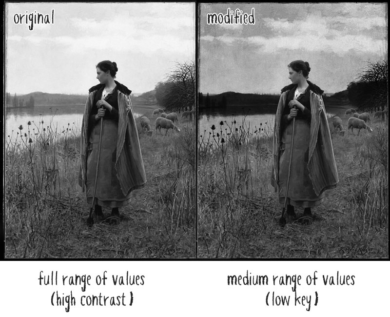
The artist Daniel Ridgway Knight made very good use of a full range of values in many of his painting compositions. (He was American born, studied at the École des Beaux-Arts, and lived most of his life near Paris).
For example in his painting “The Shepherdess of Rollebois” you can see a classic use of values for landscape paintings – the background is light toned and the middle and foreground objects progressively become darker as they get closer.
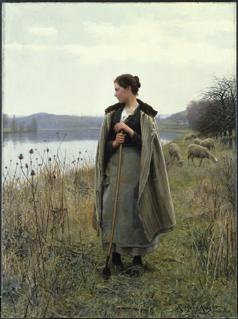
The subject (the Shepherdess) includes the darkest values in the painting. Because she is framed against a very light valued sky this sets up a focal point for the composition using contrasting light and dark hues.
Look what happens if we adjust the background and lower the contrast between the subject and its surroundings. I’m sure you’ll agree the result is less successful.
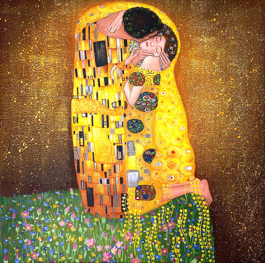
In this painting by Gustav Klimt, called “The Kiss”, we can see an extreme use of high range values. Klimt used gold leaf in his paintings. This makes the focal point of the painting (the embracing figures) stand out thanks to the contrasting background. Even in a reproduction the figures appear to glow!
The painting “The Death of Marat” by Jacques-Louis David employs a cold range of hues in mid to dark values.
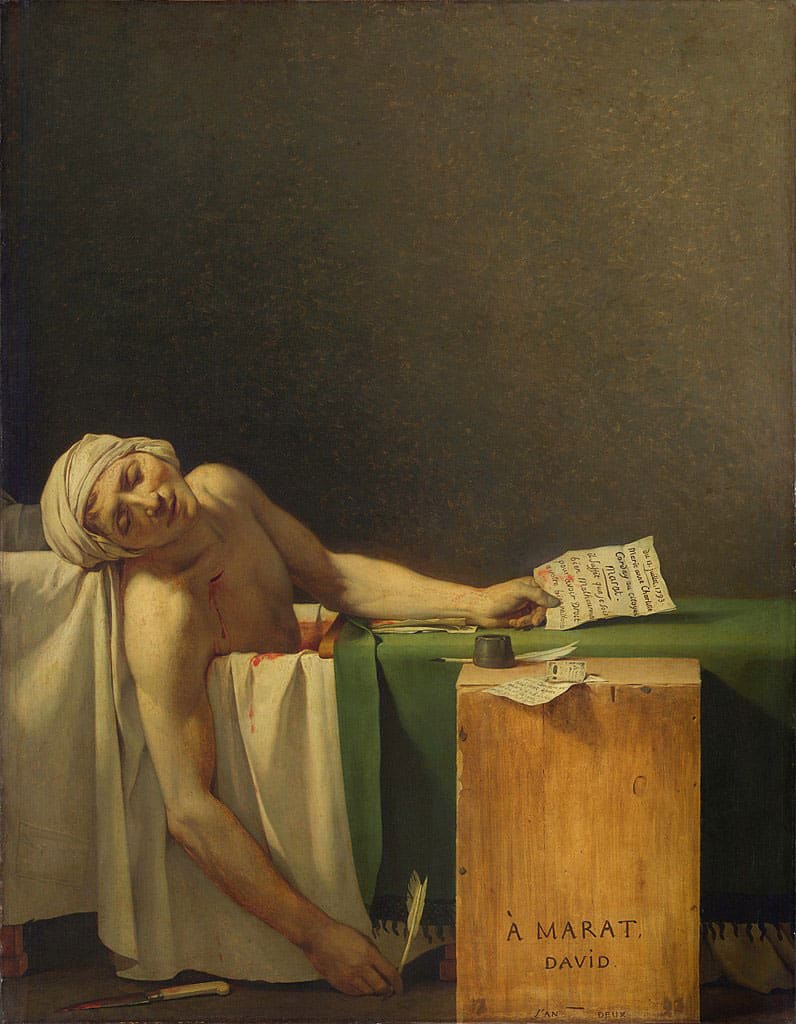
The result is fairly “low-key” but the artist makes good use of contrast to make the head and body of the figure stand out. The overall effect is muted, sober and solemn.
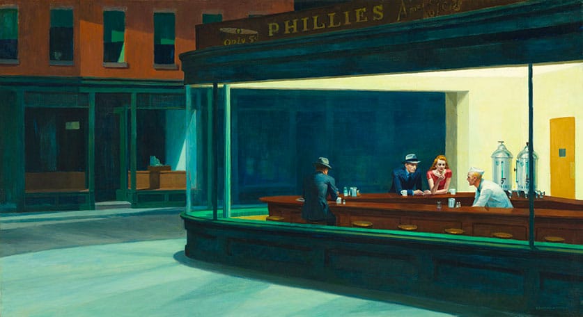
“Nighthawks” by Edward Hopper features a downtown diner interior at night. The use of a full range of contrasting values and sharp edges in the figures and architecture create a dynamic composition. This clever use of value structure draws the viewer’s eye to the interior.
Values in artworks not only help us perceive three-dimensions, but they are also a powerful compositional tool!
Next time you’re browsing a piece of art that you find attractive, think about how the artist employed values in their work, and how this effects the overall mood or the way your eye is directed around the composition.