
Watercolor Skin Tone Tutorial: How to Mix Realistic Flesh Colors
I have news for you… People’s skin is never just one color. Unfortunately, you can’t just mix one generic skin color and paint the whole of someone’s face, and there isn’t just one magic color which suits all situations. The tone of someone’s flesh varies enormously, and depicting this realistically in watercolor needs a basic understanding of color mixing and light. But surprisingly, mixing watercolor skin tones is not that difficult!
So how do you mix realistic skin tones in watercolor? Begin by finding the local color you want to mix, which is generally some variation of orange. With this information and the proper mixing method you can create any kind of flesh hue. To paint the shaded parts of skin, look closely to identify the correct tonal values, and use a complementary color to tone down your color mixes.
There is no right and wrong way to mix skin tones. But flesh colors do have some common color characteristics, which means that with the right approach and a few basic mixing recipes you can be up and painting faces in a flash!

Painting Realistic Watercolor Skin Tones
Whatever subject I’m painting, whether it’s a portrait or a landscape or a still life, I often refer back to the same basic principles of painting in watercolors. Those two basics are color mixing and values. If you can work these things out then the rest of the painting falls into place relatively easily. Funnily enough, your technique is much less important.
This is why I’m fascinated by color mixing, and probably why I talk about values all the time.
Very often you’ll hear artists talk about values or tones. Both these terms mean the same thing which is basically the darkness or lightness of any particular hue. When I first started painting I completely ignored values! I wasn’t aware how they could make such a big impact on my artwork. If you get the values of your painting just right, you can create a much more realistic interpretation of your subject.
So with this in mind, I find that the best approach for mixing good skin colors for my paintings is as follows:
- Identify the local color
- Use the right mixing method
- Determine the correct tonal value.
The local color of flesh
A good starting point for painting skin is to ask “what is the local color of flesh”?
Local color is the innate color of an object, and it’s the way we tend to describe the generic color of the things around us. For example, the sky is “blue”, and an orange is… well… “orange”! You get the idea…
Most of the time the local color of skin could be described as orange in hue, which has a warm color temperature.
But the color of skin is influenced by many other factors and in particular by lighting. The local color will be modified depending on whether the subject is in light or shadow. And the color of the shaded parts aren’t always just a dark version of the local color. In fact in natural lighting, shadows will have a cool color appearance compared to the areas in light.

So to create realistic skin tones, you can start by identifying the local color, and then create variations of this color to match the light and dark tones of your subject.
But what methods can you use to do this?
Skin Tone Mixing Method
A very useful tool for estimating which colors to mix is a watercolor color wheel(this works whatever subject your painting). If you’ve never painted one of these then it can be a very useful exercise for getting to know your paints.
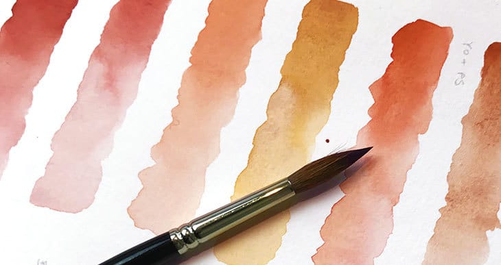
It’s fairly easy to find your starting point for mixing skin tones using this device. If you take a look at a color wheel you can begin to see that most flesh colors are going to fall somewhere in the range of the orange hues. As you know this warm hue results from some kind of mix of red and yellow.

So this is the fundamental starting point for any skin tone.
You can start your color mixing by combining different yellows and reds, or even browns (which are essentially very dark reds). Use a test sheet to see the results on paper.
Some parts of your painting might include some nice vivid colors, but others will have very light toned pinks, yellows, browns and oranges. In watercolor painting you have a few useful methods for achieving this variation.
To lighten the tone of a color do the following:
- Because watercolor is a transparent medium, to make lighter tones you just add water to your color mixture. A diluted puddle of paint is light toned because the white paper shows through to provide the white part of the color.
To tone down a color or increase it’s value you can do one of these two options:
- To creates strong bright valued colors we do the opposite and make a thick mix of paint.
- To tone down any color in watercolor you just add some of its complementary color
Take another look at the color wheel. A complementary color is any color which is on the opposite side of the color wheel. In our particular case, the complement of orange is a cool blue.

This means that once you have selected a base color for skin, you simply use different concentrations of that color. Then, once you move into the shaded or shadow parts of the subject, you will need to darken the tones further, and this is best done by adding a complementary color.
Your color wheel is a useful tool to keep handy to help you with this mixing process.
When painting a portrait for example you want to add depth to your paintings with a full range of values and interesting colors. Mixing flesh tones in this three step process:
- Begin by mixing a local color.
- Vary the proportions to achieve a basic skin hue.
- Dilute the mixture to get a range of all the possible values from that mixture.
- To darken the tones further add a small amount of complementary blue.

There you go! You’re now a skin tone mixing expert.
Judging Skin Values
A color wheel is excellent for helping to mix colors, but there’s another good tip you can try to help you judge the values of your subject. Correct values, or the lightness and darkness of the shapes you paint, will make a big difference to the success of your painting.
An artist’s viewfinder is a great device to help you assess the correct values to paint. A viewfinder simply isolates a small part of your subject so you can better judge the value of any one part. This works whether your working from real life or a reference photo.
You can make viewfinders quite easily from a piece of old watercolor paper with a hole cut into it. Alternatively, I really like this composition finder which also includes a handy grayscale value chart (check the reviews on Amazon).

Watercolor Skin Tone Mixing Recipes
Let’s look at some real examples and a few mixing recipes to make quick realistic looking skin.
There’s more than one way to achieve the same hue. And it will largely depend on the palette of colors that you have available to you. You can use a whole range of analogous colors (colors which are close to each other on the color wheel) to mix your “orange” skin color. So just pick any warm or cool yellows, reds, and browns. The following are some typical combinations of colors that tend to produce good flesh hues.
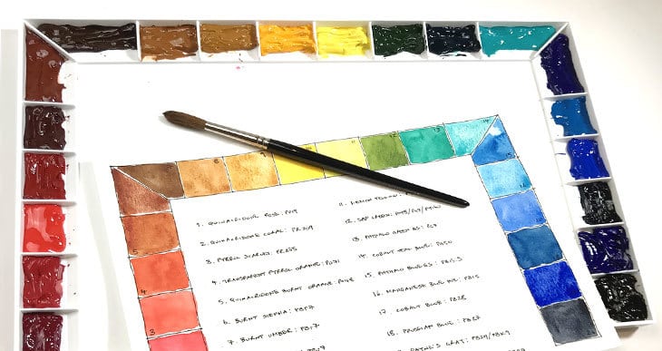
Just a quick note about the following mixing chart. I use Daniel Smith watercolors because I love their handling properties and I find the colors to be very vibrant. So the paint names below refer to that range of watercolors. (I’ve included links to Amazon for some of the paint colors which I think are the most important).
Yellow ochre is one of the most popular colors in a skin tone mixing palette. Mixed with various reds such as Pyrrol Scarlet, Pyrrol Crimson, Burnt Sienna, and Burnt Umber. I also often use Hansa Yellow Deep, Raw Sienna and especially Quinacridone Rose(love that color)!
For toning down you can use a complementary cool blue color such as Phthalo Blue (GS), Cobalt Blue, or sometimes just Paynes Gray.
Whatever you do, don’t add Chinese white to lighten your tones. Just dilute your paint mix. I find Chinese white give a chalky appearance to the final paintings.


A link to my Patreon membership where you can get ad-free video tutorials, plus other exclusive bonuses that I only share with members of my Patreon channel. Follow the link to find out more...
Skin Tone Techniques and Painting Tutorial
Glazing is my favorite technique for painting this kind of subject. You can build up your image little by little, starting with the lightest tones. Just by adding multiple layers of color you can add depth and interesting texture to your work.

Let your imagination run free! You can also exaggerate and push color saturations beyond what would be realistic and get some very creative results!
Phew!
Now congratulate yourself for being a devoted artist and a skillful skin tone mixer!


This is exactly what I was looking for. I appreciate that, rather than fancy “designer” colors or sets, you used standard Daniel Smith colors in your skin tone mixes (refreshing!). Also, your writing is clear, concise, and augmented with helpful visuals–I couldn’t ask for more. Thank you for sharing your knowledge so simply and generously!
Happy to help Sara 🙂
Thank you. Such great information. Inspirational!!
Thanks Robbie 🙂
Thank you for the detailed information and examples of different mixes. This article was so helpful!
Thank you so much from a Thailand . This tutorial is very helpful. Greatly appreciated!
So helpful!!
Thank you! Finally detailed info. Greatly appreciated!
Very informative I hope I can follow through on it
Very helpful tutorial. Love from India.
Hi Anthony
I just discovered your blogs. They are excellent. I am new to watercolors and I must be a slow learner. I have had trouble with skin tones. Your blog is so straight forward and helpful. Thank you for your help.
Happy to help Susan
Have fun with your watercolors !
Hi Anthony
Thank you very much for the informative and easy to follow information on your “blog”
I had been struggling with “skin” colour mixing as a beginner who is about to turn 80 – never too old to learn.
Thank you
Hi Bob – Nice to know the article came in handy ! You’re absolutely right ! Enjoy your watercolors 🙂
Thanks so much, it’s very helpful for me as i’m a beginer??
Thankyou for such clear detailed instruction.
So appreciate you sharing your knowledge.
Thanks for all the tutorials in this. I’m going on 78 this year and have always sketched scenes and portraits pencil and ink. I quit about 40 years ago and i am ready to get back doing art in water colors. Thank you for the great reads and pictures. Vick Tucker
Thanks Vick!
Enjoy your watercolors 🙂
This has been so helpful thank you! I’m new to portrait painting and skin tones can be challenging.
i am a rather experienced artist and still love simple straight forward instructions like yours. Why make it any more complicated? Complication doesn’t make better art!
April
Wow.Your breakdown was concise.Looked at some how to sites but yours was excellent. Will be trying these on my first nude painting.
I looked at several explanations that were just way too advanced and complicated for me to understand. Thank goodness I found this as it is simple, complete, and will allow me to get started. You don’t assume that we know the basics, rather you start at the very beginning and teach us in incremental steps how to do it. Excellent explanation.
Thanks Jeannie – glad it came in useful
WOW! Love your teaching method. It is easy to understand what I did not realize I needed to know, Haven you written any books we can buy?
Hi Wilma – thanks for your kind comments!
What a great lesson!! I vote you teacher of the year!
Gisele
Very generous of you Gisele 🙂
Respected sir,
Ur blog is very informative for the beginners like us. Thanks a lot.
Thanks lots.
I’m Live in Thailand.
I’m glad to read.
It’s very nice to read this blogs of your,I found it very helpful for me as s beginners in watercolour, thanks for this easy tutorial ☺.
Glad you enjoyed the tutorial Rissa!
I’m another first timer at painting with watercolor or any other paint medium but one thing on my bucket wish list. Your instruction is so on point using visual instruction along with your clear word instructions to make the process less intimidating for someone taking the leap. I probably will not start with skin tones but thank you for this knowledge and help. Keep up the good work
Thank you Sally – great to know you’re getting started with watercolors!
Do you have YouTube I can follow? I love your skin recipes!
Hi Kerry – glad they came in handy! Sorry no Youtube… maybe sometime in the future…
Hi Anthony.
Thankyou so much for clear concise tutorials. I’m in my 70’s and about to attempt watercolour for the first time and have found your instructions very helpful.
Valerie UK
You’re very welcome Valerie…
Yes! Finally someone who actually breaks it down. Wonderful information, can’t wait to take my work to the next level. Thank you!
Glad it was useful Rebecca!
Thank you so much for clear, simple and enthusiastic instructions! Your site is fun, encouraging and informative
No problem Bonnie – keep on painting!