Monochrome Watercolor Painting: Tutorial & Techniques for Beginners
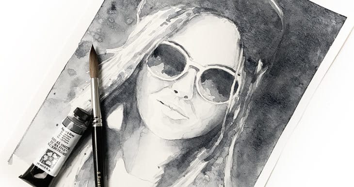
Painting watercolors in monochrome sounds pretty boring… Right? After all, your just painting with one single color. Where’s the fun in that? But what if I told you that this kind of painting is an excellent exercise for improving your watercolor skills, and a very useful tool for analysing a subject you want to paint.
So what is monochrome painting in watercolor? Painting in monochrome means painting in only one hue. The artwork is limited to light and dark, which forces the artist to focus on the important tonal values of the composition. Use of a single color also creates monochromatic color harmony. In watercolors the light values must come from the paper, and dark values can be added with successive layers of paint.
Painting in monochrome is an excellent exercise for anyone beginning in watercolor. Why? Because by removing the color from your work, you have to focus on the other key elements of painting: in particular tonal values and technique.
Monochrome Painting in Watercolor
The word monochrome originates from ancient Greek, meaning “having one color”. Monochromatic paintings are therefore limited to a single hue. The entire painting is executed in varying shades of a single color, ranging from dark to light.

Tonal values with monochrome painting
Painting in monochrome with watercolors brings focus to some of the important properties of this medium. Watercolor is a transparent art medium which means the white paper surface contributes to the final color appearance. To achieve a very light grey you need to apply very diluted paint. A common technique among watercolor artists is to build up the tonal values(levels of darkness) by applying successive layers of washes on top of each other. The more layers of paint you lay down, the darker the appearance. This is an important watercolor technique known as glazing(Yeah… I know. Artists like to use fancy vocabulary from time to time).
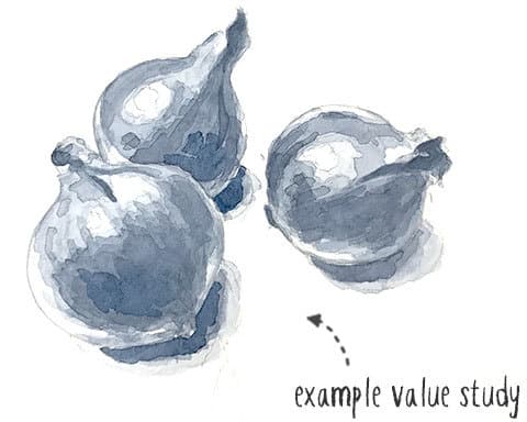
In most other mediums, dark colors are achieved by adding black, and light colors by adding white. In watercolors this isn’t the case. The white comes from the paper, and the artist must learn to control the strength of the paint on the brush to control lightness and darkness.
Technique with monochrome painting
Another attribute of watercolors is that pigments flow in sometimes unpredictable ways (which in my opinion also adds to the beauty of this kind of painting). Because of the transparency of watercolors, brush strokes, drips, and dried edges show up dramatically. Controlling water and control over brush strokes is a fundamental skill in watercolor art. The better your control, the better your watercolor techniques.
Monochrome painting shows up your technique and accentuates brush marks and water flow, so it’s great practice for improving your skills.
Monochromatic color harmony
You can’t get any more simple than a monochromatic color scheme. Sometimes, if you don’t plan the colors of your painting you can end up with an unhappy result and colors that clash with each other. With a monochrome color scheme you’re guaranteed that the result will be harmonious because it’s impossible to have any conflict of color! You can’t make a mistake with just one color! The interest in this kind of painting comes from the levels of contrast created by the values you choose to paint. The result produces monochromatic harmony.
Monochrome Watercolor Value Studies
Value is a fancy way of talking about the lightness or darkness in a painting, the darkest value being black, and the lightest value being white. The term “value” is also known as tone or tonal value. Value is an important concept to understand in art. In fact values are more important than color in your artwork!
If you can faithfully reproduce the values of a subject you can produce a believable sense of three-dimensional space and light. Scrutinizing the values of your subject is a good place to start any painting. Indeed, many artists begin a piece of work by making a value study. This is a kind of sketch which focuses on the light and dark tones in the painting.
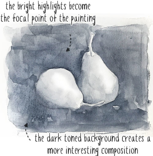
Note that values don’t have to represent the exact same tones of your subject. This is where things get interesting! Manipulating values is an artistic tool often used to improve the composition of a painting. Making tones lighter or darker than they are in reality can help create depth and interesting focal points in a composition. The human eye is naturally drawn to the lightest part of an image. By exploiting this knowledge you can use values to generate more interesting and dramatic artistic results.
Why paint in Monochrome?
Judging the apparent value of colors is difficult. It’s a skill which can take some effort to master. Especially when a subject contains a wide range of colors. Brighter hues such as yellow and orange in particular are difficult to judge.
It’s important to understand that value is independent of hue. For example, if you compare the color yellow and the color purple at the same value, we tend to interpret yellow as “lighter” because of the brightness of this hue. Judging values is important for artists, and monochrome painting helps you learn this skill.
I’ve heard it said that art is like a blend of shapes, values, edges, and color. Remove the color and you have one less thing to worry about! Monochrome painting has a range of benefits:
- Makes the painting process simpler by removing the worry about color. You don’t need to fret about color mixing or color theory. Or choosing a color scheme.
- It’s a good exercise to become familiar with how to produce different values. You learn how much water to use to achieve a desired tonal value.
- Can be used for dramatic effect. You can create focal points and improve compositions. Monochrome painting reinforces your compositional skills. For example you can use dark colors that come forward in the picture, and the eye is attracted to lightest part of the composition.
- Can be used for value studies in initial sketches, confirming ideas about tones.
- Creates a harmonious result. There’s no color conflict.
- Great for studying light and shadows.
- Improves familiarity with layering and watercolor glazing technique. It’s easier to see the glazing process from light to dark in monochrome.
What kind of watercolor paint to use for monochrome watercolors
Probably the most popular type of monochromatic painting uses black paint. Another artistic word for this technique is “Grisaille”. Basically the artist is limited to different shades of grey, and nothing else, to interpret the subject of a painting.
Renaissance artists were often trained to draw in monochrome. A fully colored painting places a lot of demands on an artist. Eliminate the color and you simplify the process. Apparently, the artist Paul Klee struggled with color in the early part of his career and for a while painted exclusively in black and white.
Technically you could choose any color you like to paint in monochrome. But some colors work better than others. Judging value in black and white however is much easier! I like to work with an unsaturated or nearly unsaturated paint such as black and grey. Paints such as Neutral Tint, Paynes Gray, or Indigo are excellent choices for monochrome studies.
Begin with a Monochrome Value Scale
A typical device used by artists to help judge values is a value scale. It helps the artist recognize light, mid-tones, and dark values more easily. The 9 step value chart below is commonly painted by watercolorists as an exercise in value control (this is known as the Denman Ross value scale). It’s a good idea to begin by painting this value scale. You will learn the proportion of water and pigment needed to produce the required level of lightness or darkness.

Monochrome Watercolor Portrait Tutorial
If you’re a beginner then working with a subject which is complex and full of color can be frustrating. I think it’s a great idea to first learn to paint simple subjects before moving on to more difficult projects. Monochrome watercolor painting is a great way to practice watercolor before moving to more difficult subjects. One of the first things you should try to achieve is how to paint dark, medium and light values.
This is an example of a fairly easy portrait subject. It will help you get to grips with the fundamentals of light, shadow, and tonal values, and also some ideas about composition. It’s just dark and light which makes it pretty easy.
You’ll be using a glazing technique for this painting. Start with diluted gray paint and build up the darkness of the image with successive layers. While painting, try to match values that you see. The idea is to learn how to simplify the subject. I recommend painting very lightly to begin with and continue building up layers. Use as many as you like. At first it’s easier to work light to dark rather than dark to light.
To paint this picture I used a photo which I turned into a grayscale version using Photoshop. This is a good trick you can use on any subject you want to paint.

I began by sketching the portrait with a HB pencil onto 140lb / 300gsm watercolor paper. I generally don’t use paper that’s thinner than this. You can download the template for this portrait here so you can trace it yourself. Get yourself a large brush and some dark paint. I used Payne’s gray for this project.
Start painting with a light gray wash into the main shadow areas of the portrait. You can blend some edges so they are soft, or leave certain edges hard. Because we’re building up the portrait in layers I find it all adds to the aesthetic appeal of the final result.
The sunglasses and the hat are the darkest elements of the image. The hair also adds darkness and shadow to the portrait. I painted these next. I’ve also started splashing some paint around the bottom of the hair for added texture.
Let the paint dry each time before adding more paint and darkening different parts of the portrait. Even using a light or mid-gray diluted paint, by building up layers in this way you increase the darkness of the final appearance. This is the technique known as glazing.
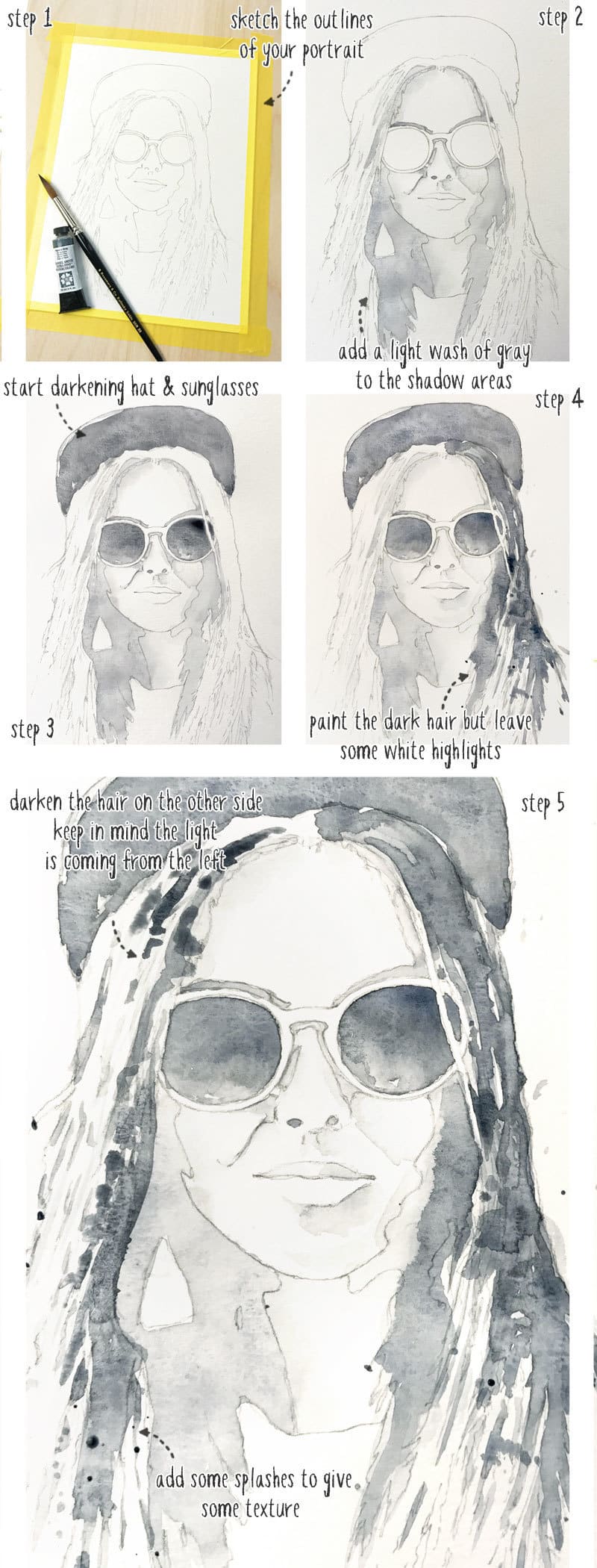
The differences in the next series of steps is more subtle. Each time I’m just painting things where i think the tones need reinforcing, then letting the paint dry, then adding another layer of gray. It’s important to let the paint dry between each glaze.
You have to train your eye to see not the whole, but the individual shapes and the different values of those shapes. Don’t worry too much about blending. Pay attention to shapes. Working in monochrome makes this exercise much easier.
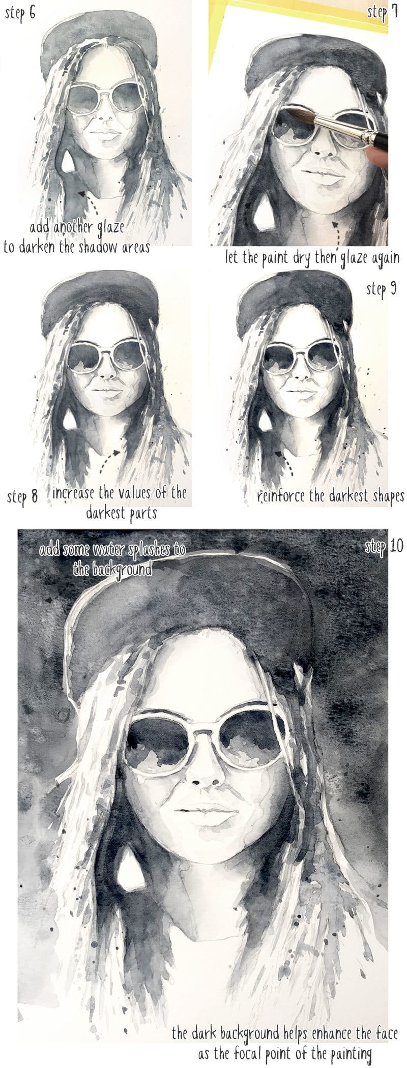
In the final step I painted the background with a dark gray tone. This is similar to the pear sketch example above. It’s a compositional device used to emphasize the lighter part of the painting, in this case, the face in the center. While the background paint was still damp, I also dripped and splashed some clean water onto the surface. This adds small blooms which add interesting texture to the finished work.
All done? Okay… Now go wash your brushes!



Great article. I’m starting a monochrome watercolor tomorrow.
I love your tutorials. Your direction makes so much sense. Thank You.
Thanks Lisa 🙂
I used Prussian Blue and love it! Thank you!
Me too Deborah !
Looking forward to learning a lot!
Thank you for the useful information. I absorbed it all like a sponge. The explanation about values, glazing was all new to be , as I am a new watercolor painter with no artistic experience. The Denman Ross value scale was a big help. It gave me structure and helped me create the range of colors I set the goal for. The template for the portrait was a huge help.This was the first time I felt as if I might be able to paint something. Thank you very much!
Thanks Jennifer – glad it was useful & happy it got you painting!