
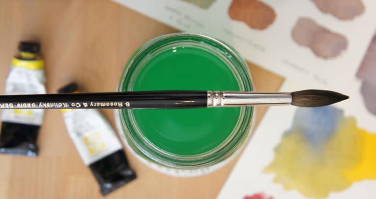
Watercolor Bowl Still Life Painting (Do This In 4 Steps!)
This demonstration is a simple still life sketch of a bowl painted in watercolor.
I enjoy still life paintings of everyday objects. They’re easy and quick to set up in any environment. And I think painting isolated objects like this is a great way to practice and improve your skills without being overwhelmed by the subject.
For example, you don’t need to add a complex background, and the objects themselves can be as basic or elaborate as you like!
I also want to point out how this painting can be broken down into just 4 fundamental steps! I think deconstructing the painting process like this is a useful way to show how the painting is built up.
As usual if you’d like to try this painting for yourself you’ll find a worksheet with the traceable outline here:
Try this painting for yourself ! Click the button below to download the worksheet for this painting.
Step by Step Watercolor Bowl Painting
Despite being very simple, there are a couple of things worth noting about this particular subject…
Composition Elements
I chose a bowl with a repeating pattern. This has an interesting advantage. Patterned objects make it easier to create an illusion of depth.
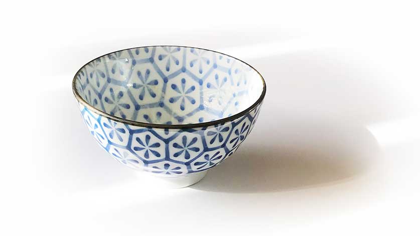
When you observe the bowl from a fixed viewpoint, the pattern appears to change and warp across the surface. In other words, when you transfer the bowl’s pattern onto a flat sheet of paper, the shapes you draw are following the direction of the curved surface.
Our eye then naturally interprets these shapes and creates the perception of three-dimensional form.
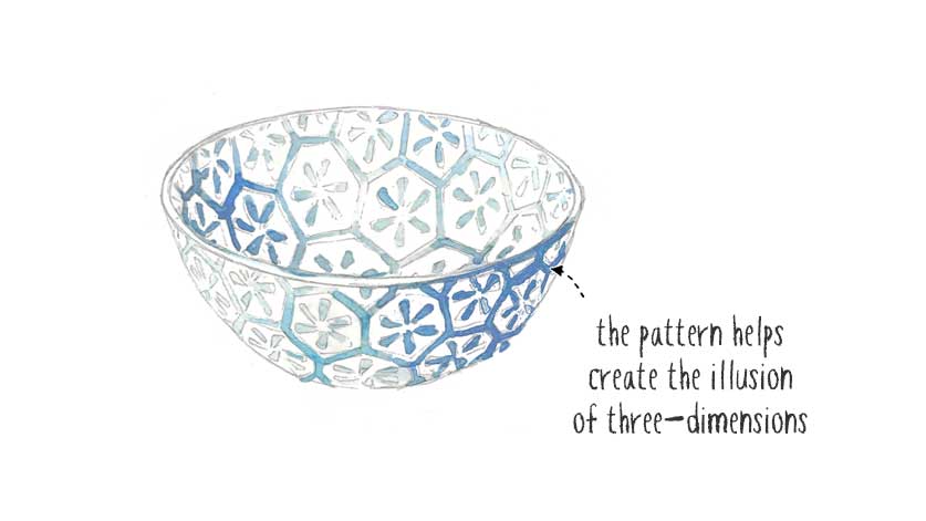
Imagine this in comparison with a bowl without a pattern. You’d need to work harder to make your shading, shadows, and values correct in order to create a three-dimensional effect.
Second, this watercolor demonstrates the notion of “underpainting”.
Without getting into too much detail, underpainting in watercolor is about laying down an initial foundation of color before building up the rest of the painting.
And because watercolors are transparent the “underpainting” shows through and influences the final color appearance of your artwork.
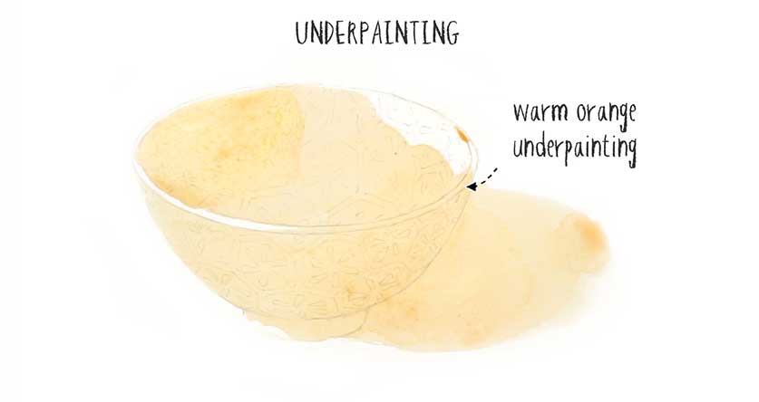
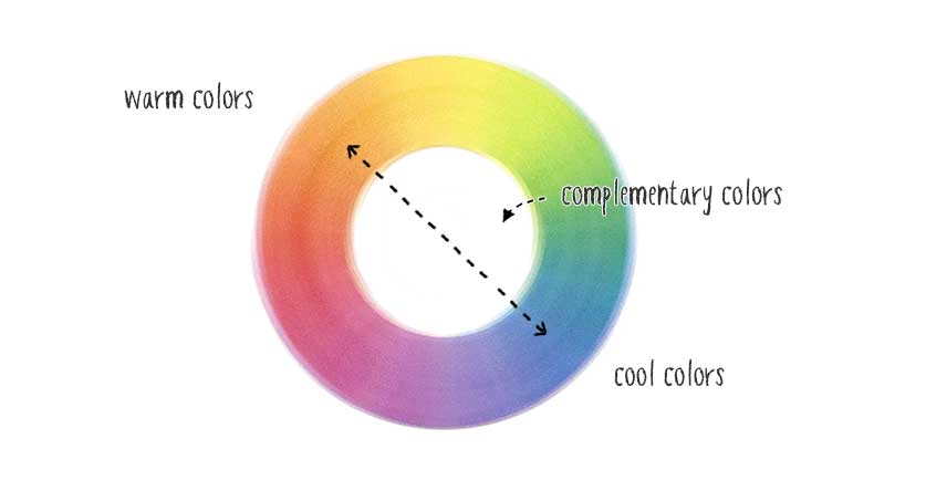
So, for the underpainting of the bowl I deliberately choose a warm orange color. Now… The bowl in the original reference scene is a cool blue! But by choosing to paint a warm color first I knew it would create a more luminous effect for the final result.
Also, blue is the complement of orange. Complementary colors tend to set up a more dynamic and interesting composition. And when you mix opposing compliments like orange and blue, they neutralize each other. In this way, overpainting with blue would create a rich array of colored shading and neutral grays!
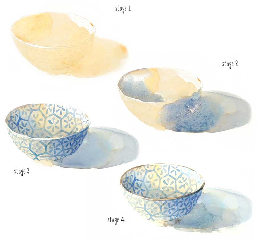
Ok, so before I show the detailed step by step process for this painting, let’s break it down into a few basic stages.
- After the sketch is transferred to the paper, I begin with the orange underpainting.
- Then I painted the shading and shadows using a blue-gray mixture.
- On top of this I painted the pattern.
- Finally I added the dark lip of the bowl, and reinforced the shadows inside and underneath the bowl.
Just 4 basic steps were needed to create what is a relatively convincing result 🙂
These are the broad steps to keep in mind if you want to try this painting for yourself…
The Step by Step Painting Process
So let’s get started…
The first thing I did was transfer the reference photo onto a sheet of watercolor paper. Many of you have asked me exactly how I do this, and I always use a lightbox. (Amazon)
In my opinion, this is the best way to transfer an image onto the sheet. I find other methods like graphite transfer paper tend to be messy and leave smudges on the paper.
Tape down the sheet onto a flat board with masking tape, then make a fairly diluted mixture of orange paint for the underpainting.
I begin by painting the interior of the bowl, being careful not to paint the bowl’s lip. I’m leaving the white paper to show through to create highlights.
Continue painting the rest of the bowl, and extend the underpainting to include the shadow shape on the right. You can see that the only place I did paint the lip of the bowl was on the shadow side.
To reinforce the tonal value on the shaded interior of the bowl you can see me add a few extra brushstrokes of paint.
Next I started adding shading and shadows to the bowl to begin creating depth. I used a dark blue for this step.
Keep in mind that the orange underpainting influences the final color appearance. Because orange and blue are complementary colors, they neutralize each other to create a darker mixture on the paper.
While this new layer of paint was still wet I started charging-in a more saturated blue color – “charging-in” is a watercolor term used for when you dab paint into a wet wash of color. I’m doing this to deepen the tonal values and extend the shadow shapes inside the bowl.
At this stage the paint is still fairly damp. This will help create a mixture of soft and hard edges depending on the wetness of the underlying wash. Because I haven’t waited for the paper to dry, you’ll even see some backruns or blooms developing in the painting. I don’t mind this effect because I think it adds some interesting textures.
I let this layer completely dry before moving on to the next stage.
Watercolor always dries lighter in appearance than while you’re painting. So the next step is to add a glaze of paint to darken the shadow shapes. I used a neutral blue color for the shadows on the outside surface, and a neutral brown color to deepen the shading inside the bowl.
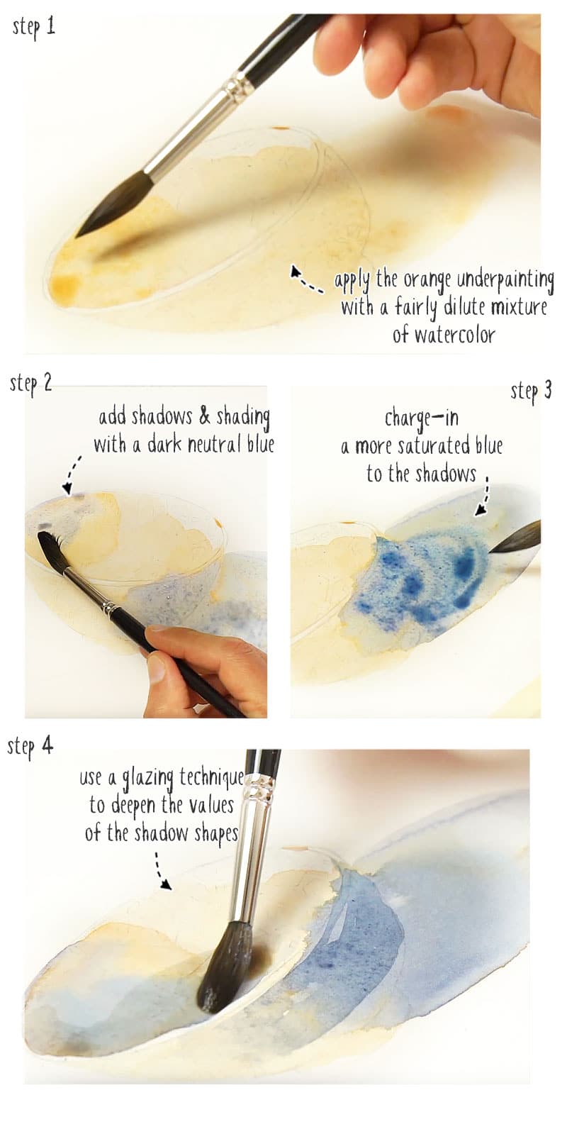
Leave the paper surface to dry again before moving on.
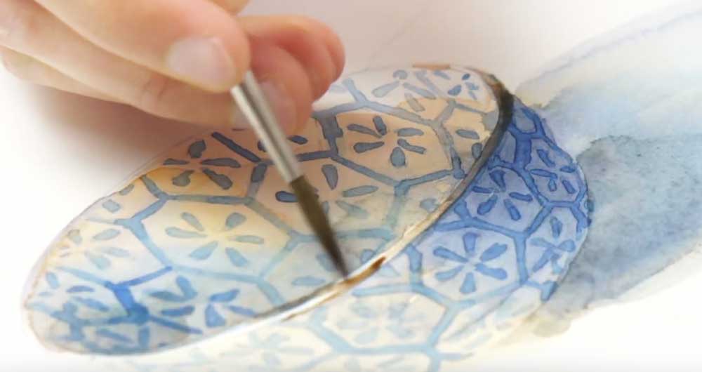
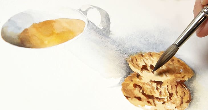
Next comes the fun part of adding the pattern to the bowl. This part really starts to bring out the three-dimensional aspect of the subject. I think this takes the painting from something that has simple shading, to something that starts to pop out of the page.
Notice that I changed my brush to a small round brush for painting these details. I’m using a more saturated blue color. But also I’m changing the strength of my paint mixture depending on the area of the bowl that I’m working on.
For example, the inside surface of the bowl that is turned towards the light was painted with a light colored, diluted blue mixture. This area is drenched in light so it needs to have a bright appearance, almost as if it was “overexposed”. But on the shaded side I used a darker, less diluted mixture of paint. The stronger color is in keeping with the darker tonal values needed for this part of the painting. This trick will reinforce the three-dimensional effect of the finished watercolor.
When the pattern is finished, leave everything to dry again.
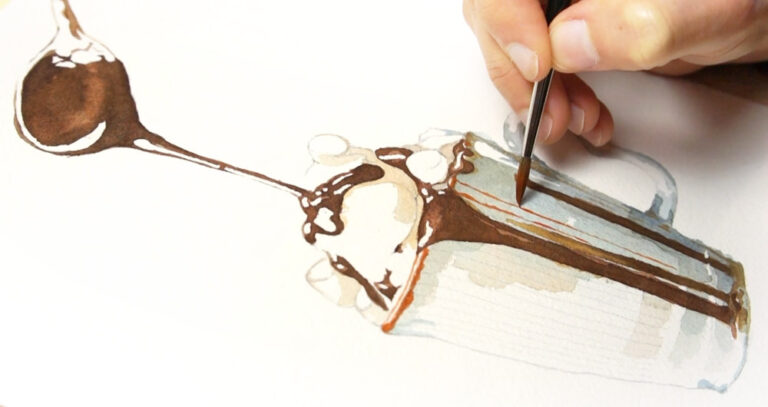
The final step is to add some cast shadows. Creating a wider range of tonal values like this increases the sense of depth of a painting, making it look more convincing. By the way, “value” is the term used in art to mean how light or dark a color is.
I used a cool gray color to add shadow to the interior cup of the bowl, then I used the same color for the cast shadow on the ground. This step helps to separate the ground surface, and the bowl and make the bowl shape stand out further.
Next, using a dark brown mix of watercolor, I added the detail to the lip, being careful not to paint over the white highlights!
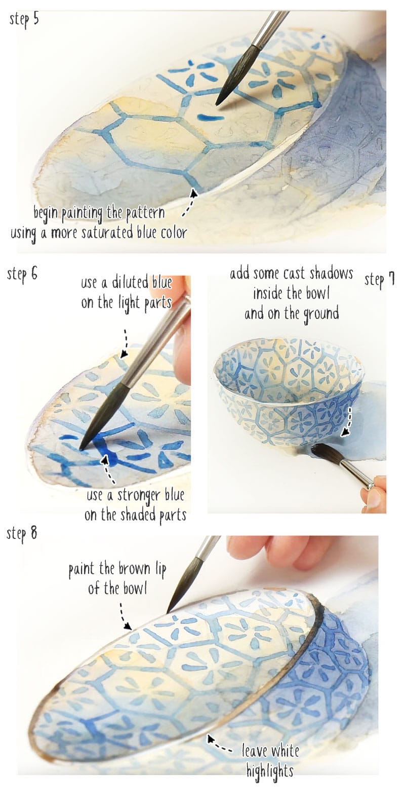
Talking of highlights, I decided to add a few extra highlights using white gouache. This just slightly improves the reflective quality of the bowl.
Let me know in the comments below if you’re going to give this a try!
And now go and check out this lesson where I talk about the advantages of painting in still life and why I think this is one of the best types of paintings for beginners…


Hi Anthony. What do you mean by a ‘neutral’ blue (in the shading)?
Rita
Hi Rita
Neutral hues are those that appear not to have much color. They lack saturation. So anything grayish could be considered neutral. So for example, a “neutral blue” is a blue that has been “neutralized” by mixing it with a complimentary color, creating a dull appearance.
Hope that helps 🙂
Hi Anthony, Thank you for this new opportunity to paint. I completed the 12 Days of Christmas and just loved the results! I appreciate this next lesson on still life.
Happy New Year,
Suzanne Duncan
Glad you’re enjoying your watercolors Suzanne 🙂
Still a bit heavy-handed, but a brilliant piece concerning layering, values and soft edges. Fighting depth in objects as usual, but my first try literally pops out at me, so I can say I am quite pleased. THANK YOU SO MUCH 🙏 AGAIN for your inspiration!
You’re welcome Rahda 🙂
Please explain the following in more detail: ‘Complimentary colors neutralize one another; they cancel each other out’. Why is that a good thing? Also, how does one know when to use them? Thank you in advance for sharing your knowledge and expertise.
Hi Clarisse
complementary colors include any two colors that are on opposite sides of the color wheel. When you mix them together you get a neutral gray paint mix (in other words they neutralize each other).
I use complements when mixing darker colors for shading and shadows (rather than using black paint for example).
You might find these two articles useful:
color theory for watercolors
black watercolor and mixing neutrals
hope that helps 🙂
This is lovely! I love learning from examples and this one is a great one.
Thanks Mili 🙂
I am an art teacher at a private school. May I share your videos with my Jr high students?
Hi Charla
Yes, of course. Please do
I am looking forward to trying this! I wish there was a video of you doing it, but maybe learning is better when I have to think it through in my own. Thanks Anthony!
Hi Lora
You’ll find a link to the video lesson on my YouTube channel at the bottom of the page 🙂
Maybe I’ll do a full length version of the video also …
Thank you so much for including the visual clues for each step. I will enjoy making this.
Have fun painting Linda 🙂
I love this and plan to try this in a week or too. Thanks
Hi Reva – give it go !
Greetings! I’m very attracted with your lesson. And yes, I will try it. I was surprised that you began with shadowing. I thought that first I should paint lighter coloured layer and gradually darken.
Hi Tanya
I think this is where the notion of underpainting is important. Watercolors are built up in layers and become darker in value as you progress. So the first underlying washes of color contribute to the final intensity of the painting.
In a way you’re laying the foundations for what will come later…
Thank you Anthony , I always enjoy your lessons . Very clear and informative. I’m just learning and your free lessons are very helpful as I’m retired and have a limited budget 👍🏻😁
Happy to help Jo
Have fun painting 🙂
I am definitely going to give this a go!
You’ll enjoy it Nancy !
This looks like fun and I plan to try it. Thank you for such a simple and beautiful idea.
Hi MaryAnn
Happy to be a source of “inspiration” 🙂