
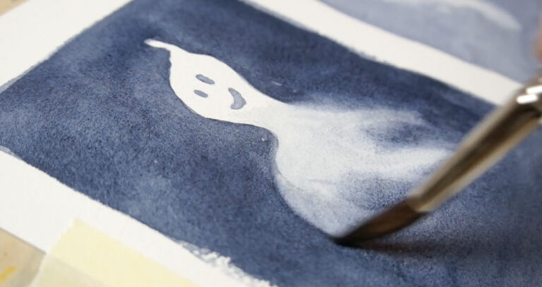
This Changed How I Paint Watercolors: Step-by-Step Tutorial to Add Depth
I started painting in watercolor when I was just a teenager – but it wasn’t until decades later that I discovered something I really wish I’d learned sooner. It would’ve saved me so much frustration.
This one simple idea completely changed the way I paint. It turned my flat-looking artwork into paintings that had real depth.
In this lesson, I’m going to show you how to apply that same idea, step-by-step, as we paint this artichoke still life together – and I’ll tell you why this idea made such a difference for me.
So… back when I was trying to make my paintings look more realistic, I was a bit obsessed with detail. I thought that if I could just draw everything accurately enough – every little shape, every detailed line – then surely, the painting would turn out looking real.
I used to marvel at those hyper-realistic paintings – like the diner scenes by Ralph Goings, or the incredible portrait works by Chuck Close – and I genuinely believed it was all about the level of detail.
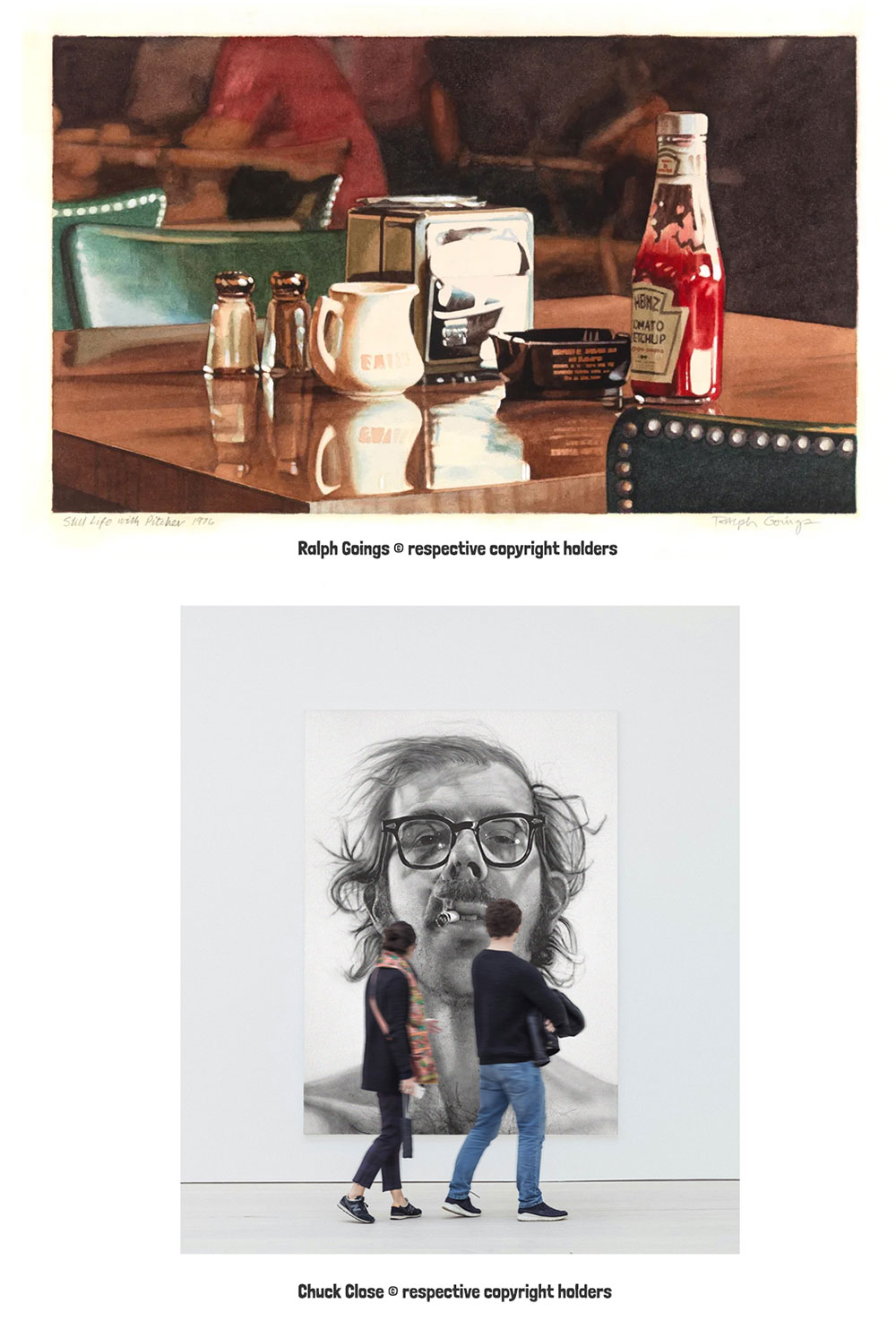
(Includes brief references to artworks by Ralph Goings and Chuck Close, used under fair dealing/fair use for educational commentary. © respective copyright holders).
So…
I’d spend hours making really careful pencil drawings before I even picked up a brush. But even after all that effort, the end result still didn’t quite work.
The final paintings just looked… flat.
They didn’t have the depth or the sense of space I was aiming for. And honestly, I didn’t understand why.
It wasn’t until years later – when I came back to watercolor after a long break – that I finally understood what I’d been missing. I was reading a book by Tom Hoffmann called Watercolor Painting: A Comprehensive Approach… and there was this one line that completely changed how I thought about painting. (Amazon link)
He wrote something like this:
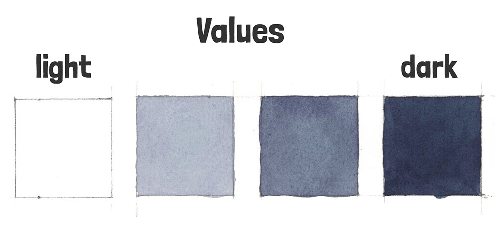
“ Of all the tools we use as painters, value is the hardest worker. You can be loose with your brushwork or even use exaggerated colors – but if the relative values are reasonably true, we can still produce a believable sense of light and space.”
And I remember just stopping and thinking—wait a minute… is it really that simple?
That was the light bulb moment for me! 💡
“The key thing I learned from all this?”
If you want to create paintings that don’t look flat, with a convincing sense of depth, focus on values first.
And by the way, when artists talk about “values,” we just mean how light or dark something is.
That’s it!
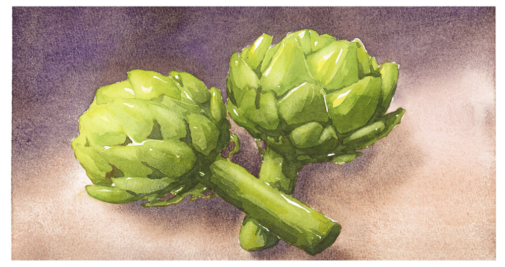
So in today’s tutorial, I’m going to walk you through exactly how I applied this idea when painting this artichoke still life. I’ll go through it step by step, and if you want to follow along, there’s a few links below to download the reference photo and my outline sketch for tracing.
Hopefully this will show you how you can use values too, to bring more depth into your own work.
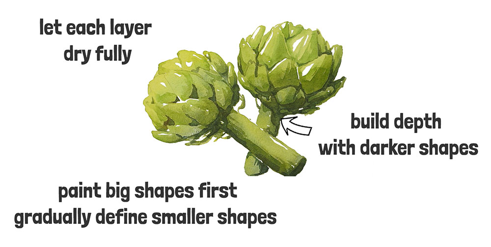
Step 1.

Begin by sketching or tracing the outline onto a sheet of watercolor paper.
Mix up a light green color and start painting the shape of the artichokes in one continuous wash – but be careful to leave some white highlights by painting around them.
To help me with the painting process, I used a value app on my phone to quickly convert my photo into a black-and-white image – this just makes it so much easier to see the light and dark areas without getting distracted by the colors.

As you work towards the shaded side, make your green mixture a bit darker. I used the value study as a guide here. And you’ll see that once the first shape was complete, I kept working wet-in-wet – dabbing in a bit of darker paint while the wash was still damp, to build up those deeper shadows in the leaves and stalks (this is a technique known as “charging-in”).
Next, paint the second artichoke in the same way.
Leave everything to dry before moving on. I’m not trying to define any detail with this first layer – the result looks relatively flat, but there’s already a gentle gradient of greens that sets up the light and shadow. That’s all I need at this stage – just a foundation to build on later.
Step 2.
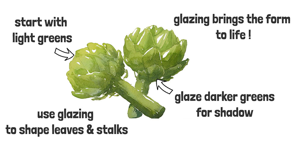
After the first wash of color was dry, I used a glazing technique to start adding form and shading to the leaves and stalks. (By the way, glazing just means painting a thin, transparent layer of color over a dry one – it lets the colors underneath show through, so you can gradually build up depth.)
Each leaf slightly overlaps the one below it, which creates a natural shadow at the base, (a bit like shingles on a roof).
That overlap creates lighter highlights on the tips of the leaves, where the light hits them, and darker shadows underneath, where they tuck under the ones above.
So when I’m painting, to keep it simple, I just keep this in mind:
- Lighter top edge
- Darker bottom edge
So for each leaf, you can see I’m adding a few darker brush marks along the bottom edge then roughly blending them out.
Also, I treated the head of the artichokes a bit like a sphere – thinking about where the light hits from the top left. So I used lighter green for the leaves catching the light, and gradually deepened the color as I moved towards the shaded side of each artichoke.
It’s really just about gently adjusting your greens to match the lighting.
Step 3.
After this layer, I let the paint dry completely again.
Then I started adding darker green shapes to define the deeper shadows – in the folds between the leaves and along the stalks.
This builds up more depth, but this time I’m working with smaller, darker shapes to suggest the deepest shadows.
So far, you’ll notice the shapes I’m painting are gradually going from big to small – and that’s a pretty typical approach in watercolor.
You start by establishing the overall structure, then work your way towards the finer details.
Step 4.
By this stage, the artichokes are starting to look more three-dimensional. This illusion of depth has been built up gradually, layer by layer, working from light to dark.
But they still look like they’re floating on the white page.

So next, I added a background and some cast shadows using a wet-on-wet technique to get soft, blended edges.
To do this, I started by wetting the whole background with clear water. It’s a bit tricky to paint around the artichokes, but it’s worth the effort – the damp surface makes it easier to apply color and helps prevent streaky brush marks.
You can see how the colored pigments spread smoothly into the moist surface, creating soft transitions with no harsh lines. (I’m using a reddish-brown mix made from burnt sienna, toned down with a touch of French ultramarine.)
Then I added the cast shadows with a darker mix, using the same “charging-in” technique as earlier — dabbing color into the paper and gently pushing it around with the brush. This wet-on-wet method gives you those nice, gradual shadow shapes with soft edges.
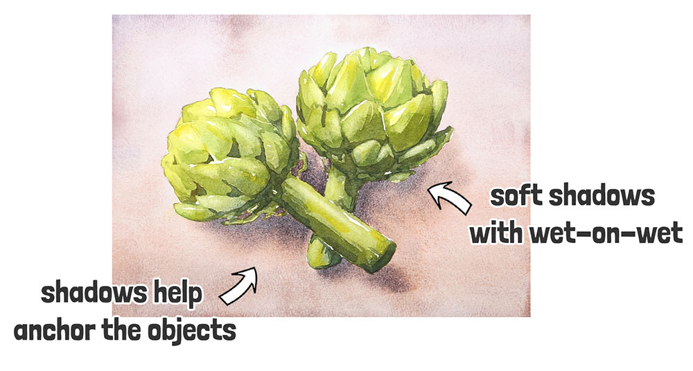
You’ll notice how the shadows help anchor the objects — they suddenly feel like they’re sitting on a surface, rather than hovering in space.
Step 5.
In the final stage of the painting, I added a darker wash to the background (to contrast with the lighter colors in the foreground), using a mix of Burnt umber and French ultramarine.
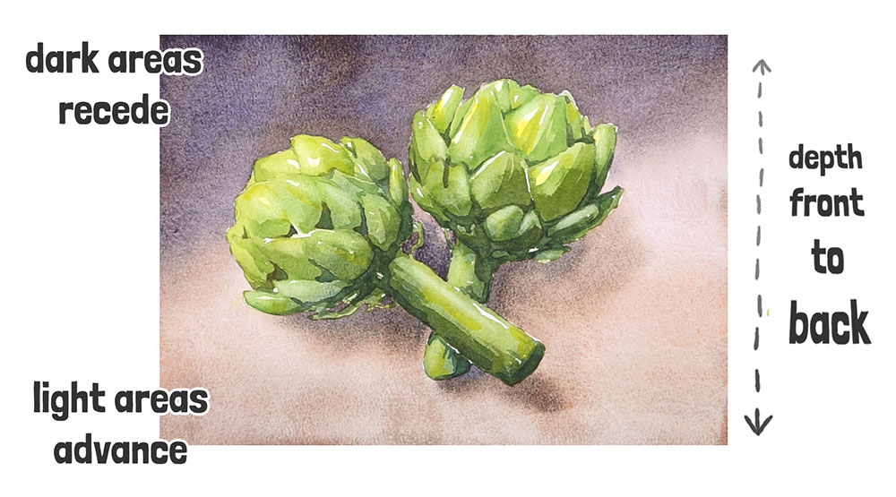
I did this to help create a stronger sense of depth from front to back. Visually, lighter tones tend to come forward, while darker ones seem to fall away into the distance.
It’s a simple trick that’s often used in still life painting — but it works.
And that’s it 🙂
From flat shapes to something that (hopefully!) feels a bit more three-dimensional. All with a few layers of paint, a bit of patience… and maybe a few cups of tea along the way.


Hi Anthony,
I really enjoyed this tutorial! Very well put together!
I have a question: when you say to add “darker green shapes”, what color would you mix in to do that? I’ve heard black is not a good choice. Another dark color maybe?
Thanks,
Denise
Hi Denise
To mix darker, more muted greens I would usually mix a warm blue and a warm yellow (on my palette that means French ultramarine & Hansa yellow deep).
These two colors neutralize each other and make lovely earthy greens.
To make a green mixture even darker you can add a complimentary color (on the opposite side of the color wheel). So maybe red or even brown…
Hope that helps 👍
Thanks for the great suggestions! I will try these! 😉
This is so helpful since I’ve been struggling to see values. I’ve been unable to train my eyes to see them. Thanks for this tutorial! Btw, is there a video tutorial that accompanies this written tutorial?
Hi Mary Lou
Glad this helps! If you like, you can watch the video version of this lesson on my Youtube channel HERE
Hello Anthony,
Many thanks for another brilliant tutorial.
Any suggestions for how to achieve that artichoke green?
Many thanks.
Hi June
I’m using Phthalo green BS with Hansa yellow deep, Lemon yellow, and Ultramarine blue to darken the shade more…
Hope that helps 🙂
Perfect. Thank you. And I just happen to have all those colors.
Anthony, when you did the cast shadows and final dark wash, did you let the first wash dry in between? Rewet the paper or do that while the paper was still wet, all in one step?
Hi Jen
the cast shadow and the light-toned background were painted in one go, all wet-on-wet (step 4)
In step 5 i added the darker background AFTER the first wash had dried completely.
You can follow this in more detail in my youtube video HERE…
This is a great tutorial, thank you! What value app do you use? I can’t even figure out what search term to use that doesn’t give me results that aren’t about finances (“value”) or identifying a painting (“artist”) or converting photo colors to hex codes (“color”).
Hi Laurie
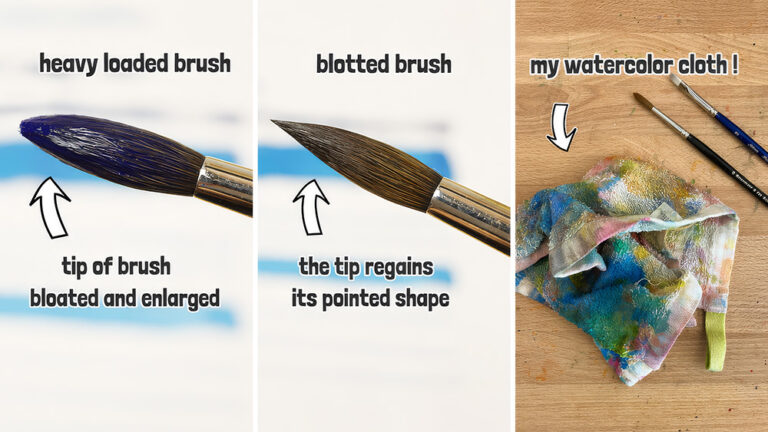
I’ve added an image of the ones I use – I like the “See Value” one for its simplicity 🙂
Thanks Anthony. Once again, you set things out so clearly. Lin
Happy to help Lin
Excellent tutorial especially the background. I struggle with them.