How to use a Color Wheel Like a Pro! (Easy In-Depth Guide)
If you’ve ever looked at one of these things and thought “what the heck do I do with that?” Well… You’re not alone!
A color wheel is a very handy tool for artists and designers, but… you’ve got to figure out how to use one first.
For a start, you probably need a magnifying glass to read the minuscule text written on the back! Furthermore, the confusing array of colors could leave you scratching your head!
So below, I’m going to show you how to use a color wheel to easily choose colors for painting, mixing paints, or for creating harmonious color relationships.
Types of Color Wheels
First let’s make a quick distinction. There are generally two types of color wheels used by artists.
- Commercially bought: A cardboard circular device that you find in art supply stores.
- Handmade: A painted circle created by artists themselves.
In this article I’m talking about the ready-made, store-bought type 🙂
I have an in-depth tutorial showing you how to make your own color wheel here…
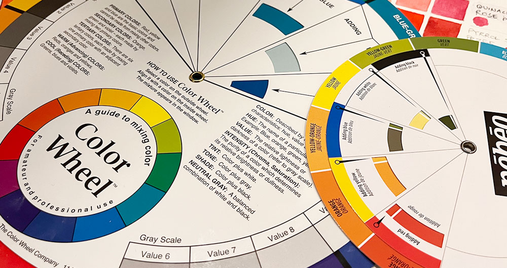
The “Color Wheel Company” produces some of the easiest to use color wheels like this one.
A Bit of History (The Color Wheel in Art)
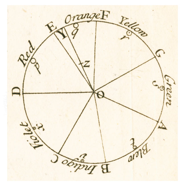
Sir Isaac Newton is often credited with the creation of the first color wheel in the context of light and the color spectrum.
Newton’s work involved refracting light using prisms, which proved that light was in fact made up of a spectrum of several distinct colors. Newton’s color wheel shows the natural progression of the colors of the spectrum around a circular wheel, and was first presented in black and white in his 1704 book titled Opticks (Color printing as we know it today developed much later):
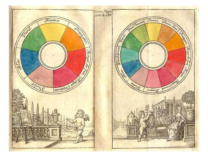
The adaptation of these principles to art emerged soon after. For example, a few years later, the painter Claude Boutet made the color wheels below based on Newton’s theories:
From then on, various color theorists elaborated different concepts through the use of color wheels. In particular, one influential figure in the development of color theory is Johann Wolfgang von Goethe, a German writer, artist, and scientist. In the early 19th century, his interest in art and painting led to the publication of his book “Theory of Colors,” in which he explored the psychological and emotional aspects of color.
Here’s an example of his color wheel:
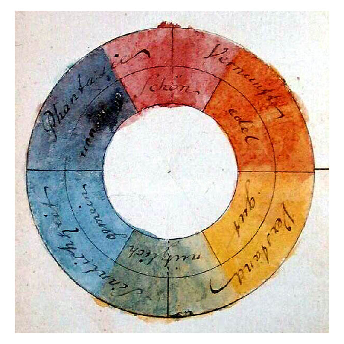
This contribution, among others, played a pivotal role in shaping modern color theory.
What is a color wheel used for today?
Over time, the color wheel became a tool for artists to navigate color relationships, create harmonious compositions, and understand color mixing.
These days most people use a color wheel for:
- mixing colors
- creating harmonious color relationships.
These wheels are designed to help artists, and anyone else working with colors to understand color relationships and make informed color choices.
With a little bit of knowledge about color theory, the color wheel becomes a handy chart for selecting colors that work together harmoniously. And it can help artists choose combinations of paint colors to achieve a desired mixing result.
How does a color wheel work
If you’ve ever wondered how to choose the correct combination of colors for mixing, or creating color schemes that work well together – the color wheel was created exactly for that purpose.
A commercially bought color wheel has two sides and each side presents two disks:
- An outer circular disk divided into segments of different colors.
- two smaller secondary disks that can be rotated.
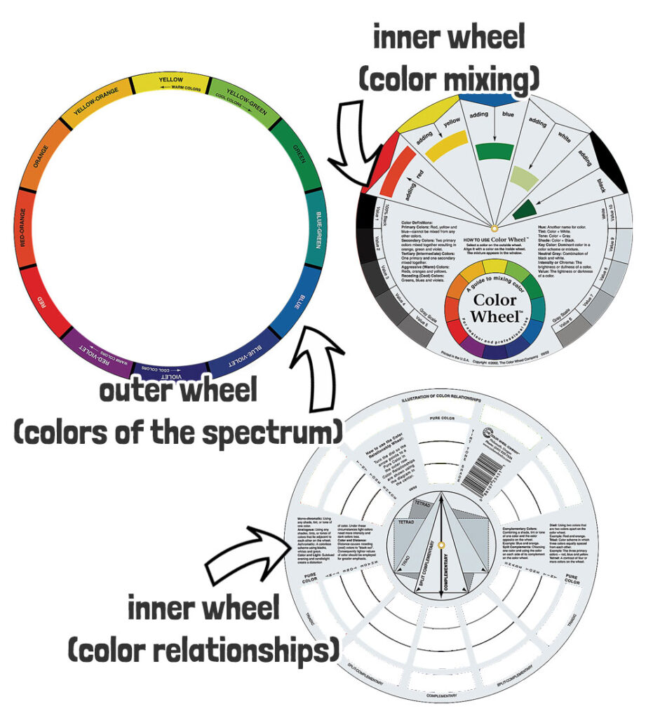
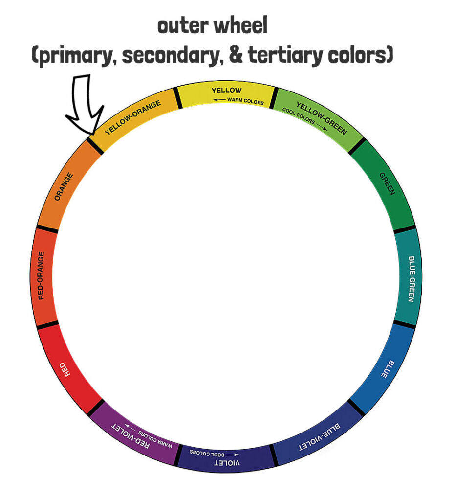
Part 1 – The Outer Disk
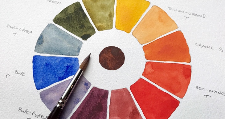
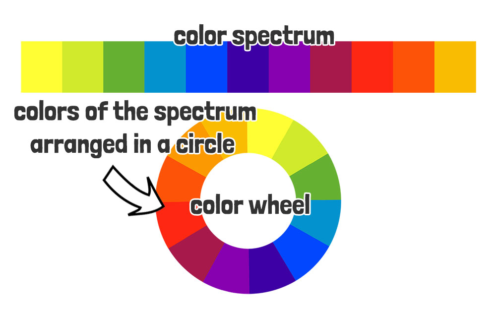
The colors on the outer disk are not just a pretty arrangement of hues! It follows a logical sequence that mirrors the color spectrum that was discovered by Newton.
A color wheel is effectively the color spectrum arranged around a circle.
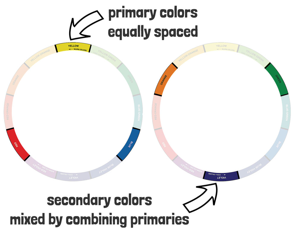
The underlying principle is based on what we call the “primary colors”:
- red,
- yellow,
- and blue.
These are positioned equidistant from each other on the wheel. These primary colors are considered the building blocks of color mixing because they cannot be created by mixing other colors.
When you combine these primary colors, you get what are known as the “secondary colors”:
- orange,
- green,
- and purple.
So for example, if you take two primaries on the color wheel and mix them, the resulting secondary color is placed midway in between. What’s fascinating is that when mixing primaries, the order of these secondary colors on the color wheel corresponds to the order of the colors in the spectrum!
I find it amazing how natural light and mixing colored pigments follow the same rules!
You’ll see that the same is true for the tertiary colors – for example if you mix the primary color yellow with the secondary color green, the result (placed in between) is a “yellow-green” appearance. Blue, plus violet results in “blue-violet”. And so on… You get the gist…
See below:
This phenomenon is not merely a coincidence – it’s a result of the way light and color interact.
A more detailed explanation: In color mixing, the primary colors are combined in various proportions to create a wide range of hues. This process, known as subtractive color mixing, occurs when colored pigments are mixed together. Each color absorbs certain wavelengths of light, and the combination of pigments results in the reflection of specific colors. This interplay of light absorption and reflection is what enables us to produce an array of secondary and tertiary colors that seamlessly correspond to the order of the color spectrum.
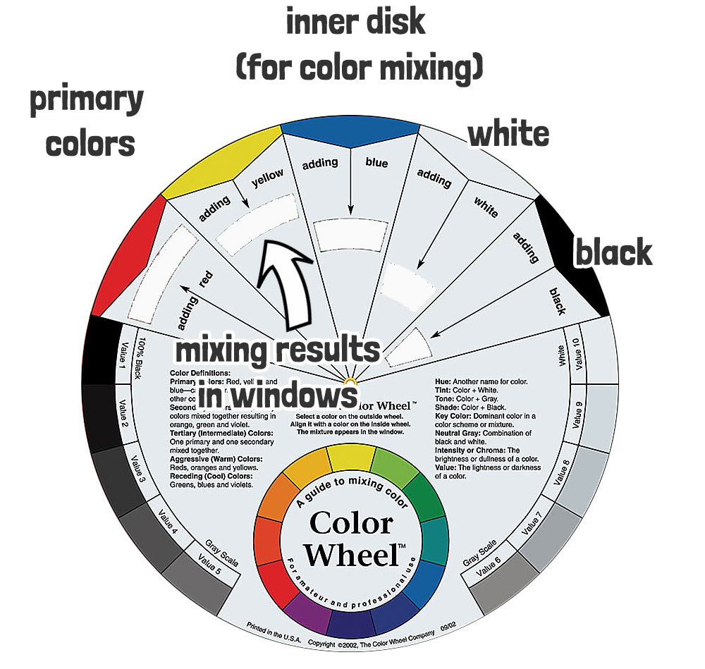
Part 2 – The inner rotating disks
The rotating inner disks vary in purpose depending on which side you’re looking at!
The first side includes the three primaries plus black and white on the outer edge of the dial, with cutout windows underneath each one. The purpose of this is to show the effects of mixing colors.
The second side also has a series of cutout windows and is designed to show different color relationships.
It’s a pretty clever setup. So let’s take a look at how to actually use it…
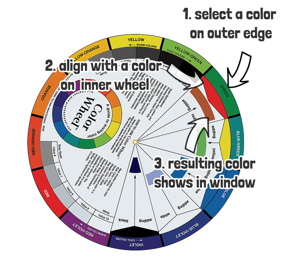
How to use a color wheel (Two Options)
Color wheels are multipurpose tools. As such, you can use it to provide different types of information. And it depends on which side of the wheel you’re looking at. One side is a guide to mixing color, and the other illustrates color harmonies.
How to use a color wheel to mix colors when painting
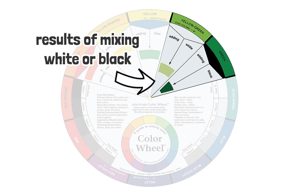
Select a color on the outside edge of the wheel – then align it with the color on the inside wheel. The resulting mixture of the two colors appears in the window underneath.
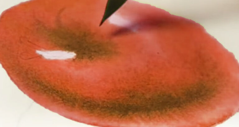
So for example if you align green on the outer disk with red on the inner disk, the window reveals the color brown:
It’s a rough guide to color mixing.
Similarly, you get the approximate mixing results of adding white or black to one of the colors on the outer wheel by aligning the inner disk accordingly.
That’s it!
Now if you’ve ever actually played around with mixing paints, you might be thinking this seems a bit over-simplified.
And it is 🙂
I’ll discuss the limitations of this system below.
How to Use a Color Wheel with Color Theory
The second side of the color wheel shows a more complex looking layout. The outer edge continues to display the pure colors of the color spectrum. The center of the disk shows a series of geometric shapes and arrows like this:

To use the color wheel for color relationships, align the inner disk with a color on the outer edge. The diagram in the middle displays various color relationships, showing how colors interact when combined.
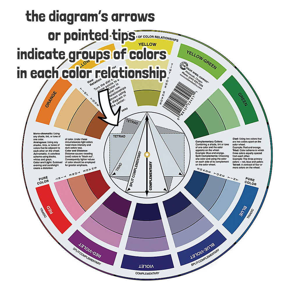
These relationships include familiar combinations as explained by color theory:
Color wheel complementary colors
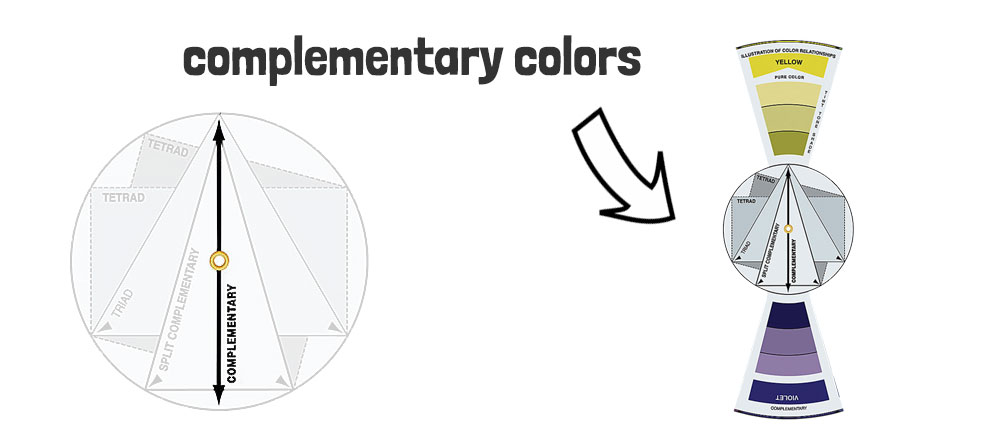
Colors that are opposite each other on the color wheel are considered complementary. The diagram in the middle shows a simple arrow pointing to the two complementaries.
For example green is the complement of red, and vice versa.
Complementary colors create strong contrast when placed next to each other, and when mixed together, they can produce neutral tones. (In this respect the wheel is also a quick guide to mixing neutrals and grays).
Split complementary color wheel
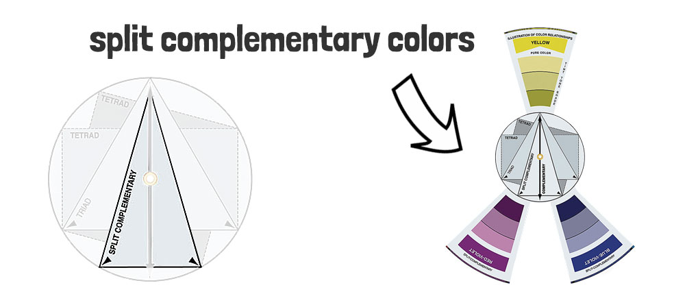
Split-complementary colors are a variation of the complementary color scheme, where you take a base color and use the two colors adjacent to its complementary color.
- Choose a base color.
- Identify the complementary color of the base color.
- Instead of using the complementary color, use the two colors adjacent to it on the color wheel.
Split-complementary color schemes retain some of the dynamic contrast seen in complementary colors but introduces a bit more diversity and harmony.
Triadic colors
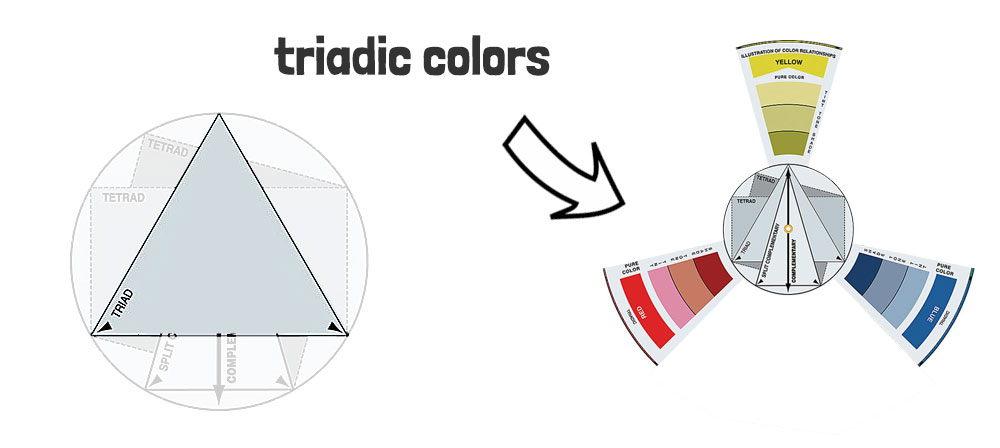
Triadic colors are evenly spaced around the color wheel and form a triangle. This is shown by the triangular shape in the center of the wheel.
- Select a base color
- Locate the two colors that are equidistant from the base color on the color wheel using the triangular diagram.
This relationship between colors allows for interesting and eye-catching compositions in your artwork.
Tetradic colors
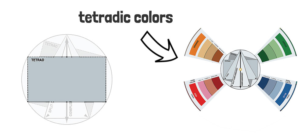
Tetradic colors are four colors, in the form of two pairs of complementary colors, that form a rectangle or square on the color wheel (also known as double-complementary colors).
The diagram in the center of the wheel shows a rectangle and a square, the corners of which point to the Tetradic color combinations.
Tetradic color schemes are quite attention-grabbing and suitable for creating visually striking compositions
Monochromatic color schemes
This side of the color wheel can also be used as a guide to monochromatic (single color) schemes. This is shown in the windows underneath each pure color of the spectrum. You’ll find three monochromatic color variations called:
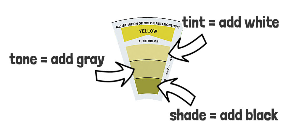
- Tint:
- Created by adding white to a color.
- Lightens the original color.
- Results in a softer, pastel-like hue.
- Tone:
- Made by adding gray to a color.
- Moderates the intensity without drastically changing the lightness.
- Produces a more muted and subdued appearance.
- Shade:
- Mixed by adding black to a color.
- Darkens the original color.
- Results in a deeper and more intense hue.
Analogous colors on the wheel
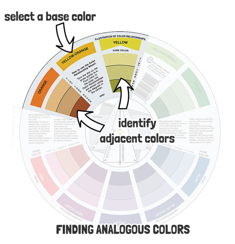
Analogous colors are those that are next to each other on the color wheel. These colors usually match well and create serene and calming compositions.
- Select the base color
- Identify adjacent colors
Analogous color schemes can include more than two adjacent colors. To create a more varied palette, you can include additional colors on either side of the base color.
Limitations of store-bought color wheels
Not all paint colors combine in the simplistic way that a commercial color wheel suggests.
For a start, most color wheels indicate mixing relationships using the traditional primary colors “red, yellow and blue” (RYB). They do not take into account the idea of an alternative primary color set “cyan, magenta, and yellow” (CMY).
Every paint pigment has its own unique color appearance. And when mixed with other paints produces unique results. And when you stick to the RYB set of primaries, you cannot get a full scope of color mixing possibilities. That’s why some artists advocate using a CMY color model which yields a wider range of colors mixing results.
(Personally I use both paint versions in my palette for the best color mixing experience. You can read more about this here…)
So keep in mind, the color wheel offers an “illustration” or “rough guide” of what you can achieve and not an exact match for color mixing.
By the way, you can also buy the CMY color wheel :
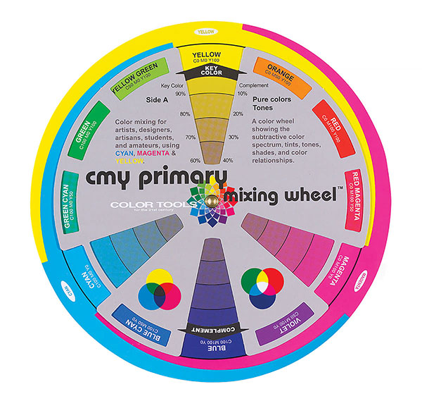
This is a useful addition to the traditional RGB version (click here).
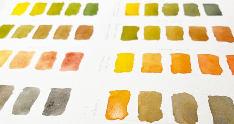
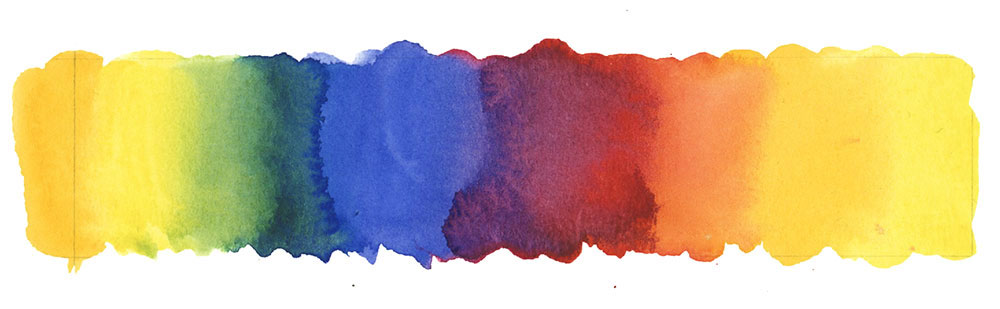
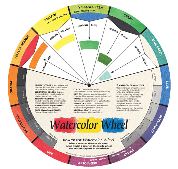
And for watercolor artists like myself, they have even produced a Watercolor wheel that takes into account this medium’s unique mixing properties using water.
Let me know your own thoughts about using these handy tools in the comments below 🙂
And you can also find a bunch of related color mixing articles in this section here…
Want to learn all about color mixing? Find out about my new course below:
“Successful Color Mixing in Seconds Using Color Maps!”