
What Are The TRUE Primary Colors?
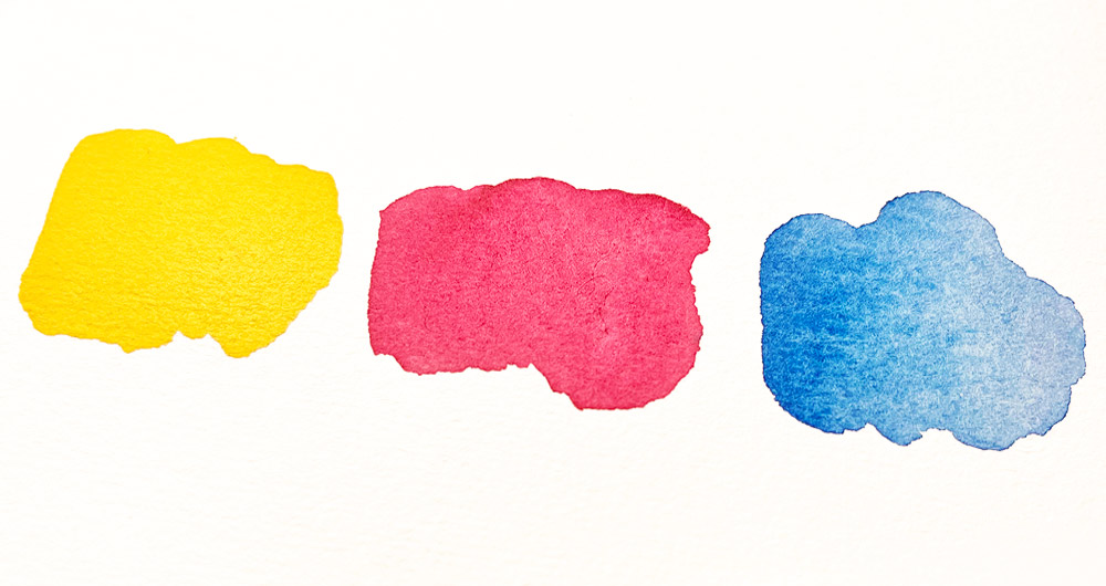
Most artists have heard the aphorism that red, yellow and blue are all the paints you need to mix any color. You were told these hues constitute the “primary” colors.
Maybe it was your art teacher who conveyed this idea during your art classes (perhaps with an air of wisdom and authority?)
However, not all aphorisms are universally true. If you’ve ever tried mixing with just these three primaries, you’ll understand why 🙂
So what are the true primary colors?
This is a long-standing debate in art circles. So in this article I’ll try to explain what the real primaries are and how you can use this to your advantage in color mixing.
The True Primary Colors
The traditional primary color set is said to be red, yellow and blue. But modern color theory suggests that cyan, magenta and yellow are the real primary colors. However for artists, “true” primary colors don’t actually exist.
Academic teaching tells us the RYB primary colors are the basis of color mixing.
These colors are called “Primary” (As in they come first and foremost, and cannot be replicated by mixing other colors).
But in practice this does not work. Because paint colors are “imperfect”.
If you’ve played around with paint mixing for a while you’ve discovered that in reality primary color paints cannot mix all possible colors.
Are you scratching your head in frustration yet?
So where do you go from here?
Two Primary Color Models (RYB & CMY)
In the realm of art and color theory, two prominent color models reign supreme: the RYB model and the CMY model.
The classic red, yellow and blue (RYB) and the more modern cyan, magenta, yellow (CMY).
Let’s take a closer look at what these are…
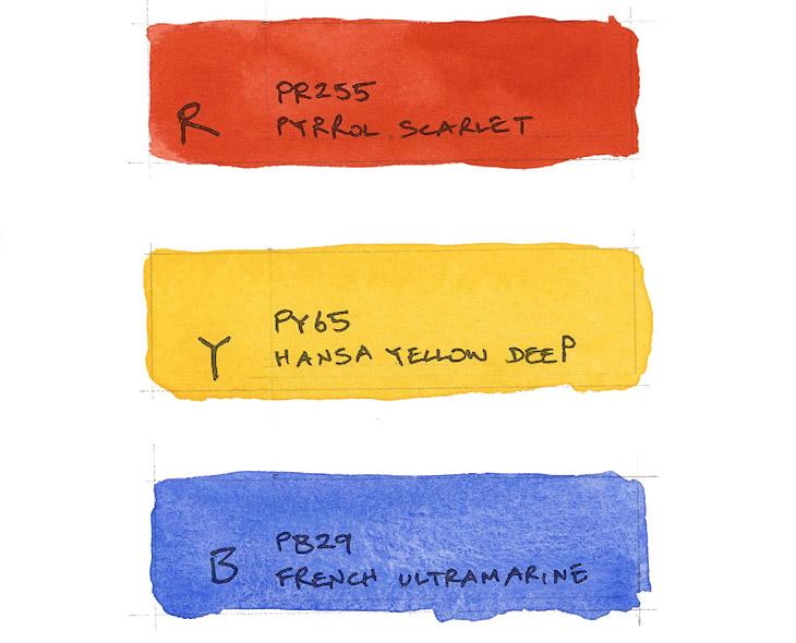
RYB primary colors (Red, yellow, and blue)
Dating back centuries, artists have experimented with pigments derived from natural sources to create paint colors.
The RYB model emerged as a foundational framework for color mixing, based on the observations of how certain pigments interact when combined.
Historically, these primary colors were readily available in the form of naturally occurring pigments, such as red ochre, yellow ochre, and various blues sourced from minerals and plants.
And so, this model became ingrained in artistic tradition and was taught in art academies for years.
In terms of real paint colors an example would be:
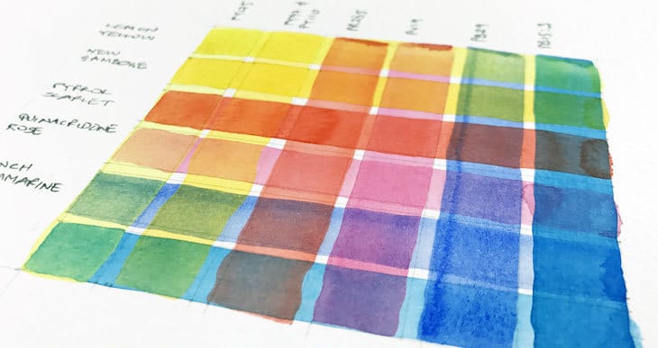
- RED – Pyrrol scarlet (Pigment number: PR255)
- YELLOW – Hansa Yellow Deep (Pigment number: PY65)
- BLUE – French ultramarine (Pigment number: PB29)
However, when mixing these colors they don’t always yield clean bright versions of secondary colors!
For example, blue and yellow should produce green. But the resulting green mixture using these primaries is actually quite dull and muted.
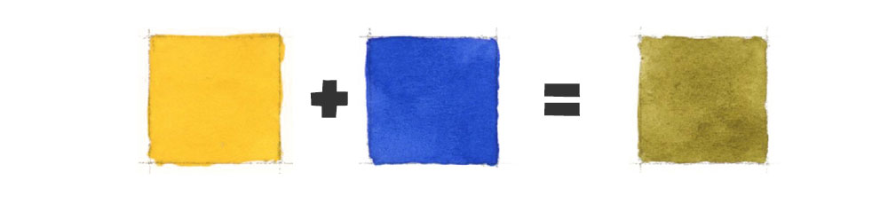
So the RYB model has its limitations. Particularly for accurately reproducing certain colors.
Despite this, the importance of the red, yellow, and blue primaries in shaping how artists understand colors and paint mixing is huge!
They were the original primary colors that laid the groundwork for modern color theory.
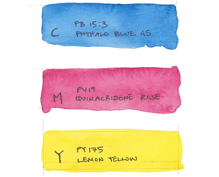
CMY primary colors (Cyan, magenta, and yellow)
In another part of the spectrum lies the CMY color model, composed of Cyan, Magenta, and Yellow.
Over time, artists sought to expand their palette beyond the limitations of traditional pigments like red, yellow, and blue. It was discovered that by combining cyan, magenta, and yellow pigments, they could create a broader spectrum of hues compared to the traditional RYB primaries.
And indeed these colors do produce more vibrant versions of secondary colors 🙂
Again in terms of actual paint colors, an example I would use is:
- CYAN – Phthalo blue GS (Pigment number: PB15:3)
- MAGENTA – Quinacridone rose (Pigment number: PV19)
- YELLOW – Lemon yellow (Pigment number: PY175)
Today, the CMY primaries are commonly used in modern printing processes. Usually in combination with black to enhance the contrast and depth of mixed colors.
However, despite the advantages of the CMY color model, it also has a few limitations when it comes to mixing paints.
For instance, if you experiment with the CMY paint colors above you may struggle to reproduce certain colors with an intense brightness. In particular, mixing good purples and oranges lacks intensity and saturation.
Two Sets of Primary Colors (Spilt Primaries)
This is where a combination of both RYB and CMY can be advantageous for artists.
A set up like this is the basis of what became known as the “split primary palette”.
These two sets of primary colors are now commonly understood as “warm” and “cool” versions of the primary colors.
| Warm Primary Colors | Cool Primary Colors |
| Red | Cyan |
| Yellow | Magenta |
| Blue | Yellow |
Yes… yellow appears in both columns, so you might be wondering how these can be both warm and cool? If you check out the paint choices I used in the examples above for each set of primaries, you’ll see that they are different. One has a warm bias and tends more towards red (Hansa yellow deep), and the other has a cool bias, tending towards green (Lemon yellow).
So… The split primary palette divides the traditional primary colors into two groups, each containing a warm and a cool version. This approach provides us with a more versatile range of hues for color mixing.
By using both color models, artists can overcome the limitations of one system with the benefits of the other 🙂
Woopee!
When considering warm and cool paint options for the split primary palette, the typical selection includes:
1. Warm primaries:
- Warm red: This is a red with orange undertones, leaning towards the warmer end of the spectrum.
- Warm yellow: A yellow with a slightly orange bias, appearing warmer in comparison to other yellows.
- Warm blue: A blue with hints of purple, leaning towards the warmer side of the color spectrum.
2. Cool primaries:
- Cool red: A red with violet or blue bias, giving it a cooler appearance compared to warm reds.
- Cool yellow: A yellow with greenish undertones, appearing cooler when compared to warmer yellows.
- Cool blue: A blue which tends towards green, leaning towards the cooler end of the spectrum.
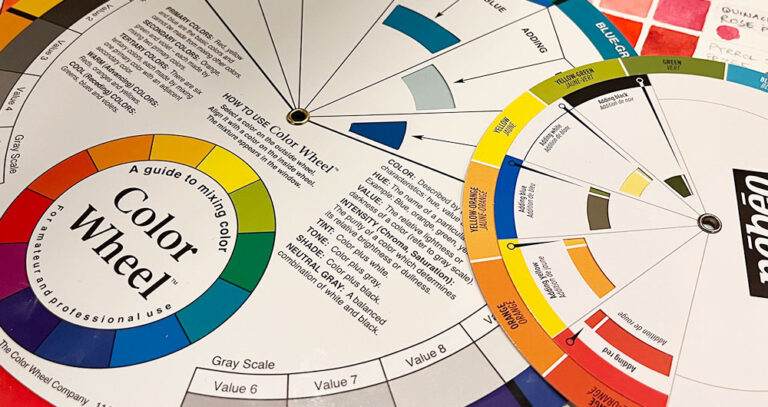
Here’s an example of a color wheel that was made using the split primary palette. By mixing the appropriate warm and cool primaries, you’ll get mixes that have a wider range of more saturated, vibrant colors.

For example:
- Mixing warm red with warm yellow produces vibrant oranges.
- Mixing warm blue with cool red yields rich saturated purples.
- Combining cool blue with cool yellow creates greens that are bright and intense.
It’s true… If you’re looking for 3 true primary colors – the CMY model is the closest you’ll get to a set of 3 primaries…
However, embracing both warm and cool primaries, artists can more easily navigate the vast range of mixing possibilities with paints 🙂
Here’s a list of watercolor paints that I typically use to make a split primary palette:
- Hansa Yellow Deep – Pigment number: PY65
- Lemon yellow – Pigment number: PY175
- Phthalo blue GS – Pigment number: PB15:3
- French ultramarine – Pigment number: PB29
- Quinacridone rose – Pigment number: PV19
- Pyrrol scarlet – Pigment number: PR255
Understanding color temperature
If you don’t know… Color temperature refers to the perceived warmth or coolness of a color. This distinction becomes particularly relevant when selecting primary colors for mixing.
In the realm of art and color theory, understanding color temperature is useful for achieving certain visual effects or color mixing. Warm colors include reds, oranges, and yellows, while cool colors include blues, violets and greens.
Key takeaways:
- Traditional belief holds that red, yellow, and blue are the primary colors, but modern color theory suggests cyan, magenta, and yellow are more accurate.
- In practice, no single set of “true” primary colors exists for artists due to the imperfections in paint colors.
- RYB primaries have historical significance but are limited for producing certain colors.
- CMY primaries offer a broader spectrum, but they also have limitations, particularly in producing intense mixtures.
- Combining both RYB and CMY primaries into a split primary palette provides warm and cool versions of each primary color, enhancing your color mixing range. You can create more vibrant and saturated colors by mixing appropriate warm and cool primaries.
If you’d like to learn all about mixing colors in watercolor, check out my course:
“Successful Color Mixing in Seconds Using Color Maps!”


thanks for the article. it was really helpful for me as I have been studying color theory looong time and sometimes I still don’t get it. this clarified a good amount of questions hustling in my brain 🙂
Happy to help Lita 🙂
Hi Anthony can you tell me again where to find that diagram that has all the pigments numbers on it. The big wheel for comparing pigments. It was a link to another site. Thanks!!
Hi Jennifer
I think I talk about different color maps in this article here.
And you’ll find a pdf of Bruce MacEvoy’s color map here.
cheers!
Great article Anthony, thanks for the clear insight. It explains why I haven’t been able to mix vibrant colors before and end up with muddy versions instead. Your color therory really “mixes it up” so to speak. Back to the drawing board for some better results. Thanks for sharing.
Enjoy your painting Maureen 🙂
I recently read “Red and Yellow Don’t Make Green” by Michael Wilcox (1989). Wilcox suggests that if you want to mix a true green, use a yellow and blue that both have green undertones such as a lemon yellow and a cerulean blue. Likewise for purple use a red and blue that both have purple undertones. Warm blues have more purple and cool blues have more green. Warm reds have more orange and cool reds have more purple. You wouldn’t try to make purple with orange so a warm red will not give you a vibrant purple. This simplified everything I’ve learned about warm and cool watercolor painting. Your color wheel illustrates it well too!
Hi Jeniffer
That’s right… this is the principle behind the split primary color palette 🙂
The colours in your new (well new to me) wheel are beautiful Anthony. Thanks for opening my eyes!
Happy to help Glenys
Anthony
Thanks for the great article. I’ve been looking for this for years. All in one place.
A simple explanation. A big help.
Thanks again.
Larry
Happy to help Lawrence!
Very informative. I love art but I’ve never fully grasped color theory, this should help in my journey back to watercolor. 👍
Have fun with your paints Joshua…
Ty. I copied your dual primaries set. I haven’t water colored in almost 3 years, it’s nice to get started again. 👍
Have fun Joshua!
Thank you for this insight on a difficult part of painting I struggle daily on trying to keep my pallet fresh
Glad it helped Bruce…
so much to learn from you! You are a treasure for all artists, beginners and beyond.
Thank you again for your expertise and the way you present your lessons in a step by step manner which makes techniques easier to understand.
Bonnie C.
Happy to help Bonnie!
Thank you for shedding light on this topic. I assumed that the CMY model was developed for screen renderings, but I now see that it is useful in real life as well.
Have fun Diana!
Thanks a lot for the help. I was having a hard time mixing vibrant secondary colours, but I have a question. Does the warm-cool principal apply to all kinds of paints like acrylics and oils?
Hi Alex
Yes absolutely. The only difference is that with opaque paints like acrylic, you generally need to add white or black to change the lightness and darkness of a color. Whereas in watercolor it’s a question of transparency – diluted paints are lighter toned and stronger mixtures are darker in c-value.
Hope that helps 🙂
I am a relatively new (under 2 years) watercolorist and found this article enlightening! Your complete explanation makes a lot of sense to me, mainly because I found myself scratching my head when trying to produce colors using what I thought was a primary palette and coming up with odd mutations of colors……not where I wanted to go at all and resorting to pre-mixed tubes to find the colors closest to what I wanted. So, as is said,…..”back to the drawing board”!
Thanks Anthony!
Mike C., South Carolina
Thanks Mike!
Hope this gives you a new way to approach mixing with primaries:-)
Hi Anthony — I teach watercolor painting at a continuing learning center in Virginia, USA, and often refer to your blog as our methods and techniques are quite similar. Most of the students have never had art lessons or engaged in any artistic expression.
I have found that using the term “color bias” instead of “cool” and “warm” to be easier for the students to grasp. For instance: I show swatches of Q. Rose and P.. Scarlet then query which is more (or leans toward) orange and which purple. Most students understand immediately. I do the same with the blue pair — F. Ultramarine and P. Blue, and the yellows — New Gamboge and Hansa Yellow light.
I mix P. Scarlet and P, Blue to demonstrate that red and blue don’t always make purple to demonstrate how color mixing works.
I teach using the Daniel Smith 6 tube paint set.
Thanks for your many great blogs!
Best – Poly
Thanks Poly!
Yes, showing how some colors « lean » or « tend » towards warm or cool, especially with a color wheel is a great way to demonstrate « warm » or « cool »
Your posts on color palettes and mixing have been very helpful. I’ve tried a few different combinations, especially yellows and reds, to see how they differ. I’m using the template you provided that starts with the primaries at the top, in the middle are the secondaries mixed from those primaries, and finally that secondary color in two boxes with each one holding a mixture that has more of each primary (i.e., yellow + blue = green, then there is a yellow green and a blue green).
This has given me a lot more confidence in mixing my own colors, besides the fact that it’s fun to see how, for instance, using a warm Hansa yellow deep looks compared to a gold ochre.
Thanks Anne.
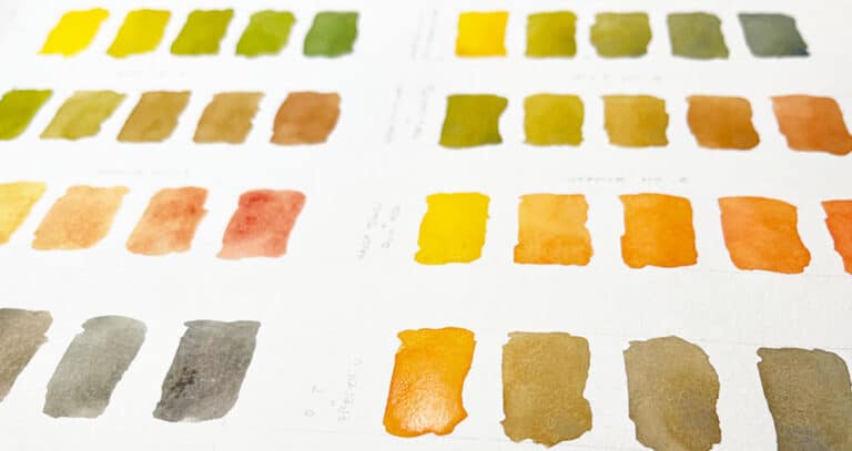
Making color charts and mixing experiments is extremely useful (I keep mine for future reference).
And you often come up with wonderful colors that come in handy later 🙂