How to paint a watercolor glazing chart
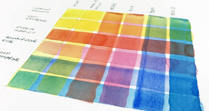
You’ve heard about glazing… Right ?
Glazing or layering colors is a fundamental technique in watercolor painting. When you paint, the transparent layers of pigment build up, one on top of the other. This layering of paint modifies the values and the color appearance of the final painting.
Yellow glazed with blue will create a green color. Yellow glazed with red makes orange. Yellow glazed with yellow makes a deeper toned yellow, etc.
But some paint combinations can be surprising. And this is where a glazing chart becomes a very useful tool. It can be done very quickly at the beginning of each painting session. Or you can take your time and create glazing charts of all your paints for future reference.
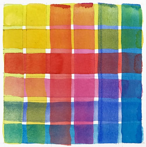
Either way, a color chart of this kind is an incredibly useful planning tool, helping you to predict the results of different paint combinations when painting and glazing with watercolors.
So how do you make a watercolor glazing chart ?
A typical glazing chart is made up of vertical and horizontal painted lines. Each line is a brushstroke of color for one specific paint. First you paint all the colored lines in one direction, and you let them dry completely. Then you paint the same colors in the other direction, glazing them over the top of the first set of lines. The resulting chart shows how your colors blend when layered on top of each other.
Below I’ll talk about why you might find it interesting to make your own charts and give you some step by step instructions on how to go about it!
Personally, I love color mixing, so as well as being useful, I find these exercises fun and relaxing…
Note: Read this article for a more in-depth overview of watercolor glazing.
Why make a glazing chart?
When I first started painting I didn’t realize the benefits of this type of chart. Yes… I understood that watercolors are transparent and that my artwork is essentially built up with successive layers of paint. For me, the ability to see the underlying shapes and brushstrokes is one of the things that makes watercolors such a beautiful and unique art form.
But what I didn’t appreciate was how different paints react with each other when glazed. And when planning a new project, this can affect your choice of paints.
The thing is, watercolor paints all have different mixing qualities. And there’s a huge range of diverse paints which interact with each other differently when mixed on the paper. For example a cool blue mixed with a cool red gives a very different appearance to a cool blue plus a warm red.
This is why I find color mixing so fascinating. There are hundreds or thousands of different combinations which produce surprising and delightful results. Glazing is basically a form of color mixing. And unless you’re an expert in mixing watercolors, anticipating how your colors will glaze can be tricky.
This is all the more true because of the varying properties of each individual paint. Paints all have diverging characteristics such as granulation, staining and transparency. For example an opaque pigment glazed over a transparent pigment can almost completely blot out the underlying color. The resulting color is also less vivid compared to glazing with two transparent paints. The staining properties of paint also need to be considered. Certain families of pigments such as the Quinacridones are highly staining, meaning that they adhere to the paper surface and are difficult to lift off. On the other hand, pigments in the Cadmium family are non-staining, and can easily lift off the paper, making them more difficult to use for glazing. The general advice is to apply staining pigments before using non-staining paints.
Glazing chart preparation & materials
First things first. I recommend you use a flat brush for painting your chart. This is because you want to be able to paint a fairly thick line in a single brush stroke. As just mentioned, different paints are more or less staining. If you paint each line with repeated brushing you risk lifting the underlying paint and the colors will bleed together.
If you’re feeling neat and organized, you’ll need a pencil and ruler to draw your grid.
If you want the best results, use a sheet of good quality watercolor paper. Glazing just works better when you use decent quality paper. The colors will be more vibrant and closer to what you’d expect when doing an actual painting.
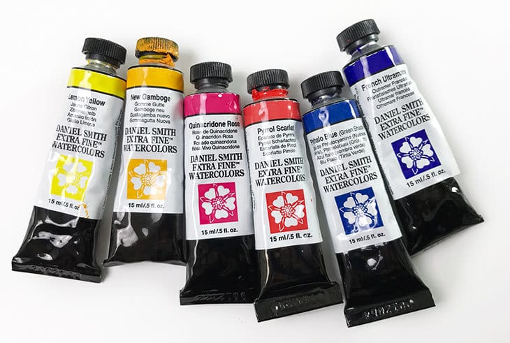
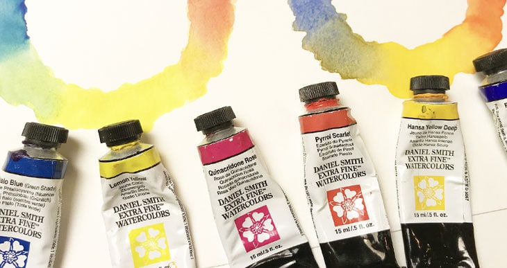
For my chart I selected a warm and cool color for each primary color. I think this shows a good example of the discrepancies between warm and cool color mixing. However you should use whichever colors you need to test.
Two jars of water are also very useful. I use one jar for rinsing and another as a supply of clear water for mixing. This helps to avoid color contamination when changing from one color to the next, especially when painting the lighter hued yellows.
How to make your watercolor glazing chart
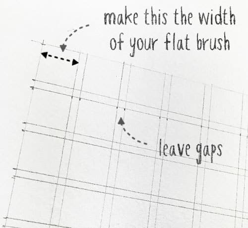
- Begin by preparing a grid for your glazing chart. With a ruler and pencil, mark out the horizontal and vertical lines. Draw one vertical and horizontal line for each color.
- The width of the lines depends on the width of your brush. Since you want to be able to paint each line with one single stroke, it’s a good idea to make each line the same with as your flat brush. Leave a small gap between each line. This prevents overlapping colored lines from bleeding into each other.
- Prepare your chosen watercolors. Either squeeze out a fresh spot of paint from a tube, or if your using pans, make sure each color is clean by rinsing them with clear water. Mix a thin wash for each of your colors. If your paint is too thick the glazing will be difficult to see.
- I recommend you start painting with the lightest hues first, in my case the yellows. Make sure your brush is completely clean since yellow is so easily contaminated with any residual color on your brush or in your palette.
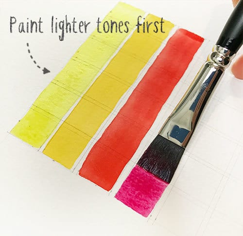
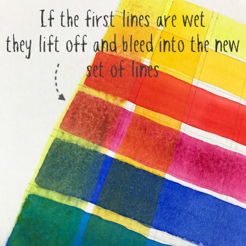
- When you’ve painted all of the colored lines in one direction, leave them to dry thoroughly! Yep… This is where you need to be patient. If you paint over the first lines while they’re still wet, the colors will lift and bleed, and the glazing effect will be lost (hint: you can always use a hairdryer to speed things up).
- When the paint has dried, paint your colored lines in the other direction using a single continuous pass of the brush. This is the most delicate part, but if you avoid scrubbing your brush over the underlying paint all will be good!
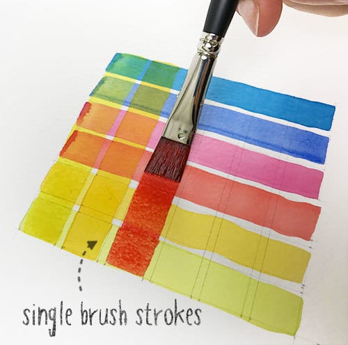
- Finish the chart by making a note of the paint names for each of the colors. If you want to learn more about the properties of your watercolors, I suggest you also make a note of the pigments used in each paint, and possibly their transparency and the level of staining.
That’s it! Now you have a handy chart that shows you what to expect when combining glazes of your paints!
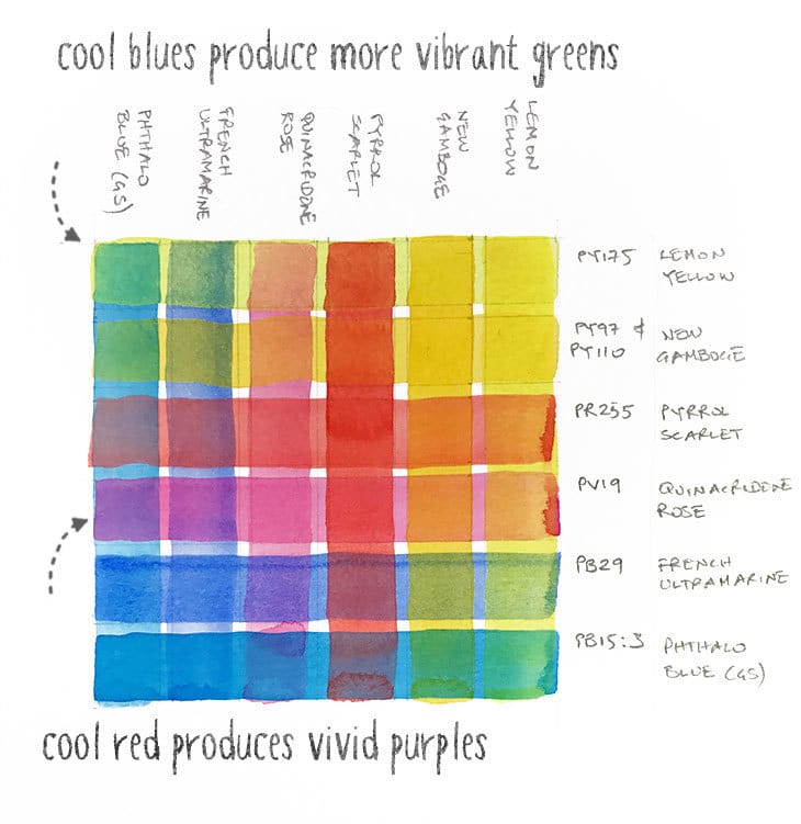
Results: Notice how the glaze of cool yellow and cool blue make a nice bright green, but the combination of warm yellow and cool blue is more subdued. Similarly, cool red when glazed over both blues is more vibrant than the glazing results of warm red with either of the blues.
This goes to show how your choice of paints can affect the final appearance of your work. A quick glazing chart can save you the disappointment of badly mixing glazes.
Tips for glazing with watercolors
As you have probably guessed, glazing is primarily a transparent watercolor technique. For the best results when glazing, most artists therefore recommend that you use only transparent watercolors(not semi-opaque or opaque). Opaque paints tend to look chalky or muddy when they dry. This is easier said than done, since finding a good palette of colors that reunite the best qualities of watercolor paints can be tricky (if you’d like help choosing paints which have the best characteristics then take a look at my selection here).
This technique also requires a light touch because as far as possible you don’t want to disturb the underlying layers of paint. Try not to scrub, and don’t repeatedly brush the previous layers. Try to be aware of the staining properties of your watercolors so that you can paint in the correct order (highly staining first, non-staining last).
Remember that with glazing, the more layers of paint you apply, the more intense the hue and value the final color becomes. The whites and light tones in watercolor come from the paper itself. For these reasons it is usually good practice to work from light to dark, applying thin, light washes first and gradually building up the intensity of your painting. It’s easy to add another glaze to make an area of your painting darker, but not so easy to make things lighter!
Finally, glazing is a wet on dry technique. Each layer of paint should be left to dry thoroughly before applying a new glaze. This doesn’t mean you can’t combine this technique with wet on wet painting. For example you could paint a background using wet on wet then glaze the rest of your subject. Just make sure the underlying paint is completely dry before glazing.
If you’re the impatient type, then it’s probably a good idea to keep a hairdryer handy to speed up the drying process. Just don’t use a high heat and burn your paper!
“Successful Color Mixing in Seconds Using Color Maps!”



Fantastic information that lets me really get the best from my watercolor start
Soooo helpful. Brilliant. Straightforward.
Loving my lockdown time to learn water colour processes.
Glad you enjoyed it Liz… Have fun !
Hi Anthony. I’m excited to get started and really appreciate your help. The Daniel Smith set comes with Hansa Yellow Light. I notice that your charts use Lemon Yellow. Is the Hansa Yellow Light an acceptable substitute for your exercises?
Thank you!
Hi Katie
Yes, Hansa Yellow Light is a cool yellow like Lemon Yellow…
I enjoy painting flowers in watercolor and am trying to figure out how to glaze the petals of various flowers using the glazing technique.
Hi Betsy – I’ll try to do some more stuff on flowers soon…
It’s very interesting how the colors shift a bit depending upon which is the top compared to the reverse.
I like how you explain that glazing to create a color is quite different from the results of mixing a color on your palette.
Hi Sandy – yes glazing is a great technique, it just takes a little practice…
Thank you, I am new to watercolor and your articles have been most helpful!
Have fun with your watercolors Lucy!