Why Warm & Cool Colors Confuse Artists!
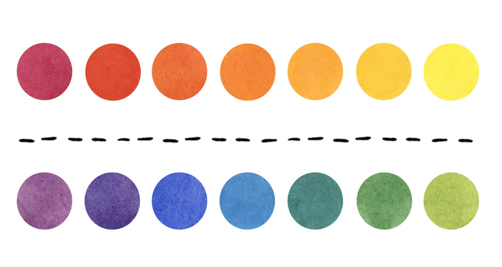
Many discussions about color, color mixing and art in general often refer to “warm” or “cool” colors.
But what does this mean? The concept can be tricky and confusing if you don’t get it!
People often tell me they struggle with this idea. And because I refer to it so often in various lessons, below I’m going to explain in detail just exactly what warm and cool colors are…
Also, the reason why you can’t figure out warm and cool colors isn’t because you don’t understand color theory… (although that does come in handy)… It’s more likely because you haven’t mastered the idea of “relative color temperatures”.
But first, let’s cover some of the basics…
What are warm and cool colors?
Warm colors include red, orange, and yellow. These colors often make us think of warmth, energy, or excitement (like the colors of fire or a sunset). On the other hand, cool colors include hues such as blue, green, and purple. These colors tend to evoke feelings of calmness and relaxation (like the colors of water or the sky).
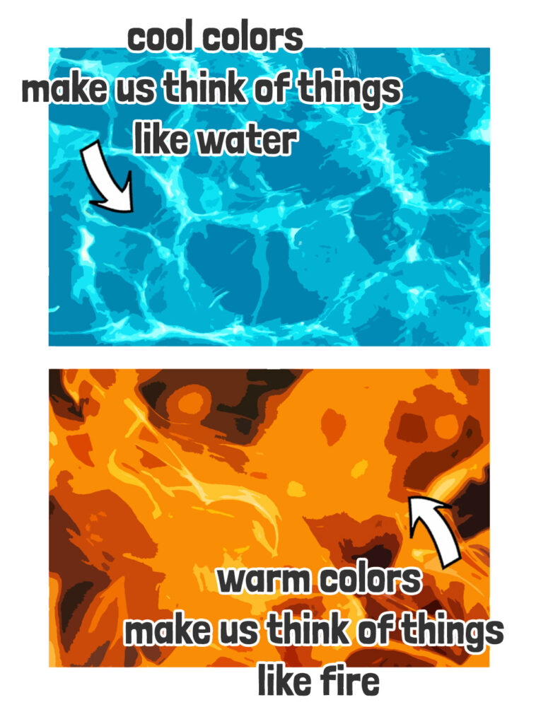
The classification of colors into warm or cool groups is also referred to as “color temperature”.
And as you can tell from the description, warm or cool hues relate to our emotional response to color.
Color temperature is psychological
Yep… It’s all in your head 🙂
The concept of warm and cool colors originates from the way we perceive colors and how they interact with our emotions and senses.
Throughout history various cultures and artistic traditions have made use of the notion of color temperature.
But the formal distinction between warm and cool colors as we understand it today actually gained popularity in the 18th and 19th centuries, with the development of color theory in art.
Artists and theorists began to explore how colors could be categorized based on their visual and emotional effects. Warm colors were associated with sensations like heat, fire, and sunlight, while cool colors were linked to qualities such as water, sky, and shadows.
This distinction became an important tool for artists to create mood, atmosphere, and balanced compositions in their work.
Why color temperature is so confusing
Many artists find the concept of color temperature confusing because it’s not a fixed characteristic.
What do I mean?
Well… The perception of whether a color is warm or cool can change depending on its context.
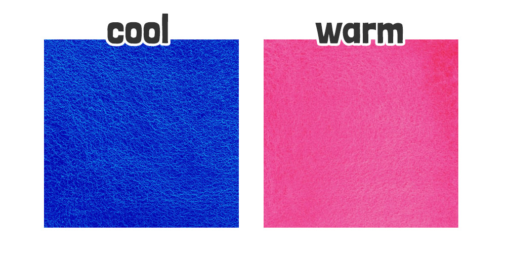
For example, this particular shade of red appears warm next to blue:
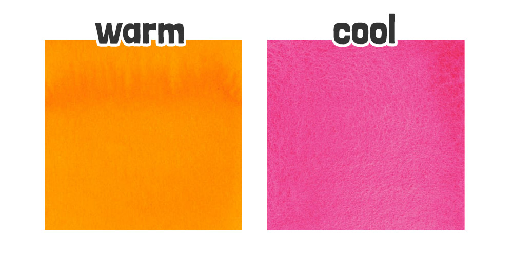
But as you can see, it seems cooler next to an orange:
This relative nature of color temperature can make it challenging to grasp 😕
Additionally, some colors can be classified as both warm and cool AT THE SAME TIME depending on the context in which they are used.
Confused yet?
Here’s another example. A green can lean towards being warm if it has more yellow in it, or cool if it has more blue !
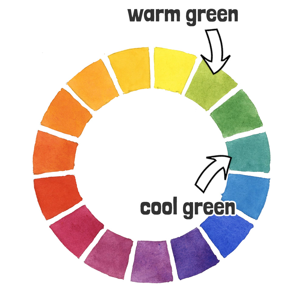
But isn’t green a cool hue?
Yes… The color GREEN is itself a COOL COLOR! And yet, it can have a warm or cool “tendency” depending on its context relative to other colors.You’ll see this kind of thing often on paint tubes. Take greens for example… The common paint color “Phthalo green” is available in both “blue shade” (meaning it leans more towards the blue side of the spectrum) or “yellow shade” (meaning it tends more towards yellow).

This duality adds another layer of complexity to understanding and using warm and cool colors effectively.
Easy rules for understanding warm and cool colors
So here are a couple of tips to keep in mind for judging whether a color is warm or cool…
1. Start with the basics:
Remember that warm colors include:
- reds,
- oranges,
- and yellows,
while cool colors comprise:
- blues,
- greens,
- and purples.
As artists we can easily visualize this using a color wheel divided into a warm side and cool side:

2. Consider the context:
Understand that whether a color appears warm or cool can depend on what other colors surround it.
This is what we saw with the example of greens above.
The color can be “relatively” warm or cool depending on which way it leans and its proximity to the warm or cool side of the color wheel. This is where the idea of “relative color temperatures” comes into play.
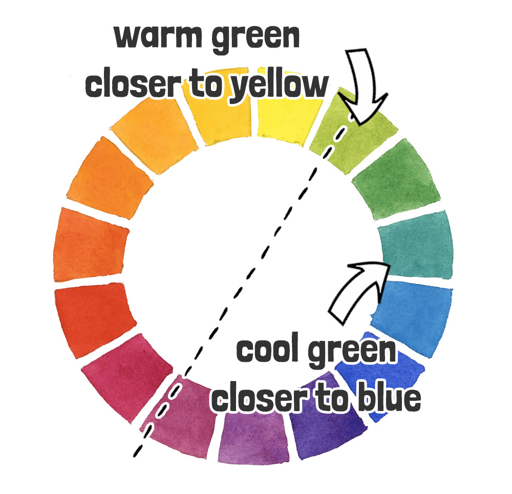
So Why is color temperature important in art?
Two reasons:
- Compositional Balance
- Color mixing
Color Temperature and Harmony in Art
By balancing warm and cool colors, artists can control the composition of their artwork, create more harmonious results, affect the mood and atmosphere of a piece of art, or help create a sense of depth.
As a general rule, it’s a good idea to let either warm or cool colors dominate a piece of art. I find that an even balance of both fails to effectively emphasize the mood of a composition. Instead try a 70/30% or 80/20% split.
Take this composition idea for example which has dominantly cool color temperature:
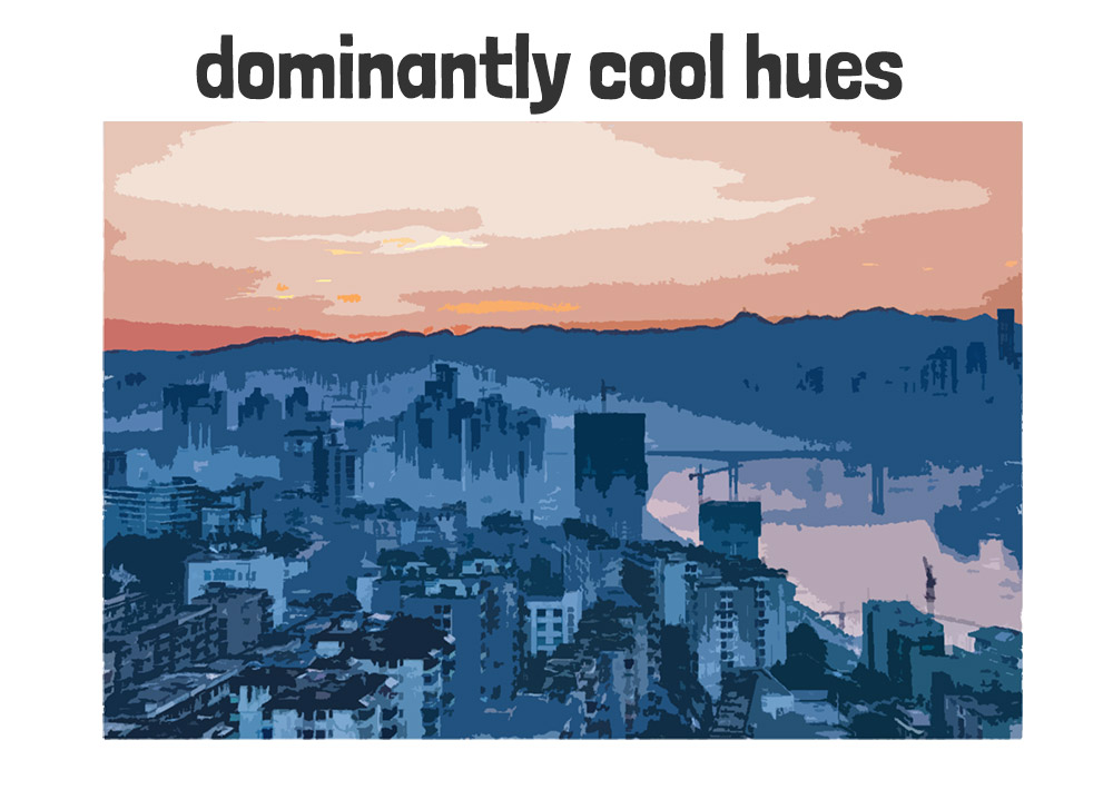
The colors in this image are mostly cool blues. The pale blue cityscape in the foreground gives the impression of a cold morning, and evokes a sense of quiet and calm. The urban landscape dominates the lower portion of the image, with its muted blue tones. Meanwhile, the pale pink-orange sky introduces a subtle warmth hinting at the possibility of a gentle sunrise.
This interplay of colors helps to create a balanced yet somewhat emotive composition, where the dominance of cool hues sets the overall mood.
Here’s another example which uses predominantly warm tones:
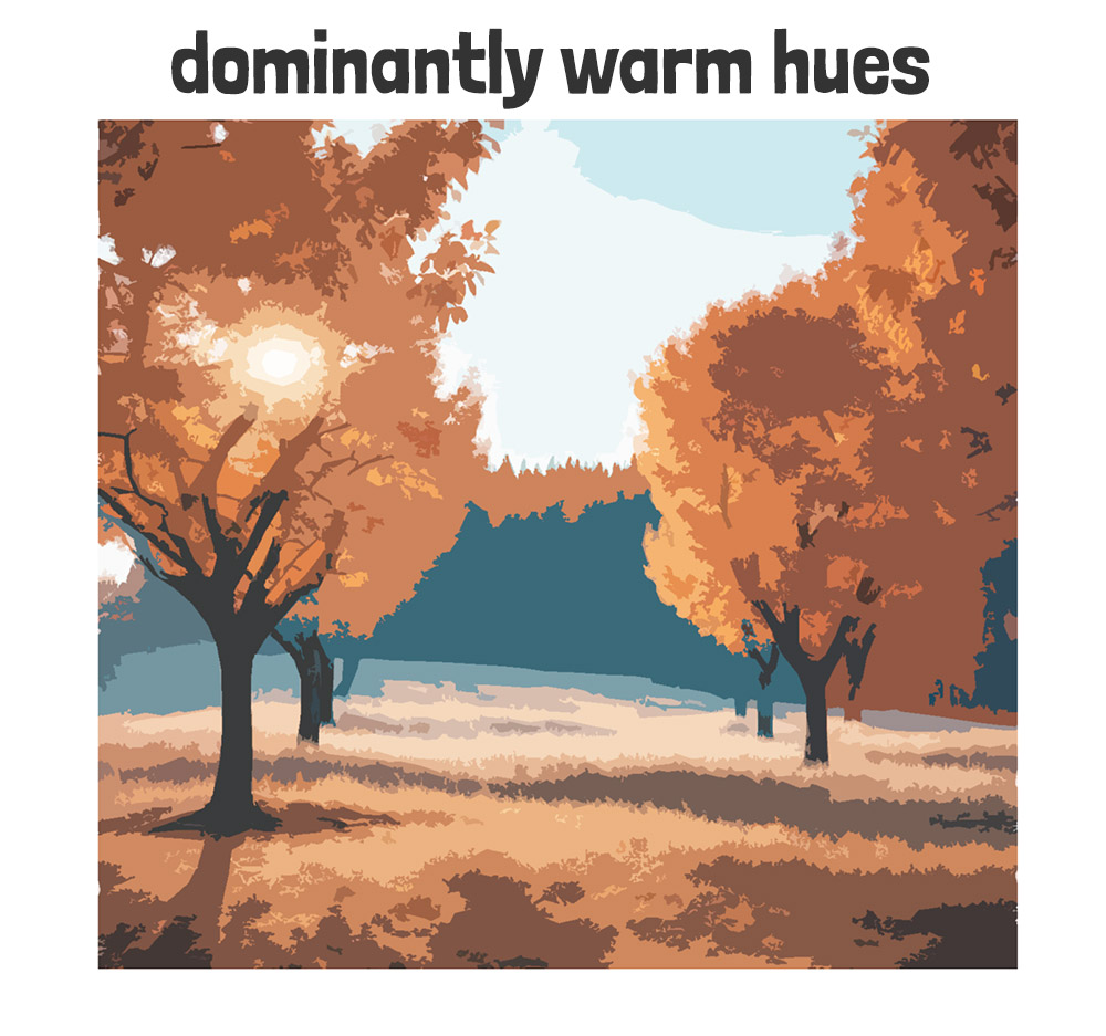
In a composition like this you can use warm and cool colors to suggest depth and distance.
The atmosphere changes the way we see color… As colors recede into the distance, they get both cooler and grayer. This is a phenomenon known as “atmospheric perspective”. Warm colors tend to advance visually, appearing closer to the viewer, while cool colors recede, appearing farther away.
This composition idea exaggerates the atmospheric perspective with warm red trees backlit by the sun in the foreground. The distant treeline on the horizon is depicted using cool, subdued blues, enhancing the illusion of depth and drawing the viewer’s eye into the distance.
This deliberate use of warm and cool colors shows how atmospheric perspective can be used to convey spatial relationships, while also adding emotional depth to the composition.
Obviously there are other things going on here to suggest depth – such as perspective, color values and color intensity. But the use of warm and cool colors to suggest distance works well since our brain is “trained” to pick up on these kinds of signals.
Color Temperature in Color Mixing
In watercolor painting, understanding color temperature is also useful for color mixing.
For example, warm and cool versions of primary colors when mixed create different results depending on which ones you use. Again… This is because of the concept of “relative color temperatures” 🙂
For instance, mixing a warm red (such as pyrrol scarlet) with a cool blue (such as phthalo blue) can result in a more neutralized, less vibrant purple, while mixing a cool red (like quinacridone rose) with a warm blue (french ultramarine) can produce a more vivid, intense purple.
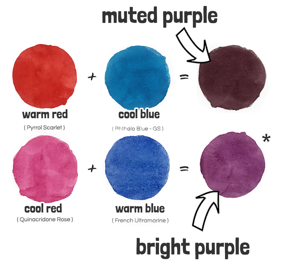
If you’re familiar with the “split primary” color palette this is where it becomes a useful guide for mixing. But that’s another lesson 🙂
Also, remember the color wheel which is divided into a warm and cool side? Well… As a general rule, mixing colors from opposite sides of the warm/cool split line results in duller, more muted results. Particularly if they are “complementary colors” (directly opposite each other on the wheel).
For example, green and red are two colors that are opposite each other on the color wheel. Mixing these together produces a neutral grayish or brownish hue…
How to tell if your paint color is warm or cool
To find out if your paint has a warm or cool bias, simply find the pigment used in its ingredients, and look up its position on a color map. A color map charts the precise color characteristics of the most common pigments and paint colors. On this map, you’ll see dots representing different watercolor pigments. They’re spread out around the circle according to their hues, just like on a regular color wheel.
But the position of each dot also shows how vibrant or dull a color is.
Locating the pigment used in the paint ingredients allows you to judge the paint’s color temperature.
This is my color map which was developed for my “Successful Color Mixing course” where I go into detail about using color maps …
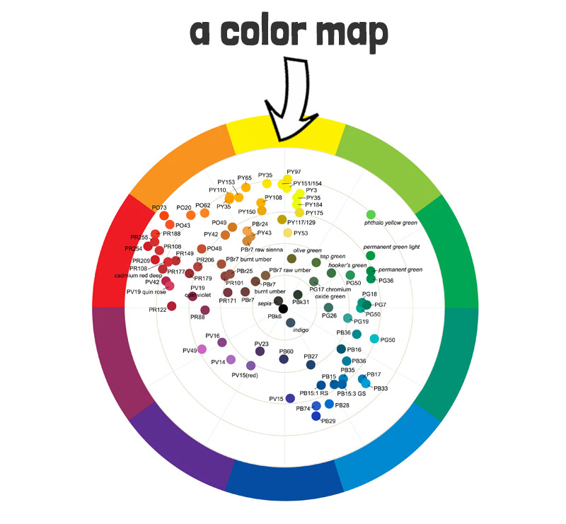
Other resources such as the Daniel Smith color map is laid out in a similar way.
You’ll find it on this page…
Lists of warm and cool watercolor paints
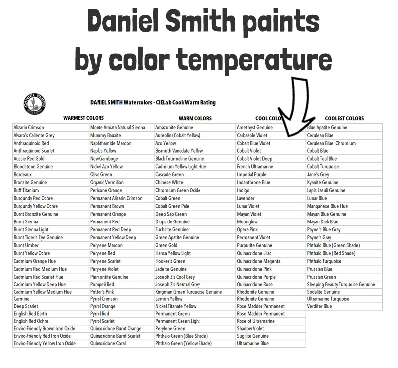
Some manufacturers provide lists of their paints categorized according to their color temperature. However, just a quick heads-up – the Daniel Smith warm and cool watercolors list is FALSE. They appear to be using a very “generic” interpretation of “warm” and “cool” colors on their color charts. For example, red is warm, and blue is cool… (e.g. french ultramarine is blue, so if you follow their logic it’s cool).
But they don’t take into account the “relative” color temperature of paints, and how “blue” paints can have a warm OR cool bias depending on the pigments used.
I also contacted Winsor & Newton who kindly provided me with the list of their professional watercolors categorized by color temperature. I’ve put this into a worksheet that you can download here…
So here are the key takeaways from my article above:
- Warm vs. Cool Colors: Warm colors (reds, oranges, yellows) evoke warmth and energy, while cool colors (blues, greens, purples) evoke calmness and relaxation.
- Color Temperature: Refers to how we emotionally perceive colors as warm or cool.
- Context Matters: A color’s warmth or coolness can change based on surrounding colors (relative color temperatures).
- Artistic Use: Understanding warm and cool colors helps create balanced compositions, and suggest depth through atmospheric perspective.
- Color Mixing: Mixing warm and cool versions of primary colors yields different results – get to know your primary colors!
- Practical Tips:
- You can use a split color wheel to visualize warm and cool hues.
- Consider the context of colors and use the concept of relative color temperatures for better mixing.
- Tools: You can also use color maps and manufacturer lists to help identify color temperatures of paints for better mixing.
If you want to learn how to mix watercolor, check out my new course:
“Successful Color Mixing in Seconds Using Color Maps!”




OMG! Thank you! I went to art school and never had such good lessons in color theory as the two posts of yours I just read! Because of that I taught B&W photography and sculpture. I’m retired and want to expand my understanding of watercolor & color theory. 🙏 You do a great job of explaining! Thank you!
Happy to help Laura 🙂
I’m new to watercolor. I’ve learned a lot in this lesson. In setting up the palette you recommended – what is the best way to “load” my paints into the palette? Should I put all the warm colors together and all the cool colors together. I have the starter colors you recommended and a few others. Thank you for any advice.
Hi Judy
You might want to take a look at this article where I show how I sequence the paints in my travel palette 🙂