
Mixing a Fall Color Palette (Keys to Success)
Fall is upon us (again!)
Funny how it keeps coming around so quick 🙂
My neighborhood’s autumn colors have inspired me to try out some paint mixes. So I wanted to share some of my favorite color-mixing recipes for fall paintings.
There’s a unique atmosphere at this time of year. The cool, sometimes foggy mornings. The ever-changing colors of the foliage. It even smells differently outdoors these days!
Each season evokes its own emotions. The colors associated with autumn are easily recognizable. Shades of yellow, orange, red, brown, and green. Rusty reds and oranges, subdued yellows, and warm greens. They create beautiful harmonies in a painting and help to conjure up feelings connected to this time of the year.
But how do you create a fall color palette by mixing the small range of pigments in your paint box?
Below I’ll show you a few suggestions and ideas…
Warm fall color palettes
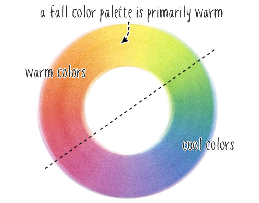
There are a few interesting things to observe about fall color palettes. First, the colors associated with autumn are predominantly warm. And for the most part, they set up an analogous color harmony.
Fall colors naturally work well together because of these characteristics.
Making use of these warm hues in your artwork has a soothing influence. For example, the softly changing colors of a fall scene create a relaxing harmony that is cozy, comforting, and calming.
But why is this so?
Fall colors are analogous.
Colors can suggest different emotional responses. And we evaluate colors in context with other surrounding colors. These relationships can be used to express feelings. In the case of an autumn color palette, the predominant hues are mostly analogous.
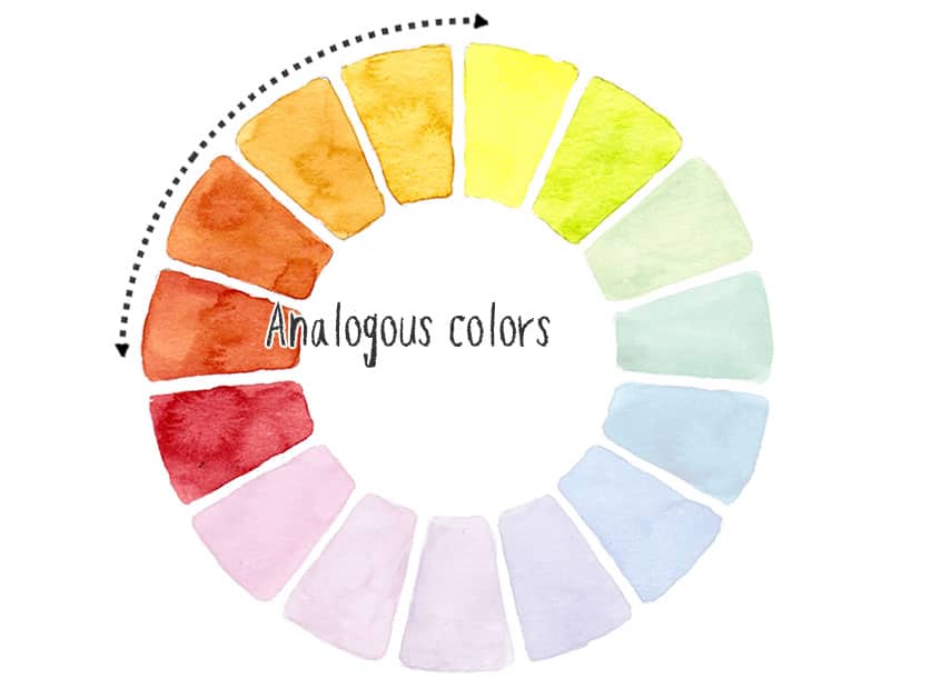
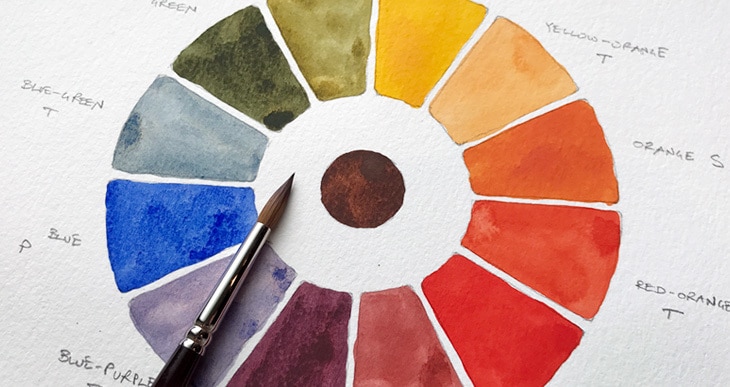
Color theory tells us that analogous colors are those which are close to each other on the color wheel. This is a valuable tool to show relationships between hues, especially when mixing paints with a few primary colored pigments.
You could also compare this to how colors are arranged on the color spectrum. Each hue appears to merge naturally into the next.
If you look at the portion of colors we associate with fall, you can see they are closely related. Reds, oranges, and yellows are right next to each other on the color wheel. They are analogous.
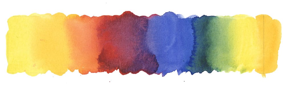
Autumn colors are primarily warm.
Different hues also have a “color temperature.” This can be a tricky concept to grasp. As a general rule, any color can be considered warm or cool. I like to use the sun and shade as an analogy for warm and cool hues. For example, the orange sun is warm, whereas blue-tinted shadows and shade are cool.
So warm colors include:
- Yellow
- orange
- red
Cool hues would be:
- Green
- blue
- purple
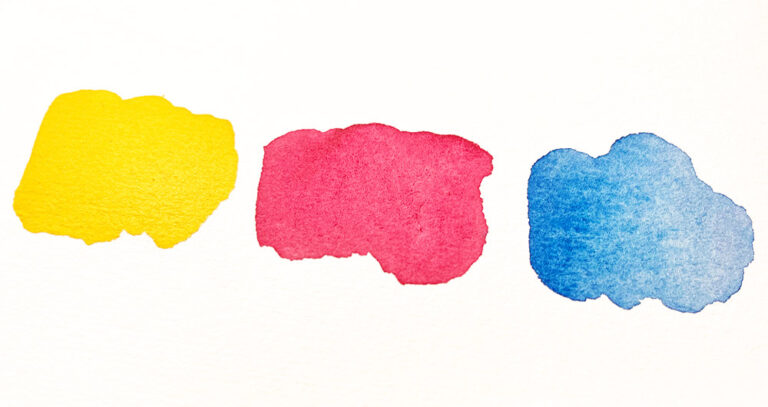
So as you can see, the golden yellows, burgundy reds, and muted oranges of an autumn subject are mostly warm.
Mixing fall colors in watercolor
Most of the colors in your paint palette are probably bright primary colors (at least they should be!). So how do you turn these into a soft, muted fall color palette?
If you observe the range of shades in an autumn scene, you’ll notice the colors are slightly subdued. There are a lot of muted versions of yellow, red, and green.
There are different ways to create this color palette with your paints. In the following examples, I’ll show you how to achieve a fall color scheme using primary colors as the starting point. But the color temperature of the primary paints is essential. To mix soft, muted colors, we must use both cool and warm versions of the primary paints.
Each primary paint color can have a color temperature of its own. For example, red can be cool or warm. This range of pigments is usually called a split primary palette. I talk more about the concept of split primaries in this article here…
The most simple autumn mixtures are made with just two paints.
Mixing two primary colors produces a secondary color. In this case, we’ll mix yellows and reds to make oranges, plus yellows and blues to create greens.
More complex neutrals and browns are mixed using three primary paints.
- Two color mixes – used to mix oranges and greens
- Three color mixes – creates neutral browns.
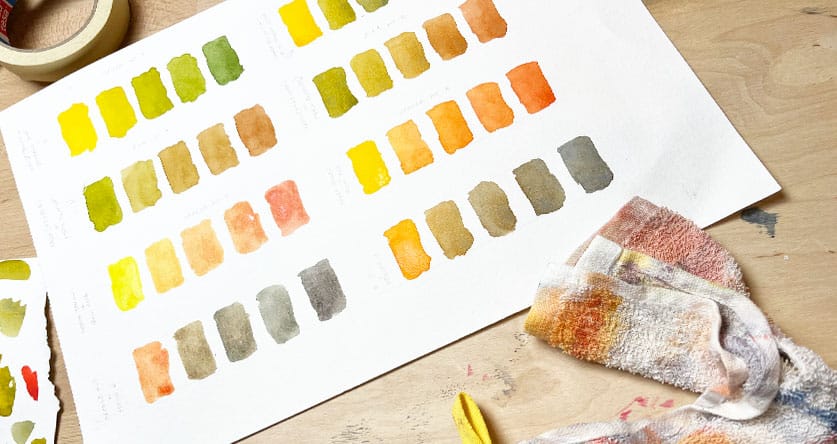
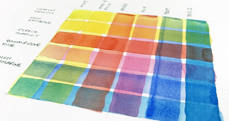
Mixing chromatic scales for fall colors
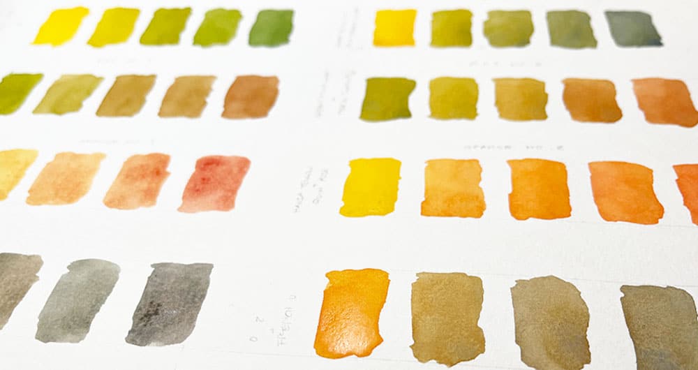
Here you can see some examples of toned-down greens. Subtle greens like this are so important for painting fall subjects. These are mixed using a warm yellow plus blue. The warm yellow is essential. In this case, I used Hansa yellow deep (all the color names here relate to Daniel Smith watercolors).
In each case, I have mixed a chromatic scale to show the gradual shift in color appearance as you add more and more of the second hue. A chromatic scale is a range of color mixes showing the progressive shift in hue as the pigment ratios change.
2 primary colors: Yellow + blue
Notice how the resulting greens are slightly neutral and muted. If you were to try this using a cool yellow paint, the green would be much brighter and less characteristic of autumn hues.
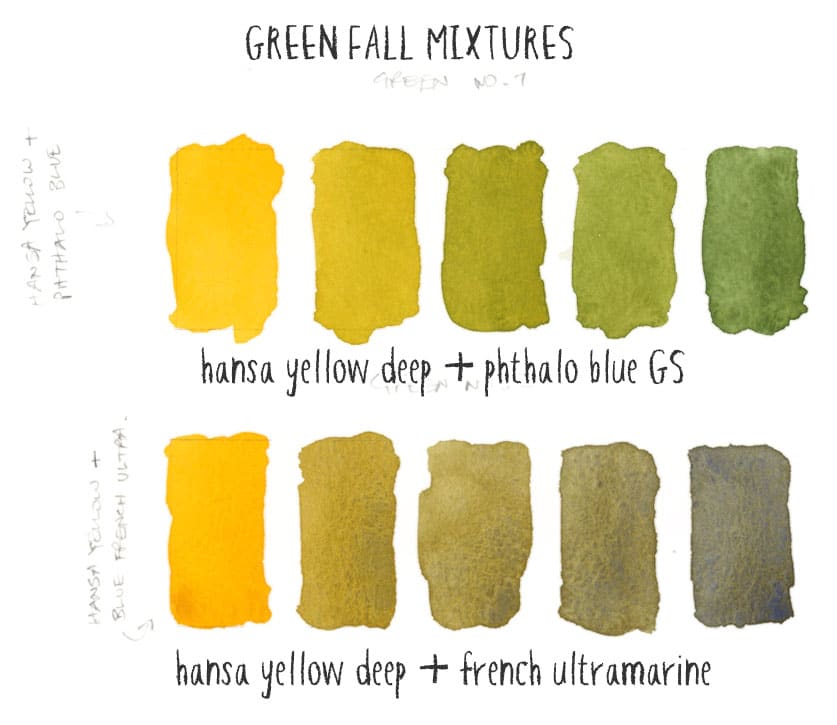
You can try this yourself if you have a range of cool and warm yellows.
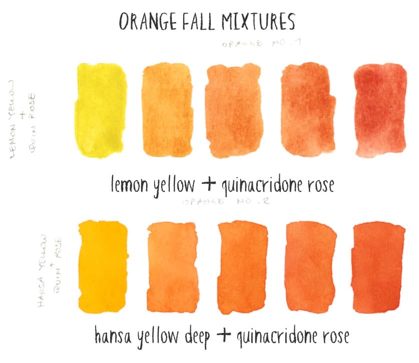
2 primary colors: Yellow + red
Next, I made some orange mixes. This time I’m using a cool red as the basis for this mixing recipe. The cool red (in this case, quinacridone rose) produces a more low-key, muted orange. If you were to mix two warm primaries (a warm red and warm yellow), you’d end up with a bright orange that is less typical of fall scenes.
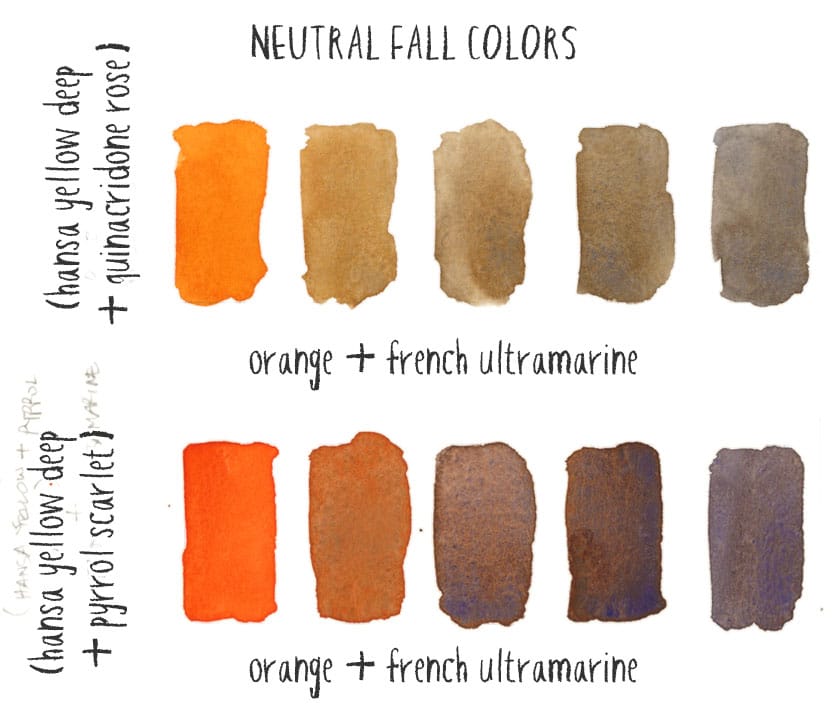
The next set of mixing recipes uses three primaries to create a range of beautiful neutrals and warm browns. This is done using the following process:
- First, mix a secondary color, such as the orange or green colors above. Make sure you make a big puddle of paint to make mixing easier.
- Next, mix this secondary color with a primary paint color. Doing this is a method known as “mixing complements.”
Complementary colors are pairs of colors opposite each other on the color wheel. Mixing complements together, neutralizes the mixture, and produces a range of darker grays, neutrals, and browns.
So the secret to creating subdued neutral hues is to mix complementary paint hues like these:
- Yellow and purple
- Red and green
- Blue and orange
Complementary colors : Green + red
Here are the results when you mix the green mixtures from above with a warm red (I used pyrrol scarlet).

You get some beautiful warm rusty browns.
Complementary colors: Orange + blue
When you mix orange and blues, you can obtain some interesting, slightly darker neutrals.
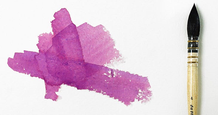
Complementary colors: Purple + yellow
The final color mix I want to share uses purple and yellow complements. This was made using a mixture of quinacridone rose and french ultramarine (to make purple). Then I added this to a warm yellow (Hansa yellow deep).

The result is a fantastic rich chestnut brown!
Try making chromatic scales with your paints to produce an autumnal color palette! This is a fantastic way to explore the mixing capabilities of your watercolors. The process is great fun, and you might discover some surprising results 🙂
If you’d like to learn how to avoid muddy colors and learn how to mix watercolors, try my new course:
“Successful Color Mixing in Seconds Using Color Maps!”


Anthony, your lessons are amazing and I get better results every time! I can’t wait to try a fall scene again…soon!
Thanks M’Lu 🙂
Wow. I’ve loved art & color & beauty my whole life, but never knew the “science or math” behind color palettes. This was a GREAT lesson! And it’s just fall colors! My mind is blown with what other combinations there must be. I can hardly wait to wet my brush. THANK YOU!
Hi Nancy
Yes you can get an amazing range of beautiful colors!
This kind of exercise is great for finding your favorite color mixes…
Have fun!
Anthony- cheering you on in your work as a painter and as an educator. I value the simple, direct, approachable instruction you give. THANK YOU!
Thanks Janelle 🙂
Happy to help
Thank you so much for your teaching on different palettes. I ordered a John Pike Palette after your advice during a previous post. I had no idea how much I’d like it! I set it up with your suggestion for Daniel Smith watercolors, most colors I already had on hand but ordered the missing pigment colors along with the Pike palette. Thanks again, for your very informative posts. I have a small Autumn painting I wish to do for a friend with a November birthday and will take your advice on the warm colors.
Hi Sharon!
So glad you’re enjoying the mixing palette 🙂
Have fun doing your autumn painting…