How to make a perfect purple with watercolor
Have you ever tried to mix a purple color and then think to yourself:
“ That doesn’t look right ! ”
Purple is one of those tricky colors in watercolor mixing. And to be honest I didn’t always understand why my attempts to make purple turned out so bad. I wondered if it was the quality of my watercolors or maybe something in the paint formula which made my purple so murky.
Surely, achieving a bright vivid purple shouldn’t be so difficult.
After all, everybody knows blue+red = purple… Right?
Purple, violet, magenta, mauve… Call it what you like. A lot of artists struggle to get just the right purple mixture.
So how do you make purple watercolor?
Mixing intense and bright purple with watercolors depends on the color bias of the paints you are using. All paints have a warm or a cool bias. In short, the best results for mixing saturated purple are obtained using cool reds.
I honestly didn’t get this for a long time ! But after I gained a little bit of mixing knowledge it became plain and clear.
Here are a few things every watercolorist should know about purple watercolor:
Purple and the color wheel
To understand why it’s so difficult to mix a decent purple color we need to talk about color theory.
Don’t worry… I’ll try to make this as painless as possible !
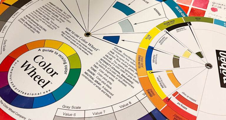
To illustrate how color theory works we’re going to be using a color wheel. Color wheels are very useful tools to help us understand color mixing.
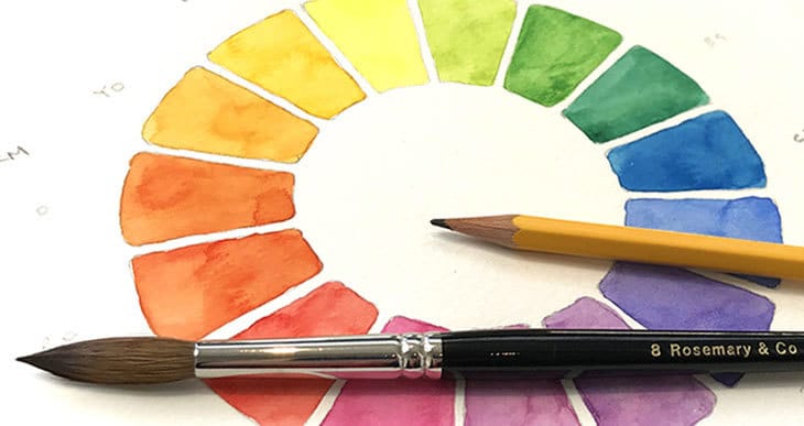
A color wheel is a circle of hues used by artists as a guide to color mixing. They also help you choose paints for the color design of a painting. All color wheels begin with the primary colors: yellow, red, and blue. From these three colors we mix the secondary colors: orange, purple, and green. Finally we mix the tertiary colors by combining adjacent primary and secondary colors. The color wheel provides us with a visual reference to color mixtures and pigment combinations.
The concept of color temperature can be easily seen on the color wheel below. Warm colors include yellows, oranges and reds. Cool colors are comprised of purples blues and greens.
This idea is quite intuitive… For example, blue is easily perceived as cool, and red as warm, etc.
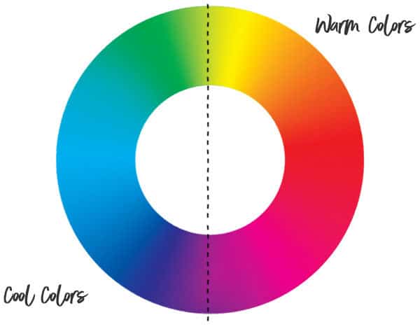
The color appearance of your paints all have a temperature bias. A cool paint color will lean towards the cool side of the color wheel and vice versa.
For example Phthalo blue (GS) has a cool bias because it contains some green. But French Ultramarine has a warm color appearance because it contains some red.
The following color wheel uses two versions of each primary color, both a warm and a cool version.
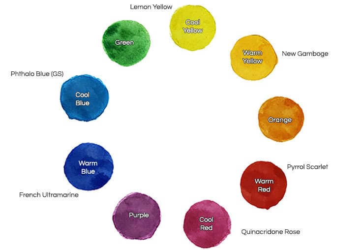
The color wheel helps us identify the color bias of our hues. If you look carefully Phthalo blue (GS) is closer to green and further away from red. It is closer to a cool color, therefore this makes it a cool blue.
In a similar way, French Ultramarine is closer to red and further away from green. This makes French Ultramarine a warm blue.
Complementary color mixing rule
Now that you are able to distinguish warm and cool hues, we need to talk about complementary color mixing.
A complementary color is any color located on the opposite side of the color wheel from your target color. Take another peak at the color wheel, you’ll see that the complementary color of purple is yellow.
The complementary mixing rule tells us that if you mix two complementary colors, they neutralize each other. A neutralized color is a desaturated color such as grey or black.
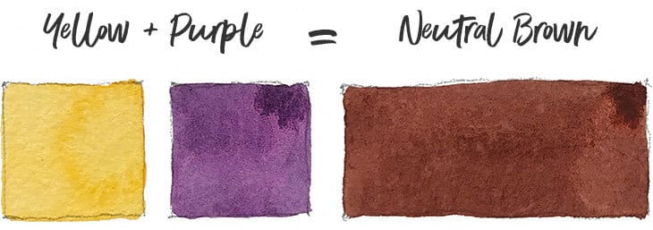
So in general, when you mix purple and yellow paints you get a neutral brown color which has been desaturated.
How to make a vivid purple watercolor mixture
OK… Now that you have a grasp of color temperature and complementary color mixing we can demonstrate how to create a nice saturated purple with your watercolors.
If you want to mix bright saturated purple you need to mix the two primary colors closest to purple. In this case, cool red (Quinacridone Rose) and warm blue (French Ultramarine).
So why does this combination of warm blue and cool red produce a nice saturated mix ?
Well, if you remember, the complement of purple is yellow.
So the more yellow you mix with purple the more dull and desaturated it becomes.
Cool red and warm blue are the furthest away from yellow. Therefore by mixing these two colors together we keep any traces of the unwanted primary yellow out of our mixture.
Cool red + warm blue = saturated purple
To mix a very saturated purple you use those primary colors which are closest to purple, and furthest away from yellow on the color wheel, therefore avoiding purple’s complementary neutralizing color.
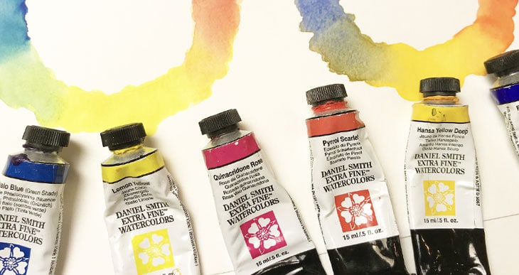
This principal holds true for all secondary colors. A bright saturated orange can be mixed using the hues closest to orange, (warm yellow+warm red). A vivid green can be obtained by mixing the hues closest to green, (cool yellow+cool blue). This is why it’s essential to include a good selection of warm and cool primary colors in your color palette. Six colors is enough to begin with:
If you want a good range of mixing possibilities and to be able to make bright saturated color you need to include at least these six options in your palette.
You’ll find a list of my personal paint recommendations here.
The secondary color purple
Color theory tells us that purple is a secondary color and to mix it we need to combine red and blue.
So much for the theory.
This standard formula is true to a certain extent, but artists mix paints, not colors.
Pigments are the real carriers of color in paints, and each paint produces its own unique color appearance, and mixing results.
As watercolor artists we need all kinds of purples. Dull purples produce beautiful rich shade and shadow areas while brilliant lively purple creates intensity and focus.
The key is understanding how to mix the right purple for the right occasion.
So what are the color combinations for mixing desaturated dark purples or bright vivid purples ?
Let’s take a look at what happens when you mix together different variations of warm and cool blues and reds.
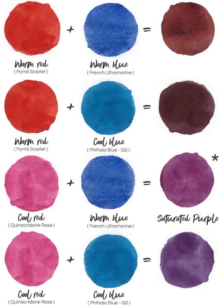
As you can see the best results for mixing bright purples come from using cool red. But warm reds (because they are closer to yellow), will neutralize the mix. You will always get a dull color purple using a warm red. These colors are nice in their own way, and can add beautiful richness and dark values to your paintings (far better than just using pure black).
The brightest purples come from hues of reds and blues which are closest to purple. So this means warm blues and cool reds.
As you have probably figured out by now, what is often poorly understood is the concept of color temperature. In practice the results of mixing different red and blue pigments produces a wide range of beautiful purples. But the general strategy of red+blue does not always give us a pure saturated purple.
The colors I used for the above test chart are as follows:
- chevron-right
A quick word of caution.
The color name on a paint doesn’t tell you want is in the paint recipe. Pigments are what produce the final rendered color.
It’s a good idea to get into the habit of learning or at least making note of the pigments contained in your different paints so you don’t get too many surprises when mixing !
Purple direct from the tube
I’ll let you into a secret…
I have a range of purples in my collection for when I’m feeling lazy !
Understanding how to mix different purples gives you so much freedom.
But from time to time you just want to grab a specific purple color directly from the tube – Quinacridone Violet is one of my favorites !
You’ll find many pigment alternatives to choose from if you want a tube of yellow, red or even green watercolor.
But there are relatively few pigment alternatives for purple.
As painters we all want to find the best pigments for specific hues. So if you’re looking for a good purple to use as a convenience color then you can’t go far wrong with the ones I’ve listed below.
Although this list is not exhaustive, I’ve indicated the pigments used in each paint formula to help you identify similar paints from alternative brands.
I try to stick to a set of quality guidelines when choosing my paints, so all of the examples listed here are transparent, single pigment paints, with good or excellent lightfastness ratings. A large number of manufacturers produce purples which are convenience mixtures of two red and blue pigments. For example the Daniel Smith color “Rose of Ultramarine” is a mix of the pigments PV19 and PB29 (Quinacridone Rose + French Ultramarine), which is exactly what I used in the tests above to make bright purple.
All these highly recommended pigments are versatile, and handle well in watercolors.
If you’re not accustomed to pigment names, purple pigments are denoted as “PV” (Pigment Violet). “PR” means Pigment Red.
Another thing I have noticed, if you like granulating watercolors, a large number of purple pigment paints are granulating…
A few recommended purple paints
Daniel Smith Quinacridone Lilac ( Pigment PR122 )
An intense red-purple color, and probably the strongest hue of any red-purple pigment available in watercolors. “Quinacridones” are a family of beautiful highly colorful pigments which all share the same excellent lightfastness and transparency. Quinacridones handle beautifully in washes and mix with other paints extremely well.
Daniel Smith Quinacridone Rose ( Pigment PV19 )
This paint is great for mixing very bright warm colors and purples, and as you can see from the tests above, it’s valuable as a “primary” cool red in a limited color palette. This is probably one of the most versatile and widely used rose pigments.
Daniel Smith Quinacridone Violet ( Pigment PV19 )
A darker valued, slightly warmer purple hue. When used wet on wet it is very ‘energetic’ and can produce some interesting blooms.
M. Graham Dioxazine Violet ( Pigment PV23 )
This is a very dark valued slightly dull purple color. The PV23 pigment is lightfast and highly staining. The color appearance is very similar with other brands of paint using the same pigment.
Daniel Smith Quinacridone Pink ( Pigment PV42 )
Not available from many manufacturers, this color is very similar to Quinacridone Rose. Tests have shown that it is slightly less lightfast, but it mixes wonderful bright purples like the PV19 pigment in Quinacridone Rose. If you have to choose between the two, PV19 would be a better option.
Daniel Smith Cobalt Violet Deep ( Pigment PV14 )
A medium value purple color, this pigment is non-staining and has excellent lightfastness. When this paint dries it shifts slightly towards red. Apparently this pigment is quite rare, making it more expensive. Beware of cheaper paints with the same generic name, which may not contain the real pigment.
Daniel Smith Ultramarine Red ( Pigment PV15 )
This is a medium to dark purple color. The color appearance of paints with this pigment seems to vary slightly from one brand to another. This one from Daniel Smith is a lovely deep blue purple.
Daniel Smith Cobalt Violet ( Pigment PV49 )
A light purple violet color, probably what some would call “fuchsia”. I quite like the granulating quality of this pigment.
Daniel Smith Quinacridone Purple ( Pigment PV55 )
This is a lush deep purple color and as far as I can tell, the use of the pigment PV55 is exclusive to Daniel Smith. It’s a rich transparent color almost like a burgundy wine color.
Conclusion
The “purple dilemma” is not really a problem if you can grasp the fundamental principles of color theory and make use of the color wheel to assist your color mixing choices.
For accurate color mixing it is important to understand how the position of hues on a color wheel affect the mixed color appearance. And if you keep in mind the rule of complementary mixing then you’ll find it easy to choose the right pigments for your desired color.
By the way… Purple continues to be one of my favorite colors !
“Successful Color Mixing in Seconds Using Color Maps!”




I’m apparently late to the game—your blog has been around for years and I’ve just discovered it! I’ve only been playing with watercolors for about six months though, so I’m thrilled to have found you so early in my exploration of watercolors! I could echo everyone’s praise about how clearly you explain things like color theory—and demonstrate, too. I love listening to you talk while watching you paint.
I’ve been an editor more than an artist most of my life, and I’ve found something that might be a typo, or maybe I’m just misunderstanding because I’m new? Under the color chart, there’s the line: “In a similar way, French Ultramarine is closer to red and further away from green. This makes French Ultramarine a warm red.” Shouldn’t this be ‘…makes French Ultramarine a warm *blue*’? Color names make me crazy! (facepalm)
Well spotted Anglea – Thanks! I’ve fixed it…
Hello. I am a beginning watercolorist (age 83) and found your article the best I’ve ever read on color theory. Frankly the other books I’ve read were never so clear as you. Thank you so very much, Judy Baker
PS looking forward to green colo mix
Hi Judy
Thanks! I’m happy to hear you’re getting started on your watercolor journey 🙂
Hi, Judy. I am 90 and have taken my first watercolor class. I am so happy for both of us. Was looking for ways to create a lovely purple and am so happy to find you and Anthony. I am a retired art teacher…all ages…and always steered clear of watercolor painting knowing what a huge challenge it is. Hugs to you and Anthony.
Thanks Margaret! Happy to help 🙂
Thank you for this article! I was wondering why my purple ended up being so ugly and brownish.
I used Daniel Smith Pyrrol Scarlet and French Aquamarine and I didn’t get that homogeneous purple that you did in this article though. Instead, my colors separated out on the paper: blue sitting on top of the orange red. I’m not quite sure what I did wrong! I achieved a semblance of purple while mixing.
Try mixing Ultramarine with a cool red such as Quinachridone rose – you’ll get lovely purple colors. Ultramarine is a granulating paint which is why you see the pigments separate when you let them dry.
Purple is totally my dilemma!! Thanks for sharing this and letting me know it is not only my problem 😀
Green is also another headache for me, never seem to find a green that is suitable. I’ll try these theory and tips for purple to tackle green! Can you write something about green too?
Hi Ming – Yes green can be a tricky color to mix as well – I’ll put together an article about this soon…
I stumbled on your blog, it’s fantastic! Do you have a newsletter?
Thanks Lissa – newsletter coming soon I hope.
Stumbled across this blog, and it is the best! Thank you for writing such great information so concisely! Keep blogging please!!
Hi Diana – more coming soon!
Hello Anthony, I just discovered your site a few hours ago and have been going through your posts. Never have I found more wonderful information and direction in one place – ever – for beginning a watercolor practice. Such a tricky and wonderful medium. So a huge thank you for all this.
I searched for a spot to add my email to follow your posts but can’t find one. I there one?
Paula Devi
Thanks for your kind comments Paula. If I find time, I’ll try to add an email list to the site.
Happy painting !