
How to Compare and Match Paint Colors from Different Brands
A lot of artists ask me how to match their existing paint colors to the ones I recommend.
Finding equivalents to another artist’s palette of colors can be frustrating, especially if you already have lots of tubes of paints from another brand!
This quick guide gives you an easy method for doing that.
If you already have your own favorite brand of paint and you’re wondering how to choose the right colors for any of my lessons (or your other favorite artists), the following guide will help you do exactly that 🙂
Finding Matching Colors Between Brands of Artist Paint
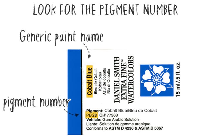
The key to matching colors between paint brands is not the generic name given by the manufacturer.
You’ve probably noticed the poetic names printed on your tubes of watercolor. You often see names like “Phthalo”, “Quinacridone” and “Sienna”. But those fancy names are just marketing names, and they don’t really tell you anything about the exact color appearance.
The principal “color” ingredient in watercolor paint is the pigment. This is what determines the actual color of the paint.
So to figure out if you have the right colors in your existing paint collection, you need to match the PIGMENT NUMBERS.
If you look carefully on a paint manufacturer’s website, you should find a color chart where each paint color has a corresponding pigment number.
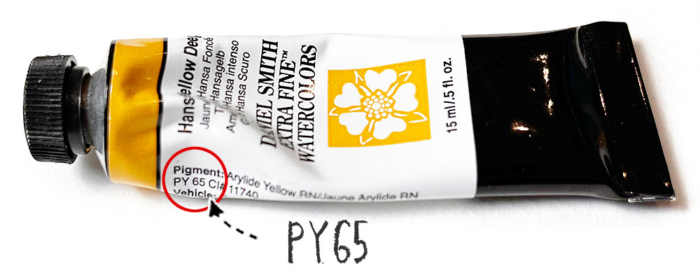
For example the number PY65 means “Pigment” / “Yellow” and “index number 65”.
Ignore the generic name on your own paints and take a peek at the label.
Labels vary from one manufacturer to another, and sometimes not all the information is available on the label itself. In this case you can usually find a complete color chart on the paint producers website.
Once you have your pigment information you can use the following chart to locate the closest matches, or even exact matches for the recommended paints.
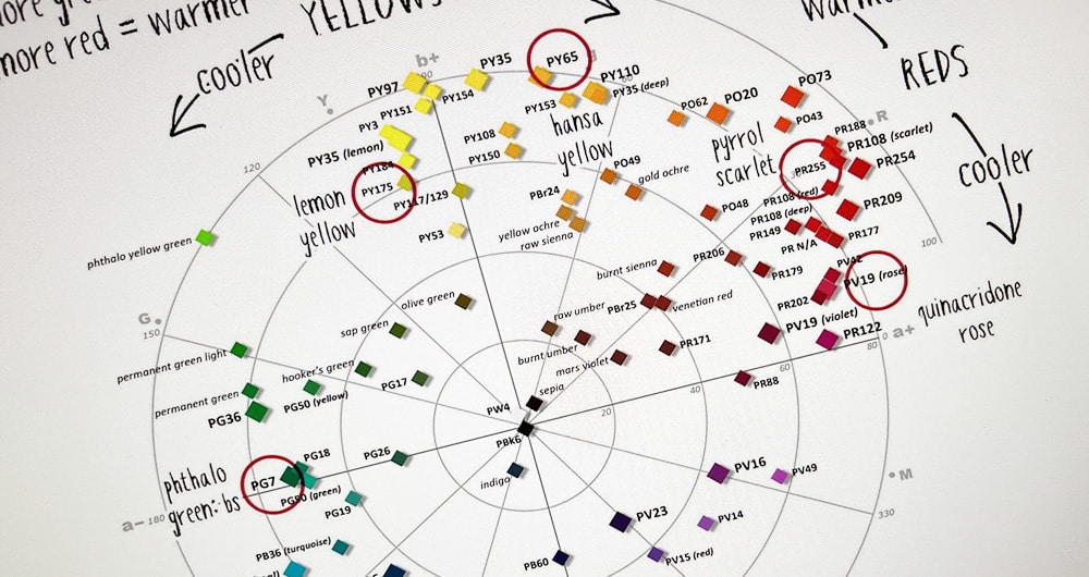
(The color wheel below was originally produced by Bruce MacEvoy and published on his website handprint.com).

This color wheel represents the placement of the most popular paint pigments around a color wheel according to their color properties.
Use this as a guide to match your own pigment colors to the ones on the supplies list…
Example – Finding a Match
For example, the red circles on the image above show six of my recommended primary colors by Daniel Smith (see below). These represent a warm and cool version of the primary colors (yellow, red, and blue).
- Hansa Yellow Deep – Pigment number: PY65
- Lemon yellow – Pigment number: PY175
- Pyrrol scarlet – Pigment number: PR255
- Quinacridone rose – Pigment number: PV19
- French ultramarine – Pigment number: PB29
- Phthalo blue GS – Pigment number: PB15:3
Locate the pigment numbers on the color wheel. Let’s say for example you wanted to match Daniel Smith Hansa Yellow Deep with an equivalent from Winsor and Newton.
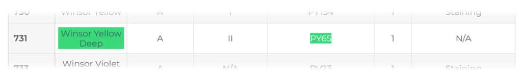
Hansa Yellow Deep uses the pigment PY65
According to the Winsor & Newton website “watercolor composition” page here, the best equivalent would be “Winsor yellow Deep” – paint number 731. This paint also uses the pigment PY65 in its formulation.
Caveats
There is one final proviso to this matching method. You may not always find an exact pigment match from one brand to another.
For example, Daniel Smith’s warm red color “Pyrrol Scarlet” uses the pigment PR255. However, Winsor and Newton do not use this pigment.
If this happens, use the color wheel to locate the closest pigment possible to your target color.
If you look at the color wheel you can see that PR255 is close to PR254, which is the pigment used by Winsor & Newton for their paint color “Windsor Red”.
“Winsor Red” would therefore be the closest warm red to Daniel Smith’s “Pyrrol Scarlet”…
Other Resources
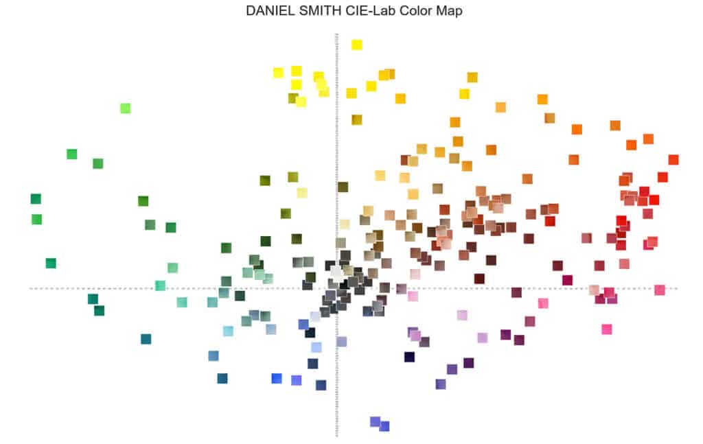
If you want a handy way to look up pigment information for Daniel Smith’s range of colors, they have created this color map. It’s laid out in a similar way to the color wheel above, with paints arranged around an axis, with the color appearance ranging from warm to cool.
Good luck finding your paints !
Keep in mind that if you don’t have the exact matches for the paints used by another artist, just try to get the closest options possible.
After all, it’s supposed to be fun 🙂


Thank you for such invaluable and clear information Anthony. As an overwhelmed beginner to watercolour painting I feel so relieved to find a clear way forward to follow. I find the illustrations very helpful for taking in the text too.
Glad you found it useful Sheila 🙂
There can be wildly different colours from a single pigment- most the Earths are Pbk7 or PR101. So that doesn’t always work. I’ve got PV19 that’s an alizarin crimson match, but most of that pigment are magenta; yet a lot of “permanent alizarin” exists from about 6 different numbers all pretty interchangeable as an “alizarin”.
Note also they have different names from the wheel. So if wanting to find pyrrol scarlet in the Windsor range, it takes some digging but PR255 is actually their Scarlet Lake, so no need to go to PR254 and get Windsor red. But with the first point I made that doesn’t necessarily mean the SL is closer to PR than the WR!
Thank you so much for all your advice..You have given me (a complete beginner) the courage and motivation to begin my watercolour journey. And not to be discouraged if things don’t go as planned. (Many a small hand painted greetings card been sent using the more successful bits) My gratification won’t cure your imposter syndrome… But I wish it could…
Thanks Alison 🙂
Dear Anthony,
I look forward to reading your emails, I learn something from each email. As always, THANK YOU
Happy you find them useful Helen 🙂
Thanks Anthony- this wheel is very helpful. When I first started painting with watercolours I’d dash off to purchase whatever colour I didn’t have that was mentioned in a tutorial! I soon realized that wasn’t necessary- nor affordable! I do have a plethora of colours, but now only use a few. I will definitely make use of this wheel!
Glad you found it useful Becci 🙂
Your information is always helpful, I print and save it, it’s becoming my custom manual! I love the easy way you explain things. Also your paint tutorials are wonderful!
Thanks Lorraine 🙂
This information is very valuable. Thank you so much!
Thank you! Really informative.