Setting up Watercolor Palette Colors like a Pro (A Beginners Guide)
Setting up a watercolor palette can be a bit of a brain-teaser, especially when you begin learning watercolors. When I first started painting it took me a while to figure out which colors to use and how to organize them. And over time, I’ve agonized over the best choice of paints to include in my palette!
Personalizing your palette might seem trivial, but if it’s done correctly it’s a valuable step towards better color mixing and an easier painting experience.
In fact, if you think about it, the way you set up your color palette has an effect on all of your artwork.
So if you’ve decided to set up your palette with the colors of your choice, then good for you!
And guess what? I just got a new watercolor palette for working in my studio. So I thought this would be a great opportunity to show you how to set up your paints and arrange your colors.
How to Set Up a Watercolor Palette
There are several advantages to a well organized palette. But before we get to those, I think there’s a more fundamental question you need to ask yourself:
What colors to put in your palette?
If you’re like me, then you probably have a whole bunch of different watercolor paints to pick and choose from. Or if you’re just starting out, then you’re probably eager to make the right decisions from the beginning.
Now… Choosing the “best” watercolor paints for your needs is a whole subject in itself which I’ll talk about in another article.
But I do have a few tips that you might want to consider before you fill up your palette with every tube you own! These are just a few of the things I learned from experience and which I wish I had known when I set up my first watercolor palettes…
- limit your colors! A common mistake among beginners is selecting too many colors. It’s actually much easier to learn to control your color mixing with a limited number of colors compared with a large variety of hues. You can start out with a small range of colors and add to them as your preferences evolve.
- Ideally, colors should work together with the other pigments in your palette when you mix them together, so choose colors which provide a wide range of mixing possibilities.
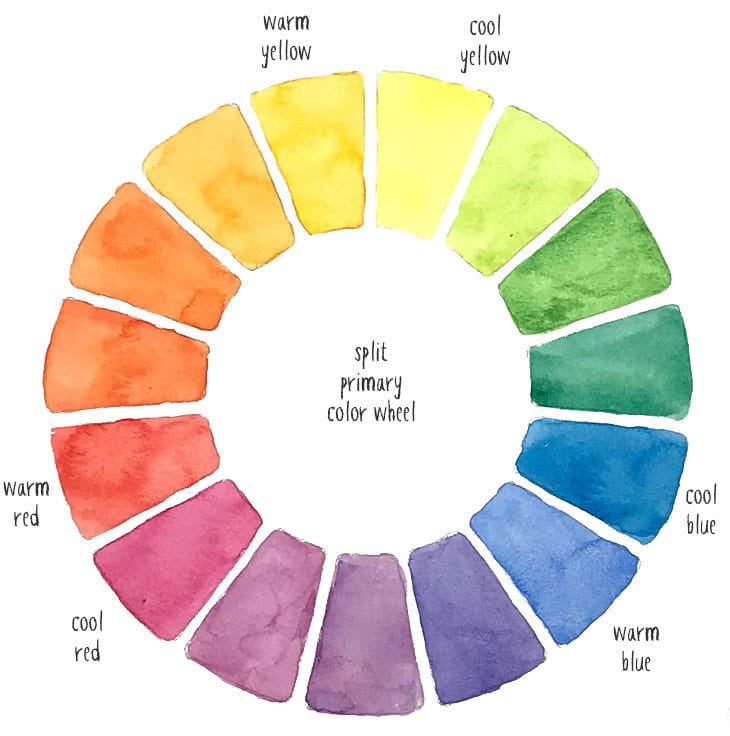
- For me this begins with a selection of both warm and cool primary colors. This is the foundation for the rest of your color palette. In theory, primary colors (yellow, red, and blue) allow you to mix just about any other color you need. And having warm and cool versions is essential for mixing bright and intense secondary colors (orange, purple, and green).
This combination of warm and cool primaries is often referred to as a “split primary palette”. I advise starting with this kind of setup because it helps address some of the mixing limitations of primary paints so you can produce more vivid, saturated colors. The split primaries let you mix brighter colors by using paints that are closer together on the hue circle.
- Choosing strongly saturated colors and single pigment paints can vastly increase your range of mixing possibilities. It’s impossible to mix bright colors if the hues in your palette are dull or if they contain several pigments in their ingredients (check the labels). This is why single pigment paints are highly sought by watercolorists.
- That’s not to say that you shouldn’t include some of your favorite convenience colors in your watercolor palettes. Browns, and dark greys are some of the most popular choices, and you can also include some “ready to go” secondary colors(purples, oranges, and greens).
Convenience colors are those that you mix so frequently that you don’t want to mix them from scratch every time. These are known as convenience colors because they save you time and they provide a consistent color appearance, rather than trying to mix exactly the right green each time you run out of paint. “Sap Green” is a common example of a convenience color which is a mix of several pigments.
- Learn to choose pigments not colors. Look at the labels on your watercolors to understand the pigments that are being used. Don’t be fooled by the fancy names. Different manufacturers often use different pigment ingredients for paints that have exactly the same name. For example a “Hooker’s green” from Winsor and Newton won’t contain the same pigments as Hooker’s Green from Daniel Smith.
- Finally, there’s no reason you can’t have more than one palette, especially in a studio situation.
My Colors
Below is a list of the colors I used for my palette. (If you’d like to know why I chose them then take a look at this article about choosing the best watercolor paints).
All of the watercolors below are by Daniel Smith (some of you may know that I love this brand of watercolors). However, I’ve included the pigment numbers for each of the paints so that you can easily find equivalents from other manufacturers.
Primary Colors:
Primaries are reds, yellows and blues. In the list below I’ve also indicated which paints are my warm and cool primaries.
- Cool Red – Quinacridone Rose: PV19.
- Warm Red – Pyrrol Scarlet: PR255.
- 2nd Warm Red – Quinacridone Coral: PR209.
- Cool Blue Phthalo Blue GS: PB15:3.
- Warm Blue – French Ultramarine: PB29.
- 2nd warm blue – Cobalt Blue: PB28.
- Manganese Blue Hue: PB15.
- Cobalt Teal Blue: PG50
- Warm Yellow – Hansa Yellow Deep: PY65.
- Cool Yellow – Lemon Yellow: PY175.
Secondary Colors:
- Orange – Transparent Pyrrol Orange: PO71
- Green – Phthalo Green BS: PG7.
Convenience Colors:
- Sap Green: PO48/PG7/PY150
Earth Colors:
- Yellow Ochre: PY43
- Raw Sienna: PBr7
- Quinacridone Burnt Orange: PO48
- Burnt Sienna: PBr7
- Burnt Umber: PBr7
Darks:
- Prussian Blue: PB27
- Payne’s Gray: PB29/PBK9
What Type of Palette?
Yikes!
There are sooooo many different types of palettes for holding watercolor paints. But whichever type you use, the principles for setting up your colors are the same.
That being said, keep in mind the following characteristics when choosing a palette…
- A white surface that lets you see the color and strength of your mixing puddles.
- A surface which is easy to clean and if possible resists staining.
- Consider the portability you need (will you be using it only indoors at home , or outdoors in plein air situations, or both?)
- A good sized mixing area for you to blend paint and water.
- Good sized paint wells to match the size of the brushes you most often use (big is more comfortable).
In this demonstration I’m using a new palette which I chose specifically for working indoors. It’s known as a John Pike palette(no prizes for guessing who invented it ! )
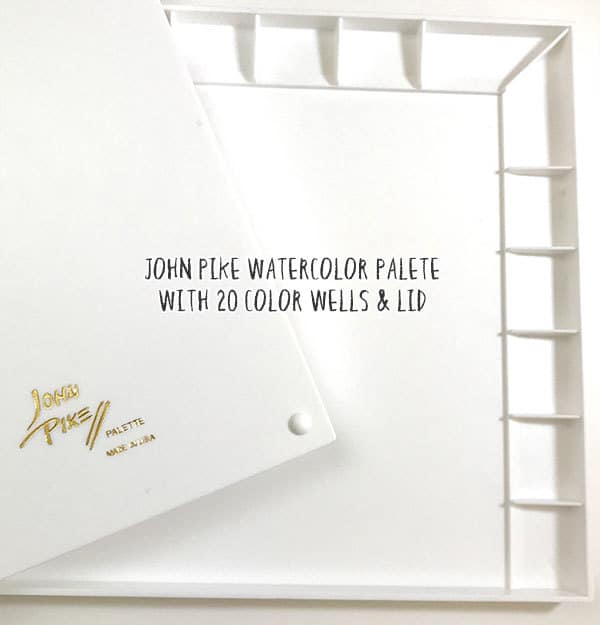
I like this palette for a number of reasons. For a start it has a lovely big mixing area and it has 20 very spacious paint wells (1 ½ inches wide).
It also has a lid! Oh how I love the lid.
I hate coming back to my palette to find the paints covered in dust ! Dust contamination is a nightmare (is that just me? Maybe I live in a really dusty place). And the lid can even be used as an additional mixing area. You can click here to see what others think of this palette on Amazon.
Watercolor Palette Color Arrangement
Begin by organizing your chosen paints in the correct order.
I like to begin with the warm and cool primary colors (like the split primary palette mentioned above).
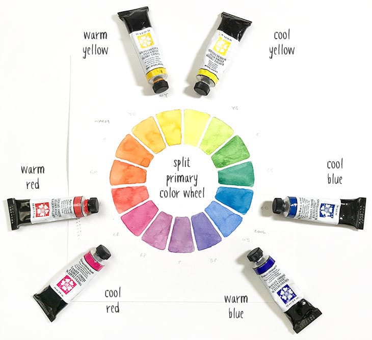
For me, organizing my colors in this way makes it easier to mix bright or toned down colors depending on what I want.
Let me explain…
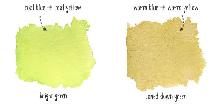
With a split primary arrangement you can mix a “perfect” saturated green by mixing the two primaries that are closest to each other (cool yellow and cool blue). If I want to mix a toned down version of green, I simply mix two split primaries that are further apart (for example, warm yellow and warm blue).
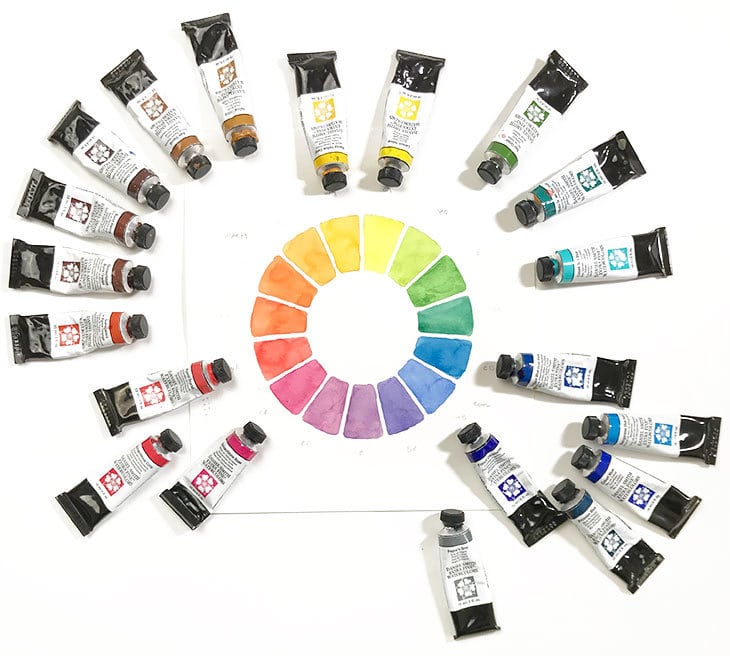
Next, place your other tubes of paint in between your split primary colors. Spread them out using a progression of colors which closely follows the color wheel. The idea is to progress from warm hues to cool hues, then back to warm, etc.
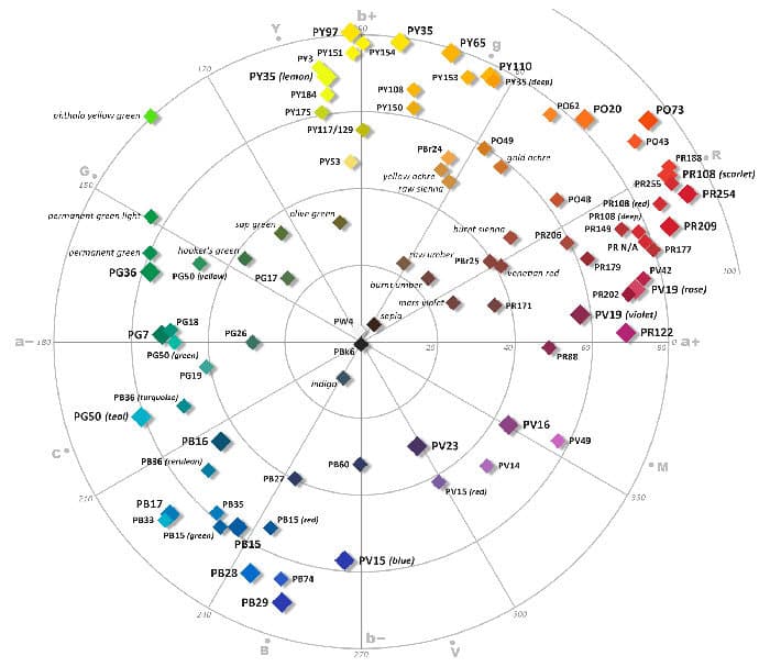
To help with this I used the pigment color wheel produced by Bruce MacEvoy on his site handprint.com. This chart shows the position of various color pigments arranged around a color wheel and is a very useful starting point for judging the color values of paints in relation to each other around the color wheel.
If you don’t want to go to this much trouble, you can use your own best judgement. As a general rule you should position browns between your reds and yellows (Browns are basically less saturated versions of reds and yellows).
I usually position dark hues near the blues or browns, depending on their chromatic value. For example Sepia is a warm hue so I would position it near the darker browns, whereas Payne’s Gray is a cool color and gets positioned near a darker blue.
Now that the colors are in the right order you can space them out around your palette. Mine has 20 wells which I’m filling with the 20 colors chosen above, but if you don’t have enough colors to fill your palette then that’s fine. Just leave some gaps between your primary colors to leave space for growth.
Filling up your palette
The next step is simply to squeeze your tubes of paint into each well in your palette.
Now… It can get a bit difficult to squeeze all of your paint out of the tube, so to help do this job I have a handy little paint tube squeezer. It will also save your fingers some tough squeezing!
Fill the wells right into the corners. This helps avoid the paint separating from the palette when it dries out.
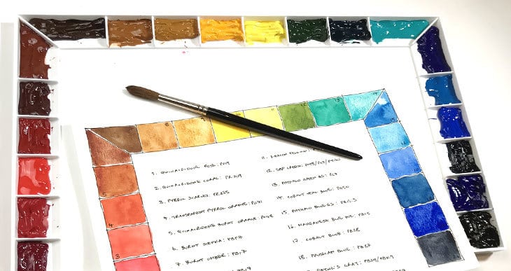
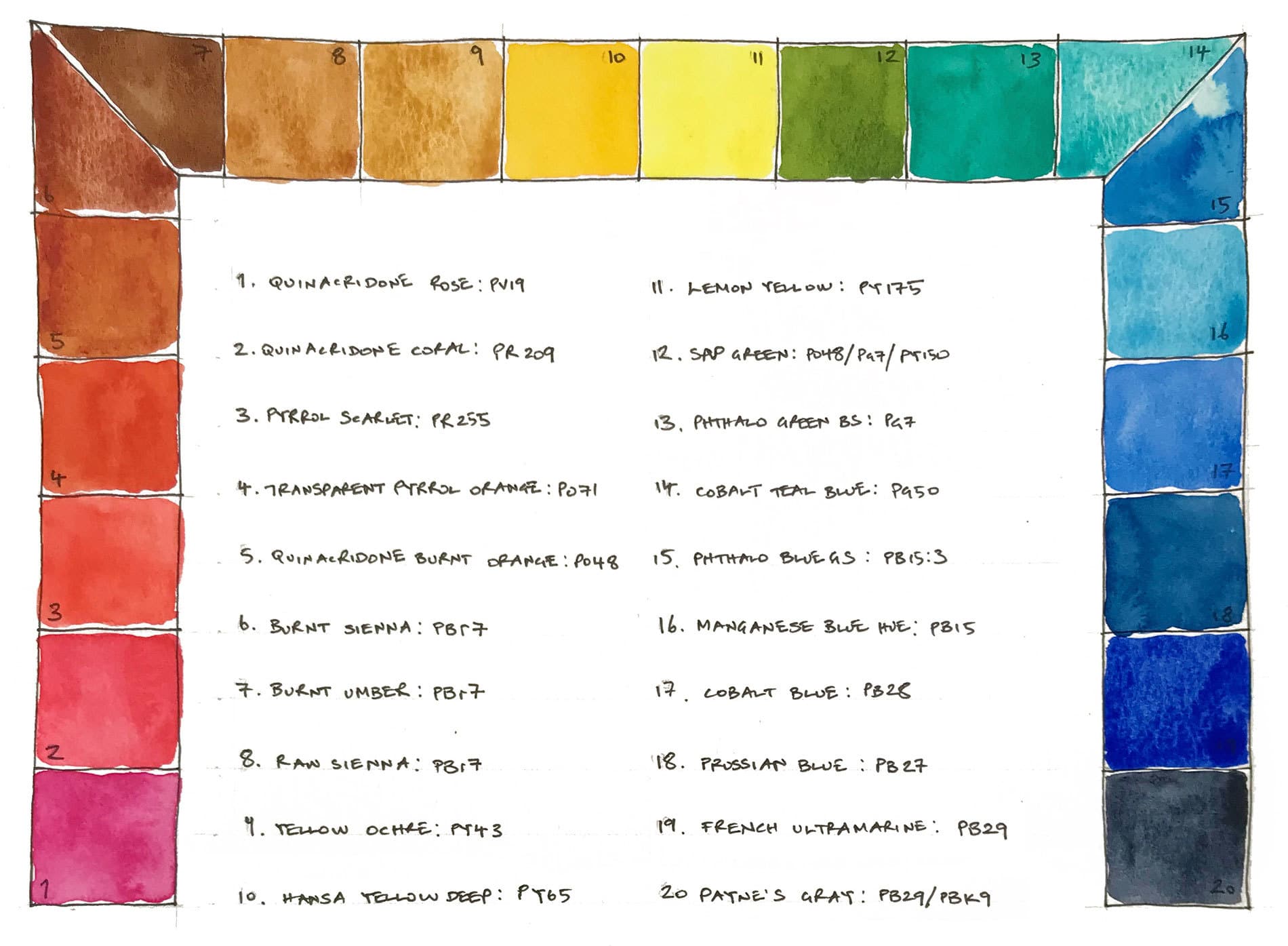
The final step which I recommend is to paint a color chart of the paints you’ve selected to match the setup of your palette. Just draw a sketch that matches the arrangement of your palette and make a note of each color in each “well”. See the example below. Ideally you should note the color name, brand, and pigment numbers for each paint (hint: use a waterproof pen).
This avoids mistakes when you need to refill, and allows you to see the real color appearance of your paints at a glance.
Here is the chart for my color arrangement. I admit that it appears as if Phthalo Blue GS and Manganese Blue Hue should be inverted. But even though Manganese blue is a lighter pigment, it’s actually warmer than Phthalo Blue GS, so logically it needs to be closer to warm blue.
Let your paints dry in the palette. Cover them if you can to avoid dust contamination. At the beginning of a new painting session, I simply use a water dropper (pipette) or a spray bottle to re-wet the paints.
The Advantages of a Good Watercolour Palette Layout
Whichever paints or palette you’re using I think setting up your colors in this kind of arrangement has a few practical advantages.
First of all, I like the split primary concept because I find it gives me a wider range of mixing possibilities. Arranging the paints in a similar way to above makes it simple to navigate around the palette. And once you get used to the layout, it makes it easier to mix bright or toned down hues (for example you start with a primary color and mix it with another color which is either closer or further away on the palette).
Having similar colors side by side also means that if they accidentally mix together you get an analogous color mixing with another, and color contamination is less of a problem.
Gotta go now… I have a new mixing palette to play with!





thanks for info.
I’m a total beginner, the way you have arranged your colors is just what I needed to stop being afraid of my palette. Thank you so very much for all the very helpful information.
Happy to help Jean!
Just got my first real palette arrived late yesterday and stopping myself from getting up a 4:30 so thought about layout; the first search came up with your site and looked no further.
As a beginner thanks for a superb article and look forward to your first emails.
Regards…Roy
Happy to help Roy!
This is genius! Thank you so much for this ~ I have been spending weeks agonizing on what colors, how to lay them out (do I start with yellows/to grey, etc or do I go with ROYGBIV, etc like you did here). This was so helpful for a beginner who is very meticulous, I was beginning to think maybe I was never going to paint! This is invaluable! I am so glad I found this just before I started filling my palette!
Happy to help Francesca!
I’m a bit meticulous myself!
Now you can have fun painting 🙂
This post has been SO HELPFUL to me. I am new and am trying to build my palette with Daniel Smith and Winsor Newton colors. Deciding how to arrange my colors in the palette has been such as challenge that I’ve hesitated with going forward with painting projects. After reading this I feel less intimidated. Thank you!
Glad to help Mary!
One more question please about the John Pike palette that you have, are the wells about the size of a full pan? I notice they offer a Big Well palette, too. Thank you so much.
Hi Christal
No the wells are bigger than full pans – on my palette they are about 1 x 1 ½ inches.
Do you know if this tray, or one like it, comes with the swatching card?
Hi Cristal
To swatch your palette colors you could use a scrap piece of watercolor paper…
Thank you for the tip on filling the pans to the corners! I have filled my pans several times and every time I open the pallet the little dried chunks of paint fall out and make a big mess. No more! 🙂
Happy to help Jessica!
Thank you soo much
Do you have a print out?❤️
Jeanette
Hi Jeanette
Underneath my color palette chart you can see a button to open a high resolution version of this image.
You can download this and print it out for reference if you like 🙂
I’m wondering where I might add a dark violet “convenience color.” I really like dioxozine purple, and use it a lot for florals, which I’m concentrating on lately. I like burnt sienna (it makes a beautiful blue gray mixed with ultramarine blue), and I would probably add a darker brown (burnt umber?).
I haven’t added all the colors yet because I’m experimenting with a palette that holds 18 colors, so I’m short a couple of wells. I have my primaries in warm and cool, plus a sap green.
Hi Anne
Good question… I Would put it at the end, after French ultramarine, or right at the beginning, before quin rose 🙂
Thank you, Anthony!
You’ve done a lot of work here! When I started, I didn’t understand anything about colors. I knew about primes, and mixing them to get secondaries, but I also bought A LOT of “convenience” colors—too many!
I looked at handprint.com for information, and that was overwhelming, but now it’s starting to make sense. The biggest problem for me is it’s not well organized, and it’s difficult to find information. Plus, everyone has a slightly different take on what the best primary colors are!! (I also have Stephen Quiller’s “Color Choices,” and his are different!)
I believe I have everything you suggest for the basic split palette except a good single pigment warm color. I see some other colors I also don’t have, but might in the D. Smith watercolor sticks I got on sale. I have Hansa Yellow Deep there, but not in a tube.
I’m worn out just looking through my paints!
Hi Anne
Yes… it can be confusing. But after a while you’ll probably find that most artists settle on a small group of paints that are very similar to the warm and cool versions of the primary colors.
To these most artists add a few paints to extend the range of mixing possibilities (usually some earth colors and a green like phthalo green).
It can be very useful simplify your palette for a while and just use a limited palette.
You’ll find an article I wrote about limited palettes here…
Have fun 🙂
Absolutely the clearest explanation of laying out a palette that I have come across. Thank you!
Glad to help Deb 🙂
Hi Anthony,
Could you please explain the differing uses and why you have both Raw Sienna and Yellow Ochre in your large palette as they seem very similar to me. Thank you in advance! 🙂
There are a lot of yellow-earth pigments to choose from, and a lot of them are very similar like raw sienna and yellow ochre. You don’t need either to get started with watercolor, but you might want to experiemnt with them later.
I tend to use yellow ochre a lot with my phthalo green to produce a nice “sap green” appearance. Raw sienna is great for sunset skies and also mixing skin tones. But I guess i use yellow ochre the most.
Hope that helps 🙂
Enjoy your instructions. Would like to set up my palette using yours as model but I cannot read it online. Is there a typed version that is easier to read? If so, I would appreciate receiving a copy. Thanks in advance.
Hi Mary Lou
I’ve updated the chart above with a bigger version 🙂
what are your thoughts on having a pallet for warm colors and and another one for cool colors? Your information is very helpful, thank you for sharing with all us us.
Karen
Hi Karen
I’ve never tried separating colors by color temperature, but that could be an interesting choice. The cool color palette would give you some brightly saturated mixes, whereas the warm palette would probably produce more subdued mixtures.
Enjoy your painting !
Really useful information on colour wheel set up, palette organising, & cool and warm colour identification which I find difficult. I shall certainly buy one of the palettes which you recommend to get organised!
Thanks for the comments Audrey ! I’m sure you’ll love the palette… i use it all the time.
Getting back to basics has been a good refresher AND reminded me of things forgotten. I LOVE the detailed explanations that help me understand before making decisions and choices. Thank you.
Absolutely amazing information, explained easily and clearly. Thank you so much for sharing all your knowledge with us!
You’re welcome Suzi !
As a begginer I’m really happy I invested some time learning about pigments and some color theory before buying too many colors, and even happier to see that most pigments I use in my 12 color palette are included in your palette too <3
Anthony you’re my favourite person lately! Thank you so much for sharing your experience.
Thanks, Anthony!
I’ve been watercoloring for some years, but it always helps me to go back to basics and see what other watercolorists do. I appreciate your care of brushes information also.
Thank you!
Thank you!! I am just getting back to art again, and this is super helpful!
Hi, Anthony
This is a wonderful guide to setting up one’s palette! Clear, concise, very accessible. Have you made any tutorials? I bet you’d be great. I’ll look around the interweb, or would be MOST happy to hear from you!
Bravo!
Glad I found your blog. Very informative. I’m completely new to watercolor so I love your beginner’s articles. thanks!
Good to know Jayne
Have fun !
I have been in painting in oils for several years and this advice is just as applicable to oil as to watercolor. Wish I had been taught this long ago but will put it to good use going forward. Thanks.
Super informative – thanks! A really great explanation for the arrangement of the colours. I’m sorry that I didn’t know this before I squeezed out my tubes! Now I will just have to wait until a) I finish the colours and b) I can buy a bigger palette.
Cheers?
Yes, I agree with what many of your reviewers have already said: your site is chock FULL of valuable, well explained info. I have always painted with acrylics and have done lots of mixed projects, but watercolor has always scared me…that’s why I decided to jump into it, and I’m having a blast! I thought I knew a fair amount from the research I’d already done, but your articles are soooo helpful. It is very much appreciated…you are providing a valuable service. THANK YOU!
Thank you for this wonderful tutorial. It is so helpful. Your explanations and guidance are a gift for us beginners.
No problem Andrea!
Thank you for your clear and detailed articles! I’m jumping in without much knowledge and am trying to learn as I explore. I had NO idea that you empty the tubes and create a palette like this. And that they then dry out and that’s okay. I thought with tubes, you would just squeeze out as you go – but realized that there can then be a lot of waste and wondered about that!! Told you – brand new at this! Thanks again!
Glad this came in handy Lorna! Have fun !
This is an excellent explanation on how to set up a palette for watercolor. I have painted in watercolor off and on for years and on and even taught beginners. This one of the clearest explanations. A good review for me. Thanks
Thanks so much Mary… Glad it was useful!
I have been reading all of the wonderful information and suggestions you have posted. I have painted with acrylics and now want to try watercolors. I have bought my paints, brushes, paper and palette! Now I just have to learn what to do with them! I recently retired so hope to have lots of time to sketch and practice.
Have fun with your new watercolors Brenda
This is so helpful. Thanks!
You’re welcome Mary!