
Neutral Tint Watercolor (All The Answers!)
So you’ve ended up with a tube of grayish-looking paint called “neutral tint.”
And now you’re wondering…
“But what the heck is neutral tint?”
Why would you need it, and how is it used in painting?
This paint name causes quite a bit of confusion for artists. Depending on your chosen brand, there are a few variations, but this particular shade was designed for a specific purpose…
Let me explain more…
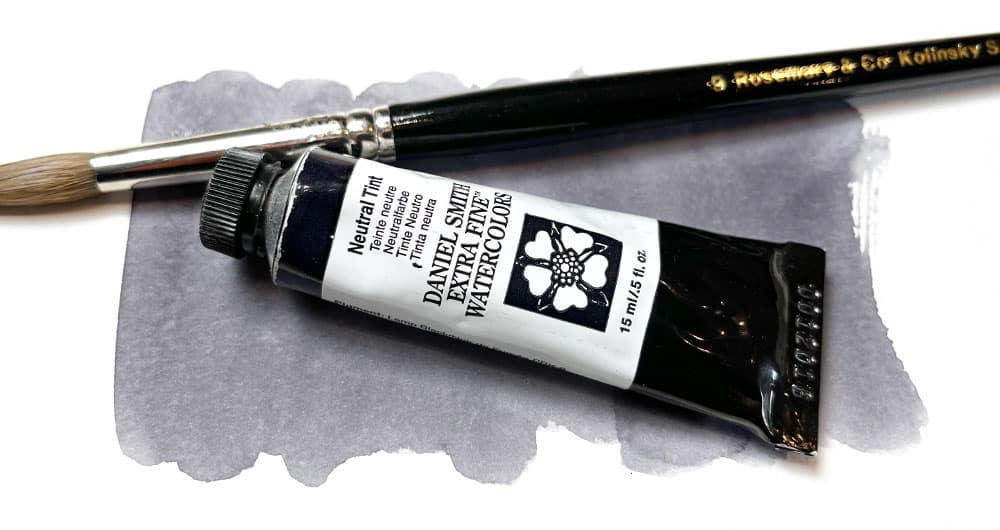
Neutral tint watercolor paint
Neutral tint is a special kind of gray paint used mainly by watercolor artists. It is a mixture of pigments that produce an unsaturated gray and is intended to gently tone down brighter colors. It is said to be neither warm nor cool in color temperature. Hence the term “neutral.”
Some artists use black watercolor as a way to mix dull or muted colors for shading. But black pigments can be harsh when combined with other paints. Gray paints will desaturate a color more gently. And a lot of artists prefer neutral tint.
A handful of traditional paint colors are used as a base for painting shadows or to tone down another color.
Neutral tint is one of these.
It was developed to easily desaturate (neutralize) any other color in an artist’s palette.
What are neutral colors in art?
Neutral colors in art are any colors that have been desaturated to remove the hue. That is to say, they do not appear to have a particularly strong color appearance. White, black, and gray are all examples of neutral colors.
Neutrals make an excellent background for a piece of art. They do not shout for attention and can provide contrast to stronger, saturated colors.
Neutral paints can also be used in mixing to create toned-down versions of another paint color. Or they can be used directly to paint shading and shadows.
Pure neutral colors do not have any color information. They are not saturated, so they contain no indications about the hue. But pure neutrals like this are pretty rare. In the real world, muted colors often have a hint of color. For example, shadows are very rarely pure gray.
Neutrals became popular on artists’ palettes to quickly add shade or darken values. Back in the 18th century, artists began using mixtures of various pigments to use as neutrals.
All these paints are called convenience colors. In other words, they’re a mixture of two or more pigments designed to give artists quick access to a ready-mixed and regularly used color.
Using off-the-shelf paint colors like this is fast and “convenient” – hence the name 🙂
But most of these “neutrals” have an underlying color bias. Some lean towards blue (cool), others towards red (warm).
For example, traditional neutral paints include:
- Indigo (Pigments PB60 and PBk6)
- Sepia (Pigments PBr7 and PBk9)
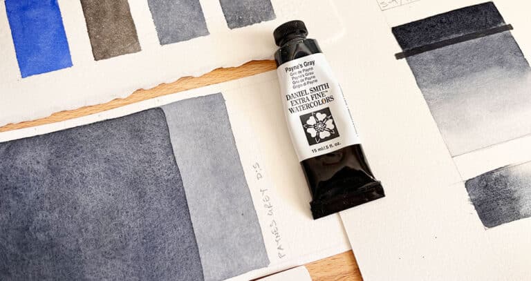
- Payne’s gray (Pigments PB29 and PBk9)
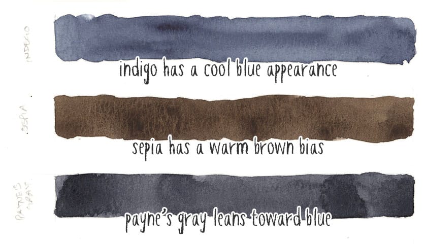
As you can see, these traditional neutrals are a mixture of black pigments (PBk6 or PBk9) and some other hue.
But indigo has a dark blue appearance. It leans towards blue, so it’s a cool neutral. Sepia is dark brown, so this is a warm neutral paint. Payne’s gray is somewhere in between, but it tends slightly toward blue (it contains ultramarine blue, after all). So again, this produces a soft cool gray appearance.
None of these neutral paints are strictly “neutral.”
By the way, you might thing black paints are completely neutral, but in truth lamp black is a “cool” black with a slightly blue bias, and ivory black is “warm” having a reddish-brown undertone.
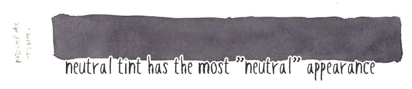
So what is neutral tint in watercolor?
Neutral tint is the result of many experiments to find a neutral gray color that has little effect on the other colors you mix it with. Therefore, it is designed to be as close to pure neutral as possible.
The formulation of neutral tint is also meant to create clean mixtures and avoid muddy colors. In addition, it can act as a complementary neutral to most other paints to quickly desaturate a mix without overpowering the original hue.
Neutral tint is neither warm nor cool. We call this “achromatic” (colorless).
Watercolor artists wanted something easy to use as a ready-to-go neutral gray. But as you can see from the examples above, many traditional options were either cool or warm neutrals or some other version of gray. In other words, they are “chromatic” (they contain color).
Using traditional neutrals like indigo or sepia is fine, so long as you take into account the color influence they have on your paint mixture.
Alternatively, you could try neutral tint…
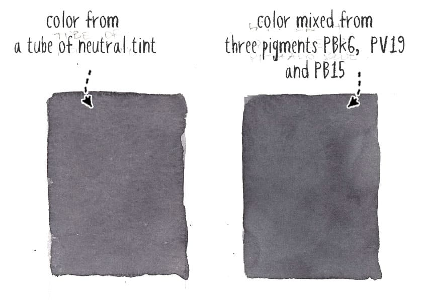
Neutral tint watercolor comparison
There are several different versions of neutral tint.
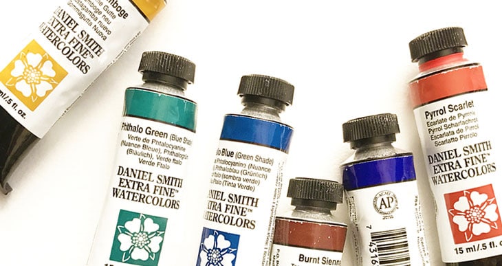
For example, Daniel smith’s formula is a mixture of three pigments:
- PBk6 (Lamp black)
- PV19 (Quinacridone rose)
- PB15 (Phthalo blue)
This is the most popular combination of pigments for neutral tint across several brands.
Here’s a table of comparison for some of the most popular artist-grade paint manufacturers:
| Neutral Tint Paint Brand: | Pigment Codes: |
| Daniel Smith | PBk6, PB15, PV19 |
| Windsor & Newton | PB15, PBk6, PV19 |
| Sennelier | PB60, PBk7, PR209 |
| M Graham | PV19, PG7 |
| Da Vinci | PBk6, PB15, PV19 |
| Holbein | PBk6, PB15, PV19 |
| Schmincke | PBk7, PR122, PB60 |
My own personal preference is Daniel Smith…
How to mix a neutral tint with watercolor
Without going into detail, any of the above pigments mentioned in the brand comparison above can be used to mix your own version of neutral tint. The most popular combination is:
- Lamp black, PBk6
- Phthalo blue PB15
- Quinacridone rose PV19
What is a watercolor neutral tint used for?
Neutral tint is used to desaturate or neutralize other paint colors when mixing darker shades. It can also be used as a stand-alone paint color for monochromatic work or as a go-to color for shading.
The name “tint” seems confusing to use in this context. After all, most artists understand that a tint is a lighter version of a color, usually achieved by adding white. But the verb “to tint” means to “slightly change the color of something”. Hence neutral tint is a paint that “slightly neutralizes another color.”
Any bright color can be muted by mixing with other paints. The amount of desaturation depends on the paint color you choose to mix it with.
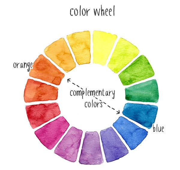
For me, the simplest way to achieve this is by mixing the color with its complement. Remember, complementary hues are the colors on the opposite side of the color wheel. So, for example, if you want to dull yellow, you add purple. Or, to tone down a green, you add red, etc.
Alternatively, you can mix any color with a neutral tint.
I often use Payne’s gray for painting shadows because I prefer the hint of blue contained in this convenience mixture. This is because most daylight shadows tend toward blue, so this paint gives a realistic look to most cast shadows.
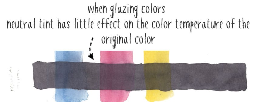
Neutral tints will work similarly. If you’re using a glazing technique, it will take on some of the color properties of the underlying colors on the paper without affecting the initial color appearance. Or it will retain some of the color properties of the original color when mixed.
To sum up
Personally, I use neutral tint sparingly. I might pick up a tube to do a monochrome study, but otherwise, I use complementary mixing for muted colors.
The downside with a completely desaturated gray like neutral tint is it can look pretty flat. Whereas dark shades mixed using other colors can produce more lively and harmonious results.
For more about using black and dark pigments in painting, read my article about black watercolor here…
That doesn’t mean this paint is not useful. But remember to have fun experimenting by mixing your own neutral colors too!
You might find the results interesting!


I see that Daniel Smith have reformulated their Neutral Tint watercolour (was PBk6, PB15, PV19 as noted in your post above, but is now (2025.08) PV19 Quinacridone Violet, PR101 Red Iron Oxide, PBk6 Lamp Black). Can you recommend a great neutral tint that is currently available? Thanks so much for any help you can offer … as well as your great site! Best, AO.
Hi
I don’t use neutral tint a lot, but I i did i would go for DS…
I prefer to mix my neutrals or use payne’s gray for shadows because I like the bluish hue 🙂
I saw a youtube video of someone mentioning using a neutral tint watercolor, and was immediately confused as I’ve never heard of it before. This article was very useful and thorough, and I feel like I understand watercoloring more now. 🙂
What is the best technique for painting shadows and adjusting values? I’m thinking of the shaded side of a building in a landscape, or the underside of a bird. Is it best to create a mix with the original ground color and then tone it down with a complementary color or neutral tint, or is it better to do it with a glaze over the original ground color?
Hi Chuck
Glazing is probably your best approach. mix a neutral color that harmonizes with the scene or subject you’re painting.
You might like to read more about neutral colors and black in this article…
This is really good and informative. Thank you. I liked the explanation of complementary colors -v- neutrals to desaturate.
You’re welcome Vanessa