Different Colors, Same Pigment – A Watercolor Paint Mystery
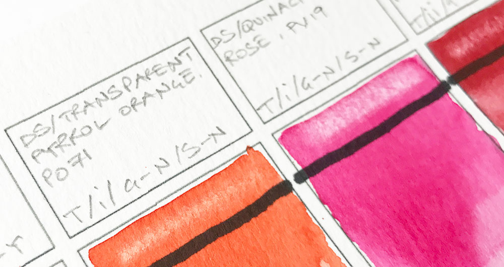
I’m a bit of a watercolor boffin!
I like to get to the bottom of things. To find the explanation to artistic mysteries.
Well, this is one of them.
And you’ve probably noticed this yourself if you’ve read your paint labels (You have, haven’t you?!)
So… Why is it that some paints all have the same single pigment in their formula, but they have a completely different color appearance?
I’ve had this question several times from readers and members of my course. So I thought I’d lay it out for the benefit of everyone (even if you’re not a boffin).
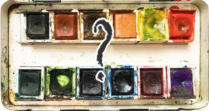
If you don’t know what I’m talking about, take a look at this:
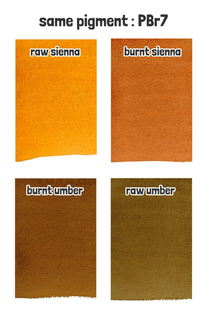
The pigment known as PBr7 is used to produce paints such as Raw Sienna, Burnt Sienna, Burnt Umber, and Raw Umber. Each one has a very different color appearance, and yet, they all use the same pigment.
Yes… Just one pigment!
This makes color choices based on pigment numbers alone very tricky!
So what’s happening?
Color index names, such as PBr7, are not actually a precise description of the color appearance of a paint, but rather information about the chemical composition of a pigment.
As a quick reminder… The color index system is a standardized method used to identify and categorize pigments. In the case of PBr7, “P” stands for “Pigment,” “Br” represents “Brown,” and “7” is a numeric identifier for the pigment.
The “real” color appearance of a pigment can vary depending on certain factors…
The effects of particle size of pigment on color
The more aware you become of the pigments you’re using, the more you’ll notice slight differences in color between paints that contain the same pigment.
This difference is often because of the pigment particle size.
Pigment color can change with particle size. Smaller particles are typically lighter in value, and a different hue. In fact, manufacturers can tweak the color of a pigment by adjusting the size of its particles, making them either bigger or smaller.
So milling the pigments to a smaller size makes them lighter in appearance.
Pigment color and the effects of heat
Sometimes the pigments are also heated to obtain variations in hue, which gives paint a slightly different color appearance.
This process is known as “pyrolysis.”
Pyrolysis is when heat breaks down organic materials chemically. When pigments are heated, their molecules change, which can alter their color.
You’ll notice that whatever process is applied during manufacturing the “foundation color” of a pigment will always remain similar. For example, PBr7 will always be a “brownish” color. This is true of all variations in color appearance in paints that use the same single pigment.
Subtle Variations in Pigment Color – Factors and Effects
The same pigment, with the same chemical composition, can be sourced from different places. This can have a subtle effect on the color appearance of paint.
Once again, the pigment index number PBr7 provides us with a good example.
Traditionally PBr7 refers to pigments from a type of clay that is rich in natural brown iron oxides.
These include Sienna and Umber, two of the most common earth colors used by artists.
Historically “Sienna” is named after the city of Siena, Italy, where it was produced. And raw umber pigments were sourced from deposits in Umbria, Italy. Afterwards these pigments were mined primarily in Cyprus.
These days, iron oxide pigments are mostly man-made by synthesis of natural ingredients. Depending on the specific formulation and process, manufacturers can create a wide variety of colors using these pigments, often employing traditional techniques like heating and milling.
PBr7 Raw Sienna Burnt Sienna Burnt Umber Raw Umber
PBr7 can be used to make a large range of colors depending on how manufacturers process it.
In the past, when it’s in its natural state, traditional sienna-based pigments had a yellowish-brown color, known as raw sienna. But if you heat it up, it turns into a warm reddish-brown tone, which we call burnt sienna.
Umber-based colors used another clay pigment with iron oxide. Umber colors were darker than Sienna-based paints because they have a higher content of manganese, making them either greenish-brown or dark brown.
Similarly umber in its natural state is known as raw umber. When heated, raw umber becomes burnt umber, which is a much darker brown.
These days, manufacturers mimic the natural processes through synthesis, allowing them to create a wide spectrum of colors using PBr7.
My favorite colors that I keep in my palette are burnt sienna and burnt umber. They are excellent convenience colors for browns and make good mixing complements for making grays and neutral hues.
PV19 Quinacridone Rose, Violet & Magenta
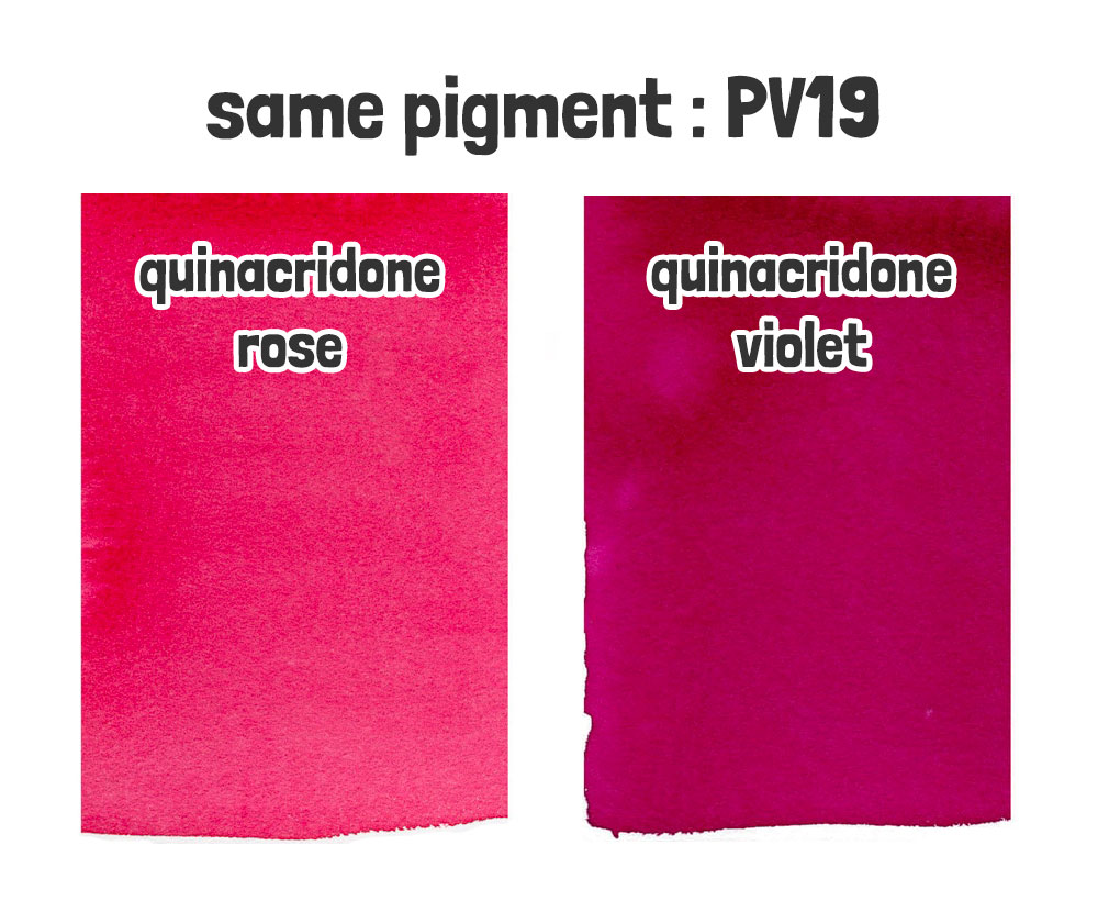
Another common pigment, PV19 can range in color from bright rose to a more subdued violet or magenta color.
Quinacridone pigments range from purple to orange, although they’re predominantly seen in pink-red shades. The pigment’s hue is influenced by both its particle size and slight variations in its chemical structure.
Quinacridone rose makes an excellent cool primary red and is an essential part of my mixing palette 🙂
Navigating Paint Color Matching: Tips for Success
These are just a couple of examples where pigment names make artist’s life confusing 🙂
But how do we accurately judge paint colors, especially when matching paints between brands, if we can’t rely on pigment numbers alone?
Traditional paint names like “burnt sienna” or “french ultramarine” are usually similar in appearance from one manufacturer to another.
This gives us a clue to matching colors between different brands, especially in cases where locating paint colors by pigment alone is challenging.
In fact, color index numbers often have common names.
For example:
- PB29 “Ultramarine Blue”
- PB:15 “Phthalo Blue”
- PG7 “Phthalo Green”
- PR255 “Pyrrole Scarlet”
- PY35 “Cadmium Yellow”
While pigment numbers may not always provide a perfect match across brands, they are still a helpful starting point for locating colors. Here are some additional tips for matching colors between brands:
- Use Traditional Names: Look for traditional paint names like “burnt sienna” or “ultramarine blue” across brands, as these names often indicate similar color appearances.
- Compare Swatches: Compare swatches or samples of the colors you’re trying to match under the same lighting conditions to ensure they’re visually similar.
- Consult Color Charts: Many paint manufacturers provide color charts or online resources that show how their colors correspond to traditional names and the pigments they contain.
- Try Dot Cards: A quick and relatively cheap way to compare real paint color appearances is to get a “dot card” of the manufacturer’s paints. these are like mini samples of a large range of paint colors. Here’s one by Winsor & Newton – and another by Daniel Smith.
Good luck!



Thanks for thé explanation.
Long ago I worked as a botanical Illustrator .
The perfect magenta, in those days for cyclamens and now as a first layer ! in kitch sunset stays the one by old holland. PR122.
This was really interesting and answered a mystery for me. I’ve been casually painting for a few years but just started getting into the “nerdy” parts with pigment codes. I had no idea how the same pigment could make such drastically different paints.
(Also, while I haven’t been commenting on every post I have been really enjoying reading through your archives. Your writing is really accessible and informative!)
Glad you’re enjoying the content Sebastian 🙂
Hello Anthony,
Very enlightening article, thank you. I have been confused why some paints have the same single pigment in their formula but yet they have totally different color appearances. You explained it very well. BTW, I am really looking forward to your color mixing course!
Best,
Lowell
Thanks Lowell!
It will be available as soon as possible 🙂
Great article on paint names, I would love to know the historical names of more paint colors. Thank you.
Thanks Gloria – something for future articles 🙂
Interesting article, thanks Anthony!
Thank you! I always want to know why about everything and since I’m now buying real “grownup” paint, I’ve been wanting to learn more about what pigments make which colors. So interesting!
🙂
Excellent information Anthony. I’ve wondered about these differences and you did an excellent job explaining it in an easy to understand manner. Thank you.
Happy to help Brenda 🙂
I have Daniel Smith New Gamboge which is supposed to be a warm yellow. Mine is distinctly orange. I’ve seen other brands of New Gamboge which are a warm yellow. Disappointing. I’ll have to buy another brand to get that warm yellow.
Hi Susan
Have you tried Hansa yellow deep?