
Paynes Grey (Exploring Paint Colors in Depth)
From time to time I take a closer look at paint colors. In this article I’ll be exploring Payne’s Grey.
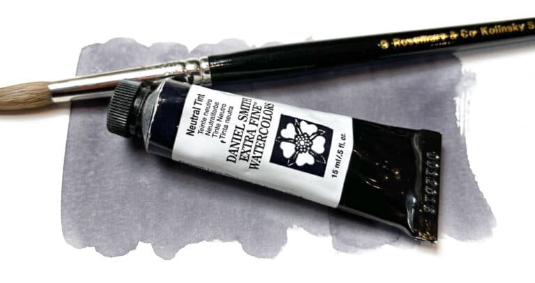
This is my favorite grey paint. I always have some on my palette ready to go!
It’s a convenience mixture, made up of more than one pigment. But I really like the color appearance, and I find it’s excellent for painting shadows!
Keep reading if you’d like to get to know this color better…
What is Paynes Gray?
Payne’s grey is a convenience mixture of two or more pigments (usually black and blue), made readily available by several brands as a pre-mixed paint color.
The idea behind convenience paints of any kind is speed, consistency of color, and of course “convenience” (bet you didn’t figure that out!)
It’s true that many watercolor artists (myself included) prefer to use single pigment paints. But I sometimes make an exception, as with Paynes grey. This is because I tend not to use it for mixing, but rather I apply it directly when painting shade and shadow shapes.
It’s said that too many pigments cause muddy, less vibrant results. Single pigment paints also create more luminous results when glazing in watercolor. Hence the reason many artists avoid pre-mixed convenience paints with too many pigments.
Origins of Payne’s Gray
Originally this color was an invention of the British artist “William Payne”. Born in the 18th century, he progressed the art of watercolor significantly with new techniques and inventions. His most famous innovation was the dark grey paint color we now call “Payne’s Grey”.
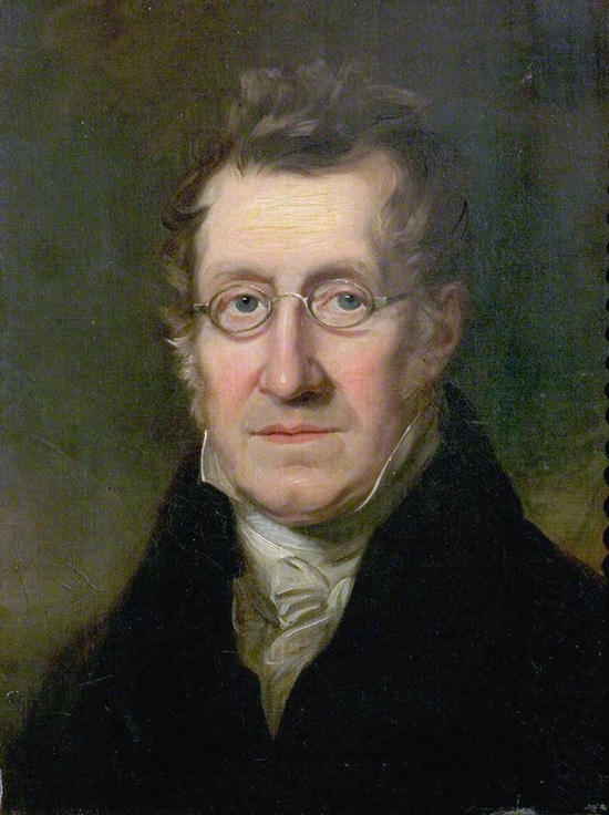
It is assumed that Payne created this mixture as a less intense alternative to pure black pigments. (Mixing with black often produces a dull, harsh appearance, since black pigments lack transparency – read more about black watercolor here…).
William Payne became a popular art teacher. He was well known for simplifying the painting process for his students. At the time, this earned him criticism for “reducing” the art of painting “to the degenerate notions of this epoch of bad taste”.
Needless to say, he didn’t receive a lot of fame or recognition. Nevertheless it’s rumored his style of painting influenced the early works of William Turner!
How to make Payne’s grey
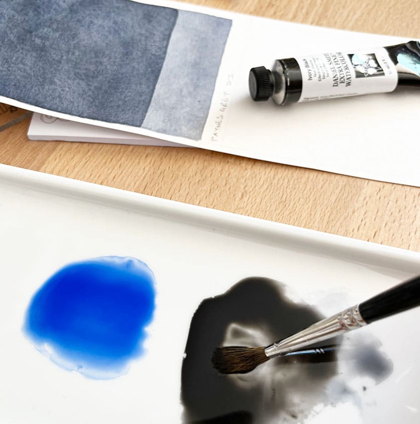
The color appearance of Payne’s grey can be reproduced by mixing black pigments such as ivory black or lamp black with a blue hue such as ultramarine or phthalo blue. The majority of paint manufacturers use this combination, sometimes with the addition of a red or violet color.
The original formula for this paint mixture by William Payne was said to be Prussian blue PB27, Yellow ochre PY43 and Crimson PR83 (blue, yellow and red).
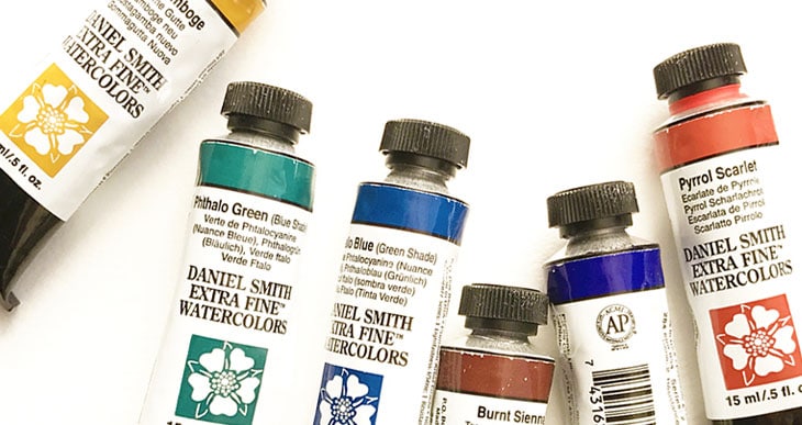
Most brands now use 2 or 3 pigment combinations using black as the cornerstone pigment. Here are some examples:
- Daniel Smith: PBk9 & PB29
- Winsor & Newton: PBk6, PB15 & PV19
- Holbein: PBk6 PB15 & PR122
- Schmincke: PBk7, PB29, PR101
- Sennelier: PBk7, PB15 & PV19
My own personal preference is Daniel Smith’s version.
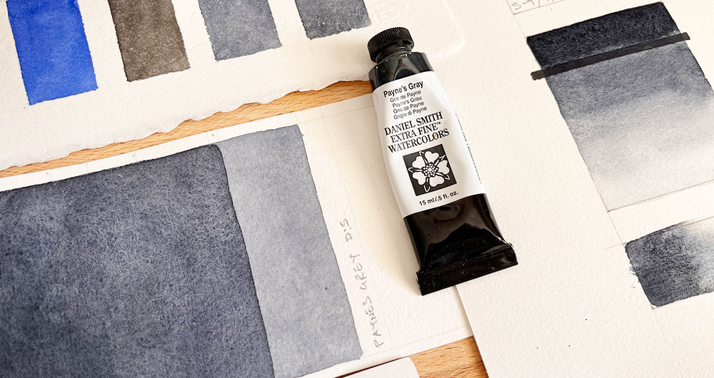
Making Payne’s grey is pretty simple to replicate. The mixture starts with black, and you add a small amount of blue ultramarine. Here’s a swatch of Payne’s grey from the tube, and a mixture I made myself using ivory black PBk9 and french ultramarine PB29:
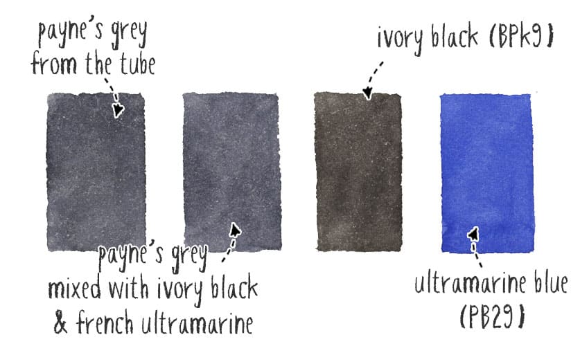
As you can see the Payne’s grey swatches have a bluish tint, and look less aggressive compared to the black swatch of Ivory black.
Is Payne’s Grey warm or cool?
This mixture of pigments has a dark blue-grey appearance. Consequently Payne’s grey is a cool paint color, not warm. The blue undertone of this paint gives it a cooler appearance than most black pigment paints.
In some ways the color is similar to indigo which is also a cool blue-grey. But Payne’s grey is darker in appearance.
Why I like Payne’s grey watercolor
The version of Payne’s grey that I use is Daniel Smith’s. Both of the ingredients in their mixture (ivory black and ultramarine) are granulating colors. As a result this convenience mixture produces a wonderful granulating texture.
I use it mostly for “cast” and “form” shadows. The fact that it has a cool blue tinge is an advantage. Exterior shadows created by sunlight are naturally blue toned (compared to interior lighting which produces shadows with a warm undertone).
I don’t only use this color for shading and shadows! It’s also great for painting skies since it mixes well with other blues. But I like to have it available when painting shadow shapes. If you need to paint a large area you also get a consistent color appearance without worrying about running out of paint 🙂
Keep in mind that this is a mixture of more than one pigment. Shadows are never just grey! They contain other colors from reflected light in the environment. So when I Payne’s grey for shadows I’ll sometimes need to blend it with another color for more vibrant shadows. This is another reason why I prefer the Daniel Smith version with only 2 pigments. (Remember, the more pigments, the muddier the mixes become).
Payne’s Grey Characteristics and Swatch
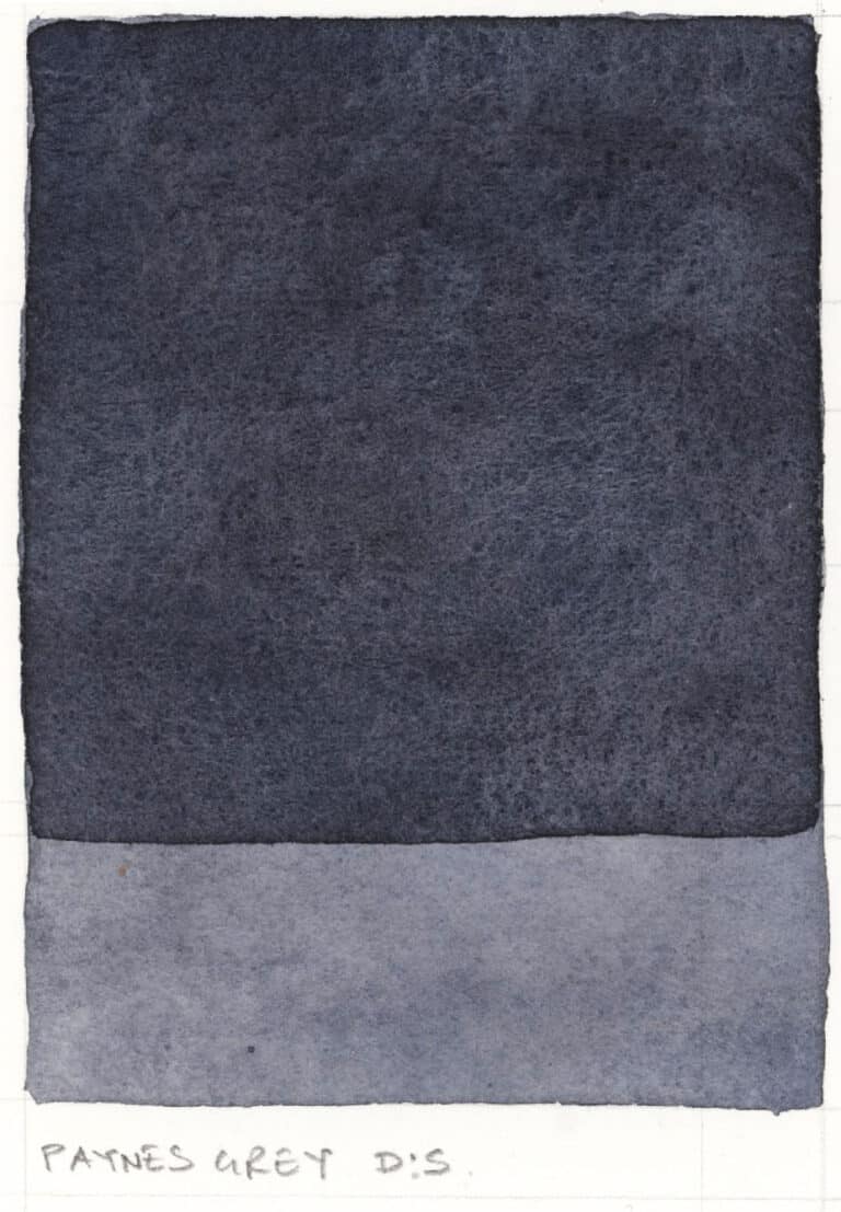
Here’s a breakdown of the characteristics of Payne’s grey (based on the brand Daniel Smith). This will vary from one manufacturer to another. For example the Winsor and Newton version uses non-granulating pigments in its ingredients. I prefer the granulating version by DS!
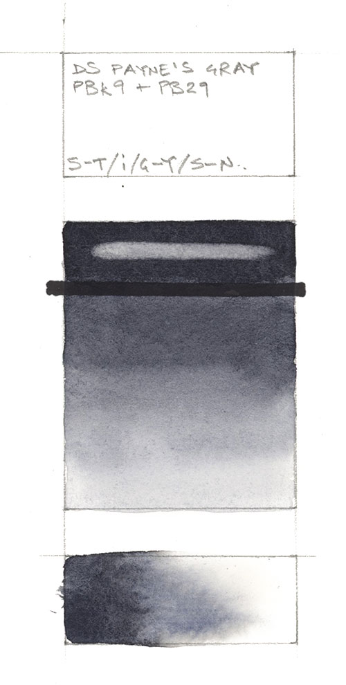
- Pigments: PB 29, PBk 9
- Lightfastness: Excellent
- Transparency: Semi-transparent
- Staining: Low Staining
- Granulation: Granulating
This is why it’s useful to get into the practice of swatching your paints, to get to know the specific properties of your own color palette.
You can see from my own switch that DS Paynes gray isn’t very staining. The white mark at the top of the swatch shows where I lifted the paint with a damp brush after drying.
Related: Read more about my recommended watercolor paints here…


Daniel Smith seems to have changed their formula for Payne’s gray.
I have the version that you mention, PB 29, PBk 9, in a large tube, but when I looked it up on Blick just now, the formula is listed as:
PB29-Ultramarine [Blue]
PY42-Yellow Iron Oxide
PBk9-Ivory Black
I don’t know whether this will make an appreciable difference in how the paint will look on paper when used alone, but as there are now three pigments, not two, in the mix, this will make for muddier outcomes when combined with other paints, no?
Hi June
I wonder if that might be an error by Blick – since Daniel Smith’s website still say the pigments are PB 29 and PBk 9 ?
https://danielsmith.com/color-stories/watercolors/paynes-gray-watercolor/