Best Watercolor Paints (A Complete Guide)
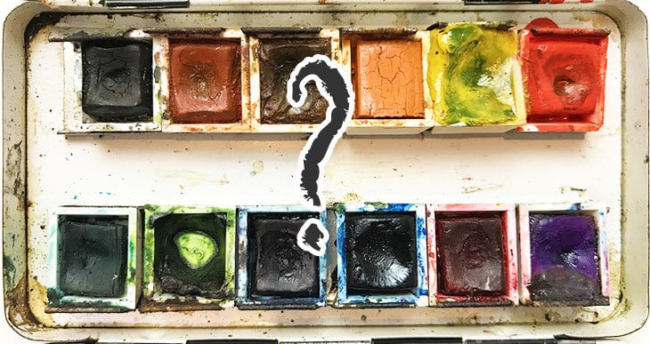
Here’s the thing…There are lots of “reviews” about which are the best watercolor paints on the market. But none of them seem to tell you “how” to choose what’s best for your needs.
And frankly, most of those reviews seem to have been written by people who probably haven’t picked up a paint brush in their life !
I have to admit…when I first started watercolors I agonized over my choice of paints. It can be pretty confusing trying to compare different brands, colors, and all the various characteristics of this beautiful art medium.
I totally understand. You want to pick the perfect watercolors to get the most out of your painting experience.
So in the following lines I’ll give you the simple truth about what you need to look for when selecting watercolor paints.
And I’ll give you the complete list of colors in my palette and tell you why I chose them.
Armed with a few good insights I hope you’ll feel confident about choosing the watercolors which best fit your needs.
How to Choose the Best Watercolor Paints
Is it a good idea to choose your paints at random?
Probably not…
I don’t think you should select your watercolors without knowing a little bit about what you’re buying first. And that means you need to understand a few basics about the characteristics of watercolor paint.
When you select your paints, the characteristics you need to take into consideration are the following:
- The number of pigments used
- The paint’s transparency rating
- The Lightfastness ratings
- The Granularity of the paint
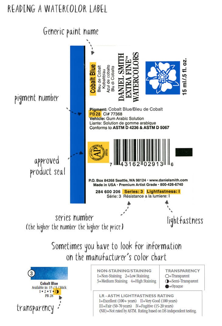
To find this information you’re going to have to read the paint labels, or do a bit of research on the manufacturer’s website. Let’s take a quick look at these characteristics so you understand what they mean…
Number of pigments
The ingredients used to make paint include one, two, three, or sometimes more pigments. Pigments are identified by a color index code. For example, if the paint label says “PB28” this means it contains “Pigment Blue number 28”, which is commonly used to make cobalt blue.
Transparency
Certain watercolors are more transparent than others. Of course, all watercolors can be made transparent by diluting them with water, but certain pigments hide the underlying paper (or previous wash of color) more than others. Look at the transparency rating when comparing watercolors – Paints are usually categorized as “transparent”, “semi-transparent”, or “opaque”.
Lightfastness
Lightfastness is a rating of how much a particular paint will fade or discolor over time when exposed to light. Watercolor paints are rated using the ASTM scale (American Standard Test Measure) which ranges from “excellent” to “very poor”.
Granularity
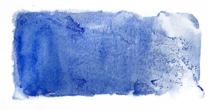
Granular paints tend to have a grainy texture when dry. This appearance is due to the uneven distribution of pigment particles on the paper surface. Granular pigments react this way because they are larger, heavier, and more irregular in shape than other small, fine pigments. This is a characteristic of the pigments themselves.
How to choose?
Ok… Now imagine you’re looking at a manufacturer’s paint chart. What exactly should you be looking for ?
When choosing paints I look for colors that fit the following criteria:
- Single pigment
- Transparent
- Very Lightfast
- Low granularity
Why is this important ?
Single pigment, transparent paints provide the most saturated and intense versions of any color. They mix well together and don’t create “mud”. I find that opaque or multi-pigment paints have tricky handling qualities. I also chose paints with “excellent” or “verygood” lightfastness because I don’t want my paintings to fade ! Granularity is more of a personal preference. As far as possible I prefer paints that are not too granular because I find granular paints more difficult to handle. But I do use them when I specifically want a granular texture! I suggest you experiment to find out what you like.
You may find it difficult to find paints that perfectly match all your criteria at once. When picking a new color the first things I look for are good transparency and single pigments. If this isn’t possible then I try to get the next best characteristics. Nowadays most modern professional watercolor paints have very good lightfastness, so this criteria should be easy to fulfil.
Concentrating on these components of watercolor paint will steer you towards the best choices.
Professional or Student Grade Paints?
Student grade paints are cheaper than professional watercolors. This is because the ingredients aren’t the same (something has to make them cheaper… Right?).
So to reduce the price, paint manufacturers use less pigment or cheaper versions which simulate true pigments but have lower manufacturing costs. Yep… It’s the pigments that cost money.
There’s nothing wrong with starting out using student grade paints to begin with. However, I suggest you avoid the cheap watercolor sets and stick to a reputable brand. Sennelier or Winsor & Newton’s Cotman Series are a couple of good examples you can easily find on Amazon.
Later, as you progress you should move towards professional watercolors.
Tubes or Pans – Which is Best?
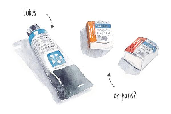
In general you’ll find that watercolor comes in two different formats: tubes or pans.
Tubes are filled with liquid paint, whereas pans are little containers with dried cakes of paint in them. These pans exist in two sizes known as “full pan” or “half pan”.
Ok… Great! So that just gives you one more choice to make! But let me make life simple for you – choose tubes!
There are a number of reasons I think you’ll prefer to buy tubes over pans.
For a start, not all brands of paint are available in pans. So if you’re keen on trying some M. Graham paints for example, you simply can’t buy them in pans!
You often see pans in ready to go palettes. The problem here is that you don’t get to choose your own colors, which I think is restrictive. For a better range of mixing possibilities it’s best to choose your own hues (more on which colors to choose below).
You can of course find ready made pans of paint that you can purchase individually. Winsor and Newton has a wide range of colors. But these pans cost almost as much as a 15ml tube, which contains a larger amount of paint!
Tubes give you the best of both worlds and in my opinion work out cheaper in the long run. You can either work with fresh paint squeezed from the tubes, or if you want the convenience of a palette of colored pans, you can simply fill up some empty pans with paint from the tube! And on top of that, one 15ml paint tube will fill up your pans more than once!
Don’t worry… The paint will slowly dry out, and can easily be re-wetted without any loss of handling quality.
Here’s a more in-depth discussion of pans vs watercolor tubes…
You can find some great empty watercolor palettes which you simply fill up with your choice of paint brand and colors. I suggest you get one with a lid like this one on Amazon to keep your paint dust free when not in use (I hate dust on my paints!)
Which Brand to Choose?
Ask five watercolor artists which brand they recommend and you’ll probably get five different answers!
The choice of brand seems to be quite a personal choice. I prefer Daniel Smith. They produce beautiful vibrant colors, lay down smoothly and re-wet easily in my palette. You can read more about what I consider good watercolor brands here…
Whichever brand you choose, I suggest you stick to a reputable manufacturer. Make sure they are clearly labeled with the specifications we discussed above. Well-known brands include Daniel Smith, Winsor & Newton, M. Graham, Sennelier, Da Vinci, Holbein, Schmincke, Van Gogh and Rembrandt.
I’m sure there are others, but these are some of the best known paints – although I still believe that Daniel Smith, Winsor and Newton, and M. Graham count as some of the highest quality paint brands.
Which Colors to Choose?
Colors create mood and emotion. You want to be able to paint both bright vivid colors or toned down hues. So ideally you need a selection of colors which provide the best range of mixing possibilities and convenience.
But how do you choose your palette of colors?
Below is a breakdown of all the colors currently in my studio palette. These are mostly single pigment and transparent paints which I selected after long deliberation. I suggest you begin with a set of six primary colors (a warm and cool version of yellow, blue, and red). In theory, you can mix any color using just the primary colors, but in reality you need at least one warm and cool version of each primary color to get a full range of mixable colors.
Daniel Smith make an Essentials Introductory Set (find them on Amazon) They include six warm and cool primary hues in an affordable package which is ideal for starting out.

You can then expand you mixing possibilities and ease of use of your mixing palette by adding some secondary and convenience colors.
In the list below the names refer to Daniel Smith colors. The names of paints can vary from one manufacturer to another, so for comparison I’ve also included the pigment numbers and characteristics for each paint so you can more easily find the equivalent in another brand.
Primary Colors:
These are the foundation of your mixing palette – start here. Note that I have more than one primary color in my palette for wider mixing choices.

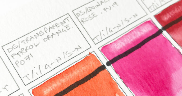
Cool Red – Quinacridone Rose: PV19 (Transparent & single pigment). This is a beautiful bright saturated pink color. It mixes very smoothly like all the quinacridone paints that I use. Most artists agree this makes an excellent cool primary red.

Warm Red – Pyrrol Scarlet: PR255 (Semi-transparent & single pigment). This is a very intense warm red color with excellent lightfast qualities. It has consistent handling properties across different brands.

Quinacridone Coral: PR209(Single pigment, transparent). This is a brightly saturated red and mixes beautifully with yellows and greens to produce a wide range of earthy browns. It has a chromatic appearance somewhere between a warm and cool red.

Warm Blue – French Ultramarine: PB29(Transparent & single pigment). This hue also counts as a blue-violet, almost purple color. The pigment used for French Ultramarine is quite granular but it’s also a very stable, single pigment, warm blue.

Cool Blue – Phthalo Blue GS: PB15:3(Transparent & single pigment). The “GS” means “Green Shade”. The green shade option is what makes this a cool blue. This is an excellent blue paint with a fine texture and good saturation.

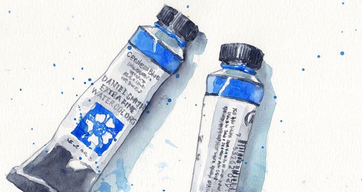
Cobalt Blue: PB28(Semi-transparent & single pigment) This is less granular than Ultramarine and useful for skies. This blue sits somewhere between a cool and warm blue. Some artists use this as their regular blue color but I use it as a “bonus” blue.

Cobalt Teal Blue: PG50 (Semi-transparent & single pigment). This is another beautiful blue-green hue. The paint retains its saturation well after drying. You’ll find the same pigment used in paints with various names, but “Teal” is the pure version of this turquoise color. This paint is quite granular.

Warm Yellow – Hansa Yellow Deep: PY65 (Semi-transparent / single pigment). This pigment gives a beautifully warm, vibrant, and pure yellow appearance. It only undergoes a very slight color shift as it dries, keeping most of its color saturation. Makes fantastic oranges when mixed with warm reds.

Cool Yellow – Lemon Yellow: PY175(Transparent & single pigment). This is a very light yellow which holds its color value well as it dries. Very useful for mixing bright greens when combined with a cool blue.
Secondary Colors:
Secondary colors can be mixed using primaries. But these are also colors that get used often so it can be quicker and easier to have some ready-to-go secondary colors in your palette.

Orange – I prefer to use Transparent Pyrrol Orange: PO71(Transparent & single pigment), because it is a fully transparent paint with a gorgeous intense orange color. If you mix it with a complementary paint color such as Phthalo Blue or even Prussian Blue you can mix some beautiful “blacks”.

Green – Phthalo Green BS: PG7 (Transparent & single pigment). The “BS” stands for “Blue shade” . You’ll find that the pigment PG7 is used in a large number of convenience green mixes by various manufacturers. When mixed with yellows and earth colors this pigment makes an amazing range of greens.
Convenience Colors:
Convenience colors are ready mixed colors that you use so frequently it makes life so much easier to have them available in your palette. I use a couple of them – Sap Green and Payne’s Gray (see darks below).

Sap Green: PO48/PG7/PY150 (Transparent – multiple pigments). Ok I admit it. I include this one because I’m lazy! It gives me a consistent sap green appearance when I want a fast color for vegetation. It provides a natural looking green that can be used straight from the palette.
Earth Colors:
Earth colors are all around us and you’ll make regular use of them when painting. Here are the earthy hues I use in my palette. If you only want a couple of earthy colors I suggest you pick Yellow Ochre and Burnt Sienna.

Yellow Ochre: PY43 (Transparent & single pigment). This yellow earth pigment is a very useful addition to even a limited palette. I use it all the time. The color remains well saturated even after drying.

Raw Sienna: PBr7 (Semi-transparent & single pigment). This color has a similar appearance to Yellow Ochre. One of its distinctive qualities is that you can paint superb glowing skies without giving a green tint to you blue sky wash!

Quinacridone Burnt Orange: PO48 (Transparent & single pigment). This is a beautiful orange earth color. It has a similar color appearance to burnt sienna, and makes some wonderful colors when mixed with blue.

Burnt Sienna: PBr7 (Semi-transparent & single pigment).
Burnt Sienna is an excellent mixing partner for many other hues. When mixed with Ultramarine you can get some amazing deep blacks.

Burnt Umber: PBr7 (Semi-transparent & single pigment). This is the darkest of the earth colors and has a rich warm earth appearance. I use it a lot to add warmth to shadows.
Darks:

Prussian Blue: PB27 (Transparent – multiple pigments). This pigment mixes easily with others and I find it great for shading and cool shadows. It produces wonderfully saturated darks. I love this low-key color and I often use it on its own.

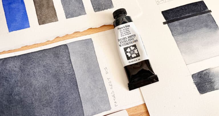
Payne’s Gray: PB29/PBK9(Semi-transparent – multiple pigments). This hue sits chromatically between prussian blue and ultramarine. Excellent for mixing shades and shadows.
Still don’t know what Colors to Choose?
Confused and undecided?
I know how you feel!
It’s not easy choosing colors, and it can take a while until you become familiar with your preferences. If you’re lucky enough to have a good art store nearby, you might be able to see some swatches of color in real life. Better still, you may be able to get samples of paint from some manufacturers.
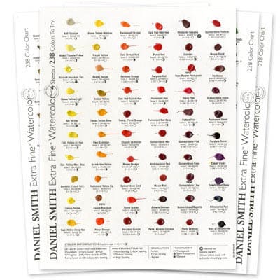
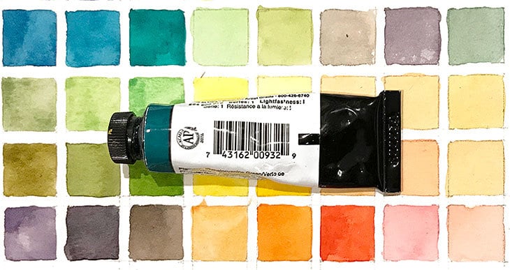
For example, Daniel Smith do a dot color chart of their full color range – again, you can find it on Amazon here… This gives you a reference of 238 different hues so you can test how each color performs before committing to buying a full tube…
Well… this article turned out a little longer than I intended, but I hope the tips above will help guide you so you can find the best watercolors to fit your needs, and start enjoying the wonderful world of watercolors!
Paints are of course just one aspect of watercolor painting. If you’re looking for more general help you might find my guide to watercolor supplies useful.
Related reading:



Hi there! Great information! Question: Have burnt Sienna and burnt umber the same pigment code? Thanks for the article
Hi Carol
Yes, they use the same pigment, but the way the pigment is prepared during manufacturing changes the color appearance.
You might find this article useful 🙂
Brilliant, thank you! I have another question: Are there multiple pigments in Prussian Blue? You listed only one (PB 27), and Winsor & Newton has the same colour name but also lists only this pigment.
Hi Carol
Yes, DS Prussian blue only lists one pigment (PB27) – some other brands may use a mixture of more than one pigment (this is then known as a “convenience” mixture).
You can easily find this info on the paint charts for each manufacturer 🙂
I am a senior citizen & I’m trying to get back into my artwork. I’m a little stumped about the Daniel Smith “starter set”. Instead of including Hansa yellow and Lemon Yellow it now has New Gamboge and Hansa Yellow Light. Your comments are needed. Should I just buy the single tubes?
Hi Sydney
New Gamboge and Hansa yellow light are both warm and cool versions of a yellow.
So from a learning point of view they are fine.
I use Hansa yellow deep and Lemon yellow because where possible I prefer single pigment and transparent paints… It’s a subtle difference that you may not notice at first.
One thing to keep in mind is that the “introductory set” includes small 5ml tubes. This makes it very cost effective if you just want to try things out (cheaper than buying single 15ml tubes)
🙂
Thank you for your quick reply! I’m making a list and really appreciate your response! Will look for lemon yellow.
Hello. I really enjoyed your article. I wanted to let you know of a watercolor brand that is new to me and only uses single pigments in their paints. They are called MaimerBlu and are from Italy. They are artist grade and I think they are fabulous. They have individual and sets of tubes available on Amazon. Another of my favorite brands of artists grade paints are QOR. What is your opinion on them?
Hi Josephine
Yes… The Italian brand Maimeri has been around for a while (not sure why they call their watercolors “MaimeriBlu”.
One of their ambassadors is the artist Jenna Rainey. They do rival top brands in quality and have lots of single-pigment options.
QoR paints are made my the Golden Artist Colors company. they have a long history of making paints for artists (I guy called Sam Golden” was the one of the founders in the 1930s), but their watercolor range is a more recent product (introduced in 2014 I believe). They use a non-traditional binder in the ingredients which is said to make the paint more vivid 🙂
Dear Anthony: this is the very very best and most useful guide to colours I have ever seen. Thank you so much. I especially like that you explain what each colour is good to use – and when – and whether they are a single pigment or a blend.
Please keep putting out your articles. I love your teaching style and am learning a lot. Jean
Thanks Jean – happy to hear you’re enjoying your watercolors !
Hi Anthony. I live at high altitude in a very dry climate and expect the tubes will dry out somewhat quickly, even if stored in an ‘air-tight’ container. I don’t want to be in the situation of having to cut open the tubes with an Xacto in a few months time. Would you recommend I just buy and immediately empty the large tubes into a series of lidded palettes? How then do I keep colors from getting contaminated by others during the process of lifting off the pans in the mixing process.. just clean the brush before every lift? Thanks for your help!
Hi Susan
The issue with tubes is they get sometimes get stuck because the paint dries around the cap, but if the tube is screwed on properly I’ve never heard of paint ‘evaporating’ inside the tube, whatever the climate…
I’ve even used old tubes of paint that have been lying around for decades (that’s showing my age!). And the paint was still usable, and reactivated fine.
I would keep the paint in the tubes they were intended for…
Color contamination is a different issue and you will inevitably get this whatever palette you use. It’s mostly a problem with lighter valued colors like yellow.
The solution is to rinse the palette’s wells under a slow flowing tap and brush away the unwanted contamination.
hope that helps 🙂
You are the best teacher I have come across, your tutorials are super simple and the explanation of colour mixing is simplified for us beginners. I find the latter confusing but you give great examples. Thank you.
Hi Rose!
Glad to be of help 🙂
Thankyou very much for all the info you provide
My pleasure Heather 🙂
Wonderful articles.
I was utterly lost as to where to begin and now I feel I actually have a starting point. Thank you so much!
Happy to help Beth 🙂
I am frustrated trying to paint purple Irises. I can’t get any really vibrant purples. I use Holbein watercolors. Can you tell me what paints you use to get vibrant purples?
Hi Louise
The most vibrant mix for purple would be something like quinacridone rose mixed with french ultramarine (in other words a cool red and a warm blue).
I’ve written an article specifically about mixing purple which you can read here:
how-to-make-a-perfect-purple-with-watercolor
Thank you for a great site.
Been painting for several years and only when delving into colour mixing
did I realise how little I know.
This information Will be most useful so thanks again
Saved to my reading list.
Rod
Hi Anthony, I love your blog and just printed your cool/warm colour chart for quick reference. Also just ordered the empty pallet to use my tubes in. I love that idea and didnt realize that was even an option. Kind of opens up a whole new world!!!
Thanks again for your generous information.
Glad you’re enjoying the site Valerie 🙂
Great article. Love your breakdown of pigments. For the last twenty years I’ve snobbishly used Michael Wilcox colours because of pigment purity. He produced 13 colours claiming you can mix most other colours from just these. It worked for me. But the time has come to expand my mind and experiment with other makes. That is why I found your page and your personal experience helpful. I’m off to buy DS tubes. Thanks for taking the time to enthusiastically write this article.
thank you! very useful and answered many questions. I am switching from Oils to Watercolors so was trying to figure out if Naples Yellow should still be part of my pallette. Now I know how to research that.
Good to know Maggie… Enjoy your watercolor paints !
Thanks a lot, I’ve learned much about choosing the right watercolor paints.
Thank you so much for this segment. I am a beginner on watercolor. This is very educational for me. Off to Blick! Lol!
You talk a lot about paint and paper but what about brushes? What brushes would be good to start with?
Thanks Anthony for the informative and fun article.
I am just getting back into watercolor and it was very helpful.
Phil
Thank you so much for writing this article. My daughter has been painting in acrylic, oil, charcoal, and pencil for years. She recently told me she would like to try watercolor because “It’s so pretty”. I have been trying to decide a basic set she could start with, then expand from; but I didn’t know how to start. Thank you so much for the lessons in the article.
I so appreciate your advice and lessons. For a long time I’ve been stuck and my paintings have shown it!! I look forward to your emails. Thank you so much!
Hi Caroline
glad you’re enjoying the site 🙂
Hi Anthony! I’m so glad that I found your website. I came across it today and I’ve already bookmarked it 🙂
You’re doing such an amazing job. I was looking for instructions on how to paint autumn leaves and discovered your website. Now I can’t stop reading all the blogs. Do you plan to open a YouTube channel anytime soon? It would be amazing to see you paint in videos. Thank you so much!
Hi Sikta
Thanks for your kind comments. I hope sometime soon I’ll be able to launch a Youtube channel 🙂
The information you have here will give me a great start and I want to thank you for taking the time to present your knowledge and talent. Merci beaucoup!!
Pas de problème Paula, c’est avec plaisir !
Nice to see someone from France on here 🙂
Thanks for your great tips
Hi,
I really like the information you have given in these articles you have written, thank you . One problem I have and maybe you have tackled this somewhere, is with colors like lemon yellow. Is lemon yellow a pigment? Are more than one pigment used to make various lemon yellows in various watercolor paint companies? Same for “permanent” red, yellow, blue ect… they may be permanent, but do they mix well?
Hi Crystal
You might find this article useful: https://www.watercoloraffair.com/how-to-read-watercolor-labels-a-beginners-tutorial/
It explains a lot about pigments and paint names etc.
This is the best information I have read about beginning watercolor painting. Simple, concise and easy to understand. Thank you, Anthony!
thanks for your kind comment Susan – happy to help !
Thanks. The article on paints was timely and very helpful. You did a great job of covering all the issues in a way that was easy to follow and apply. Found what I needed.
Thank you so much sharing your experiences.I live in Brazil and I am in quarantine for covid-19, so I am now painting everyday. God bless you for help!
Have fun with your paintings Angela !
Hi Anthony, Would you know anything about ‘Ocaldo’ paints? I have some tablets labeled ‘Ocaldo Made in England, Calder colours (Ashby) Ltd’, ‘Ocaldo Art Materials, Ashby De La Zouch Leics’. When I search online almost nothing comes up, not the Watercolor label you describe in the article.
Hi. I’ve seen Ocaldo widely available in the UK… They make basic quality art products for students, but I would not consider these to be artist quality paints.
Thanks for this easy to read and clear blog on paints. I am fairly new to the world of watercolour and find myself with this ‘hodge podge’ of various paints and manufacturers. I did buy Windsor Newton Series 1 Sepia. It is a lovely rich brown but very grainy so I have to be careful about mixing it with other paints.
Awesome! 80 yrs. Old new to water coloring. Very helpful, reading your info. I got tubes by accident, $3 unopened box at yard sale. Love them, I never liked the messy looking trays from school. Thanks!
I do wish I’d known about you and this information before I launched into buying paint and brushes and paper!
I managed to get about 50% right so not too much money wasted, thank you, my watercolour future is much more secure.
Jan
Hi Jan
Getting the right watercolor paints will get you off to a good start !
Thank you so much for being very honest and sharing your experiences .Truly appreciate it very much.Its indeed an eye opener to know so much in a simple language snd illustration.
Thanks Maria !
Thank you so much for such a summary, easy reading and remembering! It’s so helpful for beginner. I learnt a lot a lot! Thanks for guiding us the way! Thanks for your generosity for sharing your tips and talent especially your time.
Thanks for your kind words Diane – enjoy your painting !
Thank you for this easy way into watercolour. I am in New Zealand where we are all in lockdown for covid-19, and I found a supply of water-colour gear in our cupboard which my mother in law gave me years ago but I never used. Am now painting each afternoon using your website for guidance – am loving it!
Really happy to know you’re getting into watercolors !
Stay safe…
After a year of learning to paint on my own, this has been one of the most helpful posts I have read. I will keep it on hand as I grow my palette. Thank you so much
Really happy you found it useful Ricki – happy painting!
I was researching beginner watercolor techniques and came across your site. I haven’t picked up a brush since high school (I won’t say how long ago that was) and want to begin painting again. The information you have here will give me a great start and I want to thank you for taking the time to present your knowledge and talent. I will be picking up my supplies in the next week or two and will be referring to your site regularly. I find the information on color theory especially helpful.
So glad you found this was useful Theresa !
Thank for you this website. I stumbled upon it while reading about watercolor canvas. I am a beginner, self teaching, working on a couple paintings for Christmas gifts. One is on a watercolor canvas as the recipient likes to hang unframed canvases, one is on cold pressed paper. Same subject matter, such different results I am getting.
I am learning a lot from you – thanks again!!
So glad to hear you’re learning about your paints Mary – Have fun !