
Simple Watercolor Painting (Easy Method for Beginners)
I believe anyone can paint a simple version of any subject in watercolor.
It’s just a matter of how you approach it.
So in this tutorial I want to share with you an easy technique to help you paint just about ANY complicated object in a simplified way, and achieve fun, good looking results from your watercolor paintings.
Whatever your level of skill, you can produce interesting and joyful watercolors of just about anything around you using this method.
So what is this simple painting strategy?
How do you Make a Simple Watercolor Painting?
As an architect, this is something I do habitually when I want to make visual notes of objects.
I’m talking about an “orthogonal view”.
Don’t get put off by the fancy name. This is just the vocabulary used by architects and engineers for what can be more simply referred to as a “side view” or a “front elevation”.
To demonstrate this idea, I’m using some photos I took on a recent trip to London when I was able to return to the UK after travel restrictions were lifted 🙂
I took some snaps of these typically British telephone boxes and a post box. And I think they make a great subject for this lesson.

Now, if you wanted to paint a more realistic representation of these things, you might find it quite challenging. This is where making an orthogonal view helps to simplify the process.
To achieve this, first you take the perspective view of a subject, then imagine that the viewer’s line of sight is directly perpendicular to the object. In other words, you’re looking at just one side of the telephone box.
Next, the objective is to flatten this side view so that you essentially turn a three-dimensional perspective into a two-dimensional drawing.

You now have a simplified, non realistic, sketch of your subject.
The advantage of this kind of interpretation is :
- You don’t have to worry about achieving good perspective.
- Not too bothered about proportions.
- Because it’s a non-realistic viewpoint you don’t have to worry about painting with realism.
And it gets even better !
Because this method means you can paint in a loose watercolor style, without the need to be careful about your brush marks or your painting technique.
This is why I think using this kind of approach is accessible to anyone who just wants to have fun and enjoy the experience of painting ! And you can paint just about anything you fancy !
Simple Watercolor Painting for Beginners
So you get the general idea. Begin by sketching a flat two-dimensional side view of your subject onto a sheet of watercolor paper. Note that I’m not using expensive artist quality paper for this – just a sheet of student grade paper.
This is just a loose fun painting – save your good quality paper for more finished projects.
If you’d like to follow along and paint the same subjects as me, you can follow the link below to download a worksheet with an outline sketch that you can trace onto a sheet of paper.
Try this painting for yourself ! Click the button below to download the worksheet for this painting.
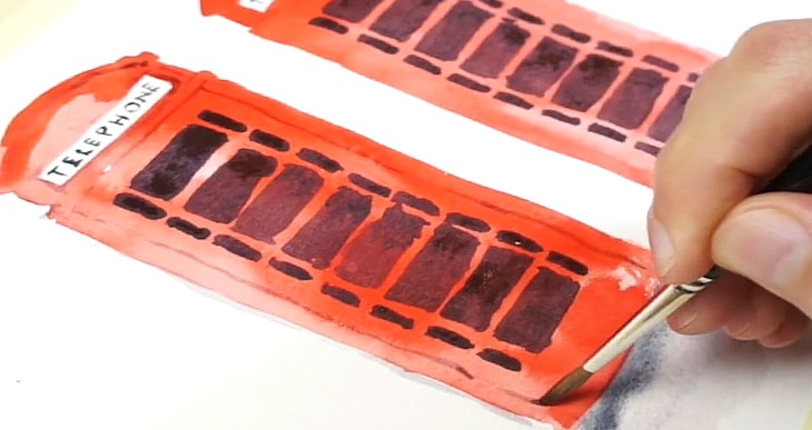
For the telephone boxes begin by painting one big red shape. You can use a large round brush for this since you’re not too bothered about the detail. The only thing to remember is to leave any white shapes untouched like I’ve done here with the sign at the top of the box.
As you can see I’m not being very careful with the way I paint the colored wash. My brush strokes are quite loose and I’m not even trying to get an even wash of color. In fact I think this will add a bit more character to the finished painting.
Paint the second box using the same approach.
While you’re waiting for the paint to dry and move on to the next step you can add a bit of shading underneath the boxes.
Even if the red paint isn’t completely dry you can go ahead and add this. If the red paint diffuses into the brush marks of gray then that’s fine – it all adds to the loose quality of the painting!
Use a light watery mixture of gray to add some quick relaxed shadow shapes then dab in a darker gray at the junction between the boxes and the shadow.
Now that the red paint is finally dry you can apply a watercolor glazing technique to add some dark shapes for the panes of glass.
If you’re not familiar with this term, glazing simply means painting layers of color one on top of the other, leaving the paint to dry between successive layers.
The color I’m using here is a warm black mixture. I’m not using black paint because this would be less harmonious with the underlying red hue. Instead I mixed a dark gray using:
This mixture is also known as “Jane’s Gray”, named after the Australian watercolor artist Jane Blundell.
The advantage of mixing your own blacks and neutral colors is that you can adjust the color bias to suit your needs – like in this case I added a little more burnt sienna to get a warmer appearance.
The final stage of this painting is all about adding detail so I swapped over to a small round brush with a nice fine point. Use the same dark gray mixture to add the “telephone” sign at the top.
I then used a diluted version of this gray color to add some lines to represent some of the details around the door and the windows and a few other things like the base of the telephone box and the edges.
I also used some gold watercolor paint to add things like the royal crest at the top of the box and the handles.
Finally I used some white gouache to restore a few white highlights on the panes of glass.

I always think a painting looks better with highlights – it helps add contrast and a bit of visual interest.
And here’s the end result.

I used the same flat, two-dimensional drawing technique to sketch the post box. Again if you’d like to paint the same subject as me, you’ll find a worksheet above.
The first step is pretty much identical to the method I used with the telephone boxes. But this time I’m being careful to leave a few more small highlights of white paper.
These correspond to the reflections around some of the surface details and of course the white panel at the top.
Paint the red shape with loose brush strokes. Then mix up a diluted gray color to paint a shadow underneath, and use the same dark gray mixture as before to add the dark shapes of the letter opening and the base.
You can let the dark paint diffuse into the shadow shape. Playing with wet-on-wet techniques like this is part of the fun of using watercolors.
The final stage of the painting is exactly the same as before. We just need to add a few details, so go back to using a small, fine tipped brush, and a diluted gray color to represent some of the grooves and shadow lines.
When you reach the lettering at the bottom try to paint as if you’re adding cast shadows to the elevated letters.
Finish off with a few quick brush marks for the white panel, and maybe another layer of dark paint for the base.
Don’t forget to add a few gold colored details, especially for things like the royal crest and a few of the letters. Then if needed go back in with some white gouache to retouch some of the highlights.

And here’s the finished result:

So there you go…
I hope you enjoyed these simple watercolor painting ideas. I think you can use this method to simplify almost any subject. It’s a great way to enjoy painting without the constraints of trying to produce realistic results.


I am an absolute novice at watercolors and I so appreciate your detailed instructions. Your phone box will be my next project – thank you!
Have fun Cheryl !
Anthony: I thoroughly enjoy watching – and reading – your watercolor lessons. I look forward to putting some of them in action, with a paintbrush in my hand! You have a wonderful teaching approach. Thanks so much!
Thanks Marie !