Easy Watercolor Christmas Cards – Step by Step Tutorial
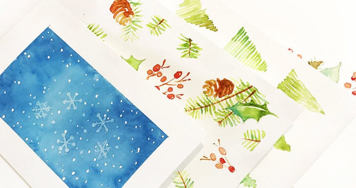
I don’t know about you, but I always seem to write my Christmas cards at the last minute!
But this year I really wanted to design and paint some of my own watercolor cards for friends and family. So if you’re looking for inspiration and some guidance how to paint your own merry little cards, I hope this tutorial will get you painting !
These easy watercolor christmas cards are simple to do and a whole lot of fun! I’ll show you how to create these watercolors step by step. As you progress the paintings become slightly more elaborate and involve some more skills, but I’ll explain these great watercolor techniques and color theory along the way. You’ll be using methods such as:
- Color mixing
- Wet on wet techniques
- Charging color
- Variegated washes
- Glazing
- Reserving whites and masking
And maybe some other fun stuff that I’ve missed! Every time you paint you will get better in this beautiful medium. So grab your paints, put on some christmas music, and enjoy…
Simple Watercolor Christmas Cards
Set yourself up with the right materials before you begin. I’m using 140 lb / 300 gsm watercolor paper for these cards. This is thick enough to make decent cards and also won’t buckle very much. Anything thinner is probably a bit flimsy. The simplest way to make the cards is to fold a sheet of paper in half, but you can also find watercolor postcards ready to pop in an envelope if you prefer.
A couple of other things you will probably find useful is some low tack masking tape and some masking fluid. I’ll explain how to use these later on.
Let’s get stuck in!
Watercolor Christmas Tree Card
Christmas trees are a typical hallmark of the festive season. You don’t need to paint a realistic looking pine tree for people to understand the significance. So for this first design I painted some simple watercolor patterns which represent Christmas trees.
I’m using repetition as a compositional tool for this design, but adding variation by using different brush strokes and colors for each tree. It’s a good idea to think about the composition of your painting before you start. This is basically just nine equally spaced triangles. Although it’s a very simple pattern, the composition sets up a rhythm which is pleasing to the eye. The mixed brush strokes and color variation break the monotony. I did nine trees because I didn’t want them to become too small so I could still add some detail with a small brush. But feel free to paint a larger number of smaller trees if you like.
This is also an excellent exercise in brush control. I’m using a reasonably small round brush. It’s a number 4 brush from the Silver Brush Company. This mix of natural hair plus synthetic bristles makes an excellent inexpensive brush with good handling qualities and a fine tip. You don’t have to paint exactly the same patterns as I used but the idea is to vary the brush strokes and colors for each tree. The repetitive brush strokes force you to apply good brush control.
Trees are green… Right? Well green is an often discussed color in watercolor painting because it can be tricky to mix. Yellow plus blue doesn’t always produce the desired green as I’m sure you’ve already discovered. But if you remember a couple of simple rules then you can mix whatever kind of green you need.
To mix greens and obtain the desired hue you can use a simple color wheel to help you decide which paints to use. The color wheel below uses a warm and cool version of each primary color (yellow, red, and blue). This is known as a split primary color palette. The colors on the wheel naturally progress from warm to cool hues. Warm colors are yellow, orange and red whereas cool colors are purple, blue and green. As a rule of thumb, warm colors tend to contain more red and cool colors tend to contain more blue.
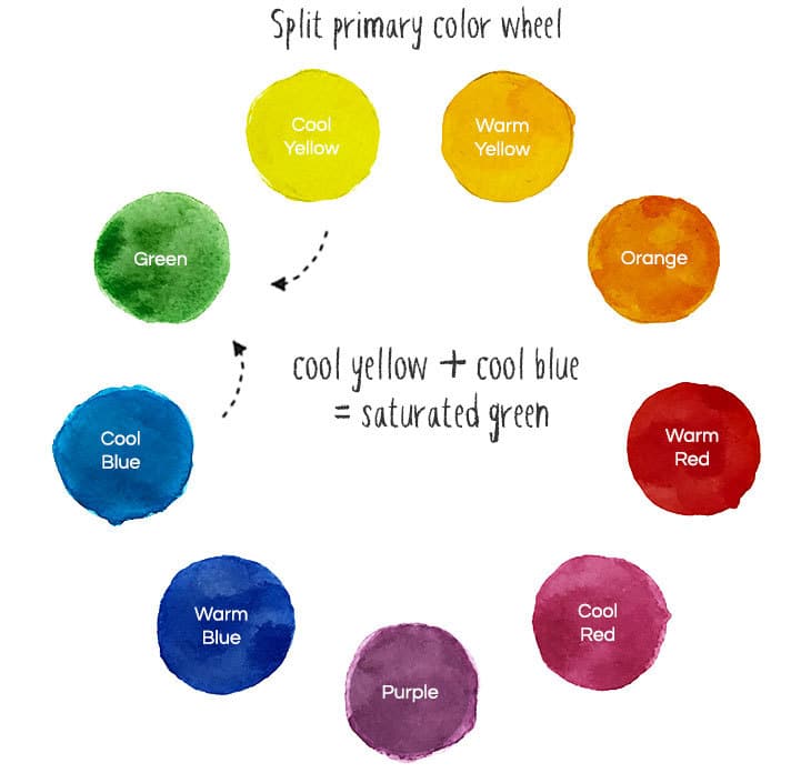
To produce the brightest possible secondary colors (orange, purple, and green), each secondary color must be mixed using the secondary color closest to it on the color wheel.
Take a look at the color wheel then read that again !
Just to be clear, a bright saturated green can be mixed using a cool yellow and a cool blue.
If on the other hand you want a more subdued green color, you should mix using primaries that are further away on the color wheel. For example a warm blue and a warm yellow.
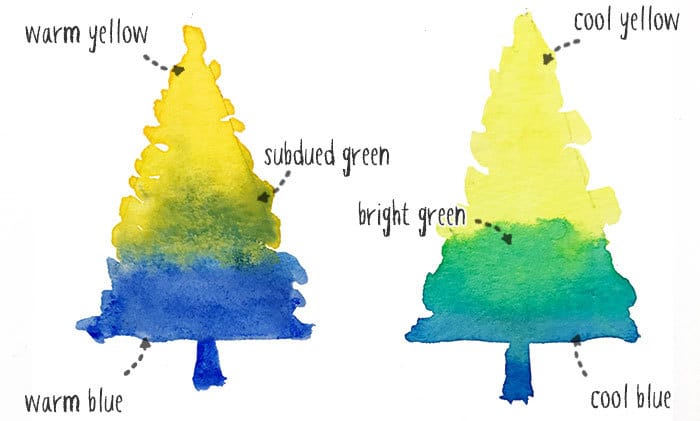
Tip: I recommend you always have a warm and cool version of each primary color to give you the best range of color mixing. Personally I love the smooth handling qualities of Daniel Smith watercolors. They do an excellent essentials set which contains six warm and cool mixing hues.
The paints I used for this card are as follows:
- Phthalo Blue (GS)
- Lemon Yellow
- Sap Green
- Raw Sienna
As you can see I’m using a cool blue and a cool yellow so that I can mix some nice vivid greens. But I’m also using a ready mixed sap green as a slightly toned down green as well.
A side note about Sap green: This paint is what’s known as a convenience color. Watercolor artists who do a lot of landscape painting or botanical work like to have this in their palette simply because it saves time mixing and gives artists a consistent color for painting foliage. But from a purest’s point of view, sap green is maybe not the best mixing paint because it is not a single pigment paint. (For example the Daniel Smith Sap Green contains three different pigments).
Watercolor artists prefer to use single pigment paints where possible because they’re considered to produce brighter more vibrant colors, and that mixing multiple pigment paints tends to produce muddy results.
Begin by drawing some equally spaced triangles with a pencil. The start painting your first tree with your chosen brush stroke texture. I’m starting with a light green mixed from Lemon Yellow and Phthalo Blue.
Next you’re going to create a variegated wash by adding some more color to the first wash that you laid down. I added some more Phthalo Blue by dabbing in some color then moving the pigments around in the wet wash. The paint must still be wet for this to work otherwise the colors don’t blend together smoothly and you’ll get sharp edges where the paint has dried. Adding more color to a wet layer of paint is often referred to a charging in.
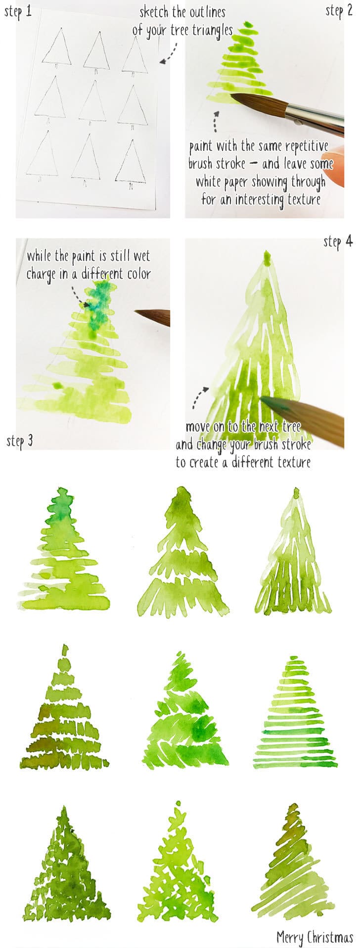
Move onto the next tree shape using a different green and a new type of brush stroke. Charge the wet paint with a second color again so you get a variegated color appearance.
Keep going until you’ve done all your trees!
Watercolor Snow Storm Card
This next design is another easy one to produce if you have a few basic supplies.
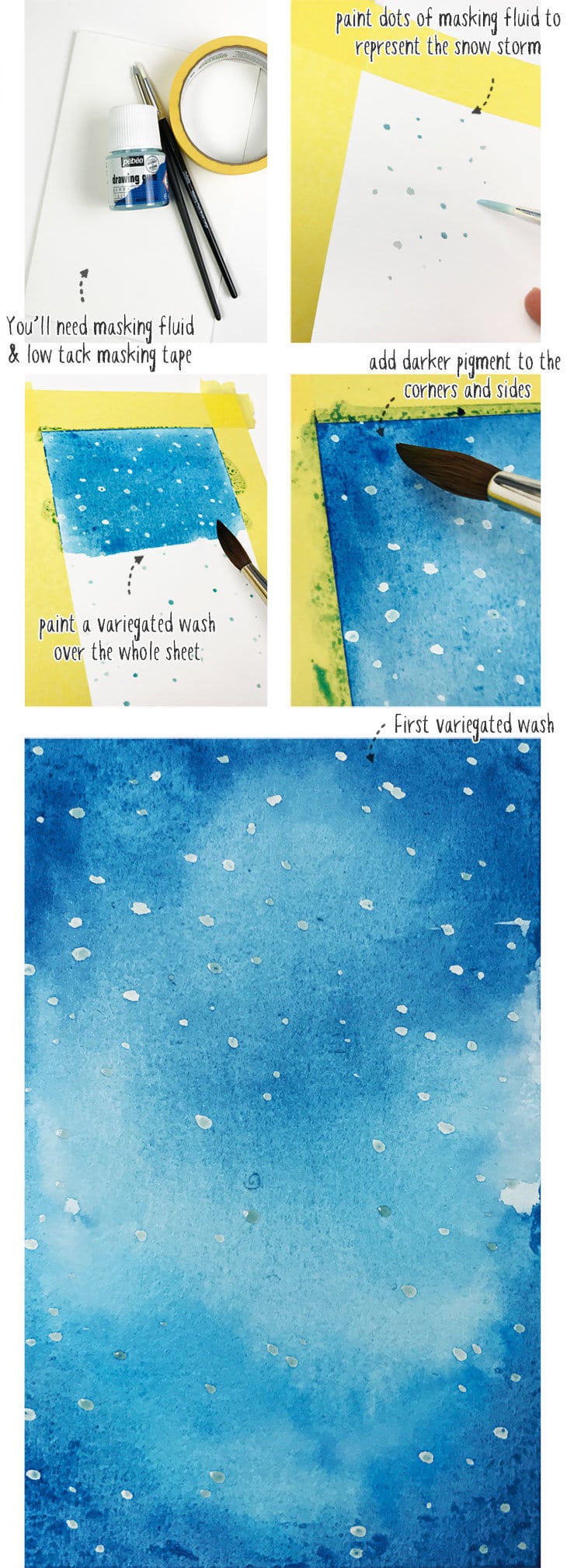
Begin by creating a border for your painting using low tack masking tape. It’s a good idea to use low tack stuff so that you don’t rip your delicate watercolor paper when it’s removed!
Next apply some random dots of masking fluid to represent the flurry of snowflakes. I’m using Pebeo drawing gum which has the advantage of being colored so you can see where you’ve applied the masking. Masking the white paper in this way is method used for reserving whites. When you remove the masking you’ll have nice crisp white dots.
Tip: Be careful which brushes you use to apply masking fluid. Whatever you do don’t use your best brush, and clean your brushes quickly after using the masking. This stuff is difficult to clean off. I use a small synthetic brush for this.
I only used a couple of blue colors for this painting, a cool Phthalo Blue (GS) and Prussian Blue which is a beautiful rich blue hue.
When the masking fluid is completely dry you can paint a variegated wash of blue across the whole paper surface (you paint a variegated wash simply by mixing two or more colors on the paper while the paint is still wet). Try to work quite quickly so that you paint remains wet, otherwise you risk getting a streaky wash where the edges of the paint has dried.
I want the surrounding edges around the painting to be darker so I’m using a brush to dab stronger paint into the edges of the wet wash (Once again this is what’s known as charging in).
When you’re happy with your wash leave it to dry before moving on to the next part. Let me repeat that.
Yep… Leave it to dry before the next stage.
You’re going to apply some more masking fluid. If you do this before the paint is completely dry you’ll have problems removing it and you can damage the layer of paint underneath.
Paint some more snowflake forms with a second layer of masking fluid. I concentrated these at the center of the painting. When the masking fluid is dry again, paint a second variegated wash across the whole of the sheet, charging the corners and sides with more pigment to make it darker around the edges.
Let everything dry one more time, then use a kneaded rubber eraser to remove the masking fluid. Then remove the masking tape around the border.
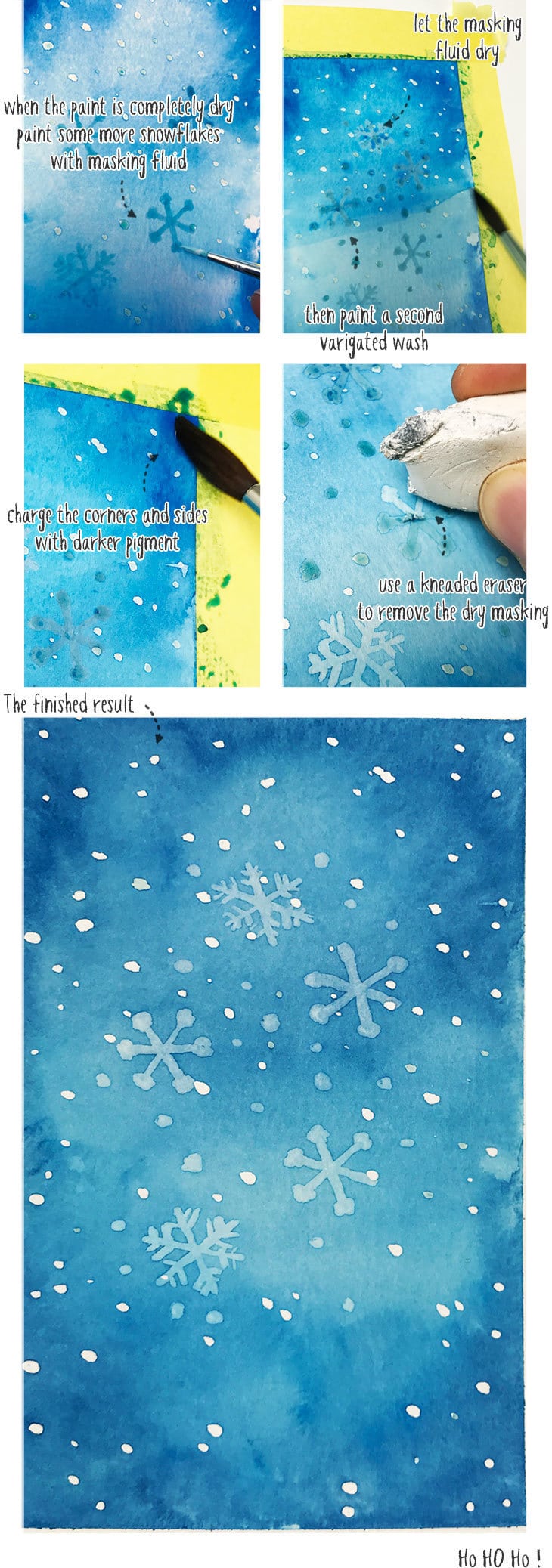
Ta-da !
Sit back and admire your handiwork…
Floral Watercolor Christmas Card Patterns
This next example stays within the theme of patterns and repetition, but we move on to slightly more complicated shapes.
Rather than just painting triangle trees and snowflakes I’ve used some more detailed floral shapes. Sticking to the Christmas theme I’ve gone with berries, holly, pine leaves and pine cones.
The shapes themselves are more complicated to paint which will get you practicing some more advanced brush control techniques. At the same time the colors have some interest because they use variegated washes. One of the characteristics that I love about watercolors is the way you can blend colors together while the paint is wet, and the transparency of successive layers of paint.
The colors used for this painting were as follows:
For the pine cones and stems: Raw Sienna and Transparent Pyrrol Orange.
For the leaves: A mix of Lemon Yellow plus Phthalo Blue (GS) then some Sap Green and Phthalo Green (BS)
For the berries: Transparent Pyrrol Orange and Quinacridone Rose.
Begin by masking your border with low tack tape, then sketch a light pencil outline of the shapes on your card. If you find the drawing part difficult, you can download the template for the card that I created and use this to trace outlines onto your watercolor paper.
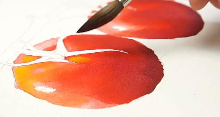
For the cones I used Raw Sienna and some curving, circular brush strokes to depict the cone texture. Leave some white paper between your brush marks. Leaving some parts of the shapes white gives a hint of highlights and I think the contrast produces a crisp fresh appearance. While the cone shapes are still wet, use the charging technique you used previously to add some Transparent Pyrrol Orange to parts of the cone. Dab the paint and push it around the wet wash so you get a nice variegated color range. Once the cones were dry I painted some further texture with a glaze of Raw Sienna (painting on top of a dry layer of paint is known as glazing).
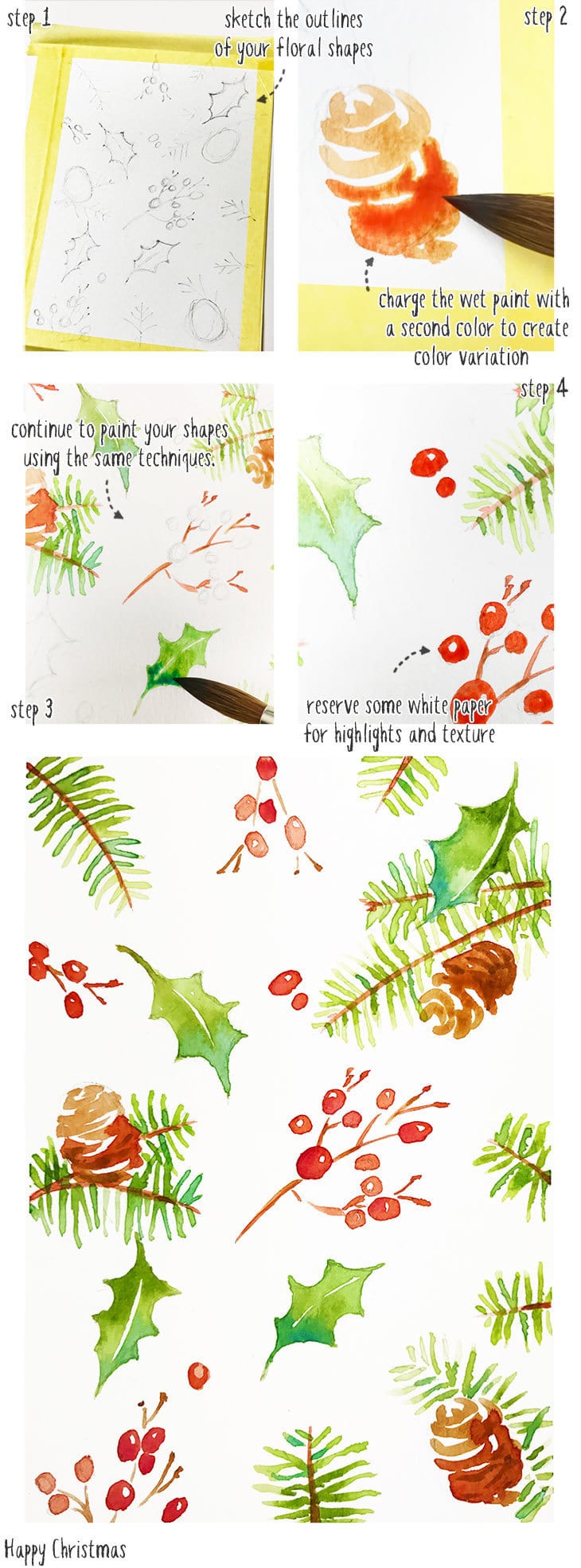
The same technique applies to the other shapes in this composition. For the leaves I began with a bright green mixed from Lemon Yellow and Phthalo Blue (GS). Be careful to add just a small amount of blue, this mix is mostly yellow. Again you can leave some white to hint at the leaf veins and charge in some Sap Green or Phthalo Blue and Phthalo Green to variagate the wash color.
For the berries I painted them in Transparent Pyrrol Orange and added a little Quinacridone Rose. Don’t forget to leave some white highlights on the berries!
Remove the tape around the border and… Voila !
Floral Watercolor Christmas Card Composition
For the last card I used the same Christmas floral shapes but this time I painted an assembled composition. When you paint a grouped composition like this on white paper, think about where you’re going to position it. Don’t just paint it bang in the middle, but rather try to set it into a corner of the sheet. This kind of compositional tool is known as the rule of thirds. (If you divide a sheet into thirds vertically and horizontally, the eye is naturally attracted to objects which lie along one of these lines or at the intersection of two lines).
The composition is painted using the same color mixes and the same techniques that were used on the previous cards. Remember to leave some white highlights and paint variegated washes to produce interesting color variations.
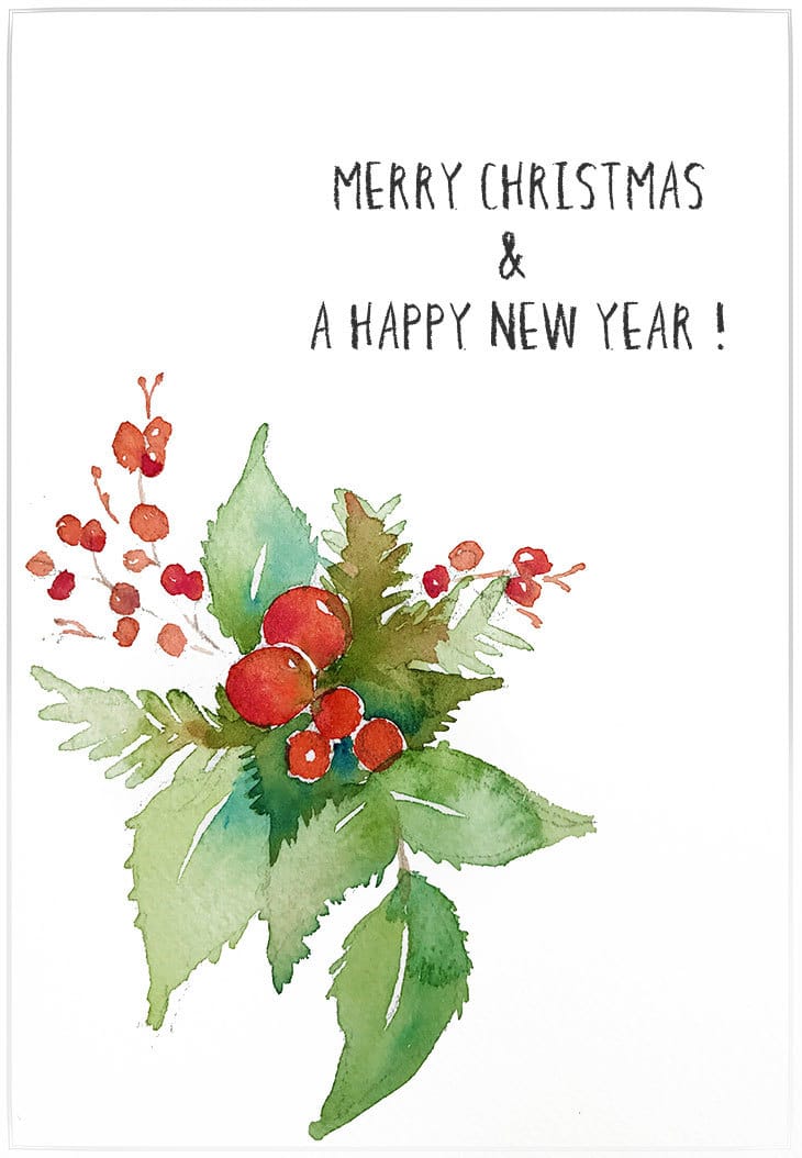
I hope these easy examples inspire you to paint your own watercolor christmas cards this year. Your friends and family will love them!
Merry Christmas everybody!




I love these Christmas Card ideas!! They are simple & really beautiful. So far I’ve just enjoyed reading your newsletters but think I’m going to actually try to paint!! As a watercolor beginner what tutorial do you suggest I start with??
Thanks for your inspiration!!
Great news Sally !
I have plenty to choose from on the site, but I suggest you start with something like this:
how-to-start-watercolor-painting
or this:
10-easy-watercolor-ideas
I REALLY have enjoy this post so much….
Many thanks and happy christmas!
Happy Christmas yourself !
Wow another great post! Please do more of these watercolor card tutorials! Love it! I learned so much reading through your post. Thanks!
Thanks for your kind comments Tami – more stuff coming!
Hi Watercolor Affair. Wow. I wanted to let you know how much I appreciate the time and expertise you have shared with us, and how wonderful I think you are, but, everyone has beaten me to it. Thank you so much. Fond regards Sherie.
He he.. thanks Sherie. Just trying to be useful…
I just found your site, and have learned So much on watercolors, So thanks so much for sharing it.
I take [have taken] water color painting classes and your tutorial was just what I needed to fill in my blanks. Each year I tell myself I am going to do original Christmas water color cards … did not happen last year. YOUR tutorial has inspired me to get this done for Christmas 2019 – which means starting now versus December 1st. 🙂 Your language is clear and I like that you provide progressive illustrations that show how to go from blank to content. Thank you for sharing your knowledge with us fledgling water colorists.
Dianne
1/19/2019
That’s great Dianne! nothing like starting early 🙂
How generous of you to share your knowledge. I’m just beginning to work in water colors and your instructions are so valuable. They make working in this medium more understandable and less intimidating. Thanks so much.
Pleased you found it useful Gail. Happy painting!
Love it.However, I did’t find a place to sign up to follow you. How do I make sure not to miss anything?
Hi Betty
I don’t yet have a newsletter… hopefully in the new year I’ll get that fixed 🙂
Thank you so much for sharing your ideas, you make it look easy, thanks again
My pleasure Penny – hope you enjoy doing some painting this Christmas!
Thank you. I’m saving this; it is very helpful.
You’re welcome Daria 🙂
Very good and easy to understand directions. Love that you give the names of the colors you use. Love Daniel Smith!
Hi Lynne – Agree with you 100% about Daniel Smith!
I enjoy reading it, the tips were clear and easy to follow.
Thanks very much
Thanks Mariela – have a great christmas!
Thanks for the great tutorial! I think the simplicity, yet beauty will give me the confidence to start watercolors.
thanks Sandy – Once you start painting you won’t want to stop !