Guide to recommended watercolor palette colors
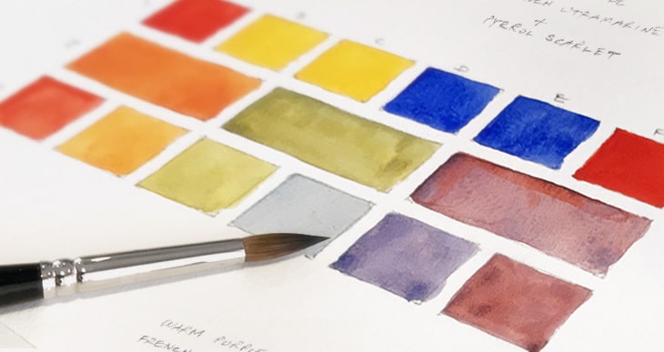
I hear it all the time!
What color paints do you recommend?
This is something that I agonized over when I first started painting with watercolors!
The choice of paint colors is staggering, especially when you consider watercolor brands like Daniel Smith (they have a huge collection of over 250 paints!)
And good quality watercolors are expensive! I didn’t want to make a mistake and buy colors that I wouldn’t use!
I even made a spreadsheet comparing the recommendations of various well known artists… Argh!
In the end I created a list of recommended watercolor palette colors, and this is what it looked like:
Notes: GS = green shade BS = blue shade.
Pigment numbers begin with “P” for pigment, then another letter to denote each color.
For example, PY means pigment = yellow. PO means pigment = orange. PR means pigment = red, etc.
|
Color |
Transparency |
No. of Pigments |
Pigment | |
|---|---|---|---|---|
|
Lemon Yellow |
Transparent |
Single pigment |
PY175 |  |
|
New Gamboge |
Transparent |
2 pigments |
PY97 & PY110 |  |
|
Transparent Pyrrol Orange |
Transparent |
Single pigment |
PO71 | |
|
Pyrrol Scarlet |
Semi-transparent |
Single pigment |
PR255 |  |
|
Quinacridone Rose |
Transparent |
Single pigment |
PV19 |  |
|
Pyrrol Crimson |
Semi-transparent |
Single pigment |
PR264 |  |
|
Quinacridone Violet |
Transparent |
Single pigment |
PV19 | |
|
French Ultramarine |
Transparent |
Single pigment |
PB29 | |
|
Phthalo Blue (GS) |
Transparent |
Single pigment |
PB15:3 | |
|
Prussian Blue |
Transparent |
Single pigment |
PB27 | |
|
Phthalo Green (BS) |
Transparent |
Single pigment |
PG7 | |
|
Yellow Ochre |
Transparent |
Single pigment |
PY43 | |
|
Raw Sienna |
Semi-transparent |
Single pigment |
PBr7 |  |
|
Quinacridone Burnt Orange |
Transparent |
Single pigment |
PO48 |  |
|
Burnt Sienna |
Semi-transparent |
Single pigment |
PBr7 | |
|
Burnt Umber |
Semi-transparent |
Single pigment |
PBr7 |  |
There’s a total of 16 colors above. Now… you don’t have to get as many colors to get started. And I’ll tell you how you can get by with less colors if you want. But I came up with this list as a result of hours of research.
Let me explain…
How to choose palette colors
The perfect color palette doesn’t exist.
Unfortunately, there isn’t some stupefying list of flawless watercolor paints, (wouldn’t that be great…)
In the end it comes down to personal styles and preferences, and a good understanding of your watercolor paints.
Different watercolorists will have different recommendations. But when you begin to compare other artists preferences, you start to see some similarities and certain colors that crop up often.
Nevertheless, there are a few basic rules that most watercolor artists stick to for choosing a basic palette of colors.
Must have watercolors – warm and cool primary colors
Primary colors are a must have because they cannot be mixed from other colors. You probably already know that you can mix any color you need from just the primary colors, red, yellow and blue.
At least that’s the theory.
In reality the color you obtain from the paint is dependant on the pigment it contains. And when you consider primary color paints more closely they can have a warm or cool hue depending on the pigment used.
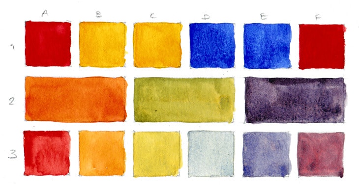
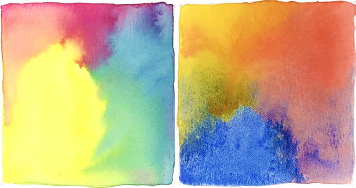
As a result, when you mix three cool primary colors you get quite a different result compared to when you mix three warm primary colors. Below are a few examples…
Warm primary color chart
Cool primary color chart
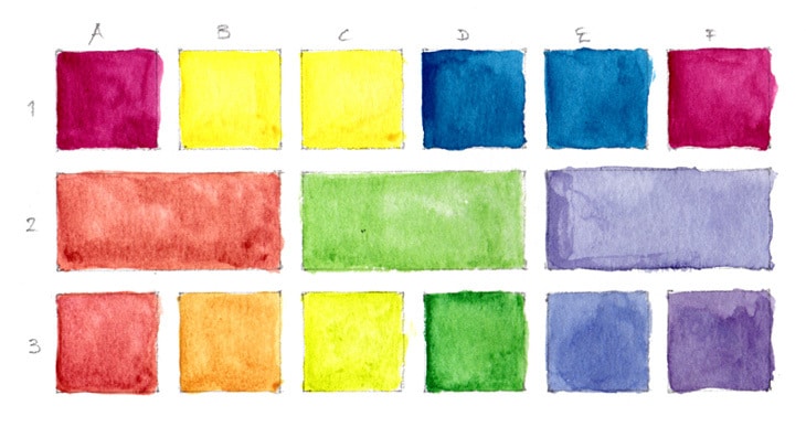
The colors used in these charts are as follows:
lemon yellow (cool) / new gamboge (warm)
Quinacridone Rose (cool) / Pyrrol Scarlet (warm)
Phthalo Blue (GS) (cool) / french ultramarine (warm)
Having a mixture of both warm and cool primary colors in your palette is a terrific start to your palette, and with these you can mix a very useful set of colors.
If you’re brave enough you can just make do with some primary colors. But the reality is, you need to really know your paints extremely well to mix the exact color you need. You can end up spending more time mixing than painting!
And you also need to be quite skilled in order to get the proportions right each time when you need the same mixed color again and again.
Mixing colors is an almost an art in itself and it is a very good investment of your time to create some color charts with your paints so you get to know what you can do with them.
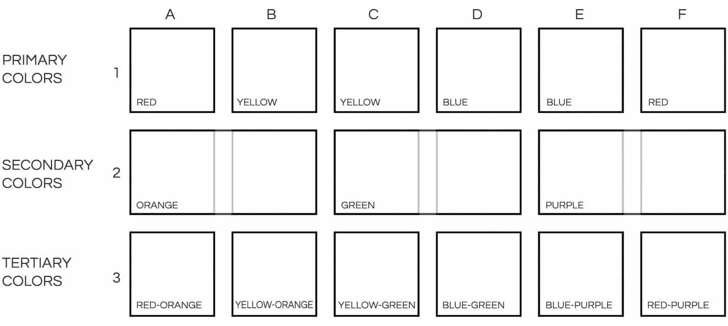
If you’d like to reproduce this experiment, I’ve created a PDF template that you download for FREE in the link below! You can use it to easily trace your own templates and it includes steps for filling in the different boxes… Have fun!
Complimentary colors
You can create an abundance of colors with just a small number of paints.
In addition to some warm and cool primary colors most artists add a few additional pigment colors to extend the mixing range of their palette.
These additional colors are mostly for comfort and convenience. There are certain colors that so common that you end up mixing them again and again. Having a color already available is a big time saver.
Phthalo Green is a very vibrant and highly saturating color to have in your palette and helps simplify the mixing of other colors.
For example, Phthalo Green mixed with Pyrrol Crimson is an easy way to make an attractive black. Phthalo Green mixed with Yellow Ochre will result in an excellent Sap Green.
Quinacridone pigment paints are transparent and very vibrant. There are many varieties of colors using this pigment, but Quinacridone Violet is fantastic for making glowing purples.
Earth colors such as Raw Sienna and Burnt Sienna are also remarkably useful, and also help produce interesting greys. Browns are wonderful for landscapes, figures and skin tones. It is incredibly useful to have a ready to go dark brown in your palette such as Burnt Umber.
Quinacridone Burnt Orange is a very versatile neutral warm tone.
Which type of watercolor paints are best?
As you add colors to your palette you should first consider the quality of the paint you are choosing. Most artists will agree that the three key factors to choosing good quality paint are transparency, the number of pigments used to make a particular color, and its lightfastness.
Transparent watercolor paints
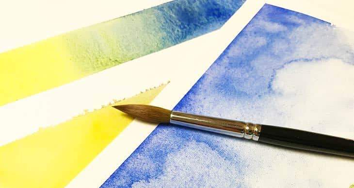
When you start looking closely at the labels on watercolor paint you’ll find that not all watercolor paint has the same transparency value. In general, paint can be transparent, semi-transparent or opaque.
This transparency affects the appearance of your paintings.
You may notice that certain watercolors have a milky or chalky appearance when dried. This happens in particular when you use opaque paints.
Why is this important?
With watercolor painting, the brightness of the colors is mostly the result of light reflecting off the white paper support. In addition, most watercolorists build up successive layers or glazes of paint to achieve the final result.
When you apply 2 or 3 glazes of opaque paint, this covers the surface of the paper and less light is reflected from the white paper surface.
The outcome is colors that are less vivid.
You can test the transparent properties of your paint by…
Single pigment watercolor paints
You can combine single pigments to mix the rest of your colors and achieve much more satisfying results. When you mix too many pigments together the resulting color becomes murky and dull. This is why many experienced artists avoid paints that are pre-mixed with 2 or more pigments. The fundamental rule in watercolor mixing is don’t mix too many paints.
Lightfastness
You can think of non-lightfast paints as temporary. Certain pigments when exposed to light for a certain duration will fade over time. The same is true for some other environmental factors such as pollution and humidity.
If you want your masterpieces to last as long as possible then you must choose lightfast paint. Check the labels and stick to pigments that have an “excellent” or “good” rating
Combining all of these quality characteristics together at the same time can be tricky. So creating a palette where every color is single pigment, transparent, with excellent lightfastness is near impossible!
So try to stick to these quality measures as closely as possible, but don’t be afraid to make some compromises, as I did in with the recommended palette above.
Related reading – What is watercolor paint? The things you should know…
My recommended watercolor palette
When it comes to watercolor the quality of the paint has a huge impact from the start. Check the properties of the paint you buy to be sure they have good levels of transparency, lightfastness and as far as possible, only one pigment.
You will often hear artists recommend that you buy the best material you can afford. This is very sound advice. And I know very well that we all have budget restrictions – just do the best you can with your budget. You won’t regret the investment! Using good quality paints from the beginning will make your work much easier. Low quality paints make it difficult to achieve intense colors and are difficult to control.
Need a limited watercolor palette?
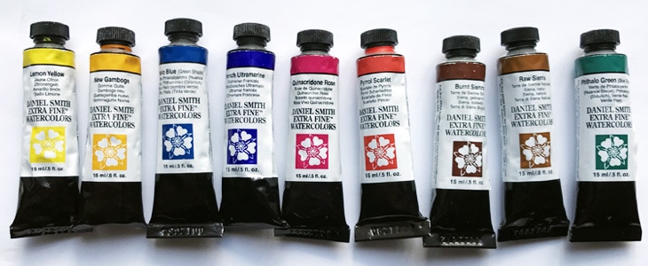
Stick to some warm and cool primary colors to start – the six colors below are good examples.
- Hansa Yellow Deep – Pigment number: PY65
- Lemon yellow – Pigment number: PY175
- Phthalo blue GS – Pigment number: PB15:3
- French ultramarine – Pigment number: PB29
- Quinacridone rose – Pigment number: PV19
- Pyrrol scarlet – Pigment number: PR255
To these you can add some earth tones. A red/orange earth tone like Burnt Sienna and a yellow earth tone like Raw Sienna are a good foundation.
I would also add Phthalo Green (BS) because it’s just so useful for expanding mixing possibilities.
(note: It’s not easy finding transparent single pigment yellows, but as an alternative to new gamboge you can try Permanent Yellow Deep, although it’s a bit more reddish)
Try before you choose !
Still can’t make up your mind ? One of the things I found valuable when choosing colors was paint samples. Depending on the watercolor brand you choose you may be able to order samples or dot charts at a lower price than buying small tubes of every paint. For example check out the Daniel Smith range of dot charts…



I had saved this awhile ago, and so glad I did. One thing I need to do is set up a basic palette because, too often, I end up with paint in various palettes, plates, containers, etc. I’ve been wanting a split palette, and your color selection looks like exactly what I need. Thank you!
Happy to help Anne 🙂
Hi Anthony I’m so excited that I came across your website needless to say it is being bookmarked thank you so much for the explanation on a different color ranges pigments this has been extremely eye-opening I have been playing with watercolor but find it frustrating and probably because the water colors that I have are since my childhood so there probably around 40 years old that they were the old Pelikan. I too started the Excel spreadsheet but I got quickly overwhelmed and gave up on that idea. Thank you for all the time and information you have invested in this blog it’s definitely helping not just myself but I’m sure thousands of others. It’s on your information I am going to use your suggestion of Daniel Smith paints and I’ll probably use your warm and cold ideas plus the additional list that you have and then play around with the different charts you have put together thank you again for all the time that you have invested .happy painting!glor
Thanks Gloria !
I’m so happy you found the information useful 🙂
Above all have fun!
I notice you didn’t mention Payne Grey, do you use it at all? I find it is invaluable in shadows and night light. Thank you for all your information, it is so helpful.
Hi Faith
yes I use Payne’s gray very often. I like its blue-gray granulating appearance 🙂
You can read a more complete guide to my preferred watercolor paints here
Hi, thank you for your eccelent and informative article! It’s very helpful!
Forgive me if I’m mistaken but near the end of the article under the heading “My recommended watercolor palate” there isn’t a list. Just a jump to the limited palate list.
Is your palate list the one at the top of the article?
Last question, the list at the top has several pictures that are not loading, they just remain a photo icon. What causes that do you think?
Anyway, thank you very much, I so look forward to your articles and classes!
Hi Lauren
Thanks for pointing out those details – should be fixed now 🙂
Hi Anthony! I love your website – thank you for all your hard work! I’m just wondering if you have Raw Umber in your big palette? Do you find this colour useful?
Hi Andrea
I do have a range of earth tones but I use them quite sparingly. I use Burnt umber the most, and I find a light earth color likes yellow ochre and raw sienna useful too 🙂
This is exactly what I needed to know to get started. I ordered the DS Extra Fine Essentials tubes from Amazon, and I plan to create your cool and warm color wheels when they arrive. Thank you for all the helpful articles!
Have fun with your watercolors Vivian !
So helpful! A wonderful breakdown of the essentials then expand the scope in our practice. Thank you!
THANKS FOR ALL YOUR HARD WORK. IT REALLY HELPS. I AM EASILY OVERWHELMED.
D
Being colorblind, I find your explanations eye-openers. A formula approach to mixing colors is where I am right now. Red, green, for example, look much the same to me; therefore, with labels on each color is a start.
I have just bookmarked this site. It has been so helpful.
I wish I had found you long ago! DB
you are amazing, really good teacher <3
Great explanation of paint colors…am going to play with the color wheels and see what I come up with…
Hi Susan. I find color wheels and mixing charts are a great way to explore your colors. Enjoy !