How to Paint Latte Art in Watercolor
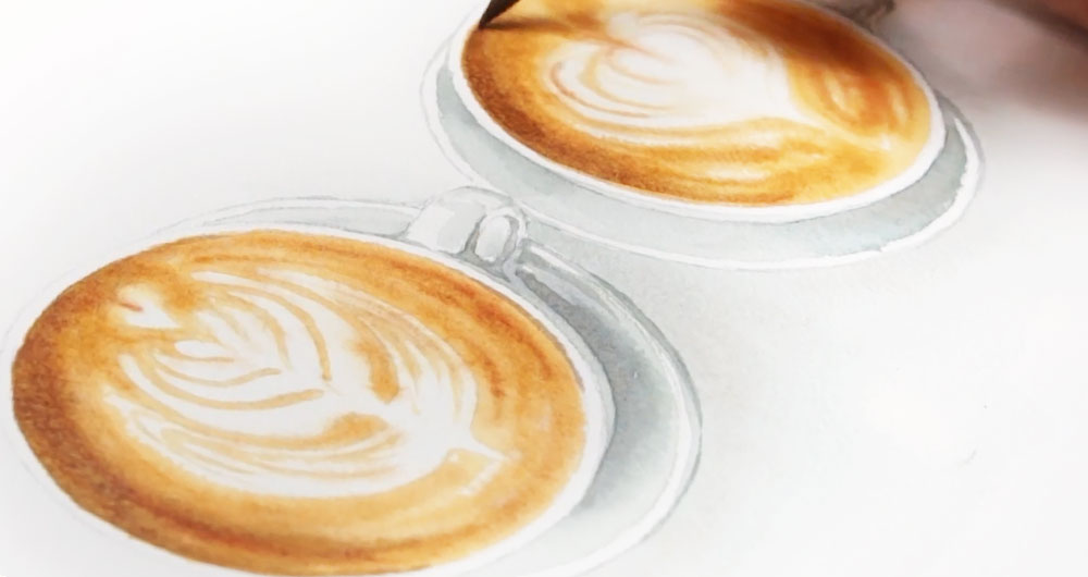
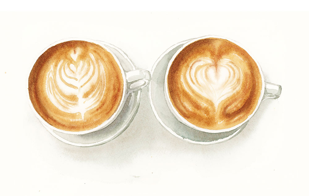
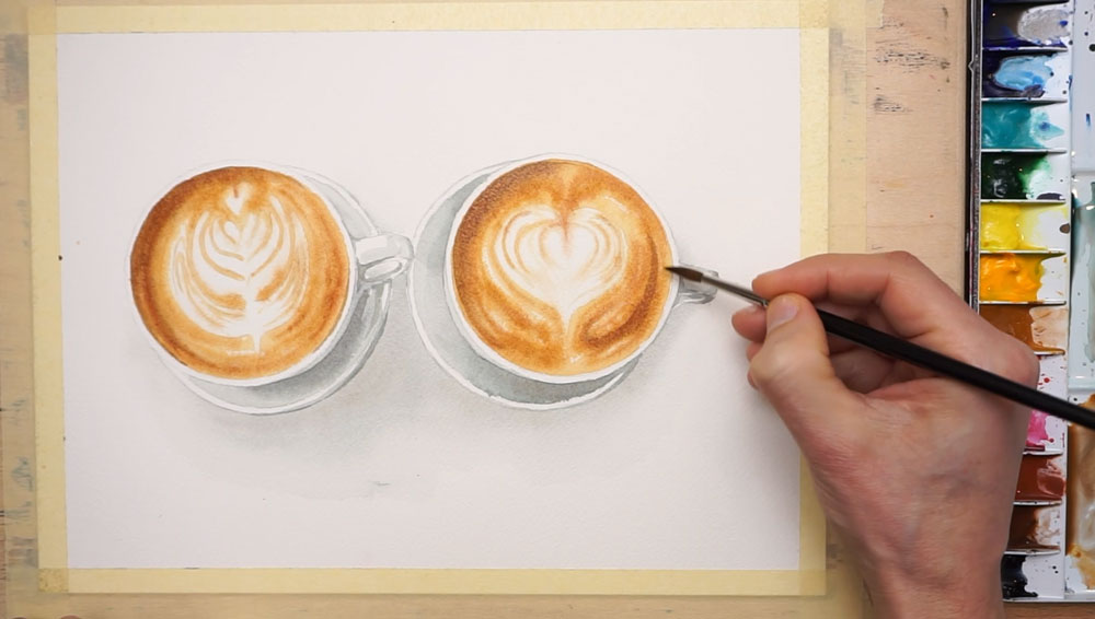
In this lesson we’re painting these two coffee cups with leafy ‘latte art’ patterns. This project is a good example for practising when to use wet-on-dry and when to switch to wet-on-wet, because the pattern really needs both methods.
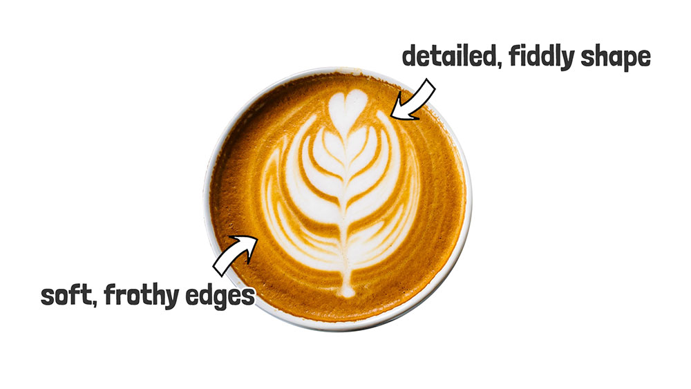
This is a really good subject for talking about these two techniques, because the foamy pattern needs painting in two different ways. The leaf pattern has fine, fiddly shapes that need to be precisely painted. But at the same time the surface is soft and frothy, making the edges softer and less defined.
Why latte art is tricky to paint
If you try to paint the whole thing wet-on-wet, the fine lines could spread out before you have a chance to control them (and you end up with a brown puddle with a vague suggestion of a leaf in it 🙂).
If you paint it all wet-on-dry, you keep the pattern, but you end up with hard outlines everywhere, and it looks more like a drawing of a leaf than foamy milk.
Wet-on-dry for the pattern, wet-on-wet for the foam
So when do you use wet on wet or wet on dry? The answer depends on what you want the paint to do.
“Wet on dry” simply means that you’re applying wet paint onto dry paper, or wet paint onto an area of dry paint.
Wet on dry gives you control. You can place a line exactly where you want it, define a shape, and keep the edges relatively sharp.
Wet on wet does almost the opposite.
“Wet on wet” means that wet paint is applied to wet paper, or added to a wash of fresh wet paint.
Once the paper is wet, the paint is free to spread, giving you softer edges and more gradual changes in lightness and color.
In this painting, we need both techniques.
The leafy patterns in these coffee cups are quite intricate, so I start with a wet-on-dry method to establish the pattern and define the finer details. Trying to paint those delicate lines into wet paper would make them much harder to control.
But the latte art isn’t made up of perfectly sharp lines. There are soft, diffused edges where the milk and coffee blend together. So once the basic pattern was established, I started working wet-on-wet to soften some of the lines and allow the color to spread slightly.
The result is a combination of definition and softness. There’s enough control to suggest the leafy pattern, but with softer edged shapes to give the impression of the frothy surface.
When it comes to choosing between wet on wet and wet on dry you can use each technique for what it does best.
Step 1
Start by tracing the outline onto a sheet of watercolor paper, and don’t forget to include a light sketch of the latte patterns.
Want the full step-by-step video tutorial, plus all the downloads, including the traceable outline and all the reference images?
Then tape the paper down onto a flat board.
I mixed up a fairly light-toned puddle of raw sienna, then using a small brush I started painting around the shapes of the patterns in the coffee, directly onto dry paper. This is a wet-on-dry method, (applying wet paint onto a dry surface), and it lets me keep a well-defined edge to all my brushmarks. I’m filling in the coffee color and leaving the white paper to show through for the pattern. In watercolor this is known as ‘negative painting’ (which is when you paint the space around a shape so the shape itself appears).
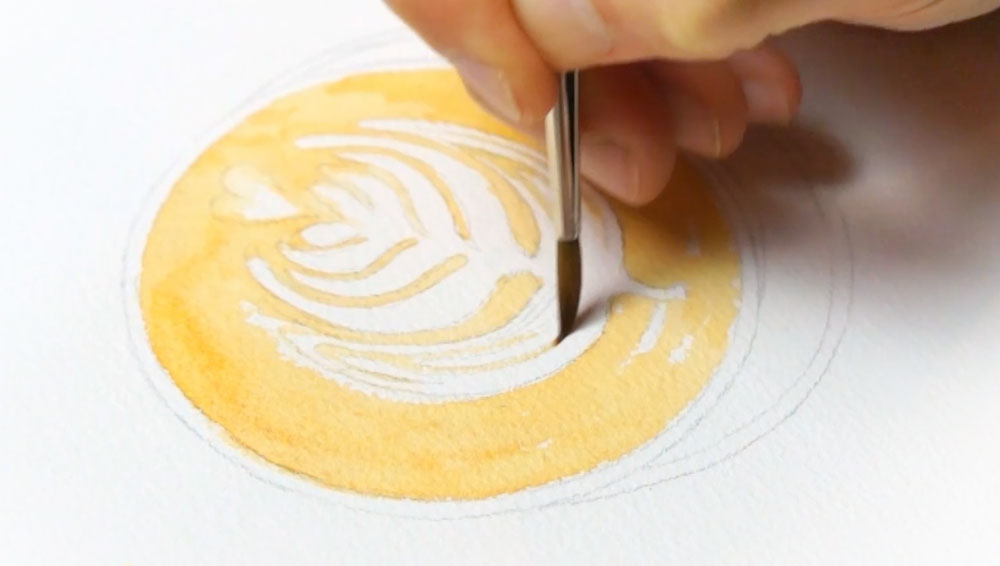
The small brush helps with the smaller, detailed brushmarks, but you can also see it runs out of paint quickly when I’m filling in the larger areas.
But I can use that to my advantage, by letting the brush run dry and painting with a ‘dry-brush’ technique.
A dry brush leaves broken brushmarks with slightly feathery edges.
Occasionally I get some rough edges to the white shapes of the pattern. For this painting I think that works pretty well, because it gives the pattern a bit more texture.
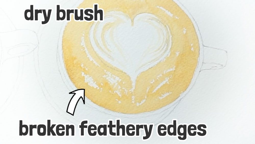
I painted the last few tiny details and then moved on to the second coffee cup…
Again I’m painting around the shape of the milk pattern, and my brush is quite dry, so you can see more of the broken, rough-looking marks typical of a dry-brush technique. These little gaps of white paper will add some nice texture to the finished painting.
Dry-brushing is of course another wet-on-dry technique. In fact, as long as the previous layer of paint is completely dry, any new brushmark you add counts as wet-on-dry, whether it goes onto bare paper or on top of dried paint.
So you can see I kept some of the broken dry-brush marks, then added some smaller lines of detail to the center of the milk pattern, following the reference photo as a guide.
Let this layer dry completely, then erase any leftover pencil marks inside the latte art patterns. This leaves a cleaner white shape to work with from now on.
Step 2
Next I used a fairly diluted mix of grey to start adding some shading and form to the cups and saucers. You can see I’m adding grey to most parts except the lip of the cup and the edge of the saucer, which are the lightest areas.
You can also add a few carefully chosen brushmarks to give the handles a bit more depth. Follow the light and shade you see in the reference to suggest the form of the handle, and keep the uppermost parts light.
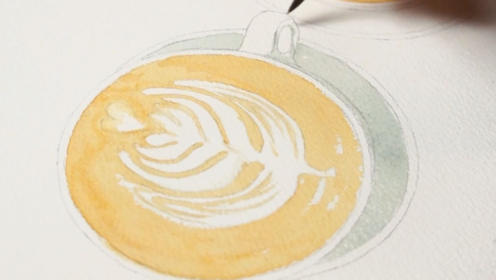
The light is coming from the upper left, so I’m adding a slightly darker concentration of grey to the shadow side of the cup. Notice I’ve briefly switched to a wet-on-wet technique for this part (which just means painting into a surface that’s still wet). Dabbing pigment into the moist paint like this is called ‘charging-in’, and it gives the shadow softer, more diffused changes in color.
Then I moved on to the next saucer, again being careful to leave the lip of the cup untouched.
After the first brushmark I picked up some water in the tip of my brush to dilute the color, which gives some variation in the shading. Don’t hesitate to change the strength of your paint a little bit to vary the shadows…
On the underside of the cup I added more pigment to strengthen the tonal value (which is just how light or dark the color looks).
Next I added some very thin lines to start defining the outer edges of the saucers, and adjusted the shadow shapes while they were still moist, charging-in more pigment where needed.
I kept defining the fine edges around the saucers.
Notice that my brush isn’t holding too much paint, so the tip comes to a fine point. This makes brush control for fine details much easier.
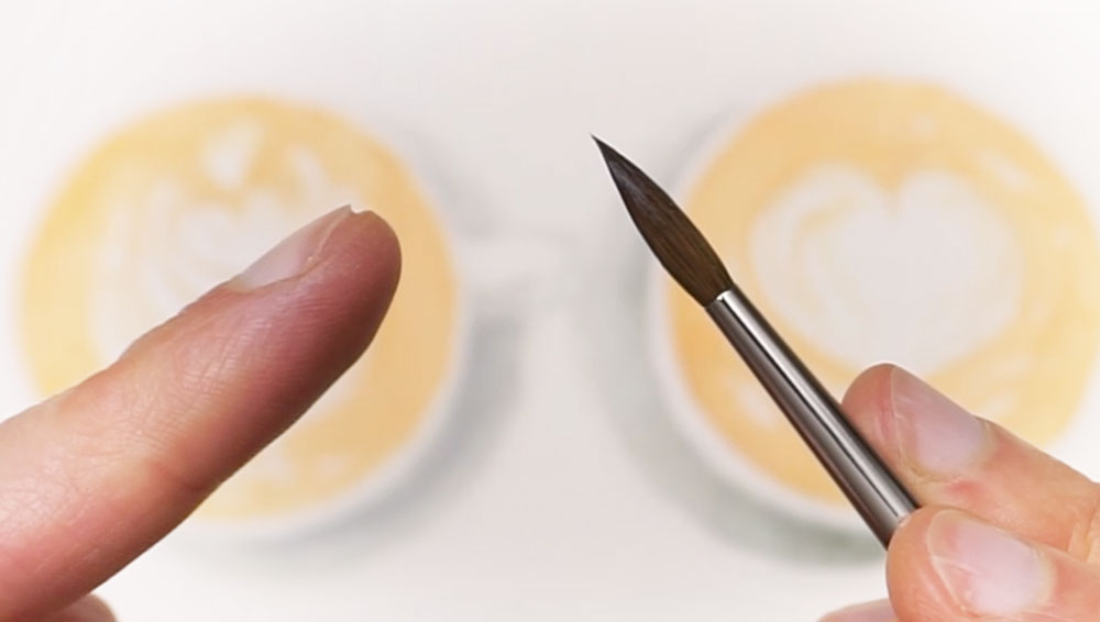
Then, add the same fine lines on the edges of the second saucer…
Step 3
Now I want to paint a nice diffused shadow underneath both cups. Because I want a soft blend, I start by wetting the paper with clear water underneath and around the cups and saucers, ready for a wet-on-wet application.
Then with a diluted mix of grey I paint into the moist surface, using the brush to push the pigment up to the underside of the saucers and letting it spread.
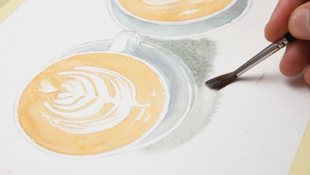
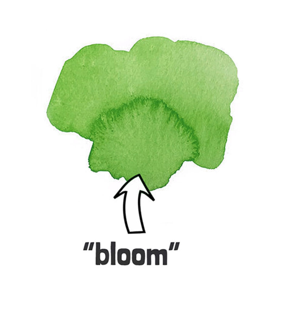
You can see my pre-wetted area probably wasn’t big enough, because the pigment seems to come to an abrupt stop. So I rinse my brush and pick up some more clear water to blend out the outer edges of the shadow and encourage the pigment to spread further. Be careful not to use too much water on your brush, or the clear water could flood back into the previous layer of paint and cause a bloom. (A bloom happens when very wet paint or water flows into an area that’s starting to dry, creating those cauliflower-like shapes we usually want to avoid.)
Step 4
Leave the paint to dry again, then this time mix up a new puddle of raw sienna, a little stronger in color.
You can use a scrap of paper to test the color.
I’m now going to lay down a second layer on the coffee shapes, and this time I’m using a wet-on-wet technique to get slightly blurred edges.
Start by brushing a layer of clear water over one of the coffee shapes, staying within the circular outline.
Then pick up some paint and start adding curved lines of color, using the reference image as a guide. For example, the upper left side of the coffee is in shade, so I add more color right up to the edge.
I’m trying to add thin lines of pattern, similar to the blurry motif in the reference image.
The timing can be delicate. The paper surface needs to be moist, almost damp, so the painted lines diffuse slightly but not too much. In wet-on-wet, how far the paint spreads depends on the ‘stage of wetness’ of the paper: the wetter the paper, the faster and further the pigment spreads.
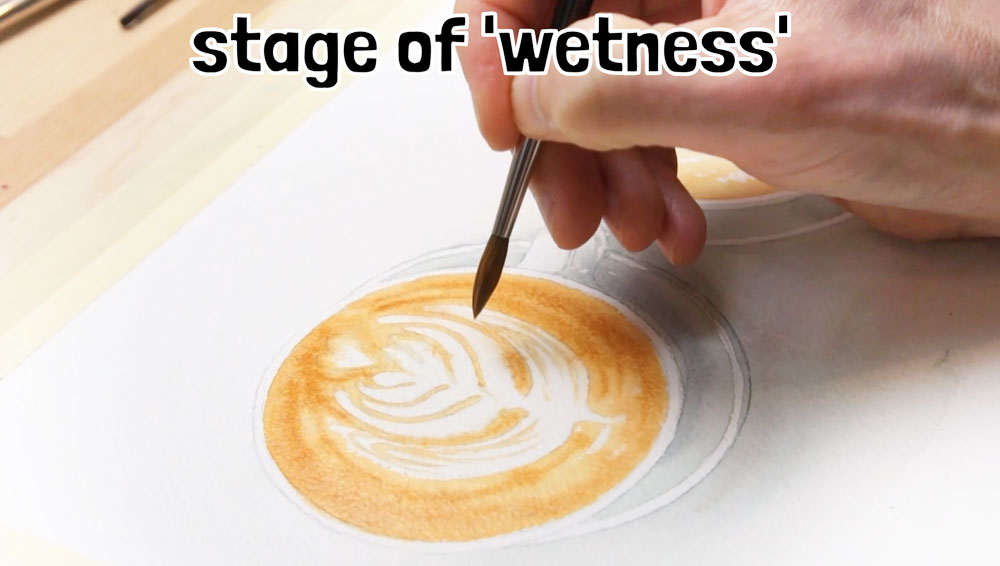
If the paint spreads too much, wait a short while and try again. At some point you’ll hit the sweet spot where the brushmarks behave the way you want.
Try to leave gaps between your brushmarks so you get alternating lighter and darker lines, like in the photo.
Step 5
While the surface was still at this moist stage, I quickly mixed a more concentrated dab of paint, and used it to add a few darker stripes into the pattern, mostly around the outer edges and on the shaded side of the coffee.
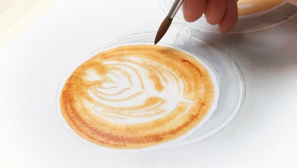
Then I moved on to the second coffee shape, moistening the paper with clear water to get started. Try to make the shape evenly moist all over, but not soaking wet.
Then work the paint into the surface with curved brushstrokes to mimic the pattern in the frothy coffee. I’m being careful not to paint over the white shapes I left earlier.
If you’re still struggling to get finely diffused lines, try using a slightly stronger concentration of paint and a brush that isn’t too wet. Thicker paint moves more slowly on the surface, which gives you a bit more control over how far it spreads.
I only started painting lines inside the white latte art pattern once I was happy with the stage of wetness, so I was fairly sure the lines wouldn’t spread out over the white paper and spoil the shape of the pattern.
You’ll probably find you need to repeat your brushstrokes to get the new lines to show. Some of the pigment spreads into the surrounding paper, so for a stronger line keep making repeated strokes until you’re happy with how it looks.
Now that both coffee shapes have their new layer, go back to the shading on the cups.
I added some more carefully placed brushmarks to reinforce the depth and three-dimensional look of the handle and around the saucer. This part is all wet-on-dry.
You can rinse and blot your brush and use it to blend out the edges of the cast shadow as needed.
Then onto the second cup, adding some darker brushmarks and blending out the edges for a smooth transition.
Notice that some brushmarks I’m leaving with hard edges (like the smaller forms around the handles) and others I’m blending out (like inside the curved bowl of the saucers). Both are going onto dry paper, so even though I occasionally add water to blend, this is still a wet-on-dry approach.
I mixed a little burnt umber with a bit of French ultramarine to make a much darker brown for the shaded parts inside the coffee shapes.
I added these marks wet-on-dry, blending out the edges with a little clear water. Again, use your reference image as a guide for finding the darkest shapes.
Same idea with the second coffee shape: I painted the shaded inner side of the cup, and the darker shapes on the frothy surface, roughly where I can see them in the reference, and smoothing the edges as I go.
And here’s the finished painting.
Your turn
During this painting, what I was after was a leaf pattern clear enough to read, but with edges soft enough that it still looks like frothy milk rather than a sharp-edged drawing of a leaf.
So next time you’re choosing between wet-on-dry and wet-on-wet, just think about what you want the paint to do… quite often, you end up using both techniques in the same painting.
And if it all ends up as a brown puddle… well, at least it’ll still look like coffee. 🙂
So if you’d like to practice this properly, you could try painting this little latte painting with me… You’ll find the full video and all the downloadable resources here: