
How Do You Draw a Realistic Drawing Step by Step? (EASY!)
If you’re aiming for realism in your drawing and artwork there are ways to make the process easier by following a few simple steps.
In fact you’ll be surprised how convincingly you can convey a subject, if you use this method. I’ll even tell you how to make the initial part of any drawing even simpler!
The concepts that I want to share with you here are also incredibly useful for understanding how to paint. In fact, they can be applied to most mediums, like colored crayons, watercolors, or other paints like gouache.
In this tutorial I’ll show you how to break down the process for drawing any subject realistically into a step by step approach.
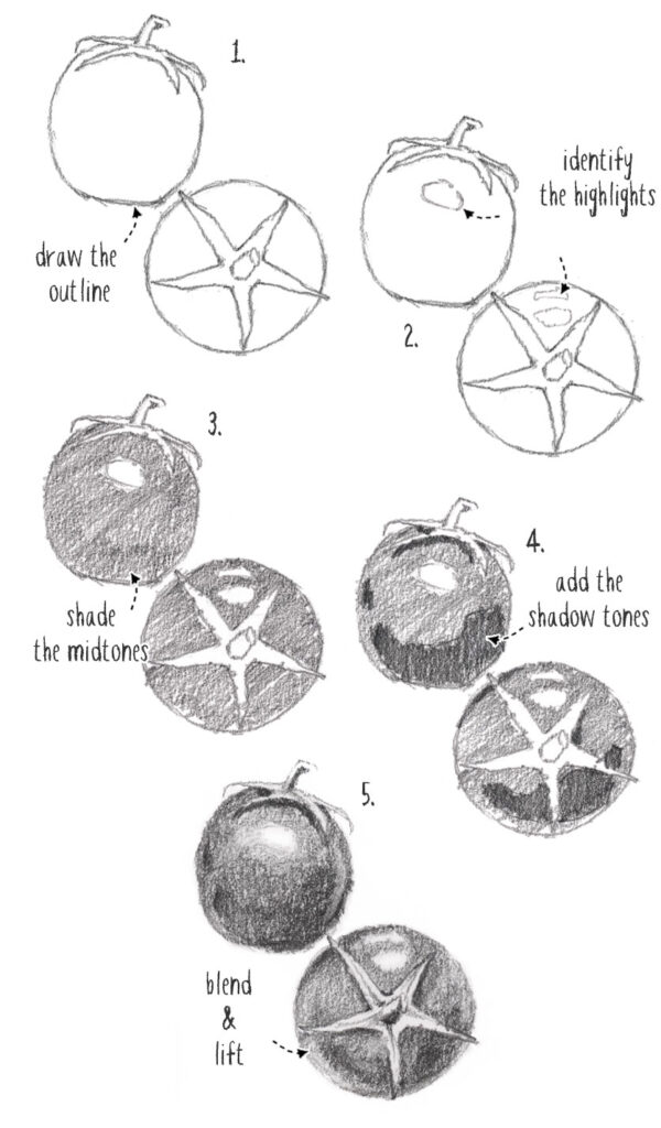
The 5 Steps Of Drawing
To draw realistically, these are the steps I suggest you follow:
- Create an Outline
- Establish highlights
- Shade the midtones
- Add shadow tones
- Blend and lift
Hmm…
That probably sounds puzzling, but I promise it will become clearer as you progress through each part! Even if you’re not confident in your drawing skills I’ll show you ways to apply this method that make drawing less complicated!
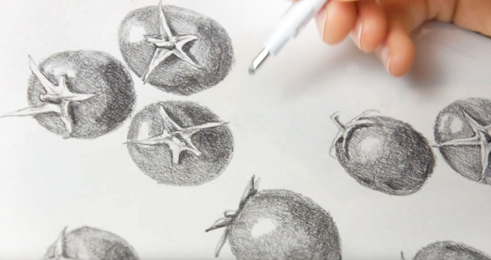
Here’s a visual example of that step-by-step process using a close-up of the drawing in this tutorial.
What is the key to drawing realistically?
Of all the various components of art, proper use of values is the most effective way to express a subject realistically.
You might have already heard this, but values (or tonal values if you prefer) are an artist’s way of expressing “light” and “dark”, and everything in between!
A typical value scale looks like this:

When drawing or painting, you might get the proportions slightly wrong, or mix the colors badly, but if you get the values of a subject right, you have a better chance of conveying a realistic scene, and a believable sense of light, depth and three-dimensions.
That’s why it’s important to build a good framework of values in your artwork.
To do this more easily, in the steps for this drawing you’ll notice I concentrate on 3 main values:
- Light values (or highlights)
- Mid values
- Dark values (or shadow shapes)

By focusing on highlights, midtones and shadows (or white, gray and black if you prefer) you can simplify the creation of depth and realism.
But of course, the tricky part is identifying the light, mid, and dark tones!
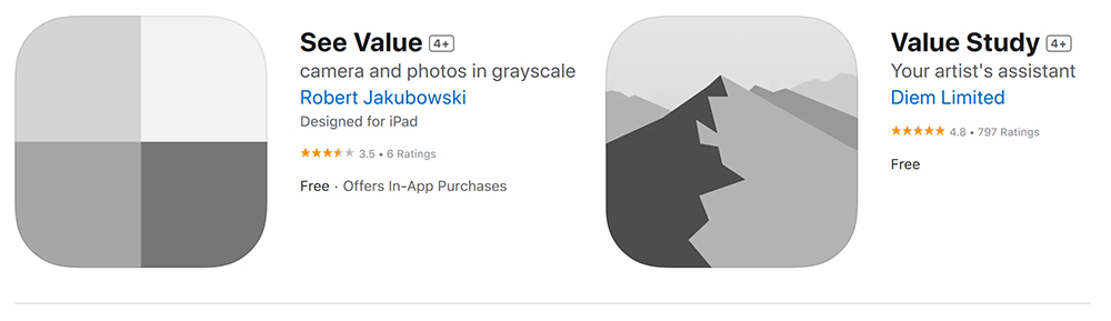
This gets easier the more you practice, but there are a few tools and applications you can use to help with this exercise.
For example, the “See Value” app and the “Value Study” app are two phone applications that let you turn any photo into a value scale image. You can easily adjust the level of detail and range of tonal values.
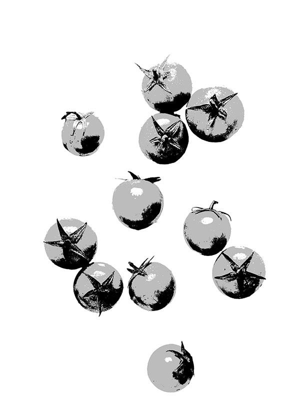
Here’s what my reference image looks like when transformed into a three-level value study using one of these apps.
You can also use a traditional gray scale value finder like this one:
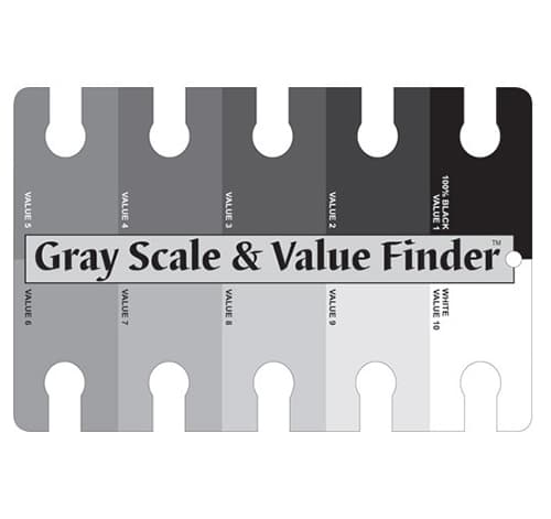
Tip: Simply turning your image into a black and white version can help make judging values easier.
Step by Step Realistic Drawing Tutorial
For this drawing demonstration I’ll be using this composition of some cherry tomatoes.
Before starting this drawing I used the See Value app on my phone to simplify the reference photo, and create a value scale image with just 3 tonal values, in black, gray and white. This grayscale reference image helps me determine the shapes of the highlights, midtones, and shadow shapes.
This gives me a real advantage to draw more realistically!
I then printed out a copy of the original photo and the value scale reference image so I can refer to them during the sketching process.
Try This Painting Yourself!
If you’d like to try this painting yourself you can download the traceable outline for free below. I also offer a special series of free watercolor lessons for anyone who signs up to my email newsletter. This is entirely optional (you can skip this and just grab the free stuff below).
You’ll also find a link to my Patreon membership where you can get ad-free video tutorials, plus other exclusive bonuses that I only share with members of my Patreon channel. Follow the link to find out more...
The tools I Used:
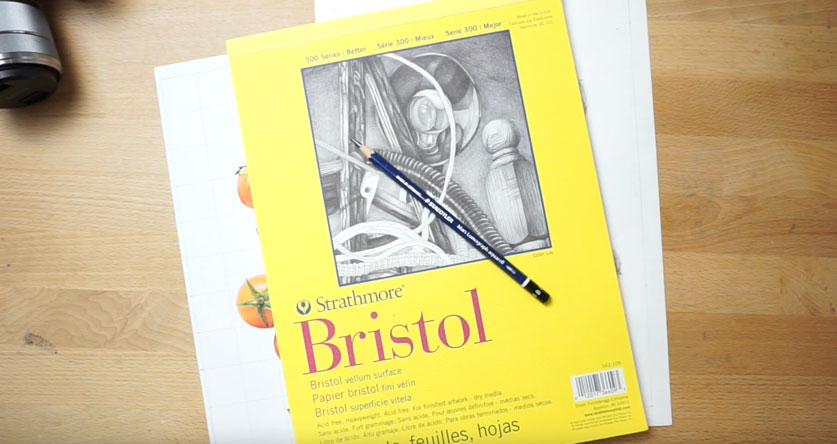
This drawing is rendered with graphite pencil. I used a soft 4B pencil to get a reasonable range of dark tones. It was drawn on a sheet of bristol vellum paper (this type of paper has a slight “tooth” or texture which helps capture mediums like graphite).
The other things you’ll need are as follows:
- An HB pencil
- A blending pencil
- A ruler
- And erasers (I prefer kneaded erasers and the mechanical pencil style erasers)
(Includes links to Amazon)
Step 1 (Creating the outline)
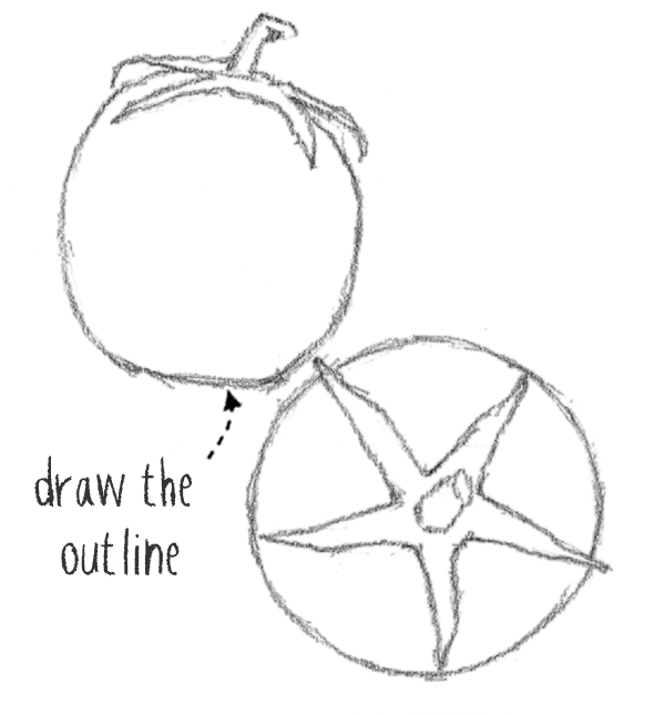
Drawing an accurate outline is the first challenge in realistic drawing. To convey the subject in a believable way, the size and proportions of the main shapes need to be translated into a convincing line drawing.
There are a couple of ways to do this pretty easily:
- Use a grid system to draw freehand
- Trace the reference image
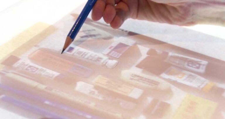
Tracing is not cheating! After all, you’re only laying down a sketch outline of the subject. The rest of the drawing process relies on your artistic judgment. But an accurate line drawing provides a proper foundation, and gets you off to a flying start!
Most of the time I use a light board like this to trace my subjects. This is by far the most straightforward and rapid way to trace. (Amazon)
Alternatively you can use a drawing grid as a visual aid.
This is the method I used here. This takes longer, but doing it this way also improves your hand to eye coordination.
Begin by putting a frame around the edges on the printed reference photo, (in my case this is 8 by 11 inches). Then I drew some 1 inch grid lines over the image.
Next, take a sheet of bristol drawing paper and reproduce the grid, with the same number of gridlines. In this case I simply used the same dimensions and drew a 8 by 11 inch mesh.
I’m doing this with a HB pencil and using a very light pressured line. Keep in mind you want to erase the guidelines later on. (A medium soft pencil and a light touch will make it possible to erase without leaving a mark on the paper surface).
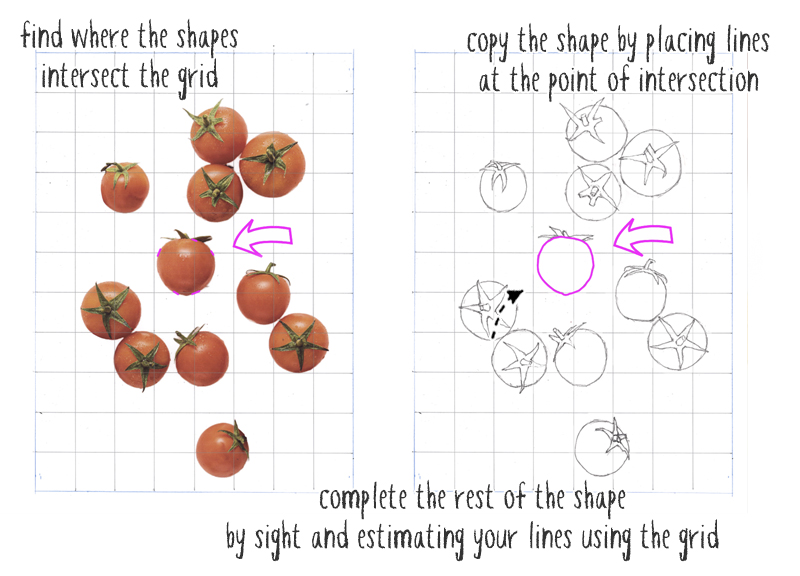
Switch to a soft drawing pencil such as a 4B. Begin drawing the big shapes of the cherry tomatoes. Don’t go into detail or add any shading at this stage. I’m only laying down the outer edges of the tomato shapes, and the leafy stalks.
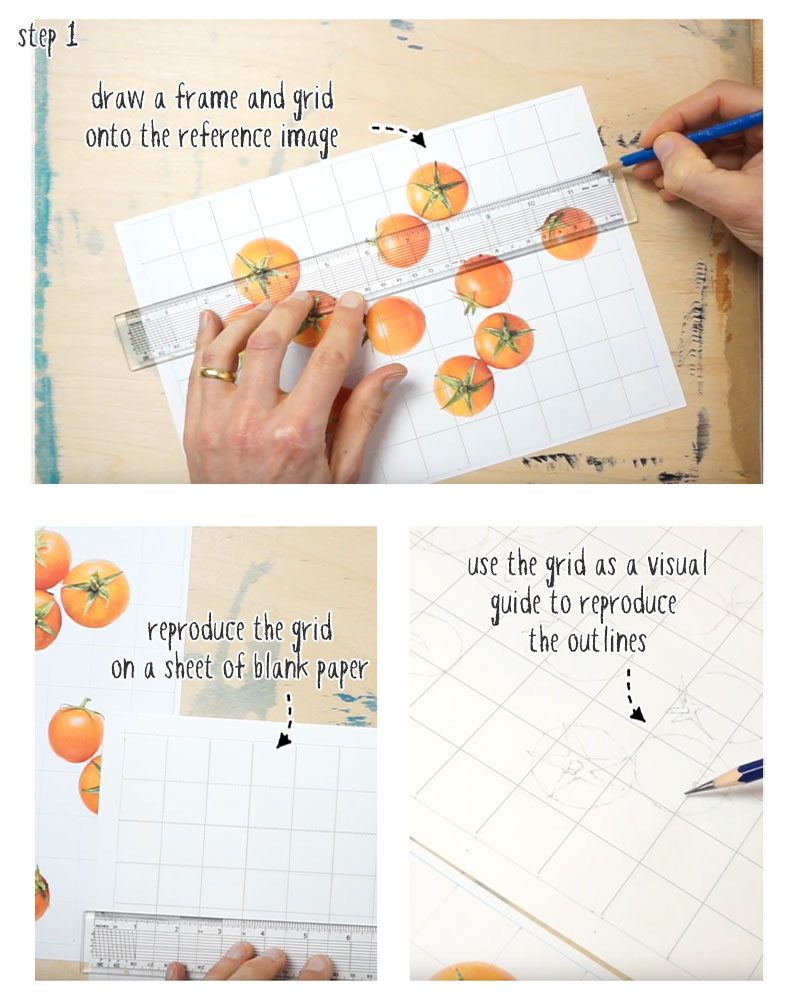
Use the grid as a visual guide to place the drawing lines in the correct locations. For example, look for the places where the shapes intersect the guidelines. Then locate the same position on the drawing paper by counting the number of grids, horizontally and vertically. Place a mark at these intersections then join up the points. Look back and forth between the reference and your sketch to judge the angles and position of your lines by sight.
When you’ve finished outlining the big shapes in the composition, erase all the guidelines using a kneaded eraser. These have the advantage of not leaving any debris on the paper surface, and you can pinch and mold them into a small point for more accurate erasing.
Mechanical pencil style erasers are also good for precise erasing.
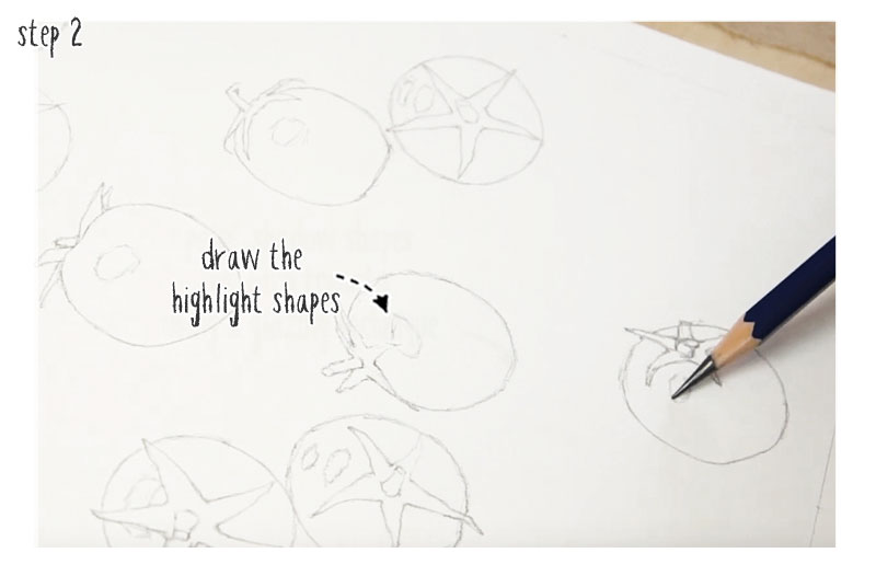
Step 2 (Identifying the highlights and light tones)
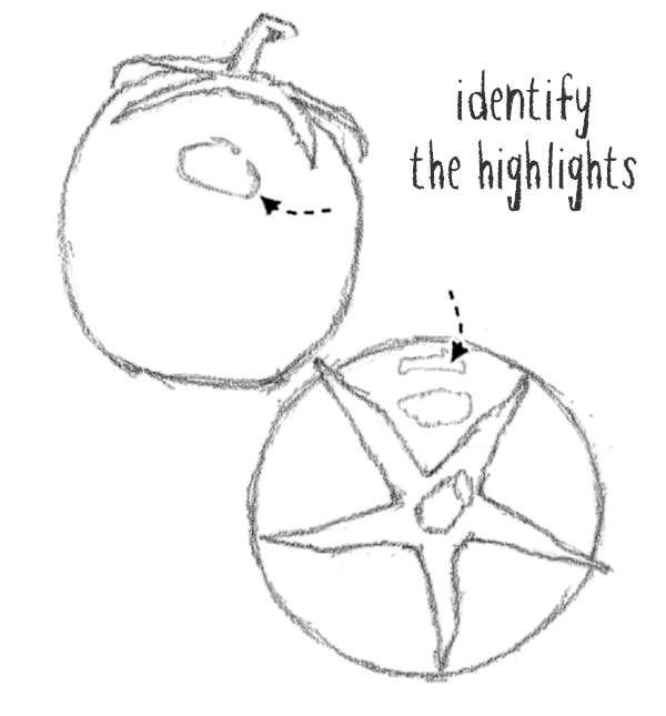
Now with the help of the simplified value scale reference image, I located and sketched in all the highlights. Draw the highlight shapes with a light pencil line. Use your observational skills to roughly pinpoint and sketch these light-valued shapes.
Doing this will make the next step less complicated.
These shapes will be left untouched so the white paper shows through to represent the lightest values.
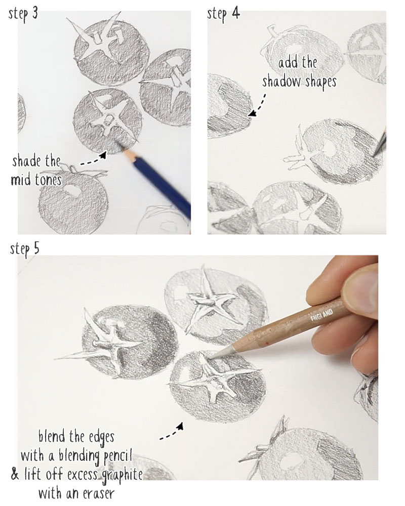
Step 3 (Shading the mid tone values)
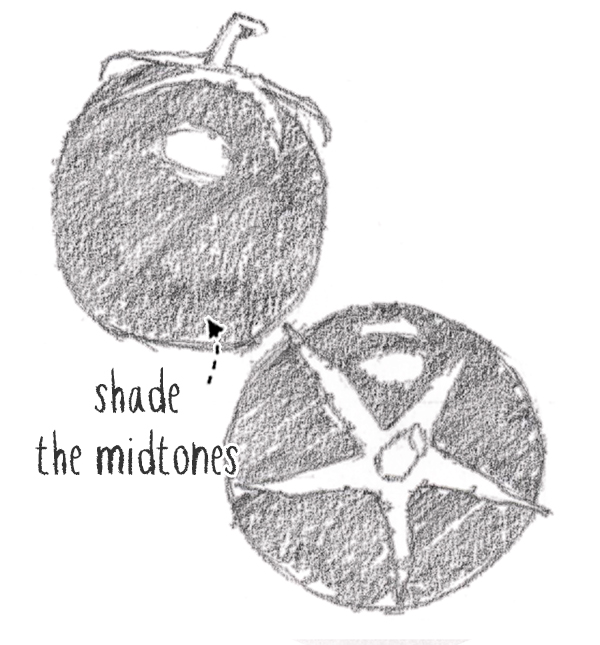
Now that you know where your highlights are, you can shade the midtone layer of your pencil sketch.
Simply shade over the whole of the tomato shapes using an evenly applied hatching. Leave the highlights untouched. Use medium pressure and try to keep the hatch lines consistent.
Don’t worry about varying the shading or trying to replicate the realism of the original reference image at this stage. Just put a gray tone over the big shapes, avoiding the highlights.
Step 4 (Add the dark valued shadow shapes)
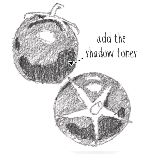
In the same way you drew the highlight shapes, now you can locate and roughly sketch in the dark shadow forms on the tomatoes. Again, you can use the value scale reference image to help with this.
Begin by outlining the shapes of the form shadows, then fill them in with a darker hatching. Use a bit more pressure on the pencil tip and apply an uniform shading to fill in these shapes.
Also, don’t worry if your hatching seems rough and uneven. You’ll be fixing this in the next step!
Don’t forget to add shadow shapes to the stalks and leaves.
Step 5 (Blend smoothly and adjust light toned shape with an eraser)
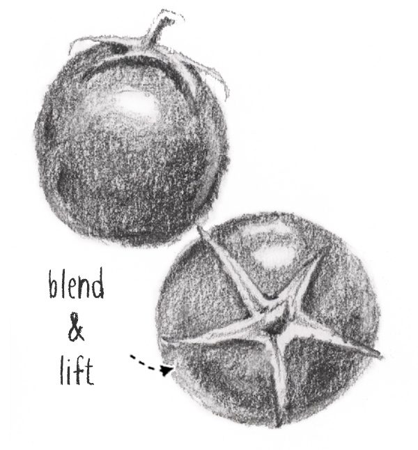
The final step is where the magic happens!
You now have a drawing with the highlights, midtones and shadow shapes blocked out. But the sketch still looks fairly basic.
In the following stage you can start adjusting the overall shading and blend the edges between the different areas of light and dark. I’m using a blending pencil for this, but similar tools such as a blending stump (sometimes called a tortillon) will also do the trick!
Work over the surface of the hatched lines, varying the direction of the strokes with the blending pencil. This helps to smudge the edges between the halftone and darker hatching lines. At the same time, rubbing the paper “burnishes” the layers of pencil lines. This action flattens the paper slightly and pushes the graphite into the paper surface. This distributes the pencil lines more evenly and deepens the tonal values slightly.
Little by little you’ll see the pencil marks blend smoothly and become deeper and darker in tone.
After the blending step, you may find some areas look too dark. This is where you can use an eraser to lift some of the graphite off the paper and reintroduce some subtle highlights such as areas of reflected light.
Use your observational powers to discern these more subtle changes in tonal value on the original reference photo and try to reproduce these in your drawing.
Voila!
Now you’re a master at realistic drawing 🙂
This drawing method uses only three simplified tonal values – lights, midtones, and dark values. I hope you can see how breaking down a subject into a limited value scale like this makes realistic drawing so much easier!
Now go check out this other tutorial where I’ll show you how to apply a similar method that lets you paint with depth and realism!


This will be very helpful. I’m anxious to practice this technique! Thank you! That was very generous of you!