How to Make Watercolors GLOW with This Trick!
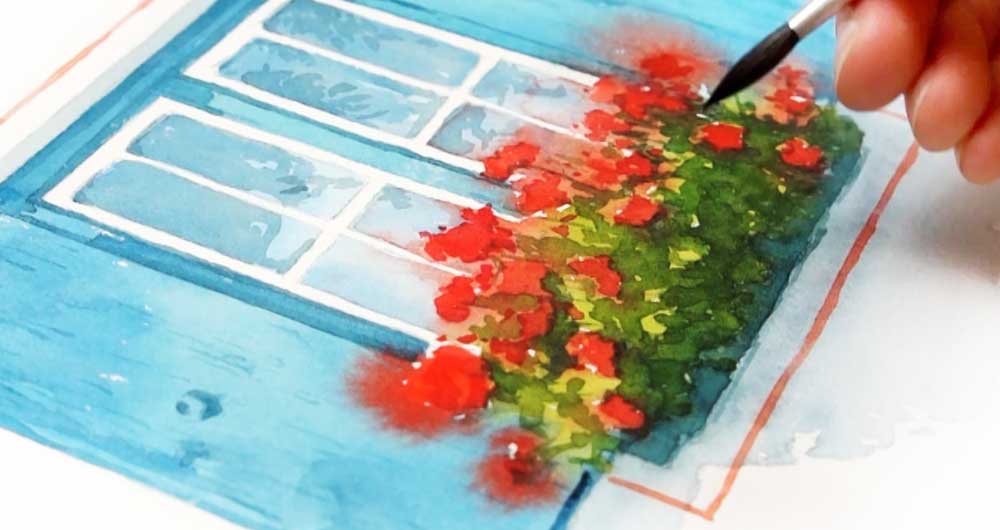
Making watercolors glow is mostly about contrast — the contrast between light and dark areas, or between warm and cool colors. That’s a fairly well known artist’s rule of thumb.
But in this painting I used one extra little trick to make the flowers really stand out. It’s a simple layering sequence that gives them a soft halo of color — so the eye sees them as if they’re ‘glowing’!

In this lesson I’ll walk you through this painting and explain how that effect was achieved — so you can see exactly how it works.
If you’d like to try this painting yourself, the full step-by-step lesson is over on my Patreon — it’s part of my ‘purposeful painting’ series, where each lesson focuses on one specific skill or idea so you can improve one step at a time. New lessons are free for the first few days – you’ll find a link below if you’d like to take a look.
If you want to practice this painting with me, the full lesson, including all reference images, is available on my Patreon
It’s part of my ‘purposeful painting’ series, where each lesson focuses on one specific skill or idea so you can improve one step at a time. New lessons are free for the first few days
Values contrast (light vs dark)

So… The first thing that makes a watercolor painting glow is something you’ve probably heard before — ‘tonal contrast’. In other words, the range between your lightest lights and your darkest darks.
In this painting the lightest area is the white of the window frame and the glass panes. The darkest areas are mostly concentrated in the shadows in the leaves around the flowers. That range of values is what gives the painting some depth. If everything sits at a similar tonal value the whole thing can look a bit flat!
In watercolor, you build your darks gradually through layering — each layer a little stronger than the last. So it’s worth planning ahead where you want your darkest shadows to end up. In my painting, the window glass stays very light — just a couple of diluted washes, letting the white paper show through underneath. The foliage under the flowers gets several darker layers, each one deepening the shadows a little more. That difference in treatment is what sets up the tonal range — and it’s what makes the flowers feel like they stand out.
Color contrast (complementary colors)
The second thing that helps watercolors glow is ‘color contrast’ — and particularly what’s happening with the colors ‘surrounding’ your focal point.

For example, red and green sit directly opposite each other on the color wheel. They’re complementary colors, which means they create the strongest possible contrast when placed next to each other. In this painting the red flowers are surrounded by green foliage — so the green is essentially pushing the red forward in the composition — making it a bit more visible and a bit more intense.
Also the blue-green shutters and the red line framing the window are doing a similar thing. They help create an overall ‘complementary color harmony’ for this painting.
So when you’re planning a painting, it’s worth thinking about what colors you place close to your focal point. The flowers seem to ‘glow’ partly because of what’s painted around them.
Watercolor dries lighter

Here’s another watercolor characteristic that you might want to keep in mind — and it has some relevance to getting that glowing effect.
Watercolor always dries lighter than it looks when it’s wet. Sometimes quite a bit lighter. So if you paint your flowers in a single layer and let them dry, that one wash of color could be paler than you expected. The best way to build up rich, concentrated color in watercolors is to add more layers. Each layer adds depth, gradually building up the intensity.
This is actually what makes watercolor ‘capable’ of glowing — the transparency of the medium means light passes through each layer and reflects back up from the white paper underneath.
So layering isn’t just about adding more paint. It’s about using the transparency of the medium to your advantage — you can use layering to contribute to the overall depth and brightness.
The wet-on-wet halo trick

Finally, here’s the extra little trick I used in this painting — the thing that gives the flowers that additional ‘glowing’ quality.
Notice that the first layer of red flowers wasn’t painted with clean, defined edges. It was charged into a moist surface using a wet-on-wet technique — so the paint spread outward beyond the edges of the flower shapes. This results in nice diffused, soft edges, wider than the actual flowers.
Then, once that layer dried… the following layers of stronger red went on top, this time using a wet-on-dry technique, producing sharp defined edges. They were painted directly over the diffused layer, with smaller flower shapes and petals.
What you end up with is a concentrated area of bright red at the center of each flower, fading out into a soft halo of color around the edges.
The eye reads this as ‘glowing’ almost like light radiating outward.
So the sequence is:
- wet-on-wet first, for the soft background wash.
- Then wet-on-dry on top — adding shapes with clean, distinct edges.
That’s it. Those two layers and two techniques, in that order, helped to give them a bit of glow!
Summary
So, to quickly recap the ideas behind making your watercolors glow…
It starts with tonal contrast — making sure you have a good range from light to dark.
Color contrast plays a part too. For example complementary colors placed next to each other tend to increase each other’s intensity.
And remember that watercolor dries lighter than it looks when wet — so layering is how you build up that richness and depth in your paintings
Finally… Remember that layering wet-on-dry on top of wet-on-wet, giving your subject both soft and hard edges, can produce an interesting illusion of glowing light.
You can watch the full video lesson on my Patreon:

Paints used:
- Hansa Yellow Deep – https://tidd.ly/4uz4y1q *
- Phthalo blue GS – https://tidd.ly/3QkkIhm *
- Quinacridone rose – https://tidd.ly/4vlAcAT *
- Pyrrol scarlet – https://tidd.ly/4e8KSg6 *
- Phthalo Green Blue Shade – https://tidd.ly/43A4MdS *