Painting White Flowers Without White!
Here’s a tricky thing about watercolor.
Because watercolor paint is transparent, every layer you put down only makes an area darker. Which means the light areas in a finished painting are the bits of paper you didn’t paint over, or never touched at all.
And it only works in that one direction. Once an area has gone dark, you can’t put the light back!
Most of us learn that the hard way. Once something’s covered up, that’s it!
So the order you do things in watercolor really matters. After a while you start to see subjects in a different way, and it’ll change how you ‘plan’ your watercolors before you start.
Because here’s the thing about watercolor:
You can’t paint white.
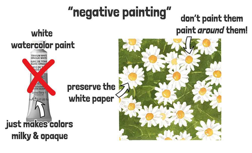
There’s no white watercolor paint that’ll give you nice fresh, clean-looking whites..
Instead, you have to preserve the white of the paper – and you do that by simply not painting it!
Sounds a bit backwards, doesn’t it?
And that’s exactly why the technique I’m going to show you is called negative painting!
In this lesson you’ll be painting some white daisies – but instead of painting the flowers themselves, we’ll paint around them.
Because watercolor is transparent, the light paper underneath stays visible. And by using darker colors to shape the space around the petals, the light areas start to shine through – even though you haven’t touched them with your brush.
It’s a bit like sculpting with paint – using contrast to carve out the shape of your subject 🙂
This way of working might feel a little counterintuitive at first – especially if you’ve painted in other mediums before. But once you get the hang of it, it opens up a whole new way of seeing. And after a while, it’ll start to feel more natural… In watercolor, what you leave out is just as important as what you paint.
Ready to give it a go?
Let’s paint some daisies!
If you want to practice this painting with me, the full lesson, including all reference images, is available on my Patreon
It’s part of my ‘purposeful painting’ series, where each lesson focuses on one specific skill or idea so you can improve one step at a time. New lessons are free for the first few days
Layer 1
Download all of the reference images from my Patreon for this painting, then start by sketching the outline of the daisies onto a sheet of watercolor paper.
Then tape your paper onto a flat board, using low-tack masking tape and create a border around your area you’re going to paint. This will give you a clean, crisp edge to help frame the finished painting.
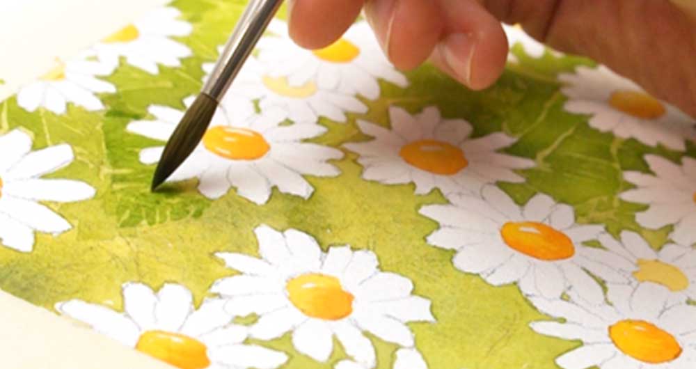
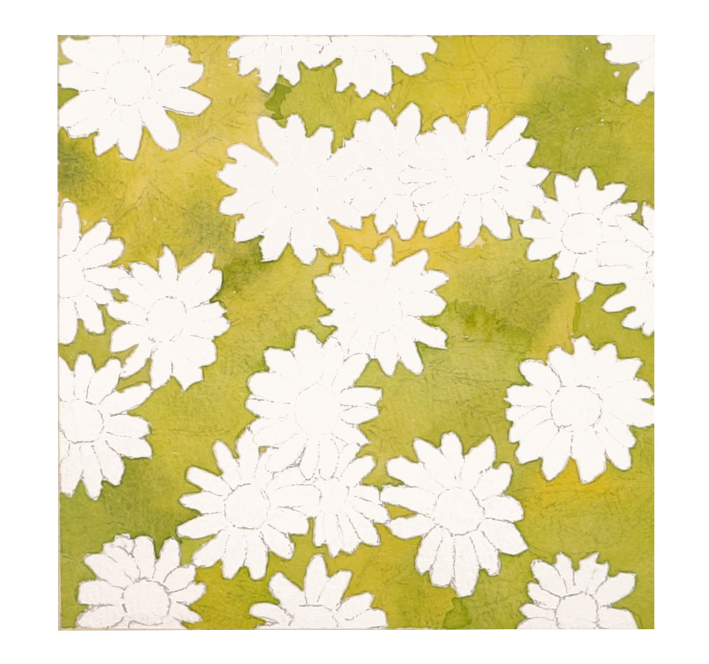
Now mix up a fairly diluted yellow-green color – and instead of painting the flowers themselves, you’ll be painting the background around them. Leave the flowers untouched, letting the white of the paper shine through.
The colors I used for this painting were:
- Hansa yellow deep
- Pyrrol scarlet
- Phthalo green : BS
- French ultramarine
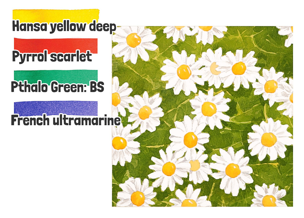
You’ll find that Hansa Yellow mixed with Phthalo Green gives you a lovely, natural-looking green color. And to darken your greens later on, just add a touch of French Ultramarine. And the red comes in handy for mixing an orange color to finish off the center of the daisies.
Once you’ve painted some of the background, try dabbing a bit of stronger green into the wet paint – this wet-on-wet effect creates a nice blend of colors and makes it look a bit more natural.
Keep going like this until the whole background shape is filled in. Focus on carefully painting around the daisy shapes — in a way, you’re using the background color to “carve out” the forms of the flowers. Basically, you’re painting the negative shapes around the daisies.
This is what you should end up with at the end of this first layer:
Layer 2
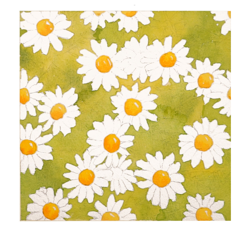
After that, I painted the center of the daisies with a mix of pure yellow. And just to make them a bit more interesting, I dabbed in a bit of orange to the bottom of each one while the paint was still wet.
In a way, you’re still painting the negative shapes – those round yellow centers help define the white petals around them, just like the background did.
Layer 3
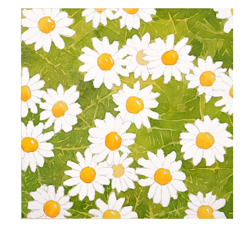
Let the paint dry completely so you don’t accidentally smudge your work – then go in with a slightly darker green to build up the background, still focusing on those negative shapes around the petals.
Now, notice what’s happening here: I’m painting negative shapes within negative shapes!
If you look at the reference image (included in the downloads), you’ll see that the green background behind the daisies isn’t just one flat color — there are lighter stalks and leafy shapes in front, and darker greens further back.
That’s why, in this layer, I’m painting around those lighter areas to leave them untouched. It helps suggest the lighter stems and shapes that sit in the foreground.
And don’t worry about making them look perfect — the aim is to paint in a loose, slightly random way, to create a pattern that gives the impression of leaves and stems.
You should end up with something looking like this:
Layer 4
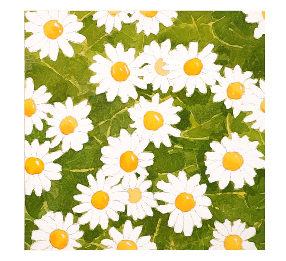
Before we move on, let everything dry completely. We’re using a ‘glazing’ technique to layer the transparent colors to gradually build up depth and darken the background.
This time I added another layer of patterned shapes, but bigger ones to suggest some of the larger shapes in the background. By doing that, the finer, more delicate shapes from earlier get pushed forward slightly — they stay visible, but appear to sit further in the foreground because they’re now contrasted by the darker shapes.
Here’s what my painting looks like at the end of this stage:
Layer 5
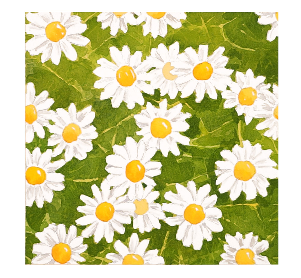
The final step was just to add a few fine details on the petals of the flowers using a very diluted grey mixture. You mix this by combining red and french ultramarine, or if you have one, use a ready-made grey paint color.
And here’s the finished painting…
Key Takeaways
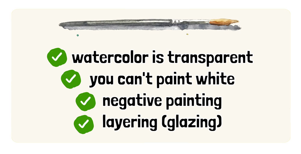
So… here’s a summary of what we’ve learned:
- Watercolor is transparent — that means the light shines through the paint and bounces off the paper underneath.
- You can’t paint white in watercolor — so you have to preserve it by leaving areas unpainted.
- Negative painting means painting around your subject, not the subject itself.
- And just like in the first lesson, we’re still using glazing – layering transparent washes to gradually build depth and contrast.
And that’s negative painting…
It does feel strange the first few times. Painting the background while the thing you actually care about sits there untouched.
But it does get easier. And after a while, you’ll find yourself looking at a subject and spotting the shapes ‘around’ it before you even start painting.
When you’ve finished your daisies, remember to share them in the community chat. I’d love to see how they turn out, and it’s always nice to see how differently everyone handles the same painting.
Happy painting, and I’ll see you in the next lesson.
You can watch the full video lesson on my Patreon:
Paints used:
- Hansa Yellow Deep – https://tidd.ly/4uz4y1q *
- Pyrrol scarlet – https://tidd.ly/4e8KSg6 *
- Phthalo Green Blue Shade – https://tidd.ly/43A4MdS *
- French ultramarine – https://tidd.ly/3ScA4oE *