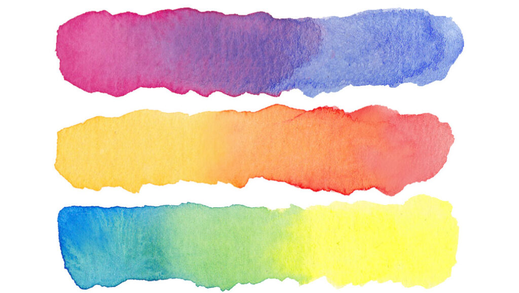
The “Magic Palette Method”!
In this lesson I’d like to show you how to get the best out of your color mixing and how to make amazing bright color mixes with your watercolors.
Not all watercolor paints are the same. You might think that yellow is yellow, and blue is blue. But pigments used in watercolor paints have characteristics which affect the appearance of the final mixed color.
Let’s start with the basics.
It’s generally understood that you can mix any color using just three primary colors:
- Yellow
- Blue
- Red
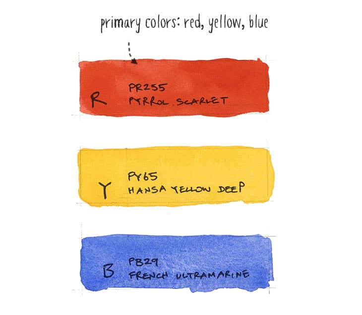
These are known as primary colors because you cannot mix them using any other color combinations. You just can’t… If you only have yellowish and bluish hues in your palette you’ll never be able to mix red.
So you’re probably saying to yourself “great” all I need is three tubes of paint and I can mix any kind of color I want.
Wrong…
I remember learning this after a great amount of frustration trying to mix nice bright greens. No matter what I did I just couldn’t produce the color I wanted!
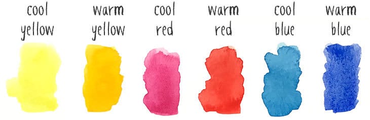
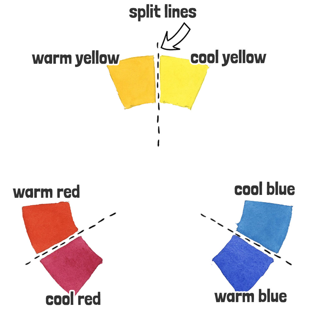
This is because all watercolor paints are based on pigments which have a distinct color bias. For example, “Lemon Yellow” is a little bit greenish (therefore it has a cool bias). And “Hansa Yellow Deep” has a bit of red in it (this gives it a warm bias).
We say that Lemon Yellow is a cool hue, and Hansa Yellow is warm.
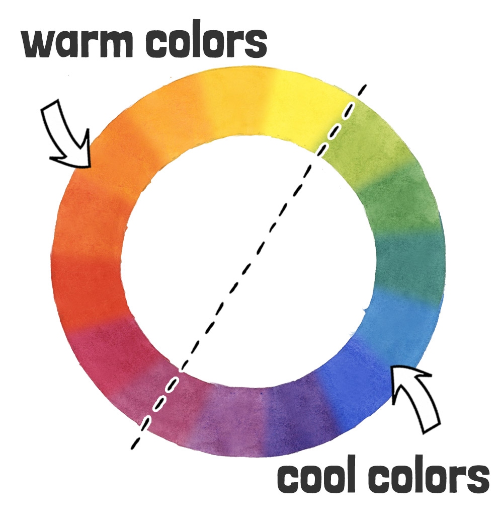
Tips & Tricks: The notion of warm and cool colors is important to this story. Color temperature can most easily be understood with the help of a color wheel. Warm colors are those that tend towards red and orange, whereas cool colors are those that tend towards blue and green.
Now let’s go back to our tubes of yellow and blue paint. For example, if you try to mix a warm yellow with a warm blue, there is NO WAY you will end up with a bright vivid green! Mixing these two warm paints produces a toned down earthy green color, not an intense green.
So why is this?
The color appearance of the mixed paint depends on the color temperature of the pigments being used.
So how the heck do you figure out which combinations of paint to use to achieve a desired color?
If you read my first lesson then you’ve probably already guessed the answer.
You need to start with a range of both warm and cool primary colors. In other words, a warm and cool version of each primary color. That’s a minimum of six paints. Here’s an example:
Many of you have asked me to share exactly what paints I would recommend. I use Daniel Smith watercolors which are my favorite brand 🙂. So here’s an example of 6 warm and cool paints like the ones above:
The Magic of the Split Primary Color Palette
This collection of six primary colors is referred to as a split primary palette. Using a split primary color palette is a principle that makes a fundamental difference between dull muddy color mixing and bright lively colors!
Tips & Tricks: The term “split primary” refers to the idea that each primary color is split into both warm and cool versions.
But it’s even better than that! If you want to be able to mix the widest possible range of different colors, having six warm and cool primary colors in your mixing palette is the best way to achieve this (unless of course you fancy buying every possible tube of paint available).
Don’t worry. I didn’t have a clue what I was doing when I first started mixing paints. Worse than that, I had no idea which paints I should choose to begin with. But now I’m going to show you a quick and handy reference tool you can use to help you mix any color you want.
It’s called a split primary color wheel.
In a nutshell, this color wheel shows you how to mix intensely bright greens, purples and oranges, (also known as secondary colors) and when you understand the theory, you can also mix any muted or earthy versions of these secondary colors.
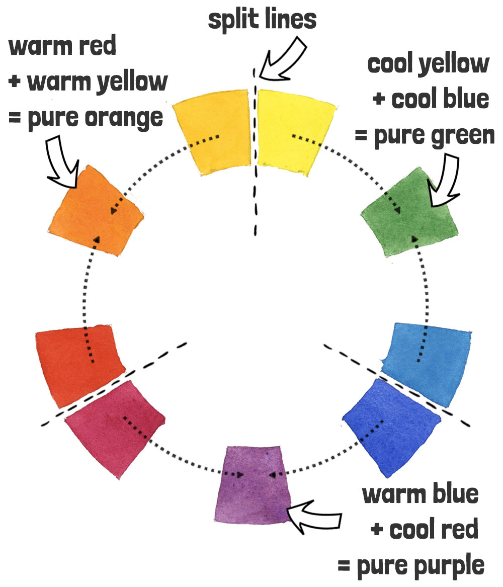
A split primary color wheel is set up in the following way. You start by arranging the six cool and warm primaries as follows:
Then you mix together the two primary colors that are closest to each other on the wheel, which produces the secondary colors green, purple, and orange. The result of these combinations is a range of brightly saturated secondary colors.
So the magic formulas for mixing bright secondary colors are:
Cool yellow + cool blue = pure green
Warm blue + cool red = pure purple
Warm red + warm yellow = pure orange
Then, next to each secondary color you can see I’ve mixed the tertiary colors. Yes… You guessed it. These are the color mixtures that sit between the primary and secondary colors on the color wheel. So the hue “yellow-green” sits between cool yellow and green, etc.
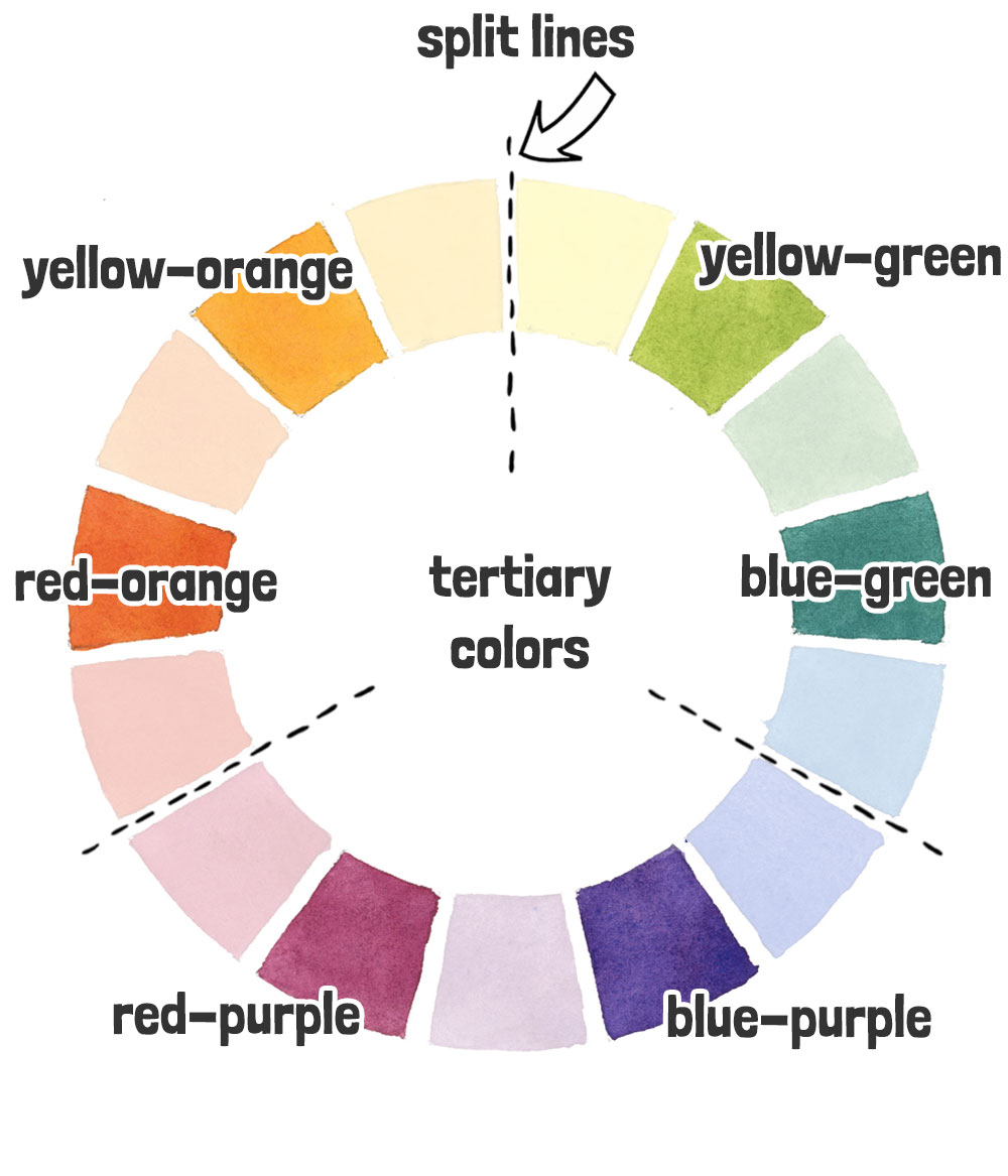
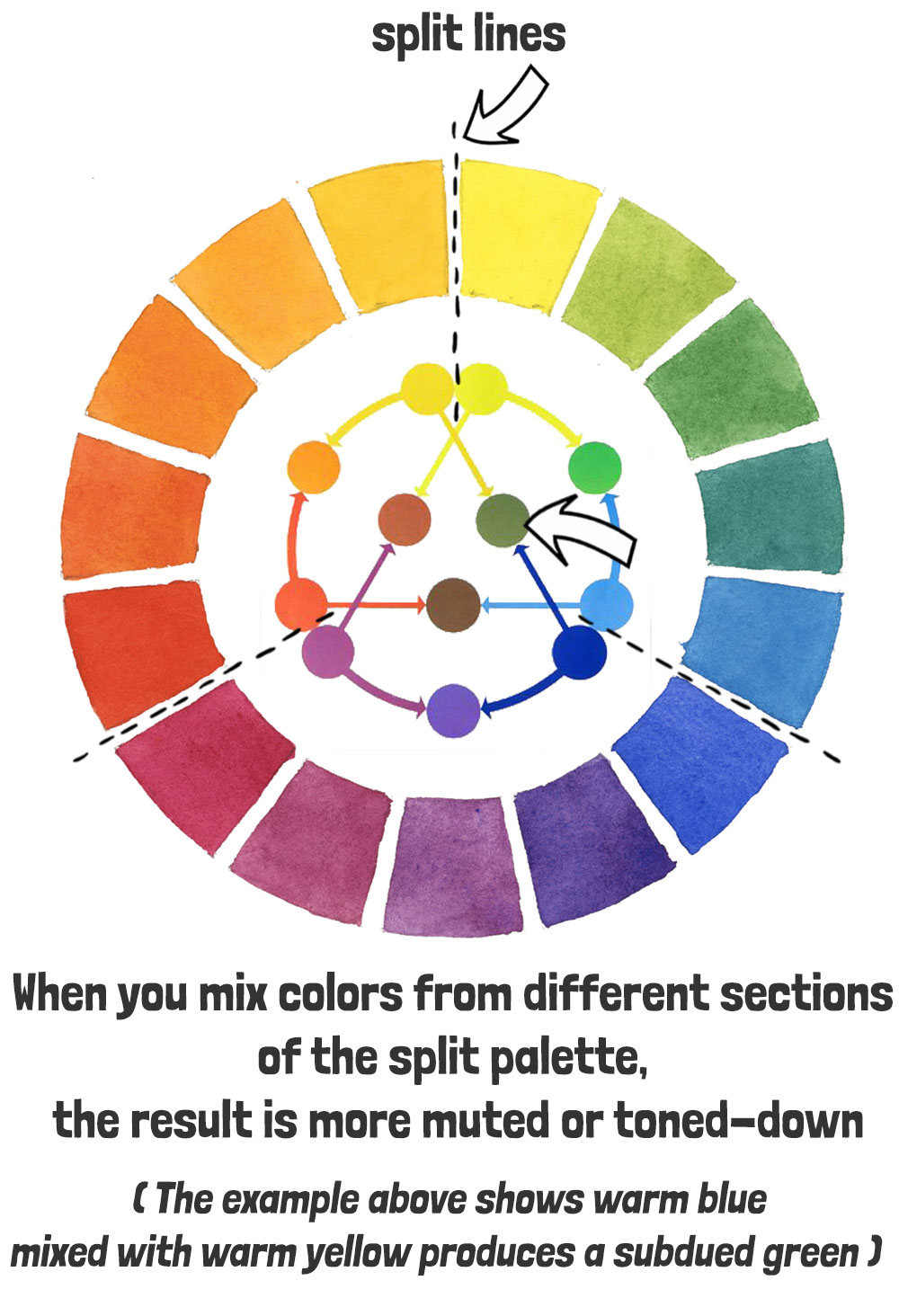
Now let’s take another look at the color wheel. Each primary color is split into two versions, right? Warm, and cool… These split lines divide the wheel nicely into three sections, or thirds.
If you try mixing across the split lines, from one section to another, this results in a muted or toned-down version of the intended color. Like in the example earlier, a warm yellow mixed with warm blue results in a muted green, because these two colors cross the boundaries of the split lines.
Get it !?
The benefit of this mixing palette is that you can very easily mix a full spectrum of colors. Also mixing with a split primary color wheel will naturally train you how to mix intense vivid colors or subdued muted hues, according to what you need!
Isn’t that great?
And on top of that, (like I already said), you probably just saved a lot of money on tubes of paint!
Whew !
Hopefully you should now feel better equipped to get the best out of your color mixing. Good color mixing and the proper use of color is obviously one of the essential parts of successful painting. Remember to use a split primary color wheel as a mixing reference. You can download this PDF here… Or better still, make one of your own!
Thanks for reading !
Anthony
Tell me about your watercolor struggles or what’s holding you back in the comments below and I’ll personally give you some guidance 🙂
P.S. (IMPORTANT) If you enjoyed this and want more I strongly suggest you “whitelist” my email address (which is [email protected]). If you need help to do this, read this page…


I have had color theory for embroidery which is more basic. Color theory more than once for colored pencils (different teachers). This is the first time it has been explained so clearly. I described it to my husband and feels the same way.
This has cinched it. I will be signing up for your masterclass within the next month. My daniel smith paints (your split palette colors + 2 other) will be here on Saturday.
THANK YOU!!!!!
Sandra
So happy this helped Sandra 🙂
So, so helpful. Thank you. I’m a complete newbie to watercolors and feel enormously grateful that I came across this lesson!
Happy to help Meredith
I knew you would make this easy to understand!
I’m not new to watercolors, and I do know what cool and warm colors are. But, I’m trying to set up one of those really big round palettes (I think it holds 32 colors!) What is confusing to me is every artist talks about having favorite colors. I admit that I love vibrant colors, because I enjoy painting flowers. But, I also like many of the *duller,* ones, especially the greens.
I like your primaries, but how do I use my other colors to fill in the gaps? I don’t really know what *my colors* are. I suppose I could look through my swatches to see what stands out? Also, I would like to add some browns to my palette.
Thanks for all the great information you provide, Anthony.
Hi Anne
I have a lesson HERE about setting up a larger range of palette colors – I think that might help 🙂
That makes so much sense – and I never would have figured it out for myself. Thank you for doing the hard work and sharing the knowledge!
Being a “forever newbie”, my biggest challenge so far is water control. I always get either too much or too little – usually too much, which seems much harder to fix. I’m hoping that one of the upcoming lessons will address that problem!
Hi Anthony,
Thanks for a great lesson. I’m still fairly new to watercolor. I understand the color wheel and the cool vs. warm bias of colors. However, when it comes to French Ultramarine and Phthalo Blue GS my eye tries to override my brain and tells me FU is cool and PB is warm. I don’t have this problem with other colors. How do I overcome this?
Hi Valerie
A great way to train your eye is to make your own color wheel like the one in this lesson. Lay out your warm and cool primaries in the same order, then mix the secondary and tertiary colors in between.
French Ultramarine often feels “cool” because it’s darker and more muted, while Phthalo Blue can feel “warm” because it’s so intense and vibrant. But the bias only really shows itself when you start mixing.
So instead of asking, “What does this look like on its own?” start asking, “What does it do when I mix it?”
– Mix each blue with a warm yellow and a cool yellow.
– Then mix each one with a warm red and a cool red.
You’ll see that French Ultramarine naturally leans toward violet mixes, while Phthalo Blue GS leans toward green and gives you much cleaner, brighter green mixes.
Hope that helps 🙂
I have been a professional beginner for 40 years. Due to the loss of a life in order to earn a living, I’ve only ever done painting in snatches. Colour mixing has been a continual mystery. I have learned more from the above pages than I have from many rushed and expensive workshops and books. Thank you.
So happy this helped Kenneth 🙂
This is a very concise and informative lesson on colors! Thank you so much. I’m glad I have lesson before I splurging on more expensive tubes of watercolor.
🙂
Me again – sorry for the bother about the colors. I looked back on day 0 and found them listed as cool/warm with the tube pictured below. I think I’ve got it now!
Thank You!
Sure – no problem 🙂
Thank you so much for this wonderful explanation of colors. I am excited about creating my first Split Palette.
I just want to be sure about the colors first.
Hansa Yellow Deep – Cool
Lemon Yellow – Warm
Phthalo Blue GS – Cool
French Ultramarine – Warm
Quinacridone Rose – Warm
Pyrrol Scarlet – Cool
I wish I was starting from scratch and I could buy the exact Daniel Smith colors that you are using, but for now I am using the odds and ends of colors that I currently have on hand. It’s amazing that you offer this information. I’m very impressed, and very grateful!
Hi Jennifer
Happy to help 🙂
That’s almost right… Here’s the warm and cool list again:
Hansa Yellow Deep – Warm
Lemon Yellow – Cool
Phthalo Blue GS – Cool
French Ultramarine – Warm
Quinacridone Rose – Cool
Pyrrol Scarlet – Warm
If you’re interested I also have a complete article about warm vs cool colors here:
“why-warm-cool-colors-confuse-artists”
Cheers 🙂
Hello Anthony
This was very interesting and informative, now I can see where I was going wrong with colour mixing!
As well as expressing my appreciation, I would also like to ask if it’s OK to fill empty watercolour pans with my own unique colours that I use a lot AFTER mixing them, provided I haven’t added any water?
I often transfer tube paints into pans that fit in my trusty palette tin for ‘plein air’ work, because I find tubes rather a challenge to take out and about, but I’ve never tried mixing the colours first and then transferring to pans to dehydrate.
What’s your take on this?
(P.S. I am using Paul Rubens tube watercolours)
Hi Shena
That sounds like a great idea – if you know you always mix too colors to make a specific result, then great – you’ll basically be making your own “convenience” colors, like many manufacturers already do…
Have fun!
Thanks for this I am going to start my colour wheel this afternoon hopefully
Have fun Susan!
Hello Anthony
Thank you for your excellent videos. They are helping to demystify watercolour painting for me. I wish I’d found them before I went off and bought a large set of Cotman W&N half pans, and cheap brushes and paper!
I recently started art classes with a local artist and after only 3 lessons she gave me a very generous Christmas present and now I feel obligated to stick with her. So I probably won’t start your Masterclasses just yet, otherwise I would have signed up straight away.
I have a question that relates to your example above of mixing ‘pure’ secondary colours.:- Why do you get pure purple from mixing WARM blue with COOL red? Is this some anomalous quirk of the colour wheel? Does mixing cool blue and cool red result in an unpure purple?
Cheers
Kate
Hi Kate
Great question 🙂 It does feel a bit like a quirk at first, and that’s really down to how a split primary colour wheel is organised. The logic shifts slightly with red and blue because of their pigment biases.
A “warm” blue actually leans slightly toward red, and a “cool” red leans toward blue. When you mix those two, you’re combining pigments that already sit close to purple, with very little yellow contamination — so the mix stays clean and vibrant.
Hope that helps!
Hi Anthony. Love the lesson. I struggle with knowing how much water to use with each color when making my color wheel. Also my paint order from your list just arrived, so super excited to sign up for your master class next paycheck 🙂😁
Hi Brynn
Yes… the water-to-paint ratio can be a bit tricky. I usually aim for a mid-strength mixture when making color wheels.
If you test the strength of the mix on a scrap of paper beforehand, you get a better idea of the color appearance 🙂
Have fun!
This was very helpful and a great refresher as it’s been almost 5 decades since my last art class. I saved the wheel to my photos and will get it printed out for easier reference. My challenge is the ratios of each color. Also, won’t we also need a cool and warm white and black. I’m considering taking the masterclass this winter – are they in closed-caption? I’m deaf/hearing-impaired so online courses are often a no-go. Please advise. Thank you for an easy to understand free course.
Hi Cheryl
I’m so glad you found it helpful!
Black and white aren’t used in watercolor in the same way as opaque mediums like acrylic.
So you won’t need a white in watercolor (white comes from the paper because watercolor is transparent).
Also I’m not keen on using black – I do have a lesson on black in watercolor that might help — You can find it HERE .
And yes, the Masterclass is fully closed-captioned, so you’ll be able to follow along easily.
Hello Anthony, I really like your streamlined teaching style. No blather, just well organized information and examples. Regarding cool and warm blues, I’m having some difficulty seeing what you see. The hangup for me is that your cool blue feels warm to me, and vice versa. I may be missing the point of warm and cool. The red and yellow warms and cools look right to me, warm looks warm, etc., but the blue warm and cool feel reversed. If I can’t determine if a color is warm or cool, can I still be successful at color mixing? And would I know if I weren’t? Haha Is color temperature related to hue, chroma, and value, or is it a separate attribute? Cat S.
Hi Cat
Thanks for your comments.
Color temperature can be a tricky subject for many artists at first.
I’ve written an article that explains this in more detail, which you can read HERE.
There’s also a color map on THIS PAGE that shows how different pigments lean towards either a warm or cool appearance.
Once you know which pigments your paints contain, you’ll be able to tell whether they are warm or cool.
Hope that helps 🙂
Dear Anthony, I am very happy to have found your course among all the youtube watercolour clips. I have learnt a lot about watercolour from your free lessons. My phase of muddy landscapes with ground fog is now over. I had so much fun creating the colour chart myself. Thank you also for the template, the printer was good and swallowed the watercolour paper. By mixing so many colours and paint so many small areas, I also got a better feeling for the right amount of water and the brush. No cauliflower produced at all.
I would like to start with the masterclass.
I still have a few questions.
Can I work through the lessons at my own pace? I sometimes don’t have much time as I work shifts. If the unfinished lessons “pile up”, it would be quite stressful for me.
Unfortunately, I can’t really draw either, so I hope the sketches in the course aren’t that complicated.
Thank you again for the great lessons, I had so much fun and relaxation while drawing.
Kind regards Bettina
Hi Bettina
To answer your questions about the Masterclass – yes the course is self-paced. you can go over the lessons whenever you want and repeat them as many times as you need.
And you don’t need to know how to draw – all the exercises include templates that you can trace onto watercolor paper.
Hope that helps 🙂
Hi Anthony, Wow! What a lesson! I spent a couple of days on this one. I have a mixture of Schminke, Windsor/Newton and some Daniel Smith. I didn’t want to buy more tubes so I made myself sort through and divide them into earth/warm/cool. Ultramarine blue for NewtonWindsor was cool while Ultramarine blue for Schminke was warm! Then I did tests for the primaries and decided what I wanted for the Magic Color palette based on swabs of each yellow/blue/red next to each other. I know this will change as I learn more about color theory and I start incorporating what you are teaching into my painting but just this exercise forced me to look at all my tubes of color in a totally different way and I started to gain confidence in my own choices! THANK YOU! Now to catch up on Day 2 and 3. 🙂 🙂
My question is this: Would you recommend choosing one brand and sticking with it? Best, Laura
Hi Laura
Yes absolutely – You can mix and match paint brands.
I would say so long as the paint is artist quality and not a student brand like W&N Cotman.
Hope that helps!
Thank you for the great explanation of the colour wheel. It finally makes sense.
Happy to help Deanna 🙂
Sounds epic !
Hi Anthony,
Thank you for your helpful, encouraging lessons. I am learning a lot from you! I am confused by the split color wheel, though. If I am seeing/reading yours correctly, you mix warm yellow with warm red to get a clear bright orange, cool yellow with cool blue to get a bright green, but you mix WARM blue with a COOL red to get purple. Why?
When I mix a cool blue with a cool red, I get a beautiful purple, so why not continue the pattern of cool with cool and warm with warm to get your clear secondary colors? Also, I read somewhere NOT to mix cool with cool or warm with warm if you want clear, bright colors because the results wl=ill be muddy or muted. I am really confused! Please advise. Thank you, Sandy G.
Hi Sandy,
Great question—and totally understandable! The split primary color wheel is set up to follow the natural flow of the color spectrum, (which is why warm blue and cool red are next to each other). This helps us mix the brightest secondary colors by combining the two primaries that sit closest together on the wheel.
So when I suggest mixing warm blue with cool red for purple, it’s not about warm vs cool—it’s about choosing pigments that are closest to purple on the spectrum and don’t contain any of the third primary (in this case, yellow). That’s what helps avoid muddy mixes.
That said, you’re right—cool blue and cool red often make lovely purples too! The split primary wheel is just a helpful guide, especially when you’re learning, because it steers you toward cleaner results by keeping you within the “friendly neighbours” on the wheel.
Hope that clears things up a bit 🙂
Thank you SO much! A great explanation, I’ve never understood this before from other resources.
Happy to help Peg !
This clears up so many things that I’ve struggled with before! Thank you so much for the lesson and the cheat sheet. Looking forward to learning more from you.
You’re welcome Pamela 🙂
Wow! This makes so much sense. I have watched a lot on color mixing, but I have never heard anyone explain how the warm and cool colors change how vibrant or muted the mixed color will be.
My biggest struggle is knowing how much water to use when mixing and when applying water directly to the paper.
Glad this helped Lisa 🙂
Wow, what a great explanation of colors and how to get the achieved tones. I have never done watercolor painting and decided to plunge in. My biggest concern is that I have no drawing ability ( at least now) so am excited to learn. Thank you
Hi Marcia
Happy to help 🙂
You don’t need to know how to draw to make great progress with watercolors 🙂
You might find this article on tracing useful…
Thank you for your advice. You are very helpful and kind to share your expertise
Glad to help Kathy 🙂
I was aware of the colour wheel and that there are cool and warm colours. But didn’t appreciate the interaction between them when mixing. Also it would help to know which paints / pigments are warm or cool. Thanks this has helped clarify my problem,
Happy to help Steve
Paint manufacturers sometimes provide charts with this information – but be careful, some of them are not accurate!
Thank you for you free lessons, Antony. I thought you were a great teacher just by listening to your soothing voice on one of your you tube videos.
Regards Angelinka
Thanks Angelinka 🙂
How to identify warm or cool temperature for below colours? what could be their substitutes? Raw Sienna, Red Quinacridone, Transparent Oxide Red, Blue Violet, Mauve Pyrrol Orange , French Ultramarine, Azometrine Green Yellow, Lamp Black
Hi!
I have a helpful article HERE about matching colors between brands if you’d like to explore that further.
That said, Just a quick note – I’d suggest revisiting the concept of this lesson because using lamp black might take you away from the wonderful possibilities of mixing your own neutral grays and rich darks with the split primary palette. It’s a fantastic skill that gives you so much more control and harmony in your paintings.
Have fun!
Thanks a lot Anthony. I learned a lot!
To tell you the truth I have two major problems. The first is finding an instructor that teaches watercolor (I know there are many and I have learned a bit from the ones I have come across but so much I learned on my own so it has been frustrating. The second is the paint to water ratio to be used while I am painting. When following a lesson the teachers I have found never explain or show when they are adding water so that has been a bit frustrating. There are a million little things like being told that with watercolor you cannot paint light over dark yet I have done it. I recently painted orange on top of a black house. I absolutely love watercolor and so want to learn more about this medium. It has been a long journey for me to learn about pigments and their importance, but I had not learned about not mixing warm with warm yet so there are big holes in what I have learned.
Hi Zoie
Thanks for sharing your thoughts! I understand the challenges you’ve faced, especially with finding the right instruction and mastering that tricky paint-to-water ratio. These are both common hurdles for many watercolorists, and you’re not alone in feeling that frustration.
Water control is something I place a lot of focus on in my classes because it’s often glossed over yet so essential.
For water-to-paint ratios might I suggest you simplify things to avoid overthinking … For example, use just 3 paint consistencies (light, mid-strength, and dark) to approach your paintings…
All the best 🙂
Dear Anthony,
Thank you for your free guide to the world of the split primary colour palette. This provides a superb, clear and concise explanation for someone just starting out on their watercolour journey. Well done!
Best
Antony
Happy to help Antony 🙂
This is great information.. One question I have though is how do you know what is a warm colour and what is a cool. For example my Windsor and Newton paints have 2 or 3 yellows – I have no idea what is a warm and what is a cool yellow.
Hi Shezz
To understand more about warm and cool colors, you might find this article useful 🙂
It seemed you used Lemon Yellow as a cool color, but it’s listed as warm in the DS spreadsheet. That confuses me a bit.
Hi Judith
I can see how that might be confusing. On the DS spreadsheet, they list yellow as a ‘warm color’ because yellow is generally seen as a warm hue. However, within the yellow family, there are both warm and cool versions. Lemon Yellow has a cooler bias because it leans slightly toward green, whereas a warmer yellow, like Hansa Yellow Deep, leans more toward orange. So Lemon Yellow is a cool yellow, because of its slight greenish tint, which makes it ‘cooler’ compared to other yellows. Hope that clears things up!
(p.s. the DS document is misleading because it labels all colors that way!)
Thank you, Anthony! That makes sense!
This was excellent information It makes a lot of sense the way you explain it
Glad it was useful Diane 🙂
Hi I am new to color mixing.
The way you explain that is just wow 👌
A great thanks to you for sharing this 😀
🙏🙏🙏
Happy to help Ilse 🙂
Now I understand why my mixed color attempts resulted in ‘muddy’ looking tones. Thanks!
Happy to help Inez 🙂
I have studied other color wheels; some were very confusing. So I figured out the split color wheel myself…sort of. It took many hours of paint mixing to “get it”. I don’t regret the practice, but could have moved on more quickly if I had your explanation then. I still practice mixing with each new color I buy before using it in a painting. Now, I know why the split works every time. Thank you!
Happy to help Rebecca 🙂
Yes… mixing your new paints is an excellent way to discover new mixing possibilities …
Thank you very much! This is exactly what I needed!❤️
Happy to help Lumi 🙂
Hi dear Anthony thank you for your valuable information about colors.I like it and learn a lot .
The best
Happy to help 🙂