
My Biggest “Aha!” Moment Learning Watercolors!
I want to teach you about the importance of values, or in other words, the light, dark, and mid-tones in your paintings. Once you grasp and apply the notion of values in your paintings it will make a huge difference to the success of your artwork.
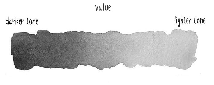
Values (or “tone” if you prefer)
I didn’t get it…
I had just finished my latest watercolor. My underlying sketch was pretty good. I’d included all the details from my reference photo. But when I stood back to “admire” my work, something was lacking!
What I eventually figured out was missing (and what I want to show you today), is the concept of values.
This is something I wish someone had told me earlier, because just grasping this idea made a big difference in my painting approach. It really was an “aha” moment when things fell into place in my mind…
The notion of values is pretty simple. Some people sometimes refer to the same idea as “tones”. Values refer to the level of darkness or lightness of a particular color.
Tips & Tricks: Equipped with what you learned in the previous lesson about water-to-paint ratios you can try painting a value scale like this for yourself!
Our eyes perceive the world as a series of colored shapes with different values. If you can interpret those shapes and values in your watercolor paintings, this will go a loooong way to creating a believable sense of light and space.
The problem with my first attempts at watercolor painting was that they all looked pale and a little bit bland. They lacked contrast and depth, and their range of values was very timid.
Here’s an example where I try to illustrate what I mean:

I’m sure you’ll agree the painting on the left looks flat. You can’t perceive any depth. You can probably guess from the shape that it’s a representation of a carrot, but the result isn’t very convincing.
Compare this to the example on the right. You can see some highlights and dark shading. There’s a higher level of contrast and a more convincing sense of three-dimensional space.
Ok… Perhaps this is an exaggerated example. But it helps to illustrate the important role that values play in a painting. And this was something that was totally missing in my first watercolor paintings – I just didn’t even think about this!
And I should probably stress just how important values can be for achieving positive results. The interesting thing about a painting with correct values is that you don’t even have to be particularly accurate with your painting, and you don’t necessarily need a lot of details ! If the values are good, it results in an effective painting. And it’s not just about making an object look three-dimensional:
- Values suggest the direction of light.
- Gradations of values can help create an illusion of depth or distance.
- Contrasting values create focal points in your painting (it’s been shown that the human eye is attracted to the point of greatest contrast).
- Knowing how to use values for focal points can improve the composition of your paintings.
- Values help add three-dimensional form to the shapes in your painting.
Watercolor Masterclass
Limited time offer for newsletter members only…
Get started for less than the price of a good watercolor brush!
Ending soon!
Working with values in watercolor painting
So how do you apply correct values to your artwork?
Observation is a key part of how to improve as an artist. In the past I wasn’t looking at my subjects the right way. I wasn’t looking at the values of the shapes.
But as soon as you start making a conscious effort to estimate the lights, darks and mid-tones of your subjects, your observation skills gradually improve over time.
Here are a few tips on how you can start developing your skills at judging values:
- Make a monochrome value study of your subject. Painting in monochrome removes all color variables from your subject. This lets you focus on the essentials. Keep it simple and try to establish just the light, mid, and dark tones of the subject. If you’re working from a photograph you can try making a grayscale copy of it to help you see better. In life situations I’ve sometimes seen artists hold up a sheet of colored cellophane in front of the subject to reduce the view to a single monochrome color (red works well).
- You can either make or purchase a simple value scale. This can be used as a value finder by simply holding it up to the subject, then peering through the holes until you get a match. Here’s one that I picked up from Amazon:

- Squint! Yep… In general when you look at a subject you can get overwhelmed by the details. Squinting simplifies the shapes of what you’re looking at and can help you discern the different values.
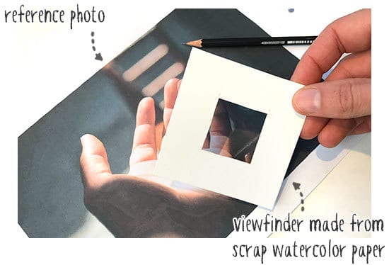
- Isolate small parts of the subject to better evaluate the values. For example, I use a small piece of watercolor paper with a hole cut in the middle. Place this on top of your reference photo or in front of your subject. Isolating in this way removes the distraction of the other parts, and allows you to better judge the values against the whiteness of your paper square.
Tips & Tricks: Sometimes the values are not very accurate when you work from a reference photo. Or maybe you’re painting a real life subject which is poorly lit. You can vastly improve your painting by forcing the contrast in your painting. In other words, reserve the white of the paper to make highlights that pop, and deepen the shading and shadows so you get a larger range of values. After all… You’re the artist. You can interpret the subject however you like!
Summary
The terms “Value” and “tone” refers to the lightness or darkness of a particular color. Value is one of the seven fundamental elements of art, but probably one of the most important. It can be a powerful tool in your artwork. Pay closer attention to values in your next painting and I’m sure you’ll find it makes a real difference!
Anthony

PS – because you’re a new subscriber to my email I’m giving you a special offer on my Watercolor Masterclass… (If there’s is still time left on the timer below, that is!)

Hi Anthony,
I’m a beginner and am so glad to learn about values and tones. (I call it the “Carrot Lesson”.) I spent time painting leaves yesterday. When I finished them I told myself, “Well, I did it again.” Something was obviously missing. I didn’t paint using values. I always had a tendency to be too precise–a perfectionist, when drawing with pencils. Now, with watercolors I’m doing the same thing! I’m in my 70’s and finally getting around to trying watercolors for the first time. This lesson is just what I needed.
Thank you!
Deb
Glad the lessons are helping Deb 🙂
This is a great lesson as well, I’m impressed with what you’re giving away, thank you so much. The Macaron lesson was like 5 in one lesson lol.
Values! just this advice, along with a $5.99 app helped me start looking/learning how to better create a picture I’ve tried a few times to watercolor, pen color, pencil…. etc. It’s words on a folded piece of paper. Lightbulb moment – getting the values wrong. I have “shading” experience from a couple years of acrylic work, but moving into real subjects, and making them pop, this gave me permission to release the subtle shading that most real life images have, and emphasize it. Thank you!
Happy to hear this helped Diana !
Have fun 🙂
Anthony
This is such great information, I just hope I can keep up with the pace and the classes (free). the carrot example was very helpful. I am new at this and feeling a bit overwhelmed:)
Glad this was useful Marcia 🙂
so am I Marcia,
but I AM starting to feel more of the joy and less of the frustration 🙂
Million thanks Anthony
working with Contrasty Black and White head shots off the internet helps you gain understanding of tones/values…I find this easier than painting live subjects, be they people or landscape…
Hi Bill…
Yes, I agree – choosing subjects with the right lighting can help enormously.
And using fixed images before progressing to live subjects is the best way to evolve you observation skills.
this is pretty fascinating!. I’m squinting at things and i can see where the highlights and the shadows are that seem to disappear when you open both eyes.
True!
You can practice this any time you see a subject you think would make a good painting 🙂
How. much is your watercolour course one month only with discount in sterling please, I live in the u.k.
Thank you
Hi Margaret
At today’s exchange rate it works out to about £113
Hope that helps
So helpful dear Anthony thank you so much for trying to simply this for us , I havent finished my Macaron yet so please don’t close as am a bit behind,and trying to fit this in with work etc need so much time to practise but at least you are the only one that has mana`ged to get the brush in my hand plus light box fantastic help as you require so many skills for this wonderful subject and cant draw!
Best Margaret
Hi Margaret
You can come back to the lessons whenever you like 🙂
Cheers
Can I access this from the UK? Also, can I stop and start at any time too?
Regards
Barbara
Hi Barbara
Thanks for getting in touch.
Yes… All the lessons are pre-recorded videos and include text versions of each lesson.
This means you can go at your own pace, and go over each lesson as many times as you want.
You also get lifetime access which means you can get the course, start whenever you like, and come back to go over the course again any time in the future.
Hope that helps 🙂