Glazing & Layering in Watercolor (Frankenstein Demo)
You know that moment when you finish a watercolor painting and think… “In my head it looked so much better than this!”
Don’t worry – we’ve all been there! Maybe you followed all the right steps… but somehow the painting just feels a bit, well, lifeless!
That’s exactly the kind of challenge my student Justin faced – until he learned one simple but powerful lesson: how to simplify his values and build depth through glazing. It completely transformed the way he painted.
So this is Justin… (say hi to Justin…)

A little while ago, Justin wrote to me. He was genuinely excited to share his latest painting – it was a Frankenstein’s monster portrait he’d painted after following the lessons in my Masterclass.
His email made my day! Here’s what he said in his message:
“I simplified the values like you suggest and did glazing to balance the values. Thank you for helping me feel successful!”
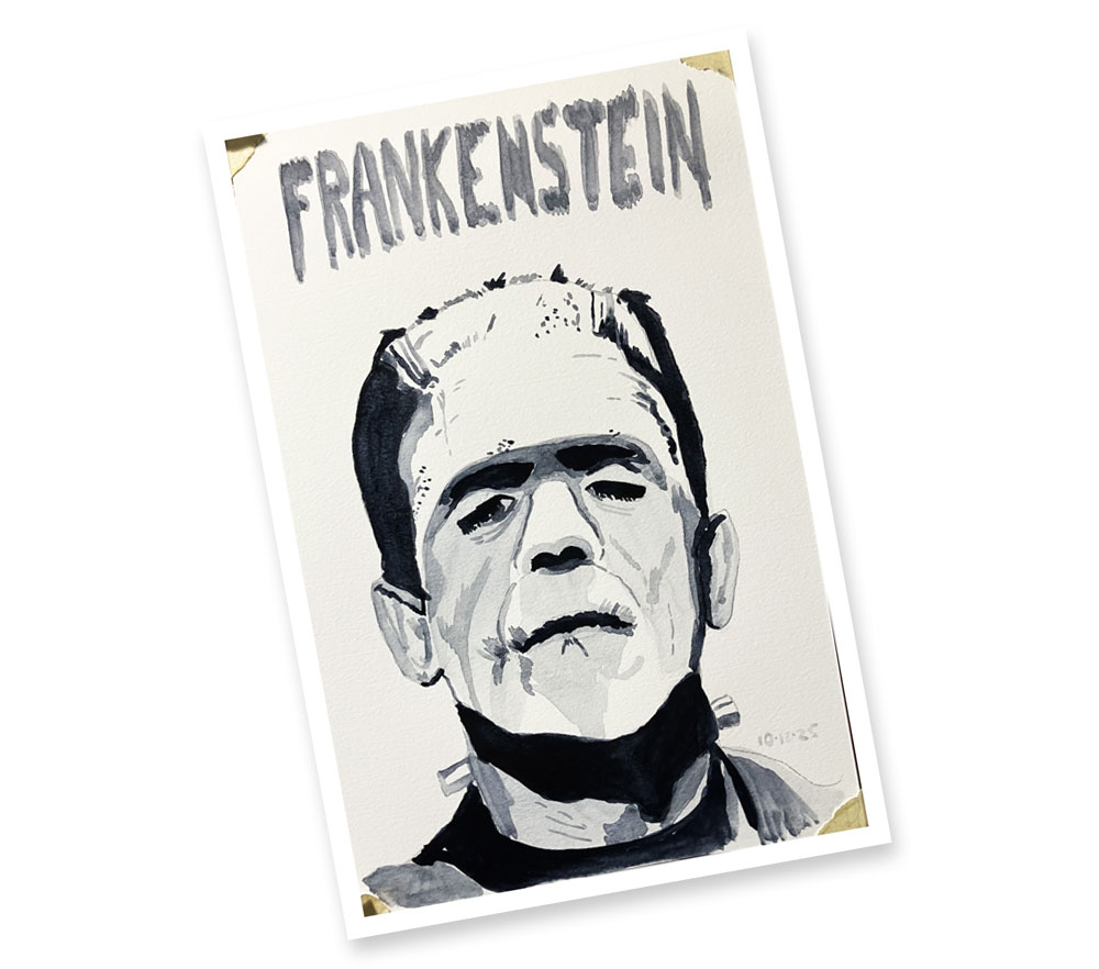
So with Halloween just around the corner, I thought I’d have some fun and paint my own version using Justin’s Frankenstein as inspiration. I’ll show you how he did it – and how you can do the same. We’ll build it up layer by layer, just like he did, and you’ll see how the gradual change in tonal values really brings it to life.
Well… hopefully not literally! Like Frankenstein’s monster!
I’d rather not have him wandering off the paper! 🙂

Building Up A Painting Using Layers & Simplified Values
Justin came to watercolor after dabbling in oils. He really wanted to paint landscapes, but with two kids, a full-time job, and because oil paint dries so slowly, it just wasn’t practical.
He said:
“ Working full time with two kids made it very hard to practice oils even once a week. I couldn’t find a teacher to teach the basics, and books weren’t working. I took to watercolor because, despite oil painters saying it’s “harder”, it is cheaper to get started and faster to work on something even on a weekday. Before the Masterclass, I couldn’t figure out where to begin… it seemed to always be hit and miss; and that’s a terrible way to learn a skill.”
And honestly, that’s such a familiar story. You want to paint, but life gets in the way – and when you finally sit down, you’re not even sure what you should be practicing.
So switching to watercolor made a lot of sense for him – it’s quick to set up, easy to clean up, and lets you get in those short bursts of creativity between all the chaos of everyday life.
But of course, that’s when a new problem shows up – watercolor might be simple to set up, but it’s not always simple to control.
Finding the Right Guidance
Justin told me he tried a bunch of beginner courses before mine – and none of them explained the why behind watercolor.
Here’s what he said:
“I tried a lot of “beginner” watercolor courses on Udemy. Still, no one could give me the foundations. It felt like you either got competent through luck or you had to be naturally gifted”.
Then one day, he stumbled on my video , ‘If I Were Starting Watercolor from Scratch’:
“Through some web searching, I came upon your YouTube video. You explained basic concepts in a logical way and I thought, “This guy seems like he can actually teach”. I jumped on the Masterclass as soon as I could and sure enough, you structured learning in a way that was progressive and at the same time enjoyable. I view the “If I was Starting Watercolor…” video regularly to keep myself focused – that’s how important I think it is”.
I have to say, that’s one of the nicest compliments I’ve had! 🙂
My goal has always been to take the mystery out of watercolor – to show that it’s not about luck or talent, but about understanding how the paint, water, and paper work together.
For example, “glazing” is one of the key techniques Justin used in his watercolor painting – “glazing” is just a fancy word for layering transparent washes of color on top of one another once the first layer is dry. But this lets you build depth and tonal values in your paintings step by step, just like Justin did in his Frankenstein portrait.
And once you grasp how to actually see and build tonal values it can completely change the way you approach watercolors.
Cracking the Watercolor Code: Values and Glazing
So, how did he actually do it? Here’s Justin explaining it in his own words:
“Taking the approach to simplify values (and reducing complexity) is a great way to start. It removes the overwhelm and teaches me to see. I downloaded the value study app you recommended and played with charcoal and pencil studies using it. I did your cube lesson with a few different colors, comparing them to a paper value study chart. I got great results with monochrome and was learning to “See” (the values). I noticed that I started to unconsciously note values on objects recently. That’s probably a good sign.”
So in this lesson, we’ll follow that same approach.
We’ll start by simplifying the subject – just like Justin did – so we can see the values clearly. Then we’ll build up the painting layer by layer, glazing progressively darker colors.
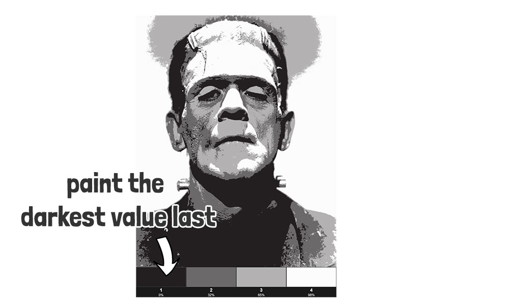
The tool I suggested is this “value study” app…
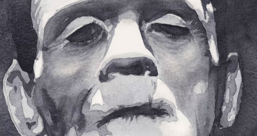
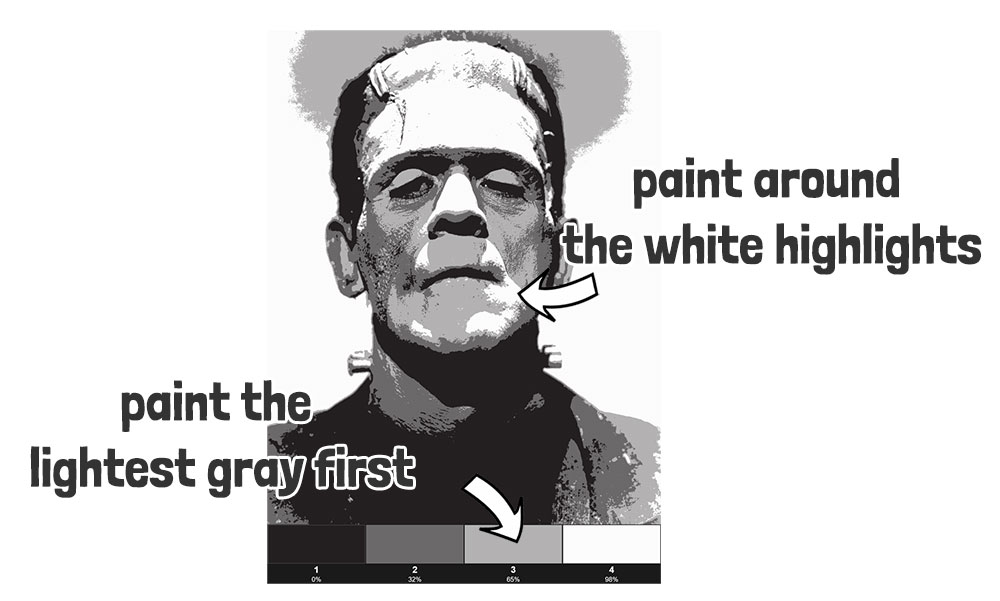
Here’s what the Frankenstein portrait looks like after simplifying the values with an app like this:

The big advantage of the image Justin chose is that it has lots of contrast – the strong lights and darks make it easier to see the structure of the face. That kind of reference is perfect for practicing values because you can clearly spot the patterns of light and shadow.
Justin said:
“this approach was very helpful. I let the white of the paper be the brightest, like you suggest. Then painted the darkest darks. I looked at the picture of the monster to figure out the next values, squinting the eyes. I tested the intermediate-values on a paper scrap, then glazed over the layers. I forced myself to keep the values simple. The picture seemed to just “appear” and that was really, really cool. When I thought “wow that looks real” – I knew I’d made a big step in the right direction”.
Step-by-Step: Building the Painting
So here’s the step-by step plan for this painting:
- simplify the values,
- start light,
- glaze the layers gradually,
- test as you go,
- and let the painting build itself step by step.
If you fancy giving this a go yourself, you can grab my outline sketch from the link below.
By the way you can also watch this lesson on Youtube here…
Layer 1:
So… start by tracing the outline of Frankenstein’s monster onto a sheet of watercolor paper, then tape this down onto a flat board. I’m using Payne’s gray for this portrait, just like Justin did.
Next mix up a big puddle of gray paint – you want this to match the lightest value of gray in the value study, so use plenty of water. You can test the strength of your mixture on a scrap of paper to make sure you get a close match.
Then start painting the first layer using a well loaded brush.
Using your value study for reference, the aim with this first layer is to paint everything except the white highlights.
Identify all the white shapes on the face and be careful to paint around them as you progress.
This is essentially like painting a continuous flat wash… A flat wash is a technique for painting a smooth, even layer of color across the paper. You need to keep the paint flowing while it’s still wet to avoid creating a streaky or blotchy appearance. Reload your brush regularly and overlap each new stroke slightly with the previous one, always keeping that wet edge of color moving down.
Leaving the white of the paper untouched gives you your lightest shapes. Most of the time, I kept the edges around these highlights sharp, but occasionally I softened an edge where the reference photo showed it should be less defined – for example, the highlights on his chin, where the lower edge fades gently into the gray beneath.
Continue painting around the white shapes, blending edges a little where needed.
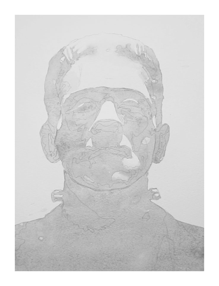
I wanted my version of this portrait to have a darker, moodier atmosphere, so I kept the grey wash going around the head to create the dark background.
Leave this layer to dry completely before moving on – if you’re a bit impatient (like me) you can use a hair dryer to speed things up!
Layer 2:
Now start painting the mid-value gray shapes. Mix up a generous puddle of paint with a bit more pigment this time — and if you’re unsure, just test it on a scrap piece of paper before putting it on your painting.
Use your reference photo and the value study as a guide.
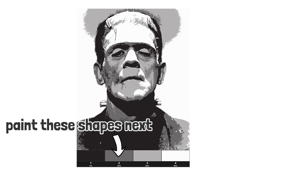
You’ll notice these mid-tone areas also cover the darker parts, so you’re really painting bigger shapes that include both mid AND dark values.
This stage can be a bit trickier than the last one. Focus on following the outline of the mid-tone shapes, even if there are darker areas inside them. Just be careful not to paint over the white highlights you saved in the previous step.
I used the same approach as before — mostly leaving hard edges, but occasionally blending the paint into the previous layer. These darker shapes are more detailed, especially around the eyes, nose, and mouth. Take your time here – features like the eyes and mouth can really make or break the portrait. Use a brush small enough to capture all those fine details, like the wrinkles around his eyes.
Keep checking your reference images as you go to make sure you capture all the mid-tone shapes.
Layer 3:
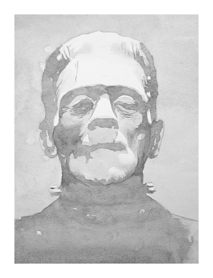
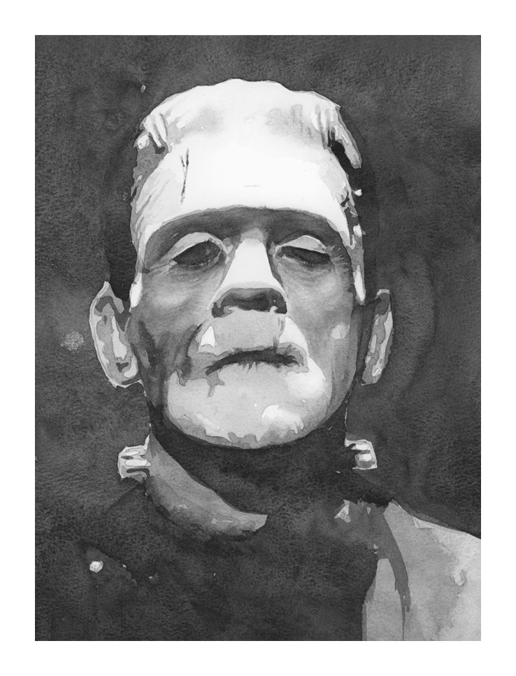
The final stage is all about painting – you guessed it – the darkest value shapes.
These are the smallest shapes in the painting, but once they’re added, they’ll give the portrait a real sense of depth.
I’d say the details around the eyes are the most important, so take your time and really study the reference photo.
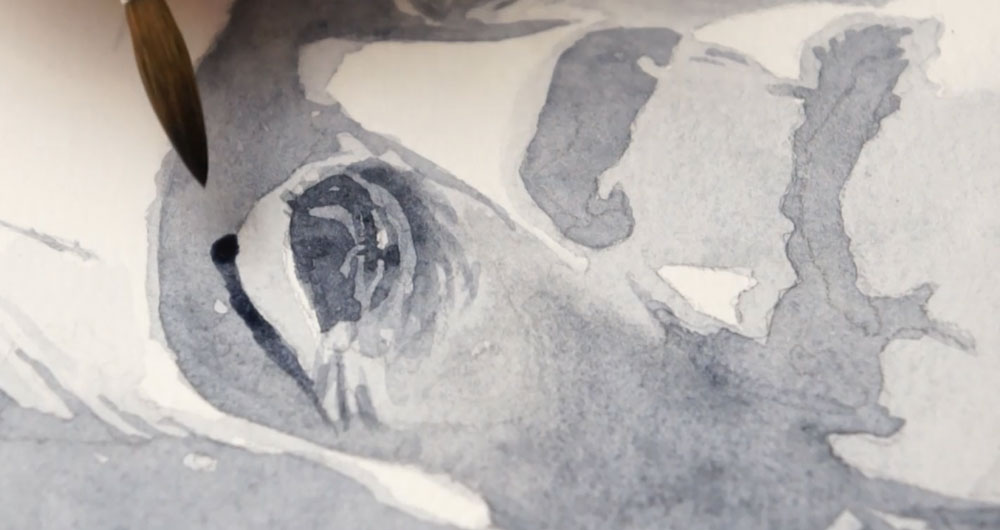
The same rules apply: keep those sharp edges where you see them (like just above the eyelids) and soften the ones that need to fade out (such as above the brows).
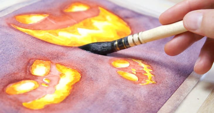
Around the mouth, I added a few spiky, jagged strokes that blend outward. It gives the mouth a cracked, slightly shrivelled look – perfect for a monster! It really helps give the mouth a dried, wrinkled texture.
Add the smaller dark shapes on the ears, and cheeks, then put a nice dark cast shadow under his chin. Then extend the shadow down onto the torso.
This big dark shape starts to add some real depth to the painting.
The final step is to add the dark background. Make sure you’ve mixed up a big puddle of paint so you don’t run out half way through…
Notice how I’m overlapping this big dark shape with the shadows at the side of the monster’s head and the torso below. This creates what’s called a “lost edge” where one shape blends so closely into another that the edge almost disappears. It’s a really effective way to make the monster feel like it’s emerging from the darkness, rather than cut out and pasted on top.
Let the paper dry completely before you take off the masking tape around the edge.
When Watercolor Finally Clicks
As you can see, glazing is such a key technique for building values in watercolor. I asked Justin if there was a particular moment or exercise where it all started to make sense for him. Here’s what he said, in his own words:
”Yes. And speaking of glazing….this actually happened yesterday. I completed the Masterclass Amazon boxes painting project yesterday. I admit I was very nervous replicating values with colors other than Payne’s Gray/monochrome. I saw how adding the neutralizing color in addition to glazing gradually darkened the values. I admit that although I have “monochrome dependency syndrome”, the project wasn’t as intimidating as I thought. I might even try a green Frankenstein!”
And that’s exactly what I love about the purposeful painting approach – you can see how Justin went from feeling a bit nervous and unsure to experimenting more confidently with color and glazing. By breaking it down, and approaching watercolor in focused, manageable steps, he was able to see better progress, perhaps without feeling so overwhelmed.
Growing Confidence (and Enjoyment!) In Painting
I asked Justin how his confidence or enjoyment of watercolor changed since applying what he learned?
“If you told me in June I could paint the Frankenstein or Amazon boxes by October, I would’ve thought you were crazy. My confidence and enjoyment have grown tremendously. Also important is the change in my attitude: it’s okay to make mistakes even with purposeful practice. Now I usually see why I made the mistake I did and how I can correct it. That to me means skill development – the very thing I’ve been looking for!”
Final Advice
I then asked Justin what he’d want someone else to know if they were in the same place he was before tackling his Frankenstein painting – maybe feeling a bit unsure, or not quite trusting their skills yet ( a bit like he was)
“I’d recommend taking the Masterclass. Invest in the quality materials. Do one exercise a week and do it a few times that week. And from time to time during the class, take a chance and paint something completely unrelated to the curriculum. You’ll be surprised at what you’ve learned”.
Thanks so much to Justin for sharing his experience – I really appreciate it. And it honestly makes me so happy to see people gaining confidence and starting to really enjoy painting. I wish him loads of joy with his watercolors going forward.
And I know this all might sound a bit like I’m blowing my own trumpet, but messages like Justin’s are something I hear quite often. After struggling for years myself, my whole aim now is simply to make learning watercolor feel easier and more enjoyable for others – whether you ever take one of my courses or not.
So wherever you are on your painting journey, I wish you every success and plenty of moments of joy with your brush and paints. And if you’d like a bit of extra help along the way, you’ll find a link below to some free watercolor lessons to get you started 🙂