
The Dimensions of Color (3 Things You Need To Know)
I think you’ll agree…
Color is important for artists 🙂
Have you ever sat in front of your watercolor palette, feeling completely unsure about which colors to mix – or how to avoid ending up with a muddy mess?
The good news is, there’s a simple, proven system for understanding colors that will help you mix and match any color with confidence. In this lesson, I’m going to show you the three key color properties that most beginners completely overlook – PLUS, I’ll show you an easy 3‑step method to apply them, so you can mix colors accurately in watercolor without the frustration or guesswork.
And, I’ll be honest – color mixing wasn’t always obvious to me either.
I used to really struggle… I’d spend ages mixing and adjusting, trying to find the right shade… and still end up with something that looked dull or completely wrong. It was pretty frustrating,
But when I finally learned about these three color properties, everything changed. Mixing became simpler, my paintings looked better, and the whole process became much more fun!
Here’s the thing I realised…
The reason I couldn’t get the right colors in my paintings wasn’t a lack of skill or practice – It was simply because I hadn’t learned to see color in the right way.I hadn’t learned about something called the dimensions of color.
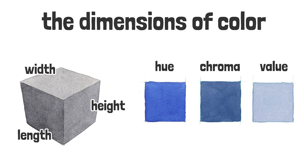
What are The Dimensions of Color?
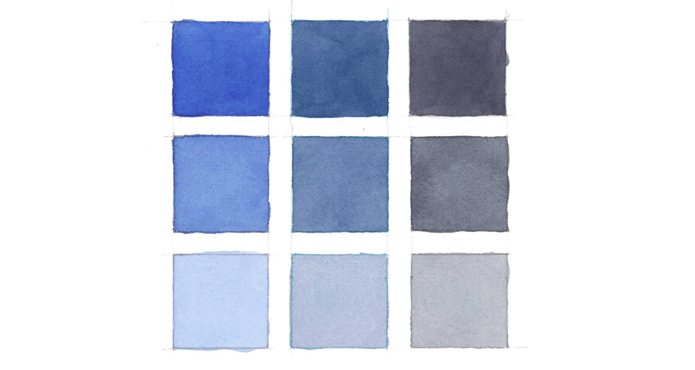
There are three dimensions of color that allow us to describe color appearance accurately. They are:
- Hue
- Chroma
- Value
In a similar way to how an object’s physical dimensions – its length, width and height – define its size and shape, these three color properties reveal how color really works and how we perceive and describe it.
It gives us a more accurate vocabulary for talking about colors in art 🙂
You’ve probably seen “hue,” “chroma” and “value” mentioned before during your artistic journey – but only when you put all three together do you get the full picture of a color’s appearance.
And you really do need the full picture! – I mean, it is a painting lesson…
So, let’s start at the beginning – with the property that artists rely on first when identifying a color:
Hue…
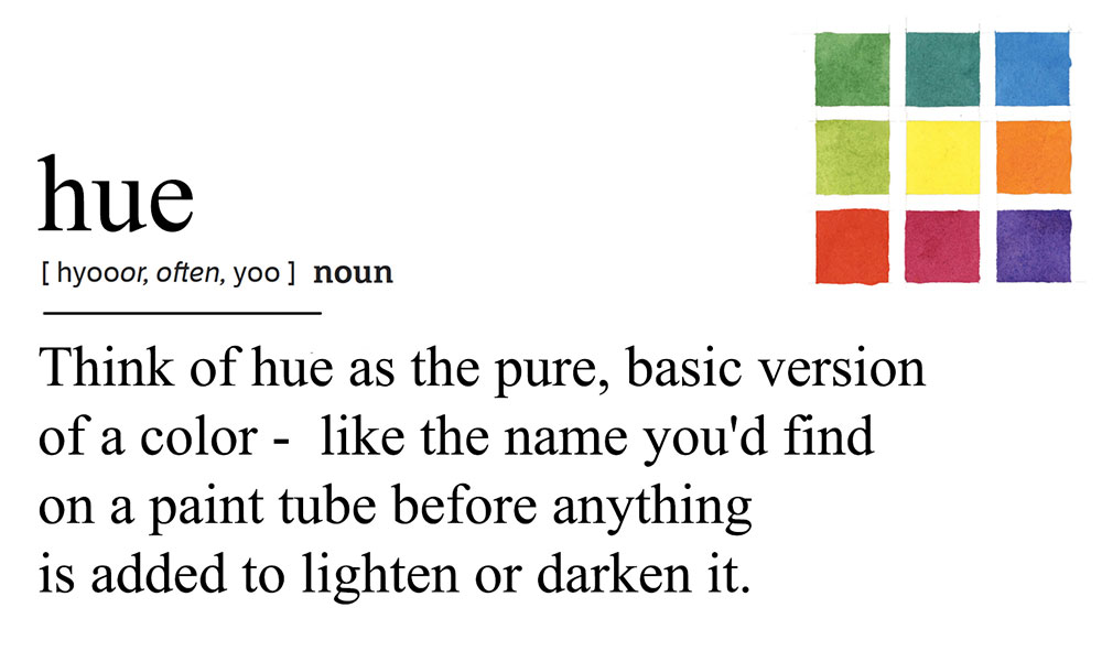
Understanding Hue (The Color’s family)
You know when you look at a color and instantly know it’s red, green, or whatever?
For example, when you spot a banana, you immediately think yellow… or apricots are orange, kiwis are green… You get the idea.
Well… That instant recognition is what artists call “hue.”
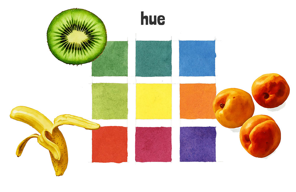
It’s basically the thing that makes each color unique and recognizable. It’s the name we’d naturally give it based on its color family.
Hue refers to the aspect of color we usually describe with familiar names like red, blue, green, and so on. These can be primary colors (red, blue, yellow), secondary colors (orange, green, purple), or anything in between.
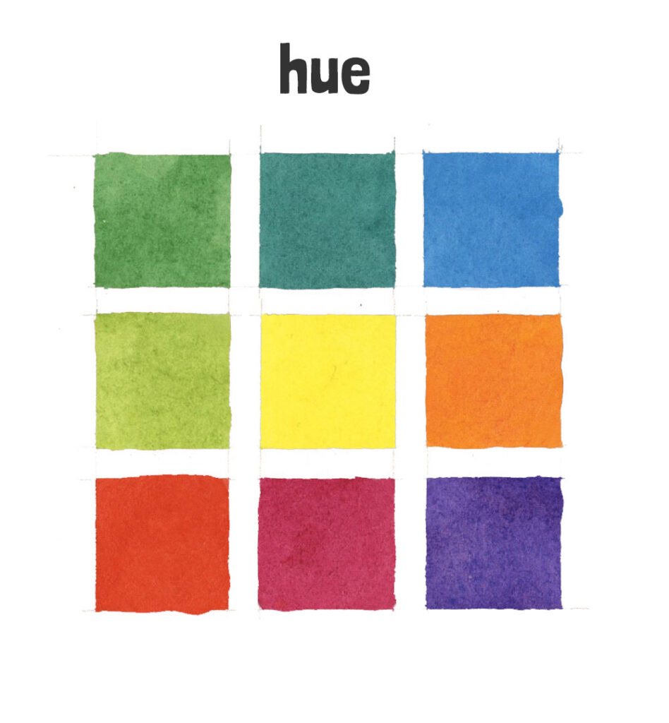
Simple definition of hue:
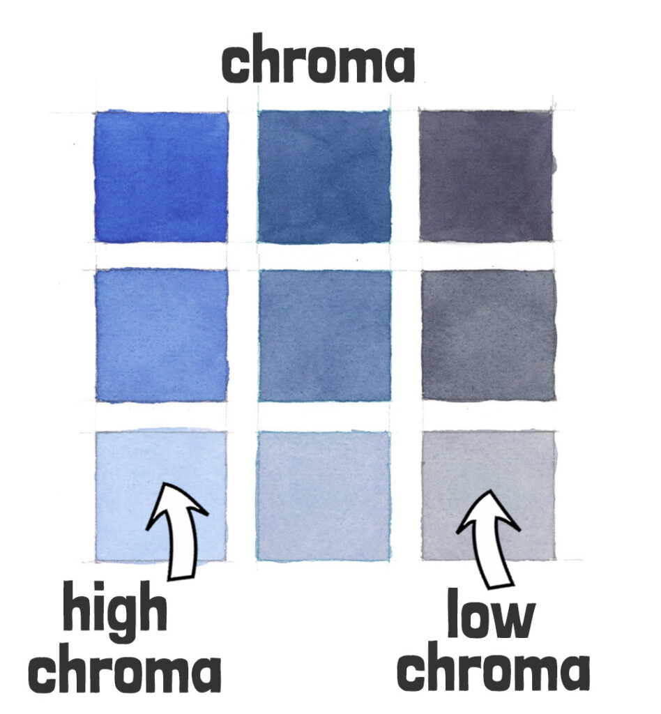
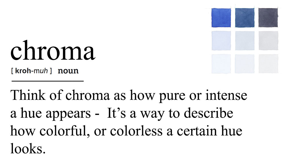
Chroma: The Intensity of Color
So now that we’ve nailed down what color something is (the hue), let’s look at the next dimension: the one that affects how vibrant, or muted a color looks…
Chroma is the intensity or saturation of a color. It describes how bright and vibrant a color appears, or how dull and neutral it looks. High chroma means the color is vivid and intense, while low chroma means the color is more muted or grayish.
A high-chroma color pops off the page with intensity. A low-chroma color feels more subtle, soft, or neutral.
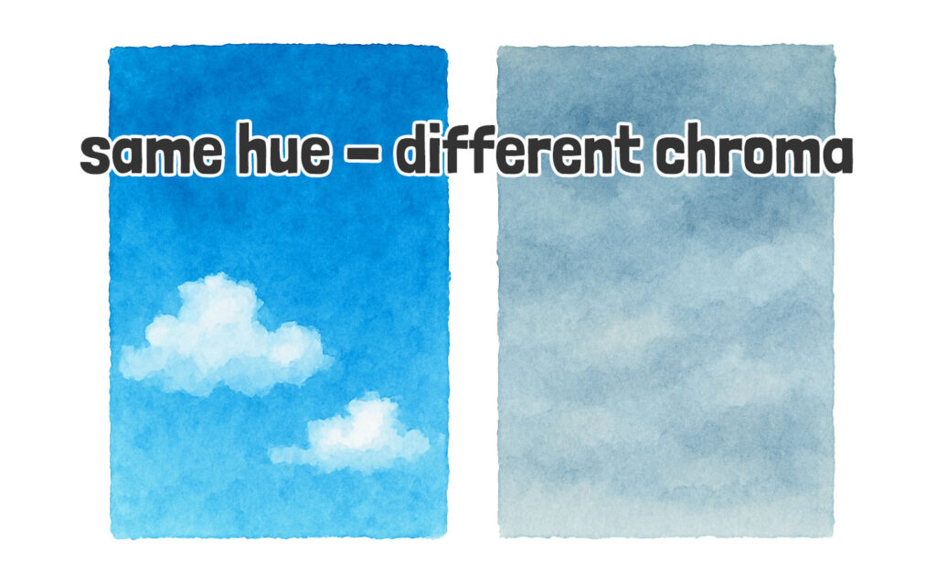
For example, think of the sky. On some days it’s a bold, electric blue. On others, it’s a much softer, greyish blue. Same hue – different chroma.
Simple definition of chroma:
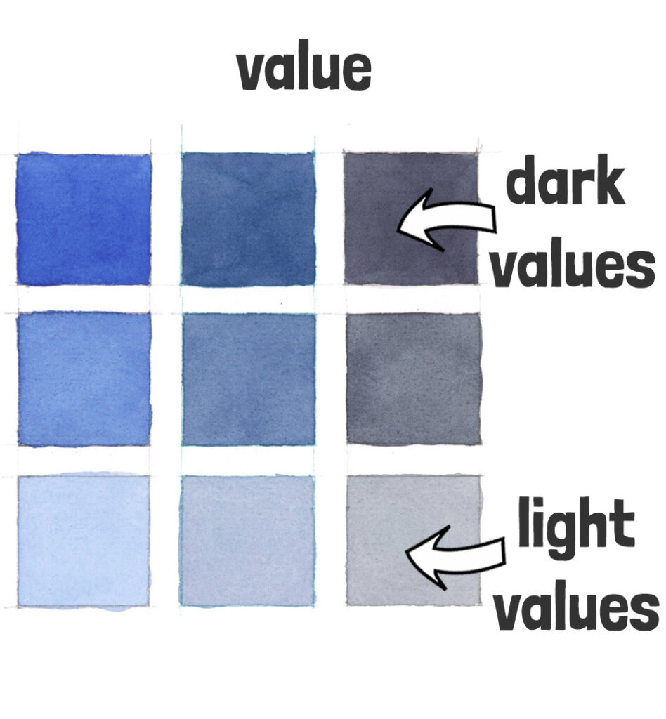
Value: The Lightness and Darkness of Color
So, if chroma tells us how intense a color feels, value is what tells us how light or dark it appears.
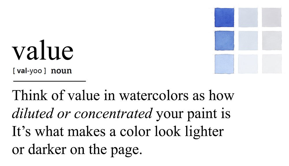
Simply put, value is the lightness or darkness of a color.
It’s one of the most powerful tools you have for creating depth and contrast in your artwork. Without a good range of values, even the best color choices can end up looking flat. Values help convey a sense of realism, and three-dimensions.
In watercolors we adjust value by diluting or thickening the paint mixture, or by layering colors on top of each other using a glazing technique.
Diluting the paint creates lighter values, thickening the paint mixture creates darker ones. And because watercolors are transparent, layering colors on top of each other using a glazing technique darkens the values of a painting.
(Note: With opaque mediums like acrylic or oil, artists usually adjust value by mixing in white or black.)
Simple definition of value:
The Secret to Using the Dimensions of Color in Art…(Simple 3-Step Process)
This is where the magic starts to happen – and how you can use your knowledge of these three color properties to mix amazing and accurate colors far more easily.
Understanding hue, chroma, and value lets us precisely describe and mix colors to achieve a desired result.
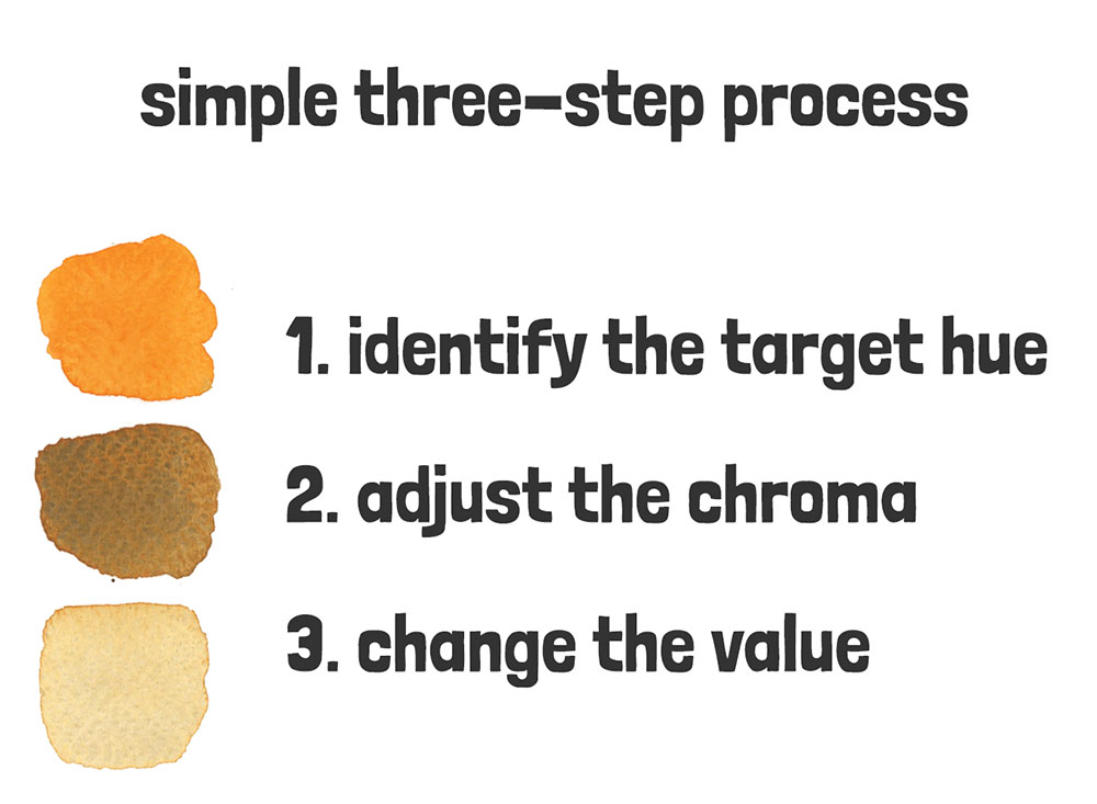
Now that you know what these “dimensions” of color are, you can use them to mix any color with this simple three-step process:
- Identify the target hue
- Adjust the chroma
- Change the value
If you’ve ever found yourself struggling to recreate the exact shade you’re aiming for, try using these three steps to get the right mixture:
Here’s an example of how this works…
Step 1.
Begin by pinpointing the target hue you’re aiming for… This is your starting point for mixing any color.
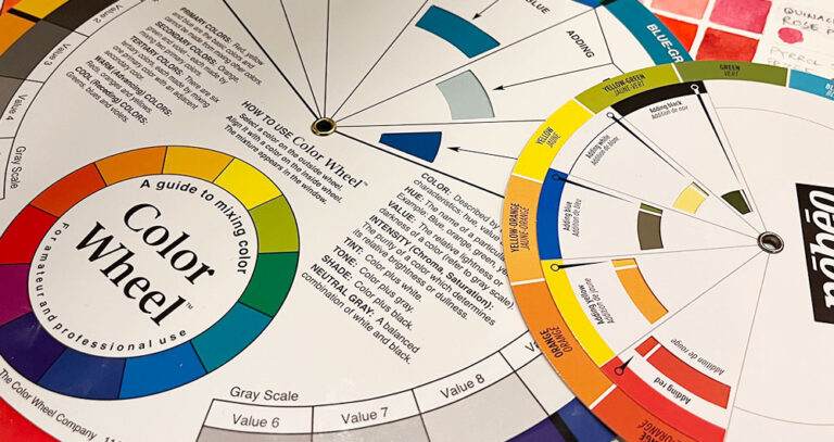
For example, use a simple color wheel to locate the approximate hue you want to match. This might be a primary color that you grab straight from the palette, or a secondary color you need to mix up.
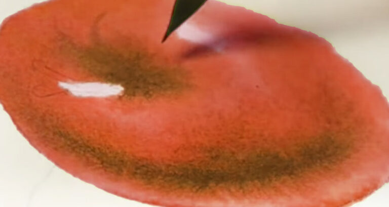
(In this example, here I’m assuming my end color is a kind brown color. Browns are essentially neutral oranges, so I’ll start by mixing a pure, bright orange hue)
Step 2.
Now consider the chroma you’re aiming for…
For example, is the target hue “colorful” or “colorless”? Is it a vivid hue, or does your color mixture need toning down.
If you’re targeting a bright color – you don’t need to change anything! You can go straight to step 3…
Otherwise, you can adjust chroma, by adding complementary colors to the paint mix.
(So in this example, to make my orange hue more brown, I can make the mixture more neutral by mixing in a warm blue like french ultramarine )
Step 3.
Now you have a puddle of paint that approaches your desired hue, you only need to adjust one final parameter – The value…
And in watercolor painting the values of any color are controlled by adjusting the water-to-paint ratio.
Diluting the paint lightens the tonal value, while darker hues need less water…
(Let’s assume for our example I’m aiming for a light brown color – maybe a bit like yellow ochre – so I’ll add more water until I reach the correct value or “lightness”).
And there you go!I think you can see using the dimensions of color in this order when mixing watercolors is a very useful way to get to your target color quickly and easily 🙂
…This is just a small part of what I teach in my new “Successful Color Mixing” course.
Through years of trial and error, I’ve developed a system that changed my approach to color mixing. In this new course I’ll show you how to quickly and easily mix colors using my simple color maps system.
“Successful Color Mixing in Seconds Using Color Maps!”
Need More Help? Share your color-related struggles in the comments… I’ll personally help you find solutions 🙂


This piece about the three dimensions of color is wonderful. How have I never really known what chroma meant and the role it plays. I’m really grateful for this. I am new to watercolor but your advice is going to make a major difference to me. Thank you!
Happy to help Ruthanne 🙂
Anthony, honestly, YOU are AWESOME! I’ve followed you during the past 3 years (maybe more) to learn how to improve my ‘non-gifted’ watercolor painting. I am still copying others’ photos, some of my own and am attempting plein air, as a blank canvas stuns me as a deer in the headlights. I have this basic, essential skill to master–color mixing. I so wish I’d taken your introductory course on the subject, but got stars in my eyes and bought A LOT of colorful pallets with A LIT of colors all provided. I should have started with the 3 primary and 3 secondary colors and forced myself to properly LEARN to mix. I do own the 2 sets of W&N P/S paints and will follow your instructions and have the discipline to work through the whole colorwheel process and practice the 3 tenants of color you remind us of in this post.
Thank you AGAIN for your generosity in sharing these. Marcy Thobaben
Thanks for your kind comments Marcy, and I’m glad this helps 🙂