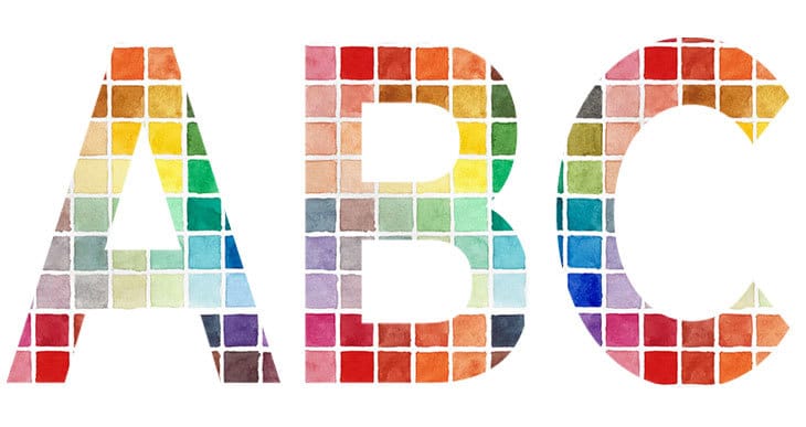
Watercolor Basics Tutorial for the Absolute Beginner
When you’re an absolute beginner, figuring out the basics of watercolor can be quite daunting. And the problem is, most watercolor artists forget what it was like to be a novice. As a result, many watercolor guides assume a lot of things they think beginners should already know. It can leave you with a lot of unanswered questions. I’d like to introduce you to what I think are the fundamental basics of watercolors, so you can actually learn something useful and feel more confident in your skills.
When I started painting in watercolors I ran into continuous frustrations, without really understanding how to improve my results. I had to figure things out for myself. I’d like to help set you on the path to better painting! Even though practice is the key to improved skills, a little knowledge helps you grow as an artist. So grab a coffee and let’s get started…
The Basic Characteristics of Watercolors & Watercolor Painting
It’s all about the water!
The fact that watercolor paints are diluted in water gives this art medium a unique set of characteristics. And in my opinion it’s what makes watercolor so darn appealing.
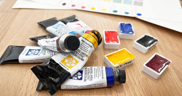
For a start, watercolor paints are transparent. The colored pigments in paint get diluted in water, which makes them liquid enough to spread across the paper. As the paint dries, the water evaporates and the colored pigments fix to the surface of the paper. The ratio of pigment to water has a direct effect on the transparency of your watercolors.
The more water you add, the more diluted and transparent the mixture becomes, and the lighter the tone of your brush marks.
This is one of the first fundamentals of watercolor paint.
If you want dark tones then you need a higher concentration of pigments in your mixture (small amount of water). For lighter tones, your mixture must be more diluted (large amount of water).

As you progress with your art, you’ll learn that one of the most important elements of a painting is value. Value is another word that artists use for tone. Put simply, values refer to the differences in lightness and darkness in a work of art.
Why is value so important? Well… If you can accurately portray the values of a subject you can create a believable sense of light, depth, and three dimensional space. I remember when I first started painting I didn’t think about values at all. I was so concerned with working out the shapes and the detail that I didn’t bother trying to identify the tonal values of my artwork.

Value is a basic principle that you should be aware of. As you can guess, the ratio of water to pigment is how you control the tonal values in watercolor. Mixing the right ratios to achieve the desired result takes a bit of practice, which is why watercolor painters often recommend painting a value chart. You can try this for yourself with some of your paints. Try painting the 9 level value scale below. This is a great exercise in value control and for becoming more familiar with your paints. One of the basics that beginners struggle with is “how much water to use”.
But watch out! When watercolor paint dries it becomes lighter in tone compared to when it’s wet!

The more transparent and diluted you make your colors, the more you can see the white paper underneath. And this is the next important quality of watercolor paints. Unlike with other paint mediums such as oils or acrylics, in watercolors the “whiteness” of a painting is provided by the paper. For this reason, a lot of watercolor artists use the method of working from light to dark as they progress with a painting (this is because if your tones are too light, it’s easy to make them darker, but it’s not easy to do the opposite).
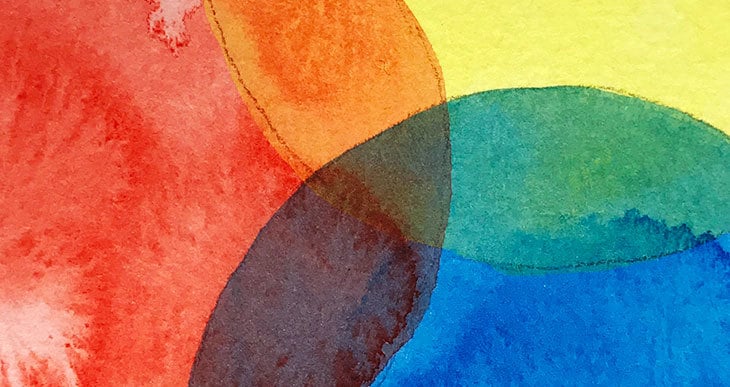
The transparent nature of watercolors also gives rise to one of the main painting techniques in watercolors, known as glazing. Glazing is another term for layering. This technique involves laying down a diluted wash of color, waiting for the paint to dry, then applying another layer of color over the top. You can repeat the process as many times as you want, and with each successive “glaze” the tone of the color deepens. (By the way, the term “wash” just means a mixture of paint and water applied to the paper).

This translucent quality is what gives watercolors their delightful and charming effects, and at the same time sometimes creates frustration for beginners. Indeed, each brushstroke is likely to remain visible underneath all the following layers of pigment, so mistakes can be difficult to fix.
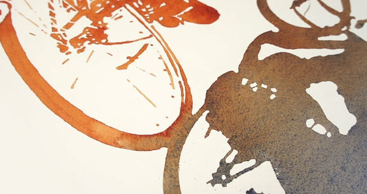
Glazing is what’s known as a “wet-in-dry” technique. The surface of the paper needs to be dry before you apply the next layer of paint. This method of painting produces hard edges when the paint dries. Again, this is a result of the dynamics of water. On a dry surface paint will only spread to the shapes of your brushstroke. It has no reason to flow beyond the limits of the washes you lay down. It’s an excellent technique for detailed work and produces some interesting textures.
The transparency of watercolors also produces some interesting color mixing when you layer the paint with a glazing technique. One color glazed over another produces a completely new color. This basic principle of color mixing is another aspect which is sometimes difficult for beginners.

Working from light to dark also needs a certain amount of forward thinking. The highlights and shapes of pure white need to be reserved because once you’ve laid down a wash of color it can be difficult to undo completely!
To preserve the white paper you either have to carefully work around the white shapes, or you can use masking film or masking fluid to protect them during the painting process. (Some artists use an opaque paint such as white gouache to add highlights to their work, but this has its limitations).

That being said it is often possible to “lighten” a color which has already been applied to your paper. Artists use a technique known as lifting off to remove some of the pigments. For example, this can be done by brushing over a wash of color with a clean, slightly damp brush. The clean brush “wicks” some of the color off the surface of the paper leaving a lighter toned color underneath.

Wetness - How the Paint Interacts with Water
Are you beginning to see that it’s all about the water?
Water is the medium which transports the colored pigments. Water plays an active role in the results you achieve, which is why watercolor artists are very concerned about wetness.
The wetness of the brush and the wetness of the paper are the two important things artists try to control. Wetness effects the flow of water, and in turn it affects the flow of pigments.
Heck… We even name a couple of the principal painting techniques “wet in wet” and “wet in dry”!
The one rule that watercolorists cannot overlook is as follows:
A higher level of wetness will always flow into a lower level of wetness.
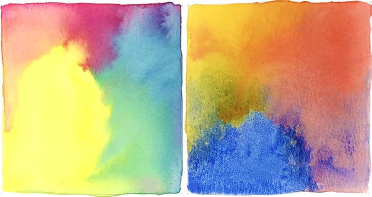
The greater wetness always flows into the lesser wetness in an attempt to balance the overall moisture level. This flow of paint across damp paper is heavily exploited during wet in wet techniques. It’s also what lets us create beautifully blended colors, resulting in what we know as variegated washes.

Wet in wet techniques produce beautiful soft edges when the paint dries. This is an excellent way to achieve blended soft shadows and gradual variations in values. You can apply this technique at any moment. For example by wetting a wash of color and adding more pigment to deepen the tones or blend one color on top of another.

But for beginners, wetness can also sometimes result in little “accidents”.
Let’s say you paint a big juicy wash of color, then leave one part of the wash much wetter than the rest. This looks fine when the paint is still wet. But as the paint begins to dry you’ll see the wet spots of paint flowing back into the drying wash. This can cause a textured appearance which we call a back-run or a bloom.
The trick is to remove excess paint before a backrun can form.

But don’t be afraid of blooms and backruns. They can be surprising at first, but these things are not necessarily wrong. In fact they can create interesting textures. But to use them to artistic effect you should know why they happen and how to control them. Wetness is the key.
With practice, you get a feel for how to control wetness and use it to your advantage!
How Watercolor Reacts with Paper
Watercolor paper is specially designed to handle the flow characteristics of watercolor paints. Not many people understand that watercolor paper is treated with a substance known as sizing to alter its absorbency.
Once again the aim is to control the flow of liquid, watery paint (remember, it’s all about the water). If the paper is too absorbent the paint will be sucked quickly into the paper fibers, and you won’t have time to play with the paint. If it’s not sufficiently absorbent, the paint will float around on the surface and won’t fix to the paper.
The sizing of good quality watercolor paper is usually gelatin. This allows the controlled absorption of wet paint into the paper fibers.
The best type of paper to use for watercolor painting is 100% cotton and rated acid-free or Ph neutral. Acid-free and Ph neutral paper ensures that the paper doesn’t degrade in color over time (often called archival paper). And cotton gives the best results for watercolor painting, but it’s the most expensive. You can get less expensive watercolor paper which is mixed with wood cellulose, but you’ll find the paint isn’t as easy to control.
Watercolor paper remains “dimensionally stable” when soaked with water. This is important because is means it won’t disintegrate when soaked with paint and repeatedly brushed. Once again you can see that good paper is specially designed to cope with the constraints of water…

Watercolor paper is available in various thicknesses, and different surface finishes. Thickness is measured by weight (pounds or grams). Surface finishes are smooth (called hot-press), medium (labeled cold-press), or rough. Ideally you want paper which is not too thin, because otherwise it buckles and warps when wet. A weight of 140 lb / 300 gsm is a good working minimum. And a little bit of texture but not too much is best for starting out, so opt for cold-press paper.
Cotton is up to ten times stronger than wood cellulose and it’s naturally acid-free and naturally white in appearance. Good quality cotton watercolor paper enhances the appearance of your watercolors, and makes the paint easier to handle. I highly encourage you to test the difference between 100% cotton paper and student grade paper for yourself.
Personally I use both professional cotton and student quality paper. This is simply because I paint a lot, and watercolor paper is expensive. So for sketching I use Canson 140 lb / 300 gsm paper which is just the right thickness for watercolor work. But for finished work I prefer Arches 100% cotton 140 lb / 300 gsm cold press watercolor paper (links to Amazon).
Tip: Don’t hesitate to use both sides of your paper! I always keep my sheets for swatching or sketching when working on new projects.
Basic Characteristics of Watercolor Brushes
A watercolor artists obsession with controlling the flow of water extends from the paint, to the paper, and finally to the brushes they use.
Once again, watercolor brushes are specially designed to help control the painting process using water based paint. The level of control is mostly dictated by the type of hair or fibers used for the bristles of the brush.
There are two main types of brush: Natural or synthetic. You can also find some good brushes which use a mix of both natural and synthetic fibers.
The preferred choice for watercolor painting is natural hair. And two of the most popular choices are squirrel hair and kolinsky sable.

So what makes a good watercolor brush? A good brush gives you control over the wetnessof the brush and the accuracy of your brushstrokes. Natural hairs provide both of these characteristics. For a start they are very good at holding a reservoir of water which provides longer working time between dips, and long flowing brushstrokes. They also don’t lose their form because the hairs have natural elasticity.
Sable brushes are considered the best for watercolors. They can be loaded with a lot of water and they have a nicely pointed tip which doesn’t deform. After each brushstroke the tip springs back to its original state. Squirrel hair brushes have similar characteristics but they tend to be softer, so they are not so good for highly detailed work. But they do make excellent “mop” brushes which are used for large washes and loose painting.
Silver Brush Ltd make some excellent brushes which are a blend of natural and synthetic fibers (Check them out on Amazon). These brushes are a great compromise. They hold water very well and the synthetic hairs help to maintain the point of the brush. They are better than some of my more expensive natural brushes, so they really are excellent value for money.
It’s very difficult to obtain good results using brushes which don’t have the right characteristics for controlling paint, and most artists don’t realize the importance that the quality of brushes has on their work.
It’s all about the water
For me the basics of watercolor revolve around an understanding of water, and how it interacts with the paint, the paper, and brushes. We’ve developed tools and equipment to help us handle what seems like an unpredictable art medium.
But at the same time, the sometimes random and unexpected results you get from fluid paint is what gives watercolors it’s beauty and charm.
Sometimes just letting the paint flow and do it’s thing gives the best results!
Was just reading your article, much information for us beginners. Thank you SO much.
Happy to help Pat 🙂
Hi there Anthony! Thank you for making this article, I have always wanted to try water colors but my perfectionist anxiety has always kept me from trying, but your article has managed to break down my anxiety so much that I actually put a brush to a page today! Thank you thank you thank you
I used to be more of a perfectionist – still am!
It can get in the way when learning something like watercolors 🙂
They don’t need perfection, they just need to be understood!
cheers
Very informative and so helpful. Also inspiring. Thank you for the clarity too.
You’re very welcome Ellie 🙂
Great first lesson for me! As an absolute beginner, this was very informative. Thanks, Anthony!
The tutorials are very easy to understand and follow. Thankyou.
The info about the water is very helpful. I always have trouble with it .Thank you
Hi Linda
Keep practicing – you’ll get there 🙂
I am learning so, so much! Thank you.
Thank you so much. This is the kind of basic info that I wanted. Do you have one on how to attach the paper to a board for painting?
Hi Betsy – Try this article:
https://www.watercoloraffair.com/4-ways-to-stretch-watercolor-paper/
I was doing a search and found you. You hit the nail on the head when you talk about books not telling and explaining the how and what. “Water”! I didn’t understand how much or less when it comes to water. Now, I can play around. Will do value charts. I have registered for a course, but I’m going to keep reading your articles! Knowledge is power and I feel empowered! Thank you!
I am sooo happy I found your website. I have been reading and watching different tutorials but your website has been the most helpful of all. Little details and subtleties are so well explained with actual visuals. Thank you so much! After I read a few of your articles, I managed to do a nice graded wash for the first time!
One question – i am finding plastic and meta palettes difficult to work with because of beading but also heard the surface may become better over time. Is this the case?
Hi Hana – glad to hear you’re getting the hang of your graded washes!
To prevent beading on your watercolor palettes you can use an abrasive kitchen sponge to prep the surface. This roughens the palette slighly and helps prevent beading!
well written,easy to understand!
Thanks Jill !
lovelovelove! thank you so much for this.
Thanks Anne!