Simple abstract watercolor painting for beginners
Fancy trying some abstract watercolor painting ?
Good for you.
So, let’s talk about ethereality and impermanence…
Nope ! Only kidding…
Abstract watercolors are a whole lot of fun. And you don’t need to ponder over complicated art concepts to enjoy them. But at the same time, there’s no reason you can’t learn some interesting techniques along the way !
After all… we all want to become better artists… Right?
I think abstract painting is an excellent way to take pleasure in watercolors without having to worry about getting things just right. The beauty of abstract art is that you can begin to use watercolors, without worrying about your level of experience.
My first watercolor paintings were all attempts at creating realistic images. I’m a bit of a perfectionist, so you can imagine the time I spent painstakingly trying to get the shape and presentation of my painting just right. Nowadays I just want to have more fun, and abstract artwork is a terrific way to enjoy painting !
Sometimes just making patterns and painting colors is a delight all by itself.
The following abstract watercolor ideas are designed to get you practicing and learning new techniques.
I’ve tried to introduce new ideas in each exercise so you can get to know some interesting watercolor methods. You can then use the techniques you’ve learned in future projects.
Each exercise is progressive so you can build on what you’ve learned in the previous painting. You’ll also become more familiar with the characteristics of watercolor. It’s only when you take up a brush and practice that you really get a feeling for watercolor painting.
And practice makes perfect… Right?

What is abstract watercolor art?
According to the Collins English dictionary:
“An abstract idea or way of thinking is based on general ideas rather than real things”.
So if we transcribe this for watercolors we get:
“Abstract watercolors are a way of painting based on general shapes or patterns rather than a real representation of things”.
That’s pretty much it !
If you ask me, there are two types of abstract techniques that watercolor artists regularly make use of. We could call these geometric and non-realistic.
I think the most basic type of abstract watercolors involve painting geometric patterns. With this kind of painting we’re not trying to represent anything real, but rather experiment with different colors, textures, shapes and values. All of these concepts are useful in any watercolor project.
(“value”, or “tone” are terms that you will find cropping up regularly in watercolor painting. Value simply refers to the different levels of lightness or darkness in a painting)
Another type of abstract watercolor involves the depiction of a real scene by using abstract shapes, forms, and colors. It’s possible to suggest a scene or an object without adding realistic detail. With this non-realistic approach, its surprising just how little information is needed to describe a subject.
The first few abstract painting ideas below begin with geometric patterns. The final project is a non-realistic scene.
Above all, abstract watercolors are an excellent way to experiment freely without all the constraints of traditional painting.
Let’s take the concept of abstract watercolor a little further: As you progress with watercolors, abstract techniques can be an incredibly useful part of the creative process. In my opinion, some of the best watercolor art happens when you combine both realistic detail and non-realistic shapes.
Take a landscape painting for example. Most of the time the distant background or foreground isn’t the focus of your painting. There’s usually a subject in the middle-ground that you want to draw attention to. The less important parts of your painting can be treated using abstract techniques. It can be enough to suggest the background trees, mountain, etc., and add detail only to your main focus.
No matter what you’re painting, try to find a balance between realism and suggestion. Abstract techniques are an important skill for suggesting parts of your paintings and help to create a successful composition.
How to paint abstract watercolors
OK, so geometric shapes and forms are pretty simple to paint… Don’t you think?
But what makes a good abstract painting ?
You might look at a Jackson Pollock painting and think he was just flinging paint around, (Well OK… That was kind of what he was doing). But even the most simple looking abstract art needs more than that to be successful and interesting.
So in the following exercises I thought we could do more than just splash some paint. We can actually apply some useful concepts and techniques to make your abstract art a little more interesting.
With a little bit of thoughtfulness your abstract art will be more effective !
Abstract watercolor techniques & concepts
- In the first exercise you will be mostly working on your brush control. Getting a good feeling for how to use your brushes is of course an essential first step in watercolors.
- We’ll also be looking at simple color design. Good color harmony goes a long way to making artwork pleasing to the eye.
- Next I’ll introduce you to some easy rules about composition. A well composed image brings focus to the important subjects in a painting. You can begin to learn composition with simple patterns, and use the same ideas for more complex subjects later on.
- You’ll also get to use watercolor techniques known as glazing and wet on dry.
- Next up, we will progress to using wet on wet techniques plus some watercolor texture creation.
- In the final painting we’ll put everything together in one artwork and also get you to practice gradient wash techniques.
Some of this may sound daunting but it really is useful to get to know some watercolor vocabulary.
Above all, remember to have fun !
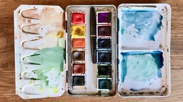
Supplies
You’ll need a couple of brushes, some paper, a rag for blotting, and two water jars. Oh, and some paint !
Using two jars helps to keep your mixing water clean. You use one jar to rinse your brush and the other to pick up clean water. I find mason jars are perfect – they’re solid and just the right size.
Watercolor paper is a must, but you don’t need to buy the best quality for practicing. Just make sure it’s thick enough (a weight of 300 gsm / 140 lb is good).
A flat brush for applying washes is very handy. For most of the exercises you can just use a size 8 round brush. There’s more detailed information on brushes in my recommended supplies section if you need help.
I’m using artist quality watercolor paints for these exercises but use whatever you have to hand.
You can read about my preferred range of watercolors here…
Abstract watercolor painting ideas
This is the first abstract painting idea I recommend you try. You’ll find it’s a great way to “brush up” your brush technique ! (sorry, couldn’t resist that one).
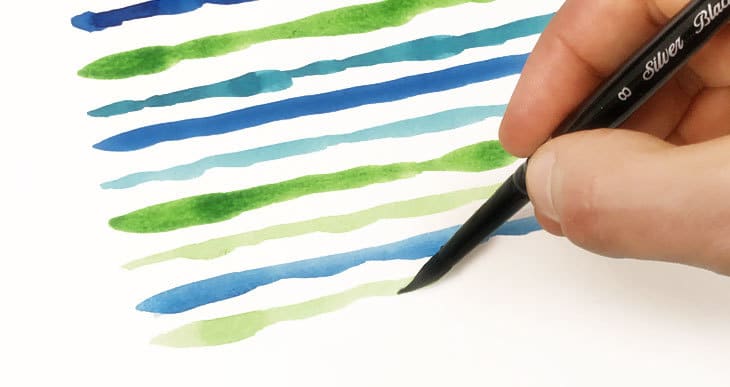
1. Abstract watercolor lines

This painting will also get you thinking about color design.
I think you’ll agree the colors work well together. The color design for this painting uses analogous colors. These are colors that are located close to each other on the color wheel, in this case, blue, blue-green, and green.

I’m sure you’ve seen them around ? A color wheel is used to show the relationships between different colors and is organised like the colors of a rainbow. It helps us identify which colors work best with each other.
Analogous colors are usually a group of three colors which share a common hue. One of the colors is often dominant. The closeness of the hues create a gradient of harmonious colors and produce a calming and balanced feeling. This kind of color scheme is often found in nature, for example when the leaves on trees turn to yellow, orange and red during the fall.
For this painting I’ve chosen cool colors. The color wheel can be divided into two categories: cool and warm colors. Warm colors tend to be perceived as energetic whereas cool colors are calming.
Choose whichever analogous colors you prefer for your own painting.
Begin by mixing some big puddles of paint for each of your three chosen colors.
The objective of the painting is to become familiar with your brushes. I used a size 8 round brush for this exercise, but you can also use a flat brush if you prefer.
Try to load your brush with a good amount of paint. You don’t want to run out of pigment during the brush stroke. The brush should not be soaking, but it shouldn’t be too dry either. This is a good way to learn how to load your brushes with the desired amount of fluid.
Paint your lines by applying different amounts of pressure. Try to paint some lines with a constant width. Others you can modify the pressure of the brush on the paper surface so that the width of your line varies. If you’re using a flat brush, try experimenting by twisting the brush head during the brush stroke. Different brush angles will modify the width of the paint lines.

This method of painting is known as wet on dry: which basically means wet paint onto a dry surface.
This may seem obvious, but repeating these simple gestures will improve your handling of watercolors.
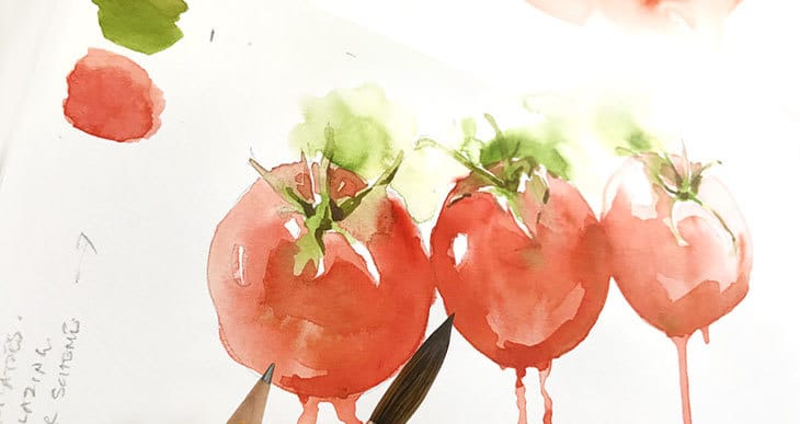
2. Layered abstract forms

In this next exercise we’re going to talk about glazing, composition, value, and some more color design rules.
To begin with, the colors that I’ve chosen are complementary colors. If you refer back to the color wheel, complementary colors are any two colors that are located opposite each other on the color wheel. In this case greens and reds.
These kinds of color combinations produce a more vibrant feeling. Because the two hues are at opposites, they are strongly contrasted. This contrast sets up a lively relationship and a more striking color impact.
The composition of the painting has been designed to take advantage of the rule of thirds.
To use this rule you simply divide your painting into thirds with horizontal and vertical lines (these are imaginary because we don’t want them in the final picture). Any object which falls along one of these imaginary lines, or at the intersection of two lines stands out and becomes dominant in the painting’s composition.

Tests have shown that the human eye is drawn to these areas of an image.
I’m also using value as a compositional tool. Notice how the forms at the outer edges have light values, but the shapes located on the “rule of thirds” lines have stronger values. Using tonal values in this way is another devise for reinforcing composition.
The watercolor technique that you are using to paint this abstract project is known as glazing(sometimes called layering). Glazing simply means painting successive layers of washes on top of each other. Each layer of paint must be left to dry before applying the next. (Yep… You’re going to have to be patient).
While painting, make your colors a little diluted. The idea is to use the transparency of watercolors so that underlying layers of paint show through. As you add new layers of color, notice how they blend to produce new hues. The effect is like mixing paints on the paper, rather than mixing them in the palette. This is glazing…

3. Wet on wet abstract forms

This abstract painting makes use of a watercolor technique known as wet on wet.
In the previous painting you were laying down washes onto dry paper. This difference here is that you will wet the paper first.
A wet on wet technique can produce some wonderful diffuse patterns. You can get some surprising results with this technique, you never really know exactly what is going to happen with your pigments.
The color palette for this project uses a warm blue and a cool red. Togther the produce a nice vibrant purple color.
begin by wetting your watercolor paper (tape down your paper at the edges beforehand, this helps prevent the paper from warping when soaked). Load your brush and hold it vertically over the paper. Apply a drop of paint to the wet paper and watch the pigment expand.
Before the paint dries add another color into the ceter of your “flower”. You can keep dropping pigment into your shapes until your happy with the result.
This technique produces a beautiful gradient of colors with a blurred effect.
4. Abstract landscape

For our final exercise the aim is to represent a real life scene in an abstract way.
I‘ve chosen a simple seascape as a reference for this painting.
Nature is our inspiration for the colors. The blues represent the sky and the water. The yellow-red colors portray the sandy beach. The colors are naturally complementary.
These color associations help the viewer interpret the scene as a “seascape”.
Here are the paints I use for this painting, from left to right:
Cerulean Blue / Phthalo Blue (GS) / Prussian Blue / Yellow Ochre / Burnt Sienna / Quinacridone Burnt Orange.

The composition is a very simple rule of thirds design, the top two thirds are sky and the bottom third is the beach.
To paint this scene you will be using both a wet on wet techniques and glazing techniques. The sky and beach are both painted wet on wet which produce a soft diffuse effect. But for the horizon we’ll use glazing to produce a harder edge.
Try to pay attention to the wetness of the paper during the exercise. If the paper is too wet, pigments will float around in the water. If the paper is too dry, your paint will fix to the paper too quickly and you’ll get no dispersion.
Begin by wetting the top two-thirds of the paper, then add some light blue in a dappled pattern to begin representing the sky. At the bottom edge near the horizon, I’m adding a strong dilution of blue with a wet on dry technique because I want a sharp edge for the horizon. Before the paint dries, I then blend the top edge of this blue band by brushing some clean water across the top edge. The paint will diffuse into the water in a typical wet on wet fashion.
Next wet the bottom third of the paper and add some wet on wet washes for the beach.
Let the painting dry between washes. You can come back and add more pigment to the areas you want to enhance. I did this using a wet on dry technique, and blended the edges with clean water.
Finally add more blue under the horizon line to represent the sea. Again I did this wet on dry and blended the bottom edge so that the pigments disperse. You can get some interesting bloom patterns by charging your wash with clear water in this way.
Conclusion
Some of these exercises are more difficult than others. The wet on wet paintings can be tricky. Wet on wet also works best when your watercolor paper has been stretched. This prevents the paper from warping during your painting session. Alternatively you can try using watercolor blocks which are much less likely to warp during a painting.
That’s it !
Now go do some more watercolors !

I’m excited to try out some of the lessons. I started watercolor about 30 years ago as a way to deal with a high-stress job, in a place where I needed something other than my work. I’ve had a stroke, which has impacted me, and I feel like I need to learn some things over. I look forward to learning and improving my art. Thank you!
Well written with clear explanations! excited to experiment.
Just learning about abstract painting ..Looking forward to trying these technic..Thanks
Delighted to have found your page. I just started trying out watercolors and need lots of help with the basics! Thank you.
Thank you.
You’re more than welcome Carole…
Anthony, thank you for this lesson. I can’t wait to try it. Well written and illustrated.
Thanks Mary ! Hope you have fun !